| THIS WEEK'S ARTICLES |
|
|
|
|
| Martin Pring's Market Roundup |
| This Country ETF Rallies Sharply After War Breaks Out |
| by Martin Pring |
Understandably, most Middle Eastern country ETFs have performed poorly since the war broke out, but there is one noticeable exception, which I will get to later.
Israel
First, as might be expected, the iShares Israel ETF (EIS) has moved lower and completed what looks to be a massive top. The same thing happened in 2020, so it's not impossible that we will see another whipsaw, as the long-term KST is more oversold now than it was then. We do not know where the intermediate momentum will bottom out, but, so far, it is on track to experience a positive divergence with the price. However, until it can rally above the converging trendlines at $52.50, it seems wise to assume that the break is valid.
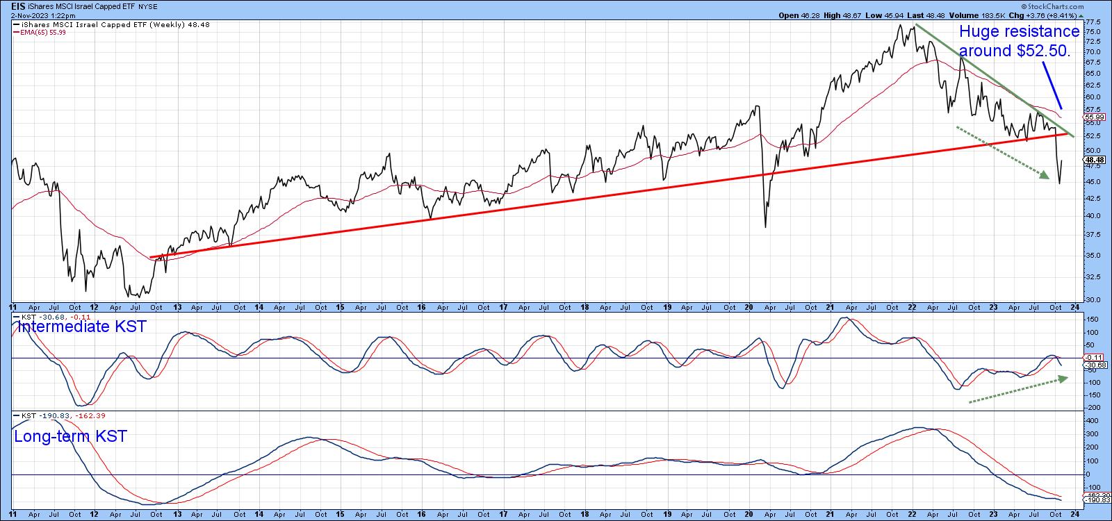 Chart 1 Chart 1
The Gulf States
Chart 2 features the UAE, Saudi Arabia and Qatar. What is encouraging is the fact that all three broke down from tops in late 2022. However, none have followed through on the downside except Qatar. Even in its case, though, the price has rebounded and is right at its extended breakdown trendline. We are left with the possibility that all three will break down from what would be a 3-year top.
However, if the bad news of the last three weeks is not sufficient to cause a widespread breakdown, then we cannot rule out the possibility that these markets will rally above the three green down trendlines on expectations of an end to hostilities and a genuine peace. It's worth monitoring, since a failure of these tops would likely be followed by a significant bull market.
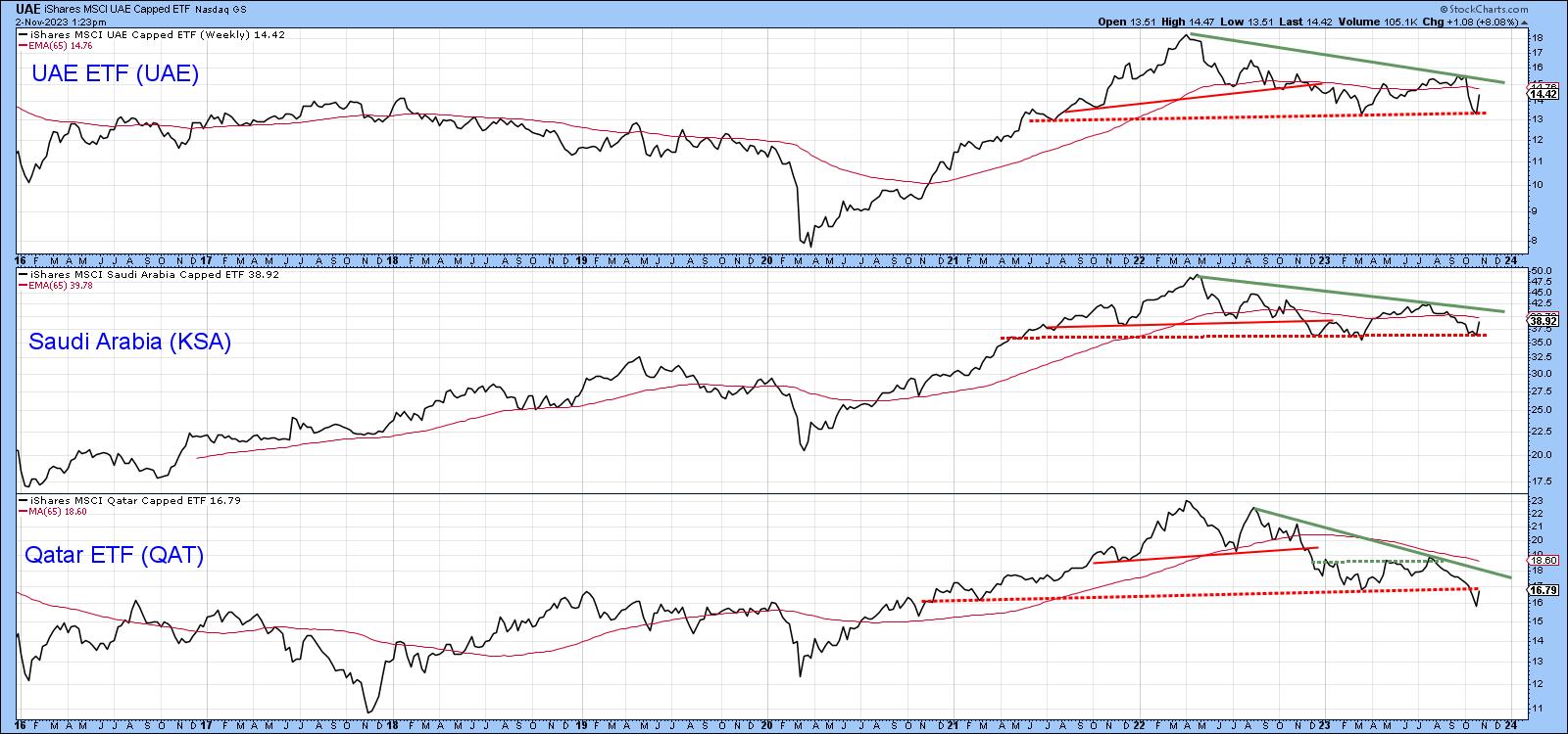 Chart 2 Chart 2
Egypt
The real surprise is to see the much-maligned Egyptian ETF (EGPT) break explosively to the upside. According to the financial press, locally-based investors have started to view Egyptian stocks as a hedge against high inflation and a weakening Egyptian pound. Confidence has waned because the Central Bank of Egypt has devalued the Egyptian pound on three occasions since March 2022, and speculation of another one before the upcoming presidential elections has become widespread. A wall of worry if ever I saw one!
What we have seen is a 9-year down trendline violation and breakout from a 1-year base. This move has also been supported by all three KSTs, and that means it is likely to stick.
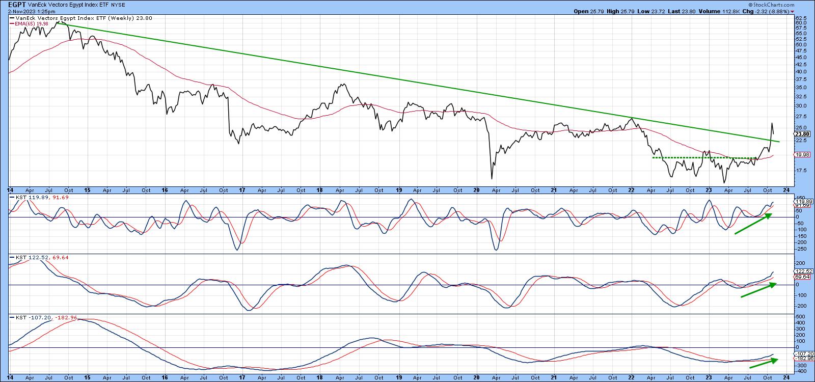 Chart 3 Chart 3
Chart 4 features the RS line against the Dow Jones World Index ($DJW). It, too, has violated a multi-year down trendline and crossed decisively above its 65-week EMA.
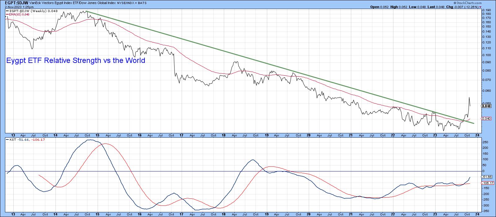 Chart 4 Chart 4
The most positive sign of all comes from Chart 5, which shows that the 12-day ROC experienced a mega-overbought condition as it reached a record high, surpassing the extreme swing high of 2020. For the record, a mega-overbought reflects a strong momentum (as opposed to breadth) thrust and is a reliable sign of a primary trend reversal. Mega-overboughts also need to be confirmed by price, and that's already happened with the trendline violation in Chart 3.
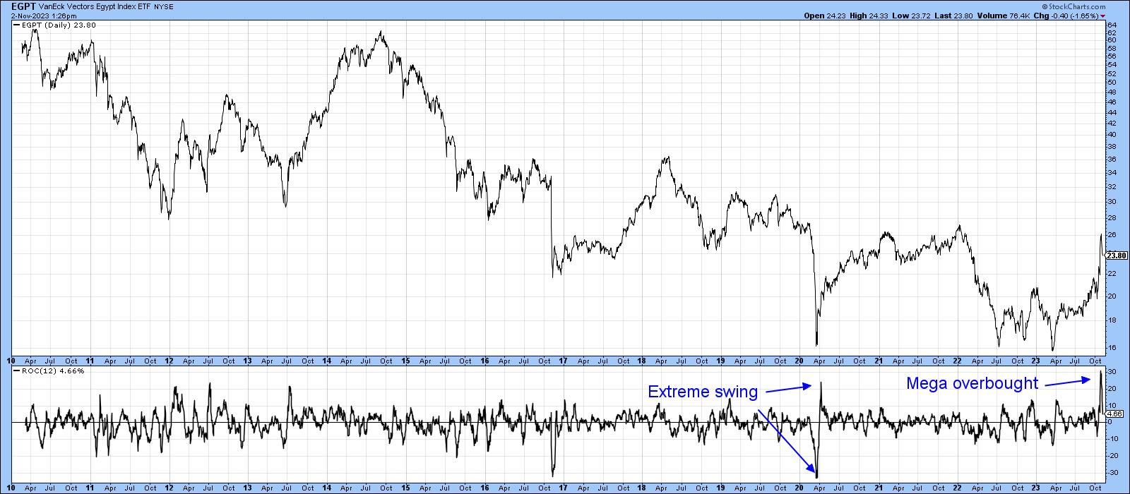 Chart 5 Chart 5
Message from Moscow
Recent technical action also looks positive for the Russian market, as it has broken to the upside in Chart 6. The Index is also north of its 65-week EMA and is being supported by a rising intermediate- and long-term KST.
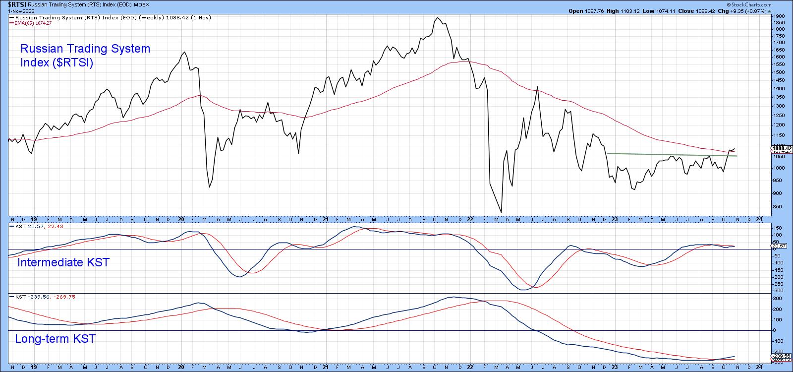 Chart 6 Chart 6
We cannot calculate relative action because of the volatile ruble, which is not part of the StockCharts database. However, it is possible to import data by way of a user index. This is featured in Chart 7.
The outbreak of war resulted in an initial sharp drop. The currency quickly rebounded to pre-invasion levels, but has been selling off ever since. More recently, a rally has enabled it to penetrate the 2022-23 down trendline. This breakout is likely to hold because the short-term KST is also breaking out of a base, having previously diverged positively with the price. Whether this action signifies a bull market for the ruble and the RTSI is open to question. However, those thinking that the Russian economy will continue to be a basket case may want to think again.
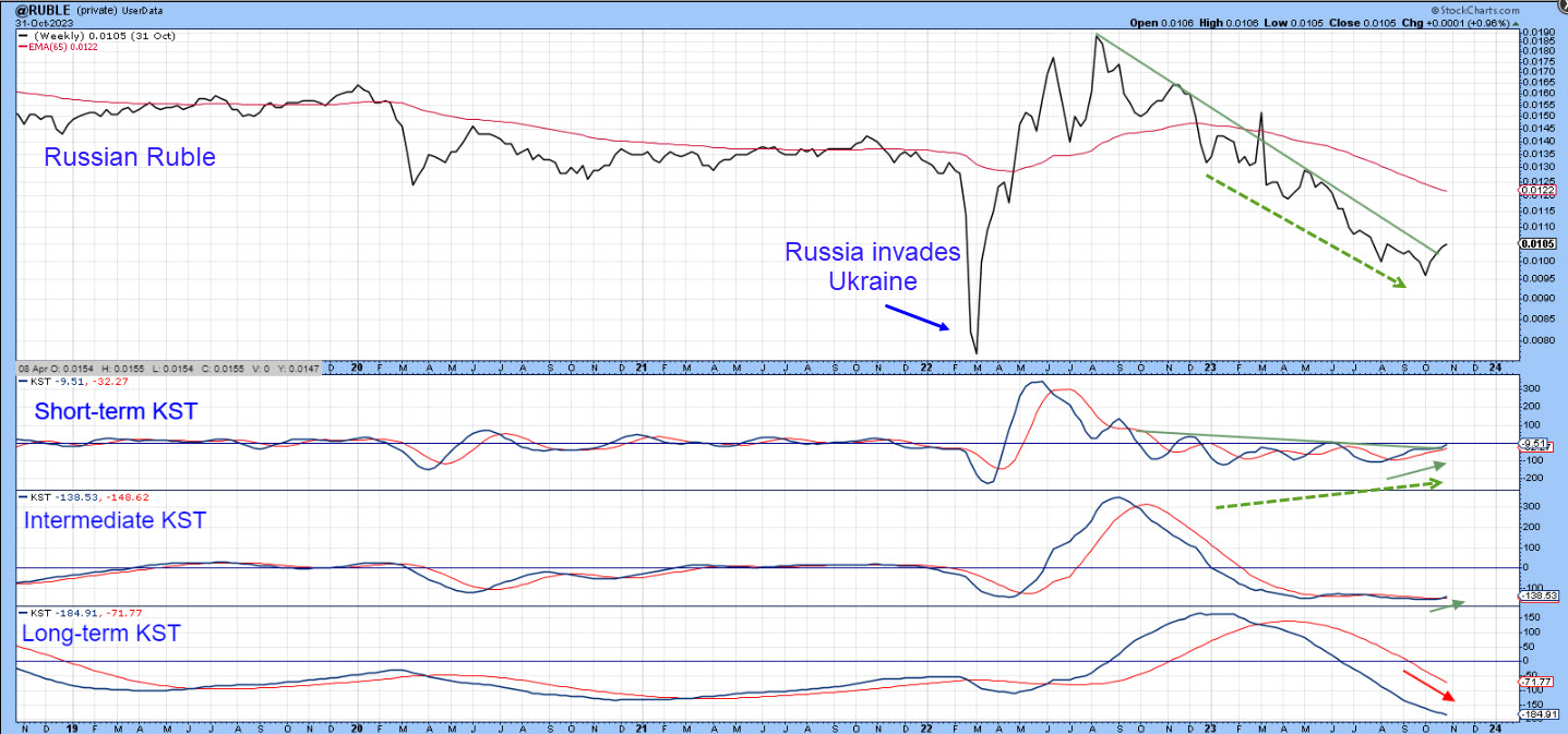 Chart 7 Chart 7
Good luck and good charting,
Martin J. Pring
The views expressed in this article are those of the author and do not necessarily reflect the position or opinion of Pring Turner Capital Group of Walnut Creek or its affiliates.
|
| READ ONLINE → |
|
|
|
| The Mindful Investor |
| Trading the QQQ in Three Timeframes |
| by David Keller |
"Are you bullish or bearish on the Nasdaq 100?"
I often get asked this, or a similar question for the S&P 500, gold, bonds, individual stocks, Bitcoin, and pretty much anything else you can image that has a price. My follow-up question is always, "Well, what's your timeframe?"
It's tempting to analyze a chart, measure the trends, break down all sorts of technical indicators, and then boil it down to one single call: bullish or bearish. But mindful investors know that the market moves on multiple timeframes, with short-term ripples turning into medium-term waves, which are part of the long-term tides.
Given this week's sudden rally, reversing last week's dismal deterioration, I thought it be helpful to focus in on the Nasdaq 100 and identify the trends on three different timeframes. I think you'll find that while the tactical timeframe ended this week in a bullish phase, the medium-term timeframe may provide better clues about what's next for stocks.
Short-Term: Rally Mode but Testing Resistance
You can't deny the strength of the uptrend this week, which provided a stark contrast to last week's dredging. Last week, we saw a clear distribution, as three of the five trading days ended near that day's low. This week, instead, most day's sessions closed near the top of the daily range.

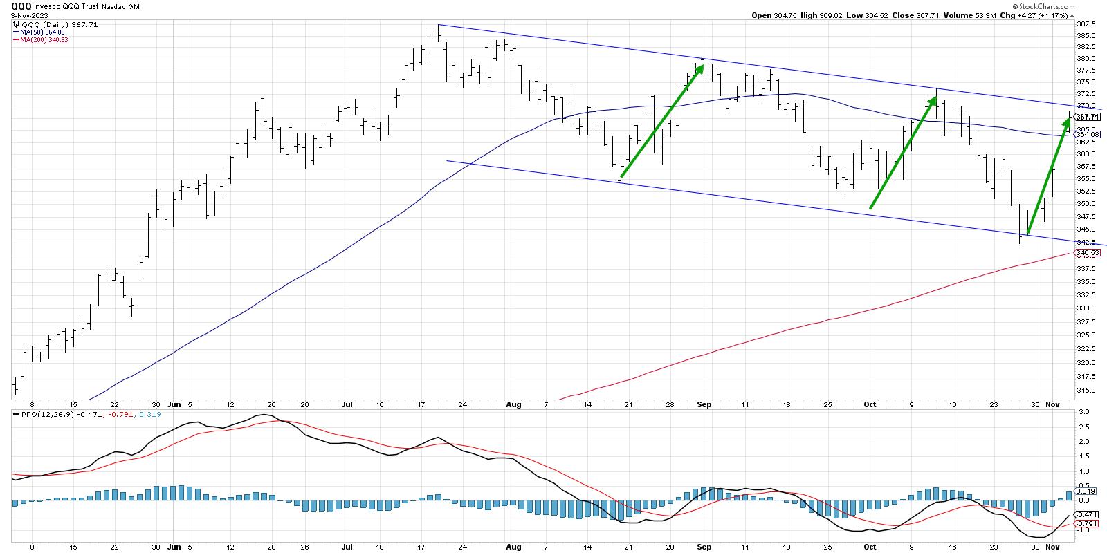
The last three months have developed a clear pattern of lower highs and lower lows on the chart. Notice how the current upswing appears very similar in price change and time duration to previous rallies in early October and late August? Now look down to the RSI, and you'll see that the RSI is right around 60, pretty much where the indicator topped out in those previous two countertrend upswings. So while this recent rally has been sudden, severe, and seductive, it actually tracks quite well with other bear market rallies we've experienced.
Thus, while I'm drawn in by the intensity of this recent rally, I wouldn't be surprised to see at least a brief pullback from this clear resistance level.
Medium-Term: Downtrend Still in Place
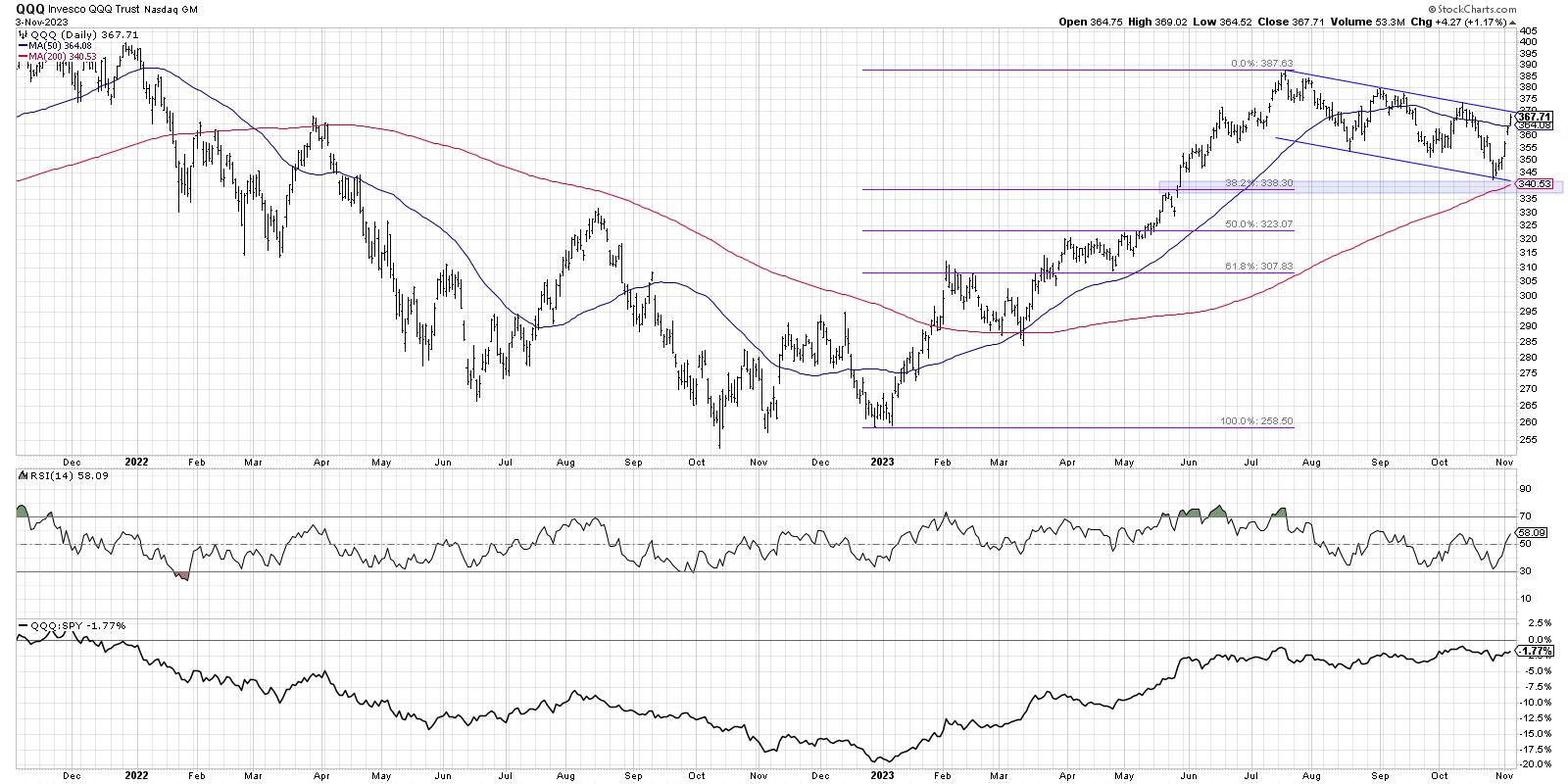
When you take a step back to a two-year daily chart, you'll see how the downtrend channel fits into the overall trends of 2022-2023. On the medium-term time frame, I've considered this market as guilty until proven innocent. Once this consistent pattern of lower highs and lower lows appears, I think you have to assume that the downtrend will persist until proven otherwise.

So what would we need to see to turn more bullish on the medium-term time frame? First, I'd watch for a breakout through the upper boundary of this trend channel. Friday's move higher made me think we might see a breakout before the weekend, but now I'd say this is the most important line to watch in the week to come. A breakout would suggest that new buyers are entering the market, or at least that the pessimism that has pervaded this market into the fourth quarter is starting to dissipate.
Another indication to watch for would be the RSI pushing above the key 60 level. Recent countertrend rallies saw the RSI top out around 60, so a price breakout accompanied by an RSI pushing above 60 could validate a more constructive medium-term thesis.
Long-Term: Bullish Thesis Remains Intact
Why is the long-term picture still bullish in my opinion? Because the downtrend starting in July didn't break below the first Fibonacci support level around 338. Because the Nasdaq 100 remained above its 200-day moving average. Because when you zoom out to the weekly chart, the recent correction seems fairly minor by historical standards.

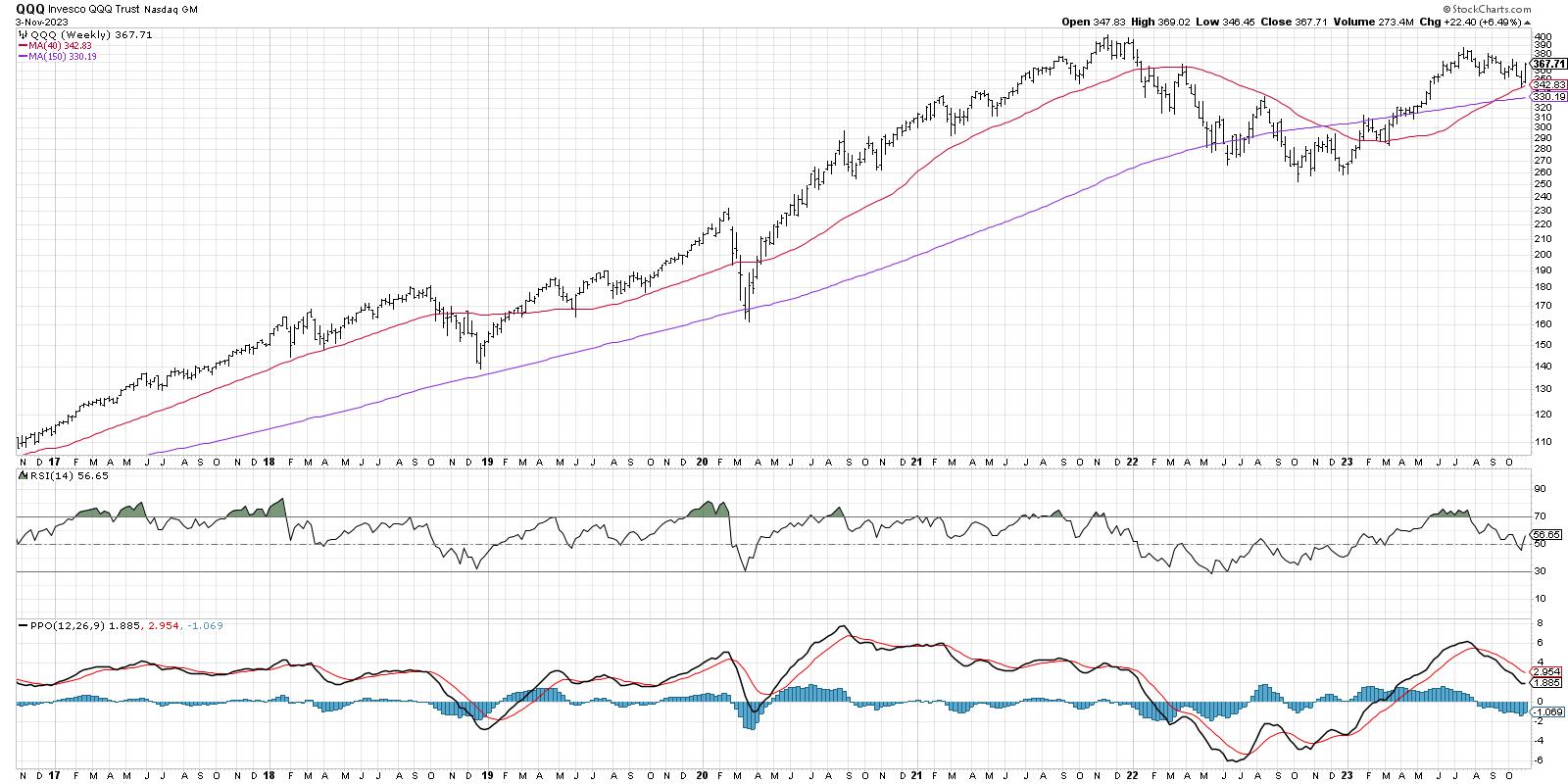
The weekly QQQ chart illustrates how the real painful corrections start with a break below the 40-week moving average, but then usually keep going. This is why so many investors track the 40-week or 200-day moving average, because as long as the market remains above this key long-term barometer, any pullback is just not severe enough to break the larger trend.
The weekly RSI is back above 50, and we are not too far below all-time highs for this leading growth index. So while the medium-term trend is still bearish by my read, the long-term charts show how we should still consider 2023 as part of a larger bull market structure.
Which time frame is most important to you? What is your average investment horizon? However you would answer those questions, never forget the value of going one time frame larger, and one time frame smaller. Only by considering the trends in other time frames can we better understand our main investing time frame.
RR#6,
Dave
P.S. Ready to upgrade your investment process? Check out my free behavioral investing course!
David Keller, CMT
Chief Market Strategist
StockCharts.com
Disclaimer: This blog is for educational purposes only and should not be construed as financial advice. The ideas and strategies should never be used without first assessing your own personal and financial situation, or without consulting a financial professional.
The author does not have a position in mentioned securities at the time of publication. Any opinions expressed herein are solely those of the author and do not in any way represent the views or opinions of any other person or entity.
|
| READ ONLINE → |
|
|
|
| ChartWatchers |
| An Incredible Stock Market Rally Closes the Week on a Strong Note: The Best Week This Year, So Far |
| by Jayanthi Gopalakrishnan |

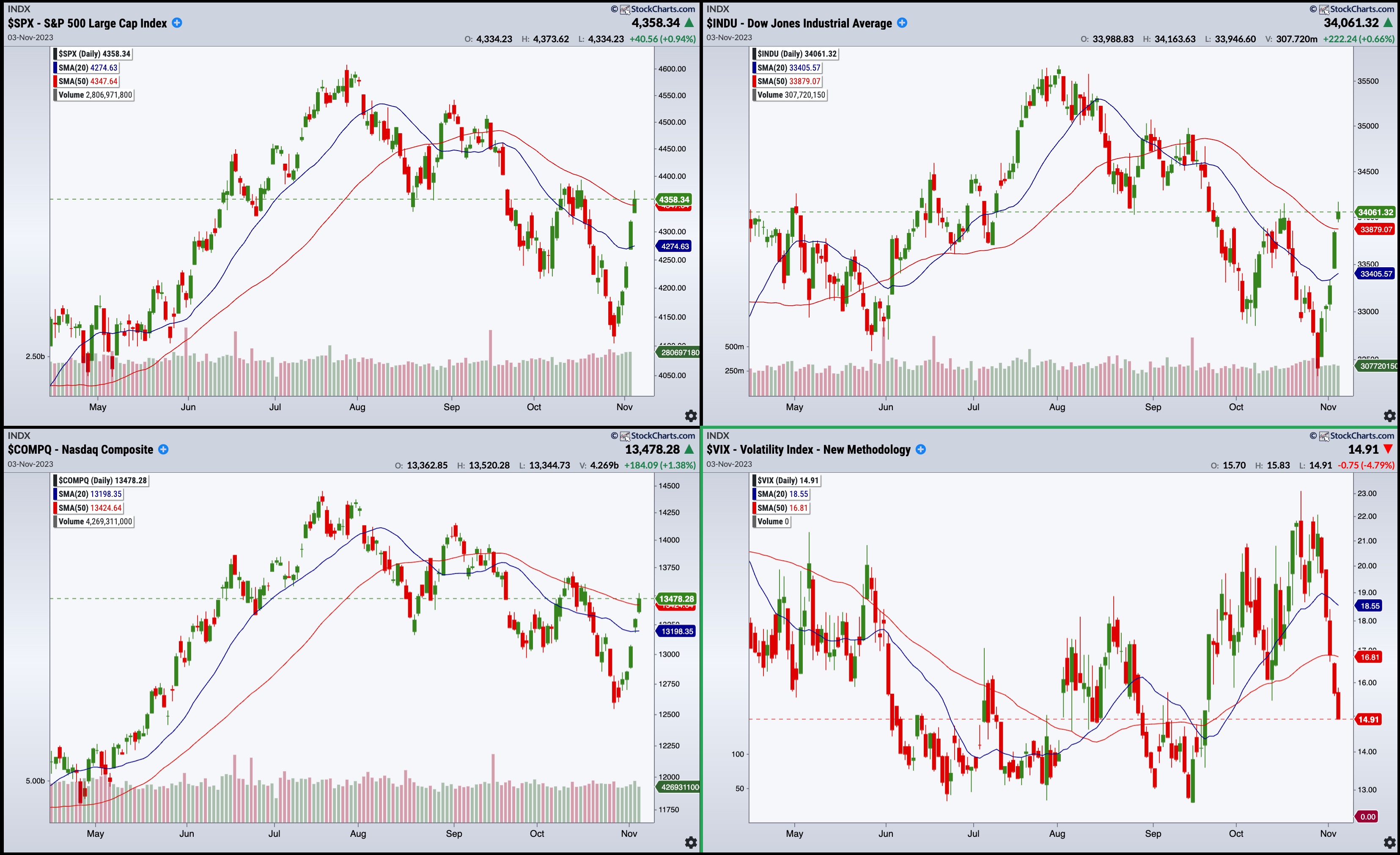
Five up days in a row for the S&P 500 ($SPX), Dow Jones Industrial Average ($INDU), and the Nasdaq Composite ($COMPQ)! That's a drastic change in investor sentiment from October.
Following the end of a dismal month, the first week of November delivered the strongest weekly close seen this year. And it's not just mega-cap big tech names. All S&P sectors, except Energy, ended in the green. For a Friday, that's an impressive showing. Does this mean investors can expect November to follow its expected seasonality pattern and ignite a rally to the end of the year?

CHART 1: THE S&P 500 INDEX, NASDAQ COMPOSITE, AND DOW JONES INDUSTRIAL AVERAGE CLOSED ABOVE THEIR 50-DAY MOVING AVERAGE. The strong finish was mostly due to the possibility that the Fed may be done hiking interest rates. Note the significant drop in the VIX.Chart source: StockChartsACP. For educational purposes.
Weakening Labor Market and Manufacturing
A lot of the investor optimism may be riding on Fed Chairman Jerome Powell's comments on Wednesday after the decision to leave interest rates unchanged at 5.25–5.5%. Although Powell didn't say the Fed was done raising rates, investors assumed that there would probably be no more rate hikes given the results of the more recent economic data.
The October jobs report came in weaker than expected, which helped ease some concerns. October's unemployment rate is 3.9%, indicating that the effects of interest rate hikes are beginning to show their impact. Manufacturing jobs are also slowing despite the recent strikes. Last month, 150,000 jobs were added, much lower than the 170,000 that was expected. ISM services for October came in at 51.8, less than the 53 estimate. So, a soft jobs report and a weakening manufacturing sector support the narrative that the Fed is done raising interest rates.
Stocks, Bonds, and Everything In Between
Equities continued to rise, Treasury yields fell, and the CBOE Volatility Index ($VIX) fell sharply to around 15. Earlier this week, the VIX was hovering around the 20 level, which was a concern. But that changed quickly. The picture the charts are revealing as this trading week comes to a close is one that illustrates how quickly investor sentiment can change. It's a classic scenario of herd mentality at work—investors rush to stocks for fear of missing out.
At times like this, it's best to be calm, determine what might be happening under the hood, and enter your trades when the time is right.
Market breadth indicators are a great way to understand the health of the different indexes. One breadth indicator to review is the bullish percent index (BPI). StockCharts publishes the bullish percent index for indexes, sectors, and industry groups. You could create a ChartList of the different BPIs and scroll through them to identify which indexes, sectors, or industry groups exhibit bullish sentiment. It can reveal some interesting scenarios that may be worth diving into.
Focus on the Financial Sector
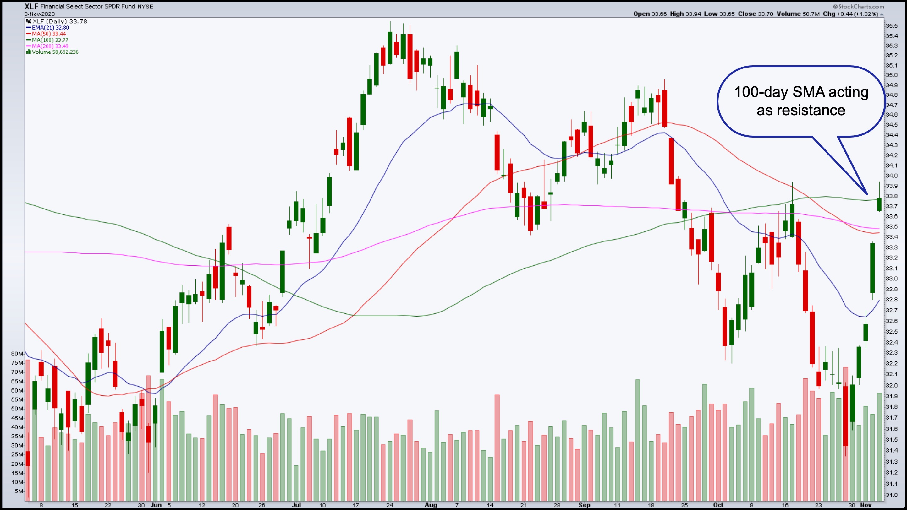
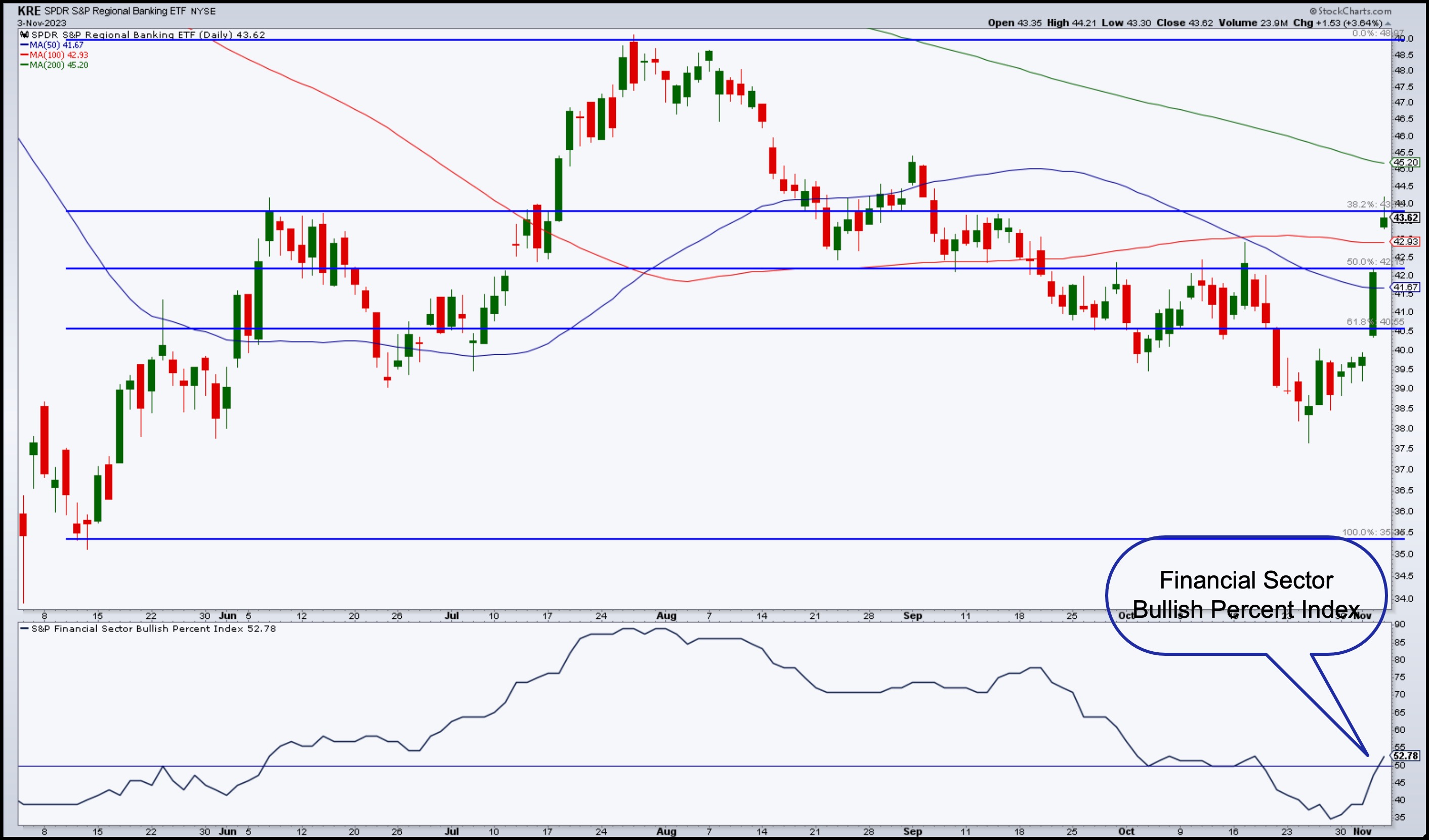
For example, the S&P Financial Sector Bullish Percent Index just crossed above the 50 level, which should prompt you to check out the Financial sector. One way to do that is to bring up a chart of the Financial Select Sector SPDR ETF (XLF). It has followed a path similar to the S&P 500—five up days in a row. XLF has crossed above its 50- and 200-day SMAs and closed at the 100-day SMA.

CHART 2: DAILY CHART OF XLF. The Financial sector is showing strength, which could be because of falling Treasury yields.Chart source: StockCharts.com. For educational purposes.
Even regional banks are doing well. The daily chart of the SPDR S&P Regional Banking ETF (KRE) below shows how this troubled subsector is beginning to show signs of life.

CHART 3: DAILY CHART OF S&P REGIONAL BANKING ETF (KRE). The ETF didn't close above its 38.2% Fibonacci retracement level, but it's worth watching. Note the Financial Sector Bullish Percent Index in the bottom panel.Chart source: StockCharts.com. For educational purposes.
Using Fibonacci retracement levels from the May low to the July high, the ETF has stalled at the Fib levels, for the most part, during its downward move from July to October. The ETF is now battling with its 38.2% Fib retracement level. A break above this level with follow-through would be a good time to accumulate some shares of KRE or its top holdings. The top 5 holdings are:
- Trust Financial Corporation (TFC)
- M&T Bank Corp. (MTB)
- First Horizon National Corp. (FHN)
- Zion (ZION)
- Western Alliance Bancorp. (WAL)
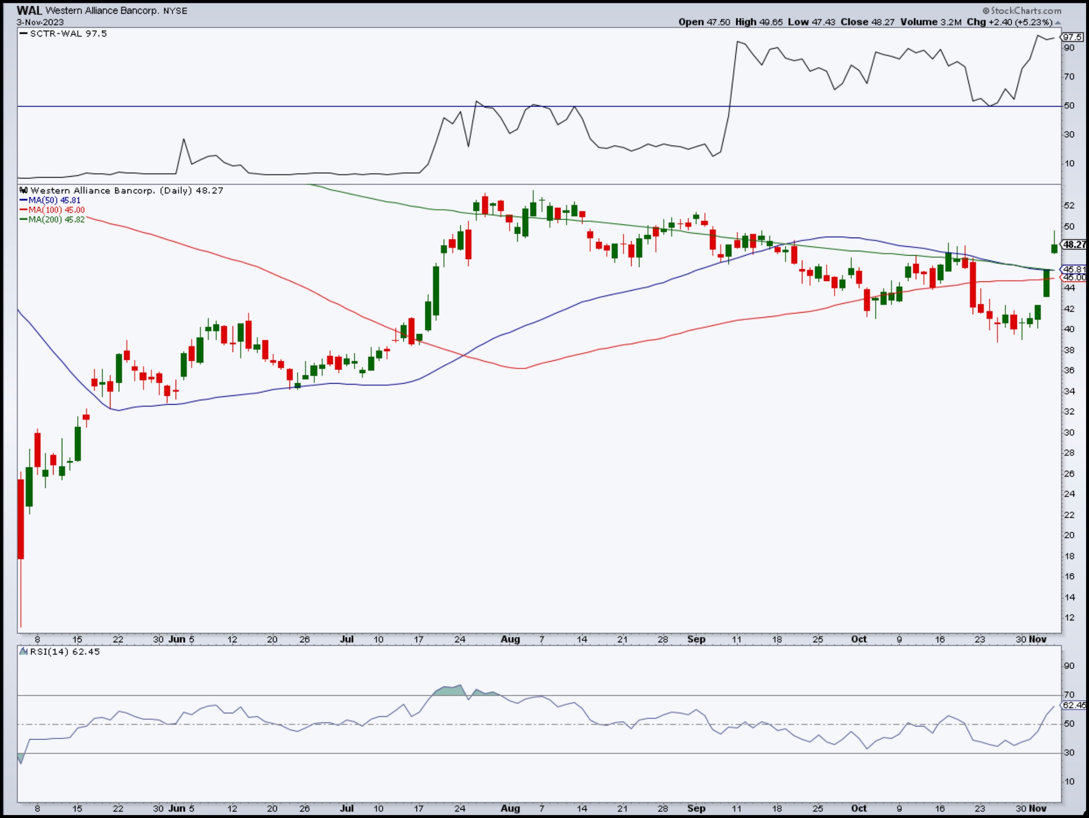
Looking through the daily charts of the five stocks listed above, the one that looks closer to starting its upward move is Western Alliance. Looking at its daily chart below, you can see that the stock has crossed above its 200-day simple moving average (SMA), its SCTR score is at around 97.5, and its relative strength index (RSI) is between 50 and 70, which indicates the stock has room to run.

CHART 4: WESTERN ALLIANCE BANCORP CLOSED ABOVE 200-DAY SMA. With a SCTR score of 97.5 and an RSI of 62, this stock has room to rally.Chart source: StockCharts.com. For educational purposes.
The fall in Treasury yields is good news for banks since it opens the door to servicing loans. The 30-year yield, which at one point was above 5%, has pulled back to its 50-day SMA, and the 10-year and 5-year yields traded below their 50-day SMA.
The reversal in market sentiment happened quickly, and there's a chance it could be short-lived. Things can always go awry, and any piece of news that shifts investor thinking can quickly reverse the market. That's been the nature of the beast of late.
In a recent episode of The Final Bar, our chief market strategist, David Keller, CMT, said it best; "In a bullish phase, the market is innocent until proven guilty, and in a bearish phase, the market is guilty until proven innocent." Given that equities are in a bearish phase, what do you need to see for the market to prove itself innocent?
The broader indexes would have to overcome the trend of lower highs and lower lows. The S&P 500 ($SPX) and Dow Jones Industrial Average are very close to their previous highs, and with the speed at which the indexes have moved higher in the last five days, the wait may be relatively short.
Will the stock market prove its innocence? It's possible, but we'll have to wait till next week to find out.
End-of-Week Wrap-Up

US equity indexes up; volatility down
- $SPX up 0.94% at 4358.34, $INDU up 0.66% at 34,061.32; $COMPQ up 1.38% at 13478.28
- $VIX down 4.73% at 14.92
- Best performing sector for the week: Real Estate
- Worst performing sector for the week: Energy
- Top 5 Large Cap SCTR stocks: Vertiv Holdings, LLC (VRT); Palantir Technologies, Inc. (PLTR); Applovin Corp. (APP); New Oriental Education & Technology Group, Inc. (EDU); Splunk Inc. (SPLK)
On the Radar Next Week
- Earnings from Walt Disney Co. (DIS), Warner Bros. Discovery, Inc. (WBD), BioNTech (BNTX), Hilton Grand Vacations (HGV), Gilead Sciences (GILD), Robinhood Markets (HOOD) and many more.
- November 30-Year Mortgage rates
- Fed speeches
- November Consumer Sentiment
Disclaimer: This blog is for educational purposes only and should not be construed as financial advice. The ideas and strategies should never be used without first assessing your own personal and financial situation, or without consulting a financial professional.
|
| READ ONLINE → |
|
|
|
|
|
| DecisionPoint |
| New PMO Crossover BUY Signals Across All Major Indexes |
| by Erin Swenlin |
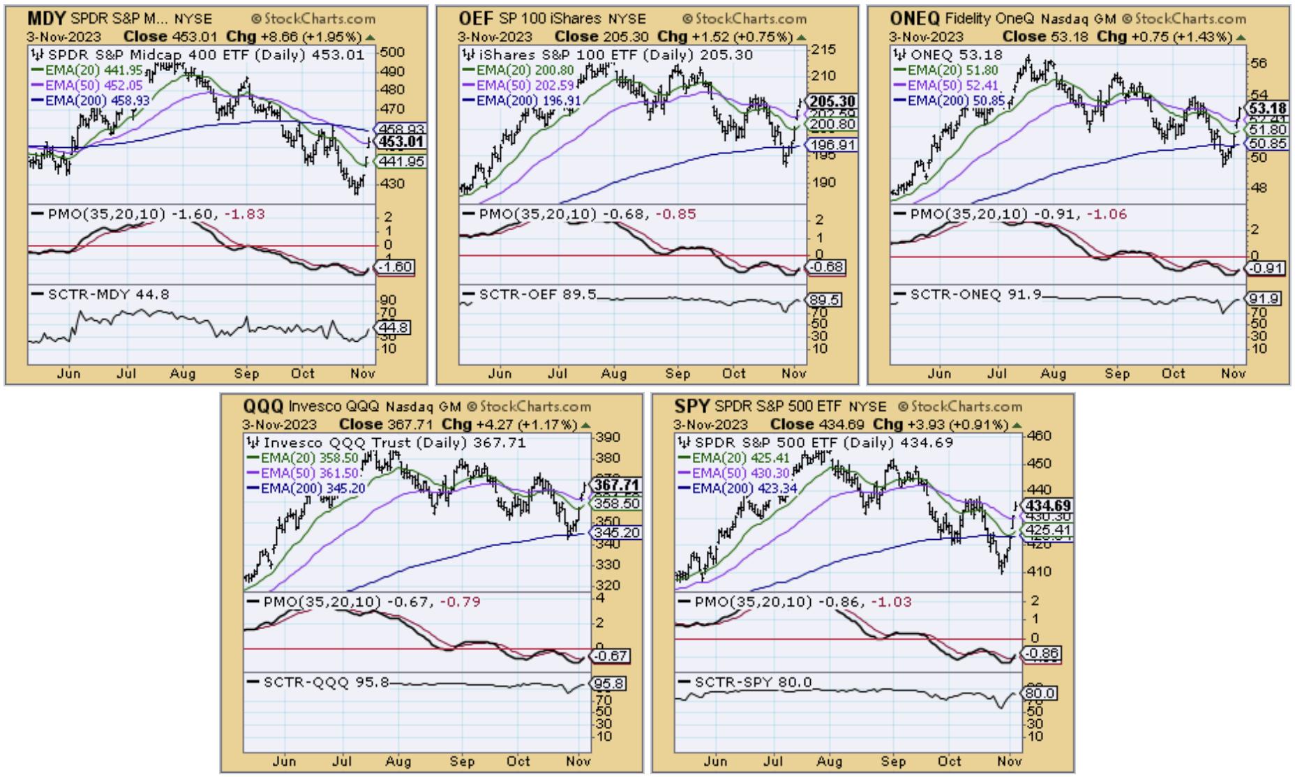
Yesterday, the SPX (SPY), OEX (OEF) and Dow Industrials (DIA) all saw new PMO Crossover BUY Signals. Today, they were joined by the remainder of the major indexes. The market is clicking; now we need to determine how long this rally will stick around.
Seeing so many oversold PMO BUY Signals is especially bullish. They are all oversold signals as well. Our only caution would be that we did see similar signals early last month and they didn't produce a lengthy rally. The signals came in just in time for the decline.
 

Try us out for two weeks with a trial subscription!
Use coupon code: DPTRIAL2 at checkout!
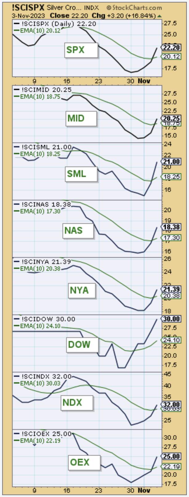
Finally, we also note that the Silver Cross Indexes on all of these indexes show a BULLISH BIAS in the intermediate term. The Silver Cross Index measure the percentage of stocks within the index holding a "Silver Cross" or 20-EMA above the 50-EMA. When the Silver Cross Index moves above its signal line (10-day EMA), it is called a Bullish Shift. Once the crossover occurs, the bias changes to BULLISH in the intermediate term.

Conclusion: The markets are set up for a lasting rally. We have oversold PMO Crossover BUY Signals and a Bullish Bias in the intermediate term. It has run hot, so a digestion phase does seem imminent. That should offer some good entries.
Learn more about DecisionPoint.com:
Watch the latest episode of DecisionPoint on StockCharts TV's YouTube channel here!

Try us out for two weeks with a trial subscription!
Use coupon code: DPTRIAL2 at checkout!
Technical Analysis is a windsock, not a crystal ball. --Carl Swenlin
(c) Copyright 2023 DecisionPoint.com
Disclaimer: This blog is for educational purposes only and should not be construed as financial advice. The ideas and strategies should never be used without first assessing your own personal and financial situation, or without consulting a financial professional. Any opinions expressed herein are solely those of the author, and do not in any way represent the views or opinions of any other person or entity.
DecisionPoint is not a registered investment advisor. Investment and trading decisions are solely your responsibility. DecisionPoint newsletters, blogs or website materials should NOT be interpreted as a recommendation or solicitation to buy or sell any security or to take any specific action.
Helpful DecisionPoint Links:
DecisionPoint Alert Chart List
DecisionPoint Golden Cross/Silver Cross Index Chart List
DecisionPoint Sector Chart List
DecisionPoint Chart Gallery
Trend Models
Price Momentum Oscillator (PMO)
On Balance Volume
Swenlin Trading Oscillators (STO-B and STO-V)
ITBM and ITVM
SCTR Ranking
Bear Market Rules
|
| READ ONLINE → |
|
|
|
| ChartWatchers |
| Holiday Shopping Bonanza: Retail Stocks You Need to Watch |
| by Karl Montevirgen |

The holiday season and discretionary spending can be synonymous, ringing in a boom in retail profits. And with Halloween in the rearview mirror, it's time to strategize a few killer plays in the retail arena.
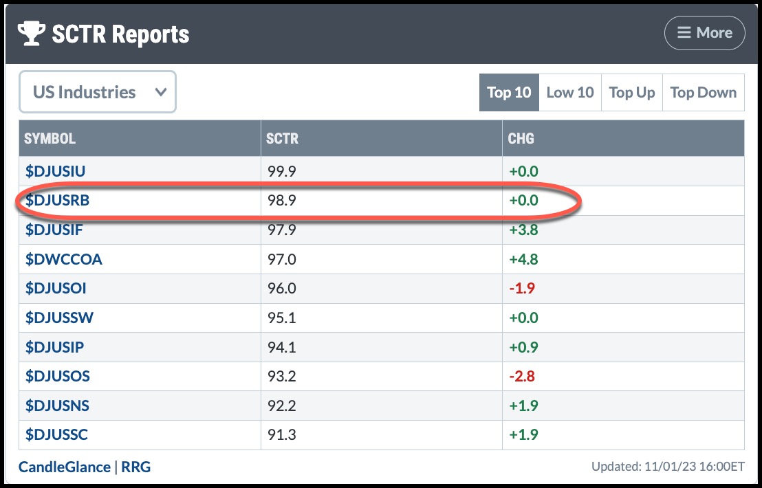
Perhaps it's no coincidence that, upon running a StockCharts Technical Rankings (SCTR) report using the US Industries menu, the Dow Jones US Broadline Retail Index ($DJUSRB) emerged among the top outperformers with an impressive score of 98.9 (see below). The holiday shopping season has started, so it's worth looking more closely at this industry. Retailers in this industry have diverse products and services that work across several sectors.

CHART 1: US INDUSTRIES SCTR RANKING. $DJUSRB ranked second in the US Industries category.Chart source: StockCharts.com. For educational purposes.

CHART 2: DAILY CHART OF $DJUSRB. The index is currently pulling back, but shows several support levels should the bounce fail to break above the most recent swing.Chart source: StockCharts.com. For educational purposes.
The index bounced off the 38.2% Fibonacci retracement level from the December 2022 low to the September 2023 high. It's outperforming the S&P 500 index ($SPX) by over 6% and looks like it's on the verge of moving even higher.
So, How Might Inflation Affect Holiday Spending?
According to recent consumer spending reports, cash is flowing out of pockets and into the hands of retailers despite inflation and mounting household debt. "Borrow and spend freely" seems to be the main theme as we head toward the end of 2023.
Still, you must consider the toll that inflation may eventually have on consumers' spending pockets, especially when it comes time to play Santa Claus. And that makes the Dow Jones US Broadline Retailers Index particularly sturdy this holiday season.
In 2022, AMZN took the largest share of holiday shopping (around 41%). It's also a large component of the $DJUSRB. Looking at the daily chart of AMZN below, you can see that the stock is outperforming the S&P 500 index ($SPX) by about 29%. It also has a strong SCTR score.

CHART 3: DAILY CHART OF AMZN. The recent slide in AMZN's stock price suggests that buying momentum may be slowing.Chart source: StockCharts.com. For educational purposes.
Though AMZN has pulled back, it appears to be clawing to challenge its September high. However, there's a deceleration in buying pressure, and you can view this more clearly if you look at the Chaikin Money Flow (CMF) in the lower chart panel. AMZN bounced strongly off the 200-day SMA line and broke above its most recent swing high of 134.50. It will have to challenge its 2023 high of 145.85 if its uptrend is to remain valid.
Let's look at some of the other US large retailers, starting with Walmart (WMT).

CHART 4: DAILY CHART OF WMT. The stock price is about to challenge its all-time high, and the CMF shows that buying pressure is still strong.Chart source: StockCharts.com. For educational purposes.
WMT, too, is outperforming the S&P 500, and the buying pressure, as exhibited by the CMF, concurs with this reading in momentum. Though WMT's price appears to be pulling back, it has several levels of support, including its 100-day and 200-day SMAs before its 50% Fib retracement. If WMT breaks above 165.75, it will have reached record highs, and right now, it looks poised to break above that level.
Like WMT, Costco (COST) benefits from a diverse suite of private-label products and economies of scale, allowing it to control costs better and maximize profits.

CHART 5: DAILY CHART OF COST. Investors seem indecisive about accumulating CSCO stock.Chart source: StockCharts.com. For educational purposes.
Technically, COST is experiencing higher levels of volatility as it approaches its all-time high above 600. It also outperformed the S&P 500, though its relative performance exhibits slight indecision. Its CMF reading is positive, but shows divergence over the last month (see the flat blue line on the CMF and compare it to Costco's rising trajectory, leading to its pullback and the following fluctuations).
Although COST appears to have bounced off its 100-day SMA, if it falls further, it has plenty of technical support between 510 and 530, where the 38.2% and 50% Fib retracements are clustered along with the 200-day SMA.
The stock price for Target (TGT) presents a different scenario. Amid a high-interest rate environment, mounting theft, and, particularly, a strong consumer backlash against certain products, TGT shows the most epic falling knife scenario (see chart below) among the largest retail giants. Still, it's an arguably solid company with a diverse portfolio of cost-competitive offerings.

CHART 6: DAILY CHART OF TGT. Ouch! However, the selling pressure looks like it's drying up. If it breaks out to the upside, its reversal faces many headwinds.Chart source: StockCharts.com. For educational purposes.
It's difficult to predict if the stock price has bottomed, but certain levels can help you gauge its advance and momentum once it begins to show signs of recovery. And the holiday season may provide the catalyst for TGT's upside reversal.
TGT is caught within tight consolidation between roughly 106 and 113.50 after a 42% plunge from its 2023 high of 177.50. Its SCTR score of 13 and -38% underperformance against the S&P 500 underscore the severity of TGT's drop. Any early signs of a recovery would begin with a close above resistance at 113.50. The CMF indicator paints a slightly optimistic picture of this likely upside break as selling pressure recedes, and buying activity sends the indicator above the zero line for the first time in four months.

But even if TGT bulls attempt to rally the stock, it has multiple resistance levels. Drawing a Fibonacci retracement from its 2023 peak to its lowest point, you can expect resistance between 132.50 (38.2%) and 140 (50%), a range in which the 200-day SMA will likely be met. Also, 125 and 137.50, the bottom and top of a previous rectangle formation, will likely provide additional resistance, adding to TGT's technical headwinds (not to mention the consumer-driven headwinds that played a significant part in its near-term demise).
Actionable Levels
AMZN, WMT, and COST are all prone to pullbacks, while TGT awaits signs of a potential reversal. Each stock presents different technical scenarios, momentum profiles, and potential support levels. Where you choose to buy (if you're bullish) depends on your level of aggressiveness and means of (bullish) confirmation. Fibonacci and SMA levels (as well as swing points) also present different stop-loss scenarios that can be trailed should you find yourself on the right side of the market.
The Bottom Line
As we enter the holiday season, retail stocks will likely take center stage. The Dow Jones US Broadline Retail Index ($DJUSRB) shines with a robust SCTR score. Its biggest component, Amazon (AMZN) faces challenges. Other large retailers show different scenarios—Walmart's gaining ground, Costco is wavering, and Target is eyeing a comeback.
Add these four retail stocks to your StockCharts ChartLists and set alerts at the possible support and resistance levels shown in the above charts.
Disclaimer: This blog is for educational purposes only and should not be construed as financial advice. The ideas and strategies should never be used without first assessing your own personal and financial situation, or without consulting a financial professional.
|
| READ ONLINE → |
|
|
|
| Don't Ignore This Chart! |
| Arista Networks: A Profitable Tech Stock That Has Room to Surge |
| by Jayanthi Gopalakrishnan |

When the market goes up one day and down the next, it becomes challenging to jump into a stock. It's best to exercise patience until the market shows direction. But that doesn't mean you should keep your eyes off the stock market, as it's an excellent time to set up your ChartLists so you can jump into stocks when the time is right.
One stock not to ignore is Arista Networks (ANET). It may not be one of the AI stocks that makes it to the headlines, but if AI is the next big wave in technology, the infrastructure will play a massive role in its development. ANET is a big player in this space. The company reported earnings on Monday after the close; earnings and revenues beat estimates, and the stock received a bullish call from a Morgan Stanley analyst. That was enough of a catalyst for Arista Networks' stock price—it gapped up at the open and is now trading at a new 52-week high.
Is Arista Networks Toppy?
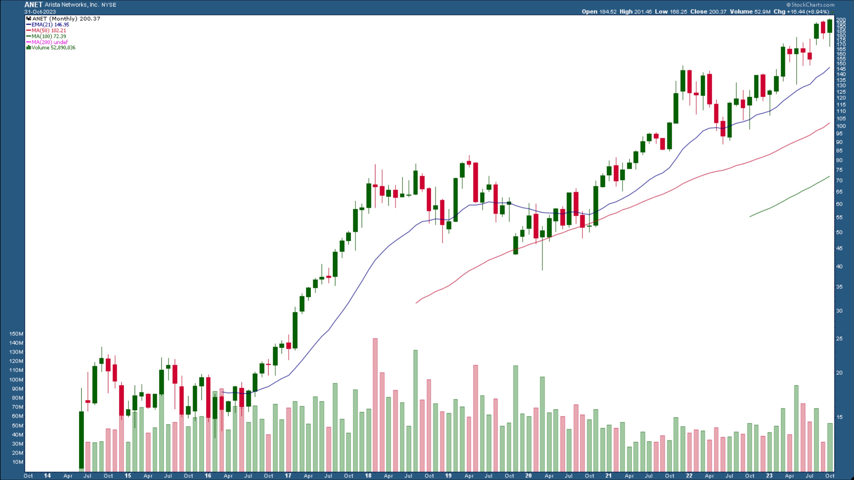
Whenever a stock sees a price spike, especially when it's trading at its all-time high, the general thinking is that the stock has already hit the top and it's too late to get in. Well, that could be true, but looking at a longer-term view of Arista Networks' stock price, it's been in a pretty steady, shallow uptrend. Looking at past price action, whenever the stock price hit a high, it stalled, pulled back, and continued its uptrend. A similar scenario could occur again.

CHART 1: MONTHLY CHART OF ARISTA NETWORKS (ANET). The stock is trading at its all-time high. Does it have room to rise further?Chart source: StockCharts.com. For educational purposes.
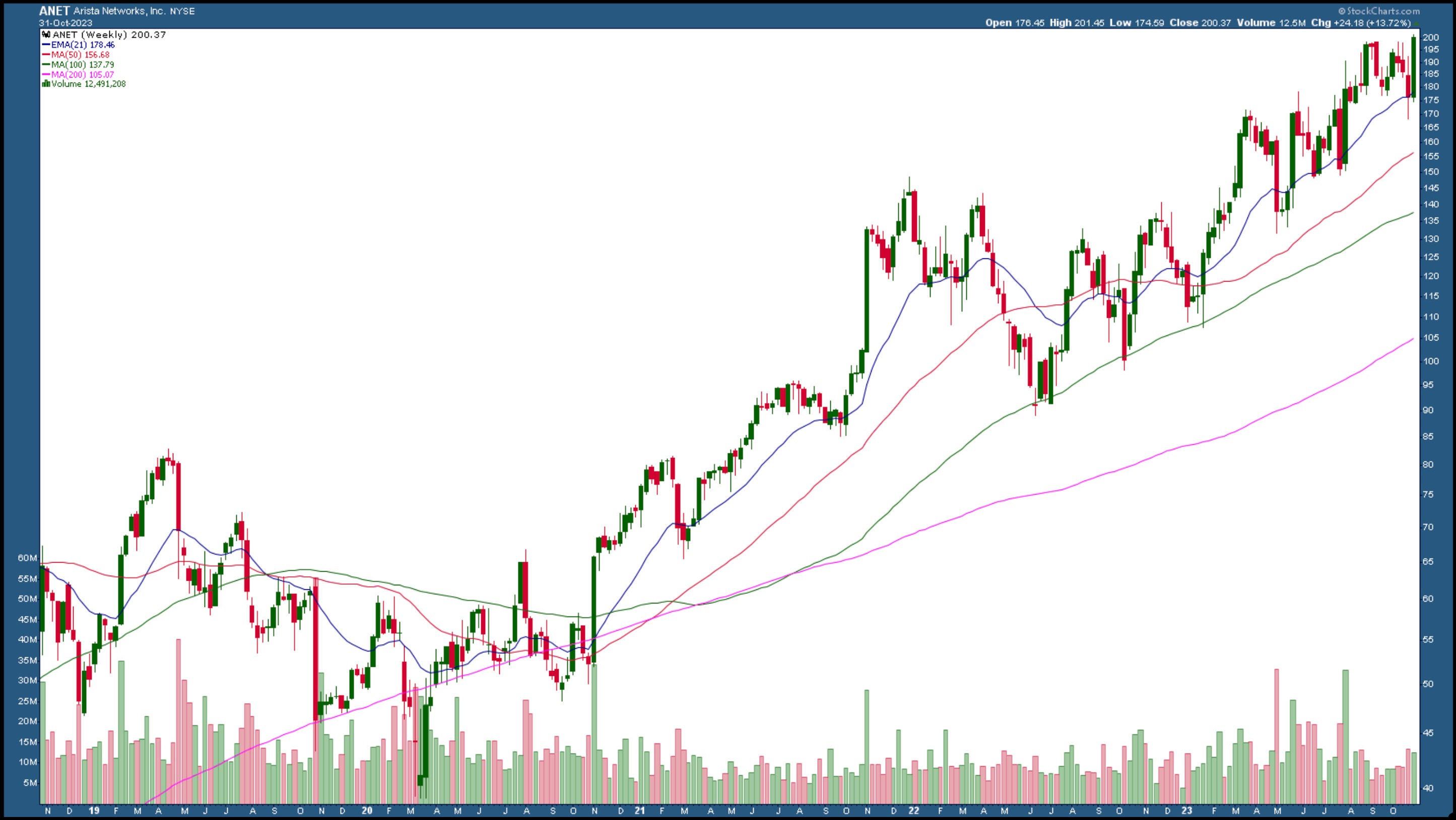
The weekly chart shows a similar picture. ANET is hitting against its all-time high. Will it bust through it or pull back for a few weeks and start making its next leg up?

CHART 2: WEEKLY CHART OF ARISTA NETWORKS. The stock is trading above its 21-day EMA (blue line) and closed at a new high. Chart source: StockCharts.com. For educational purposes.
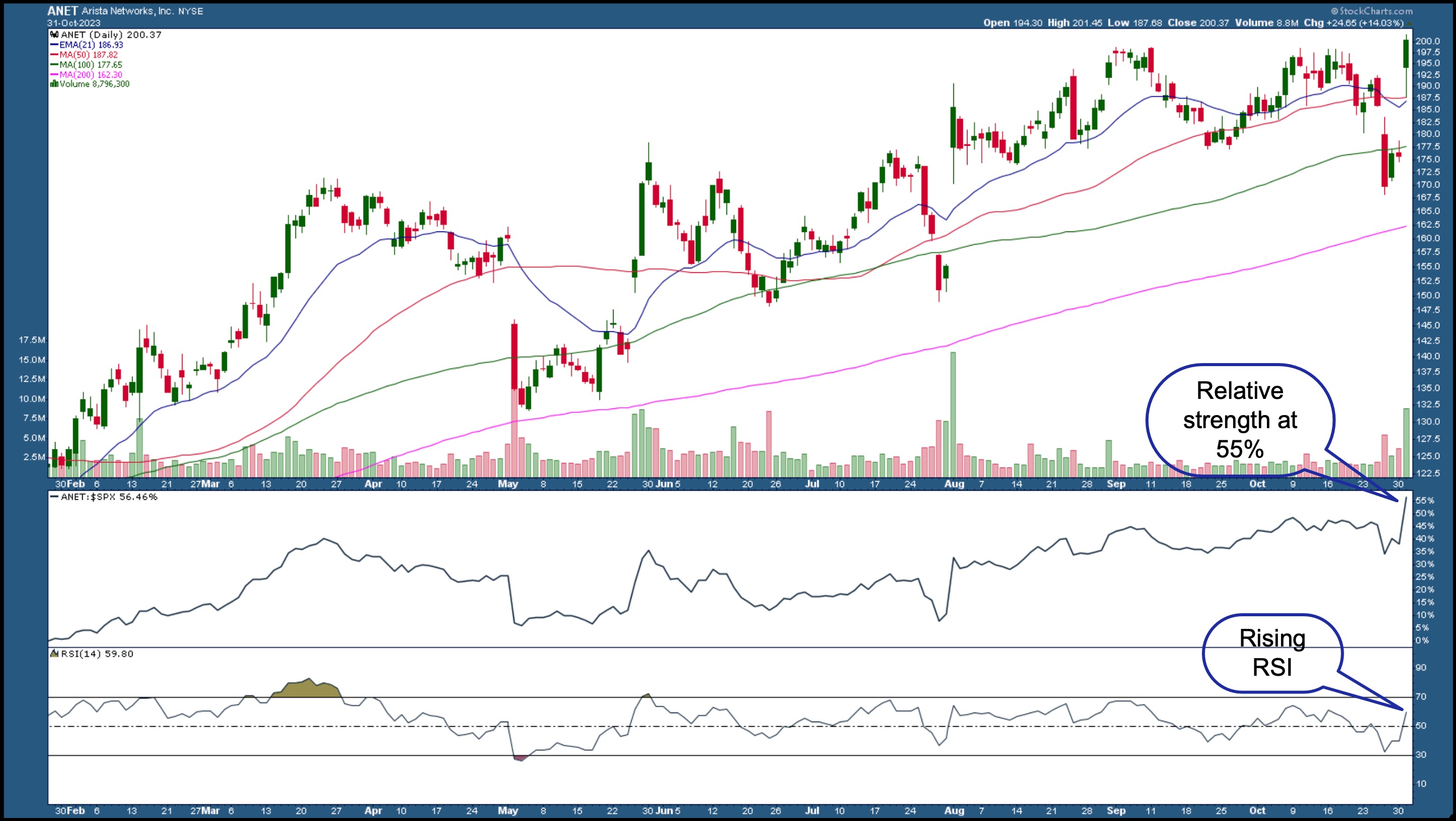
The daily chart shows that price gapped up on positive news, pulled back to its 50-day simple moving average (SMA) support level, and then moved higher. This suggests that the buyers were dominating and keeping the stock price higher.

CHART 3: DAILY CHART OF ARISTA NETWORKS. The stock bounced off its 50-day simple moving average, is outperforming the S&P 500, and its relative strength index (RSI) is rising. Chart source: StockCharts.com. For educational purposes.
Relative to the S&P 500 index ($SPX), ANET's price performance is at 55%, which means the stock is outperforming the index. The relative strength index (RSI) is also encouraging; it's between 50 and 70, which means there is room for an upside move in the stock's price. During its last earnings report on July 31, ANET's stock price displayed a similar scenario. Price gapped lower, but after the earnings report, the stock price gapped up on strong volume, then moved sideways. It gently trended higher until right before the most recent earnings report, when it repeated a similar action.
The Pattern Could Repeat
If Arista Networks' stock price pulls back and continues its uptrend, it could be a longer-term hold. Keep an eye on its relative strength, the RSI, and how the price moves relative to its moving averages. This stock is definitely one to add to your StockCharts ChartLists.

Disclaimer: This blog is for educational purposes only and should not be construed as financial advice. The ideas and strategies should never be used without first assessing your own personal and financial situation, or without consulting a financial professional.
|
| READ ONLINE → |
|
|
|
| MORE ARTICLES → |
|
 Chart 1
 Chart 2
 Chart 3
 Chart 4
 Chart 5
 Chart 6
 Chart 7

