| THIS WEEK'S ARTICLES |
| The Mindful Investor |
| Three Behavioral Biases You're Probably Struggling With Right Now |
| by David Keller |
I've spent much of my career helping investors become more like pilots. Why is this such an important mindset to adopt? Well, pilots have to maintain good situational awareness, understanding what is happening around them. They need to make difficult decisions and recognize when conditions are changing. And, perhaps most importantly, they have to fight the pull of their emotions, which could get them into serious trouble otherwise.
 First solo flight, Norwood Airport (KOWD), July 7, 2012. First solo flight, Norwood Airport (KOWD), July 7, 2012.
Author's Note: Fun fact... I created a video celebrating my first solo flight, and I believe that was the very first video I ever uploaded to YouTube!
The rise of behavioral finance as a legitimate field of study has helped investors to identify and classify a series of cognitive and emotional biases. Today, we'll share three that we find most commonly displayed by investors, from seasoned market professionals all the way down to novice traders. We'll also share some technical analysis tools that could help you minimize their potentially negative impact on your portfolio!
I hope you can reflect on where you've seen these biases crop up in your own process, and identify some tools on StockCharts to help you minimize their disastrous impact on your returns!
Confirmation Bias
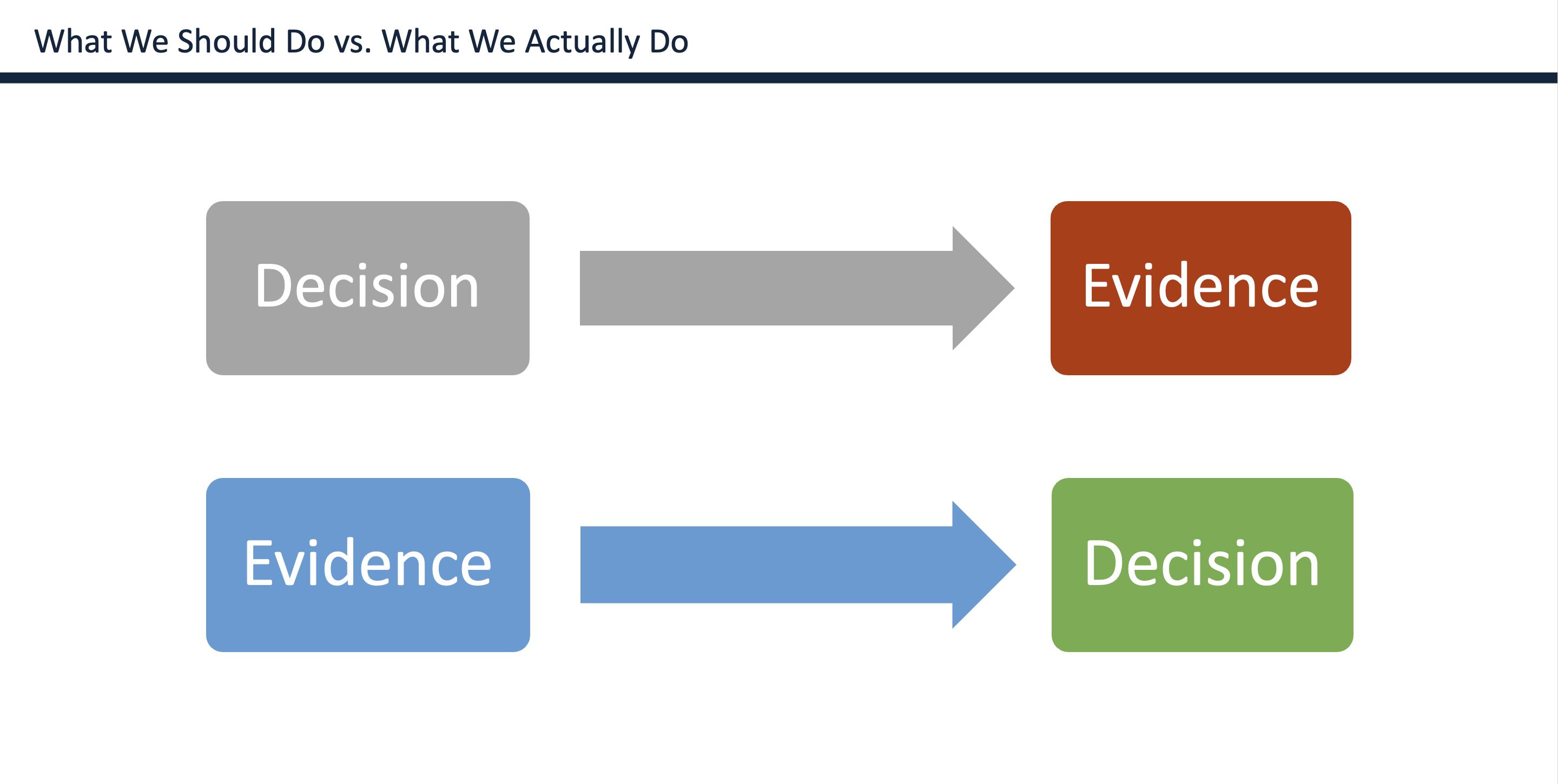
The most common bias in my experience is confirmation bias, where you gather evidence to confirm a decision that you've basically already made. Now what actually happens is that you often come across lots of evidence that could either support or detract from your investment thesis. Your brain assigns greater value to evidence that supports your thesis, and sort of mentally pushes away evidence that would refute your opinion.
Social media tends to exaggerate the effects of confirmation bias, because every time you "like" or "follow" a particular account with a specific approach or point of view, you are teaching the algorithm to give you more content with a similar voice and perspective. So basically you are teaching the social media platform to give you more of the same, over and over.

The right way to develop an investment thesis is to gather evidence, consider the weight of the evidence, and then make your decision. I call this an "evidence-based process" and it is at the core of how I use charts in my daily and weekly routines. In fact, my Morning Coffee Routine uses a set of charts to help me review conditions for the broad market averages, breadth and sentiment indicators, intermarket analysis, sector and thematic plays, and individual stocks.
The best way to fight confirmation bias is to have a rock-solid chart review process, and then to consistently and religiously search out alternate hypotheses and opposing points of view. Social media platforms don't make that process particularly easy, but your portfolio will appreciate your efforts to consider various perspectives!
Narrative Bias
"The S&P 500 will go higher because the Fed will be lowering interest rates and semiconductor stocks will plow higher due to the AI craze." If you've ever uttered a sentence like that, you're most likely setting yourself up for what is called narrative bias.
We love stories, especially when we're the main character. That's why when you go to buy a car, the salesperson will try and get you behind the wheel for a test drive. Because at that point, you're no longer thinking about the price tag, you're enjoying the narrative of you as a brand new car owner.
Narratives come from an honest place, as they are really a way that we as humans make sense of the world around us. To be human is to tell stories, to engage with others and to better understand the human condition. But when you become too engrossed with a market narrative that you ignore when the evidence changes, that's when it can become a costly mistake.
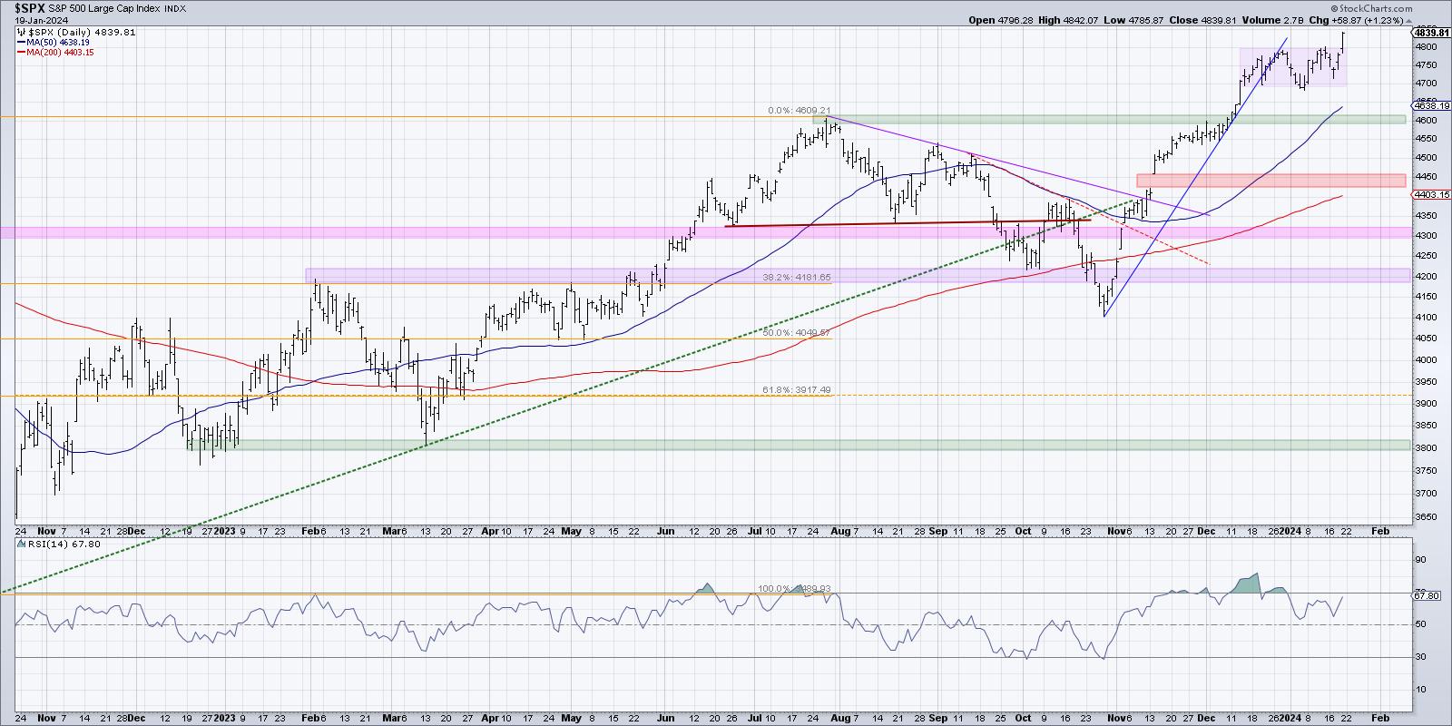
The S&P 500 made a new all-time high this week, and I've seen lots of commentary talking up optimism for stocks based on a combination of lower interest rates, a more dovish Fed, limited fallout from conflict in the Middle East, the dominance of mega-cap growth stocks, and a low-volatility environment. That may be the current situation for the markets in mid-January 2024. But conditions can, and most certainly will, change.

One of the great benefits of technical analysis is that it can provide clear levels and signals to help you define when a change in trend has occurred. For me, the S&P 500 chart is strong, as long as we hold 4700. A break below 4700 would open the door to a more long-term support level at the price gap, around 4550. As long as we remain above 4550, I would say this market is in a confirmed uptrend.
Now here's the best part. I have set price alerts on StockCharts for when those downside thresholds are reached for the S&P 500 index. And the platform will e-mail me, text me, and pop up a banner on the website if and when those levels are reached. Want to minimize narrative bias? Have StockCharts tell you when the narrative is no longer in play!
Overconfidence
Social media (and the market in general!) is filled with overconfident traders and investors. It's not hard to find examples of people taking virtual victory laps for their incredible track record or market calls.
I have yet to meet a successful investor who has not made huge mistakes in their career. I was once told that these early misses were the "tuition you paid to the market" as a downpayment for future successes.
Technical analysis tools can really help to upgrade your confidence in your abilities to pick stocks and ETFs, and that is a very good thing. But, especially when you have a run of good trades, it's very easy to start thinking that you can do no wrong in your portfolio. As many successful traders will tell you, this is usually when the rug is yanked out from under your feet!
Investing is an incredibly humbling way to spend your time. I have been right plenty of times, and I have been wrong more times that I could count. That's why my trading journal has three lines for every trade:
- What's the position I'm taking?
- Why am I taking that position?
- What would tell me that I was wrong?
That third line, by the way, is how I try to avoid overconfidence. Every time I take a position, I'm admitting that there is a very real chance that I'm going to be wrong. Most importantly, I lay out exactly what I'd need to see to confirm that very thing.
These are just three of the literally hundreds of behavioral biases that I've observed over my career. You may find that one or two of the ones I've described today resonates with you, and you've probably experienced them all at times. The good news is that a consistent process using charts and technical analysis tools can provide a more objective view of the weight of the evidence and help you to make better (and more mindful!) investment decisions.
By the way, I'm super excited for new all-time highs on the S&P 500, but I'm also skeptical of further upside, based on a review of five market breadth indicators. Check out my latest YouTube video for more on the divergence between price and breadth for the S&P 500!
RR#6,
Dave
P.S. Ready to upgrade your investment process? Check out my free behavioral investing course!
David Keller, CMT
Chief Market Strategist
StockCharts.com
Disclaimer: This blog is for educational purposes only and should not be construed as financial advice. The ideas and strategies should never be used without first assessing your own personal and financial situation, or without consulting a financial professional.
The author does not have a position in mentioned securities at the time of publication. Any opinions expressed herein are solely those of the author and do not in any way represent the views or opinions of any other person or entity.
|
| READ ONLINE → |
|
|
|
| Larry Williams Focus On Stocks |
| MEMBERS ONLY |
| Larry's "Family Gathering" January 16, 2024 Recording |
| by Larry Williams |
|
In this video, Larry digs into rate cuts and how they affect the markets. When interest rates are high, money is in circulation. He's been watching the rate of inflation; as he notes, an object in motion tends to stay on the same path...
|
| READ ONLINE → |
|
|
|
| ChartWatchers |
| Dow Jones and S&P 500 Close At Record High -- Time to Add Tech Stocks To Your Portfolio? |
| by Jayanthi Gopalakrishnan |

Tech stocks are striking back after a rough start in the first week of the trading year. Back then, it might have been inconceivable to think that tech stocks would lead a bullish rally, but that narrative has changed quickly. Today's continuation of yesterday's strong rally boosted the broader equity indices, while the Dow Jones Industrial Average ($INDU) and S&P 500 ($SPX) closed at record highs, and the Nasdaq Composite ($COMPQ) clinched a new 52-week high.
Chip stocks continued to gain momentum after yesterday's explosive rally, which followed Taiwan Semiconductor's (TSM) strong earnings report and positive guidance. Perhaps investors are optimistic that other tech stocks will follow suit, as some prominent players report earnings next week, and many more the following week. Early indications suggest that AI will continue to be the buzzword in 2024 and the catalyst for the stock market!
As far as economic conditions go, the US economy is still healthy. Consumer sentiment is high, indicating that the consumer is extremely confident. Earlier in the week, we got a better-than-expected December retail sales report showing that consumers are still shopping. There was some concern that the higher interest rates ahead of the holidays would be a headwind for retailers, but it looks like things went better than forecasted.
There's a lot of euphoria surrounding the stock market, which spread to mid- and small-cap stocks toward the end of the trading week. It's a risk-on environment, with investors gravitating toward the Technology, Communication Services, and Consumer Discretionary sectors. Defensive sectors, such as Energy and Utilities, were this week's weakest-performing sectors.
The Big Picture
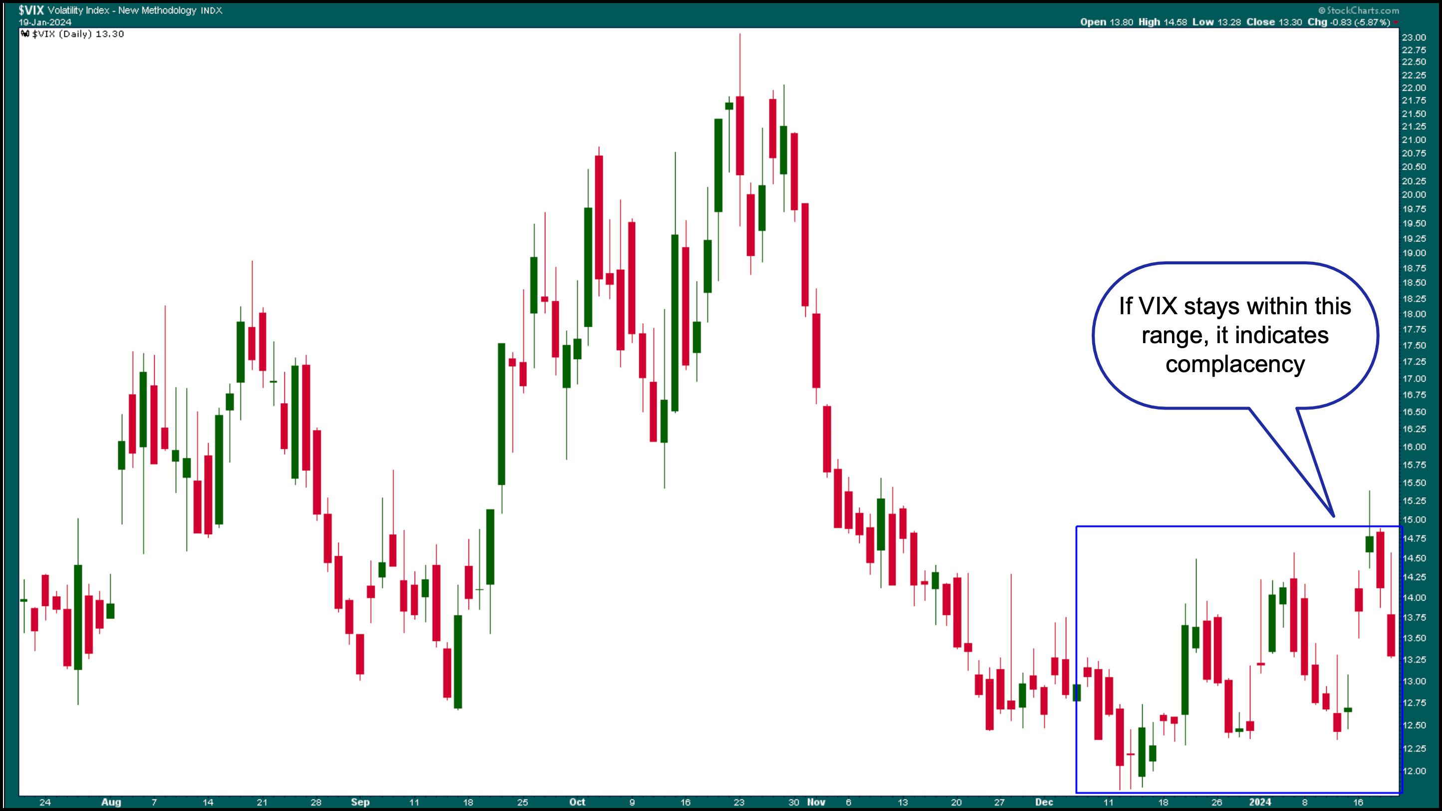
A glance at the StockCharts Dashboard gives you an overall view of the big picture. Equities led the rally, with all the equity indexes in the Market Overview panel in the green. The only red is the CBOE Volatility Index ($VIX), which shows that investors are extremely complacent.
The chart of the VIX displays an interesting pattern of choppiness in the last few weeks (see chart below). Earnings season is an exciting time in the stock market, and it isn't unusual to see some choppiness in volatility. When the VIX is low, it implies that investors aren't concerned about hedging their portfolios.

CHART 1. DAILY CHART OF CBOE VOLATILITY INDEX. The VIX is low, which indicates that investors aren't worried about the stock market. When the VIX starts climbing higher, it's time to become cautious, as it tends to spike quickly and without much warning.Chart source: StockCharts.com. For educational purposes.
The VIX, considered the fear gauge, is key in identifying shifts in investor sentiment, so it doesn't hurt to regularly review this chart as you go through your stock market analysis. If you go back over ten years, you'll see the VIX tends to spike quickly, and the last thing you want is to get caught off guard.
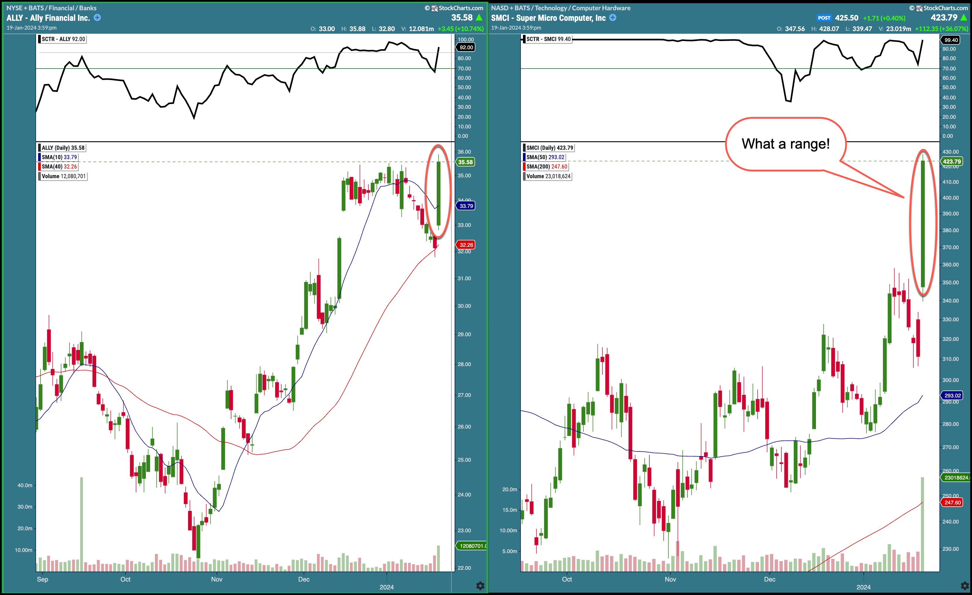
The StockCharts Technical Rank had a handful of stocks that increased by more than 14 points. Ally Financial (ALLY) and Super Micro Computer Inc. (SMCI) are the top two in the Top Up category for large-cap stocks. The chart of these two stocks (see below) shows the magnitude of their move on Friday.

CHART 2. TWO BIG SCTR MOVERS IN FRIDAY'S TRADING. Some stocks saw relatively large percentage up moves. Here, you see a financial and a tech stock seeing substantial gains.Chart source: StockCharts.com. For educational purposes.
So, will the investor optimism continue into next week? There's not much economic data that will be released next week except for PCE, which is an important one. More important are earnings. In addition to these reports, keep an eye on the momentum and the VIX.
End-of-Week Wrap-Up

US equity indexes up; volatility down
- S&P 500 up 1.23% at 4839.81, Dow Jones Industrial Average up 1.05% at 37863.80; Nasdaq Composite up 1.70% at 15310.97
- $VIX down 5.87% at 13.30
- Best performing sector for the week: Technology
- Worst performing sector for the week: Utilities
- Top 5 Large Cap SCTR stocks: Affirm Holdings (AFRM), Veritiv Holdings, LLC (VRT); Nutanix Inc. (NTNX); CrowdStrike Holdings (CRWD); Super Micro Computer, Inc. (SMCI).
On the Radar Next Week
- Earnings week continues with the first of the Magnificent stocks, Tesla (TSLA) reporting on Wednesday. Other companies reporting include Netflix (NFLX), Intel (INTC), Lam Research (LRCX), KLA (KLAC), United Airlines (UAL), Abbott Laboratories (ABT).
- December PCE Price Index
Disclaimer: This blog is for educational purposes only and should not be construed as financial advice. The ideas and strategies should never be used without first assessing your own personal and financial situation, or without consulting a financial professional.
|
| READ ONLINE → |
|
|
|
| The MEM Edge |
| Don't Ignore This Unusual Event on the Market's March to New Highs |
| by Mary Ellen McGonagle |
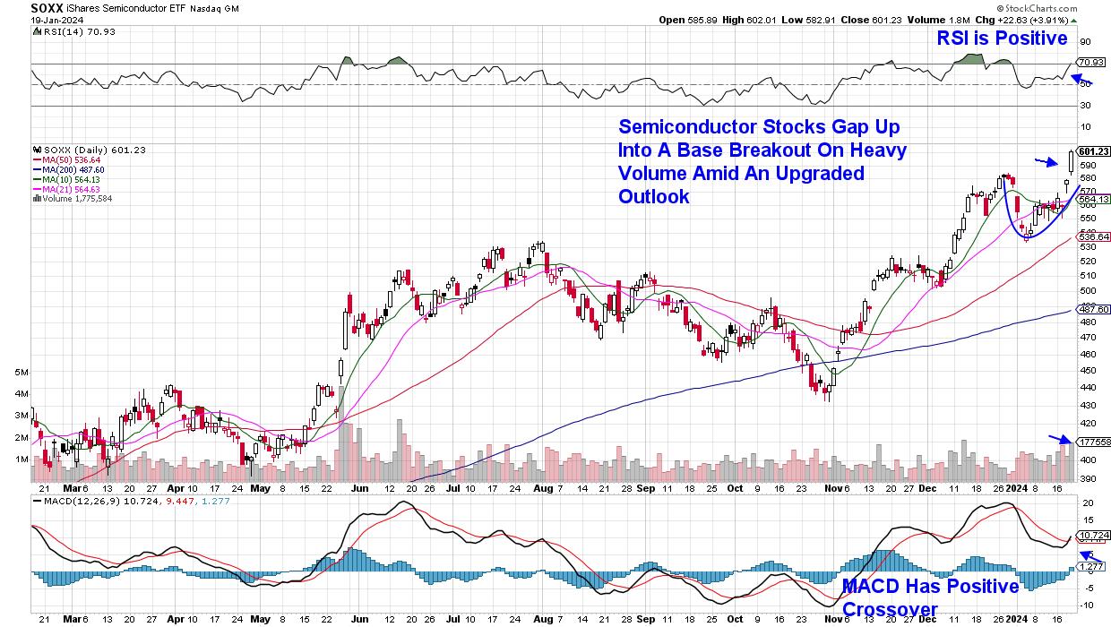
The S&P 500 gained 1.1% last week in a move that puts this Index at a record high. While this is exciting news for investors, those that owned some of last week's top performers are in even better spirits, as the average gain for the top ten movers in this Index was 10.3%. Even more unusual was that almost three quarters of these names were from the same industry group.
The industry group I'm referring to is Semiconductors, which posted outsized gains after a positive earnings report from the world's largest chip manufacturer, Taiwan Semiconductor (TSM), sparked a rally in these stocks. Prior to that, a bullish report for Advanced Micro (AMD)'s outlook put this stock on its path to posting almost 20% for the week. Subscribers to my MEM Edge Report will be familiar with this stock, as we highlighted AMD as a strong buy on Sunday and then again on Wednesday.
 Daily Chart of iShares Semiconductor ETF (SOXX) Daily Chart of iShares Semiconductor ETF (SOXX)
Software stocks also outperformed last week, with the names from this area that are on our Suggested Holdings List posting gains that keep them in confirmed uptrends; they're poised to trade higher from here. If you'd like immediate access to this List, use this link here for a 4-week trial of my twice weekly report. In addition to recommending leadership stocks that often go on to outperform the broader markets, this report keeps you tuned into sector rotation, interest rate outlooks, and other big picture concepts that keep you on top of what's moving the markets and, more importantly, what to look out for.
This Sunday's MEM Edge Report will review additional events taking place in the markets that are unusual. Among them, Growth stocks are advancing, despite interest rates remaining relatively elevated, and while the S&P 500 is now at new highs, the Equal-Weighted S&P 500 has been languishing. Use the link above for insights into these and other counterintuitive activities shaping today's market.
Warmly,
Mary Ellen McGonagle
MEM Investment Research
|
| READ ONLINE → |
|
|
|
| Martin Pring's Market Roundup |
| MEMBERS ONLY |
| Buying Bitcoin ETFs is the Easy Part, But What Comes Next? |
| by Martin Pring |
|
Last week, eight new Bitcoin-based ETFs began trading courtesy of recent SEC approval. This launch was well anticipated, as the price had already run up in the hope that these new buyers would push it to an even higher level...
|
| READ ONLINE → |
|
|
|
| RRG Charts |
| Watch Stocks Triumph in Latest Asset Allocation Battle |
| by Julius de Kempenaer |

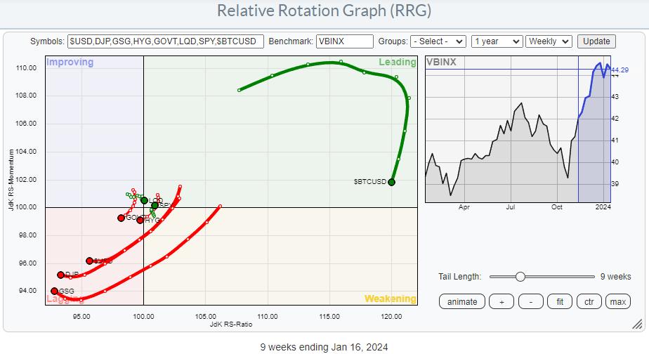
The RRG above shows the rotation of various asset classes, using VBINX (Vanguard Balanced Index Fund) as the benchmark. The long red tails pushing deep into the lagging quadrant are for Commodities (DJP&GSG) and $USD, while the long Green tail deep inside the leading quadrant and moving lower is for BTC.
The first takeaways from this RRG are:
- BTC is in a very strong relative uptrend vs. all other asset classes, but is currently going through a setback, potentially offering a "buy-the-BIT-dip" scenario in the next few weeks.
- The long red tails deep inside the lagging quadrant are for Commodities (DJP&GSG) and $USD. These asset classes are in a strong relative downtrend. The slight pickup in relative momentum (JdK RS-Momentum) is not meaningful enough (yet) to warrant any action.

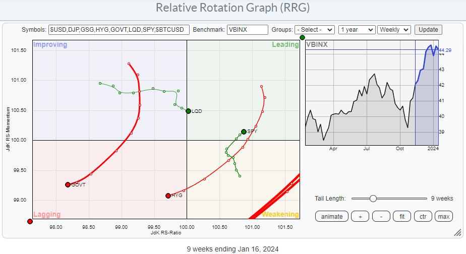
Zooming in on the center of the RRG highlights the rotations for stocks and fixed-income asset classes. It shows a strong rotation for stocks, and it has been doing that for weeks already.
The tail on SPY rotated through weakening, after a stint through leading, and is now moving back into the leading quadrant. As you know, this is one of the strongest possible rotations, as it signals the start of a new up-leg within an already rising relative trend.
The fixed-income tails are moving in the opposite direction, except for corporate bonds.
- Government Bonds (GOVT) rotated back into the lagging quadrant from improving and is now back at a negative RRG-Heading, moving further into the lagging quadrant.
- High-yield bonds (HYG) have just crossed back into the lagging quadrant after a full rotation through leading and weakening, starting a new relative downtrend.
- Corporate Bonds is currently the strongest asset class in the fixed-income domain, crossing into leading but doing so at a negative RRG-Heading.
All in all, these rotations present a very clear picture in favor of stocks over bonds.

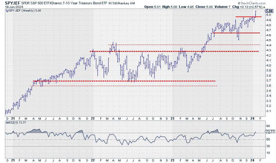
The direct comparison of SPY against IEF underscores this strength with a solid breakaway from the consolidation period in play since Q4-2023. The break to new highs unlocks fresh upside potential for more outperformance of stocks.
#StayAlert, --Julius
|
| READ ONLINE → |
|
|
|
| Don't Ignore This Chart! |
| Utilities' Unique Seasonal Powers: The Best Months to Invest |
| by Karl Montevirgen |

The Utilities sector is known as a defensive investment simply because it generally withstands all phases of the business cycle. Utility stocks are often considered complementary assets to assets aimed at "growth."
Yet even within defensive sectors like Utilities, growth is also a matter of timing. From a seasonal perspective, there are some months when Utilities tend to outperform the S&P 500. Considering the rising demand for electrification and EV adoption, and that many utility companies are adopting artificial intelligence (AI) technologies, the rising tide in Utilities might come in stronger and higher this time than in years previous.
Whether it does or not, it's worth anticipating such a trend, especially if you are looking at Utilities for a short-term seasonal play or to further diversify your portfolio long-term. Let's look at the Utilities Select Sector SPDR Fund (XLU) as a sector proxy by focusing on the following:
- XLU's 10-year seasonal performance
- XLU's 10-year seasons' performance against the S&P 500 ($SPX)
- XLU's weekly and daily performance
If you want to allocate some of your funds to XLU, you must find a good entry point.
How to Access the Seasonality Tool
There are different ways to access the seasonality tool in StockCharts.
- Click the Charts & Tools tab at the top of the StockCharts page, enter a symbol in the Seasonality panel, and click "Go."
- Enter the symbol in the ChartBar at the top of the page and select "Seasonality" from the dropdown menu on the left.
- From Your Dashboard, in Member Tools, click on Seasonality.
- Below the seasonality chart, you'll find links to instructions and quick tips that give more detailed instructions.
XLU's 10-Year Seasonal Performance

CHART 1. XLU'S 10-YEAR SEASONAL PERFORMANCE. Look at its higher closing rate relative to its average monthly returns and compare it to the chart below, which tracks its relative seasonal strength against the broader market.Chart source: StockCharts.com. For educational purposes.
XLU's strongest seasonal months are in March (67% higher-close rate and 3.2% average return), July (78% higher close rate and 3.3% average return), and October (89% higher-close rate and 2.2% average return).
February is seasonally its worst month, with a 33% higher-close rate—a 67% lower-close rate—and an average return of -2.5%. This seasonal context is important to know because we're heading into February in a matter of weeks. But a seasonality reading would seem incomplete if you didn't also look at XLU's performance against the broader market.
XLU's 10-Year Seasonal Performance Against the S&P 500

CHART 2. XLU'S 10-YEAR SEASONAL PERFORMANCE AGAINST THE S&P 500. Compared to the S&P 500, seasonality charts can change quite drastically.Chart source: StockCharts.com. For educational purposes.
In contrast to the seasonality chart in Chart 1, July is a poor month for XLU compared to the S&P 500. XLU's comparative performance in October is rather tepid. However, March's performance against the S&P 500 is seasonally the strongest, while February remains similarly weak.
So, if you're aiming for a seasonal play, might February be a favorable entry point in anticipation of March's potential outperformance? Let's look at XLU's weekly performance.
XLU's Longer-Term Cyclicality

CHART 3. WEEKLY CHART OF XLU. It may be channeling downward, but are the smaller cycles relatively consistent?Chart source: StockCharts.com. For educational purposes.
Since the March 2020 crash, where XLU (along with the market as a whole) bottomed out, you can see how it channeled upward, peaking in the summer of 2022, before then channeling downward.
Many analysts would argue that Utilities tend to see longer growth swings a year prior to (and months after) a recession. It's a safe-haven play. As for 2024 prospects, analyst predictions for Utilities and XLU remain mixed. However, note XLU's strong cyclicality, referencing its swings to the Stochastic Oscillator's high-to-low cycles. XLU is currently in a down cycle. And this matches both of XLU's seasonality profiles mentioned above. So, if you were to jump into February weakness to ride XLU's potentially strong March upswing, what's a good buy point?
A couple of things: If seasonality expectations prove consistent with previous years, then it's reasonable to expect further weakness in February and a potential rally in March.
Overlaying an Ichimoku Cloud in the daily chart is helpful for reference and context (see chart below). Its lowest point coincides with the first level of potential support near $59.00 (November lows indicated by dashed line labeled 1). Price is likely to reach this level in a few weeks, and you'll want to see whether price begins consolidating at the level or whether it bounces. This level also serves as a potential buy point if you're looking for a seasonal trade.

CHART 4. DAILY CHART OF XLU. Note the three possible entry points coinciding with XLU's February seasonal weakness.Chart source: StockCharts.com. For educational purposes.
Worse to worst-case scenarios will see price breaking below the first level and potentially bouncing off the second and third levels indicated on the chart. The third level ($54.50) marks a two-year low; you'll likely see plenty of reaction if the price closes toward that level.
So if you're looking to take advantage of February weakness and March strength expectations, you'll want to set a price alert at $60 and observe what happens when price reaches $59. If no consolidation or reversals occur, and if price continues to fall well into February, set alerts for the next two levels indicated on the chart. It's kind of a see-and-respond scenario. And timing, especially considering it's a seasonality play, is everything in this situation. But at least you have the reference points to help make a better decision.
How To Set a Price Alert
Setting a technical alert at these support and resistance levels would be helpful as you weigh your potential entry points against any market developments that may influence your decision.
To access the Technical Alert Workbench, follow these steps:
- From Your Dashboard, click the Alerts button > New in Your Alerts panel.
- In the Alerts workbench, choose which type of alert you want to create from the Alert Type buttons at the top left.
- To create a price alert, select Price Alert as the alert type.
- Add a symbol in the symbol box, set your price trigger, and choose how you wish to be notified.
- Click the Save Alert button.
The Bottom Line
Remember that this particular seasonality reading frames the larger economic context surrounding Utilities. Many changes and new developments are happening, and analyst predictions are mixed. So, set a technical price alert at the support and resistance levels as you weigh your potential entry points.

Disclaimer: This blog is for educational purposes only and should not be construed as financial advice. The ideas and strategies should never be used without first assessing your own personal and financial situation, or without consulting a financial professional.
|
| READ ONLINE → |
|
|
|
| DecisionPoint |
| Has Rate Cut Anticipation Run Its Course? |
| by Carl Swenlin |
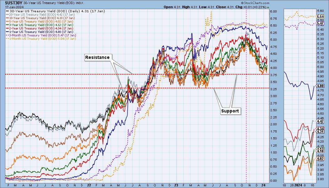
The Fed stopped raising rates in July, and, by mid-October, yields had peaked. Since then, yields have begun to decline in anticipation of the Fed beginning rate cuts this year. At this point, it appears that yields have found support and may possibly bounce, or begin moving sideways. This chart is a little dense, so let's try and clarify the technicals.

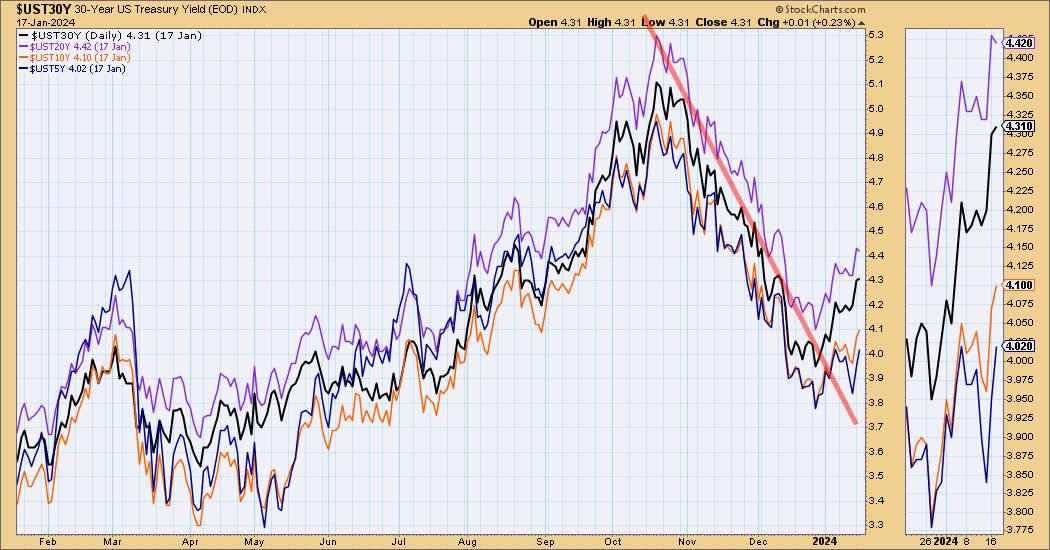
The next chart shows durations of five years or longer. Clearly, they have broken out of the three-month declining trend, so we anticipate that they will trend higher for a while.

Learn more about DecisionPoint.com:
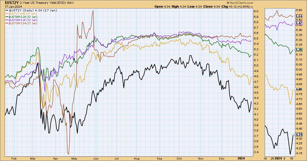
By comparison, shorter duration yields, two years and lower, present a much different picture. First, the very shortest durations, one month to three months, have not declined much at all. This accounts for the increased inversion between long and short duration yields. Additionally, while the one- and two-year yields have pulled back somewhat, they have not broken out of their declining trends yet. This will probably change as the longer-duration yields continue to advance.

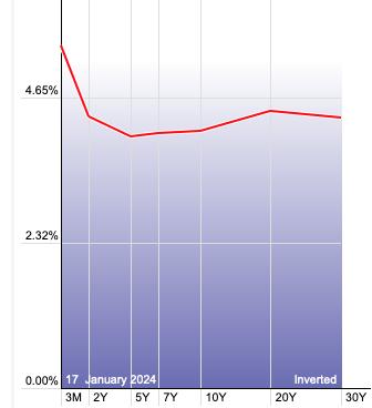
The Dynamic Yield Curve chart on StockCharts.com shows the severity of the yield inversion that currently exists. This should be abated somewhat as longer-duration yields rise, but currently we have no expectation that the inversion will go away.

Conclusion: Yields have been declining for about three months, but most of the decline is concentrated in durations of five years and longer. This will alleviate some of the short versus long duration inversion that exists, but it is not likely to erase it. Significantly, the longer duration yields have broken their declining trends and will probably trend higher until rate cut fever returns.
Watch the latest episode of DecisionPoint on StockCharts TV's YouTube channel here!

Try us out for two weeks with a trial subscription!
Use coupon code: DPTRIAL2 at checkout!
Technical Analysis is a windsock, not a crystal ball. --Carl Swenlin
(c) Copyright 2024 DecisionPoint.com
Disclaimer: This blog is for educational purposes only and should not be construed as financial advice. The ideas and strategies should never be used without first assessing your own personal and financial situation, or without consulting a financial professional. Any opinions expressed herein are solely those of the author, and do not in any way represent the views or opinions of any other person or entity.
DecisionPoint is not a registered investment advisor. Investment and trading decisions are solely your responsibility. DecisionPoint newsletters, blogs or website materials should NOT be interpreted as a recommendation or solicitation to buy or sell any security or to take any specific action.
Helpful DecisionPoint Links:
DecisionPoint Alert Chart List
DecisionPoint Golden Cross/Silver Cross Index Chart List
DecisionPoint Sector Chart List
DecisionPoint Chart Gallery
Trend Models
Price Momentum Oscillator (PMO)
On Balance Volume
Swenlin Trading Oscillators (STO-B and STO-V)
ITBM and ITVM
SCTR Ranking
Bear Market Rules
|
| READ ONLINE → |
|
|
|
| MORE ARTICLES → |
|
 First solo flight, Norwood Airport (KOWD), July 7, 2012.