| THIS WEEK'S ARTICLES |
| The Mindful Investor |
| Tesla Tests Key Support: Is This a Trade? Or an Investment? |
| by David Keller |
There is no denying that Tesla has been a big-time outlier out of the Magnificent 7 stocks. While names like META have exploded to double-digit gains just this week, TSLA is down about 38% from its July 2023 high and about 55% off its all-time high in late 2021.
Now, Tesla is approaching a "confluence of support" where multiple technical analysis techniques agree on a particular level or range. Will this be the time when TSLA finally finds its footing? And how can we differentiate a short-term mean reversion bounce from a more sustained recovery?
It's worth remembering that, in the first half of 2023, Tesla was a serious outperformer, handily outpacing the S&P 500 as it almost tripled in value in just over six months. But after the July 2023 peak, it's been a fairly consistent stepwise downtrend of lower lows and lower highs.
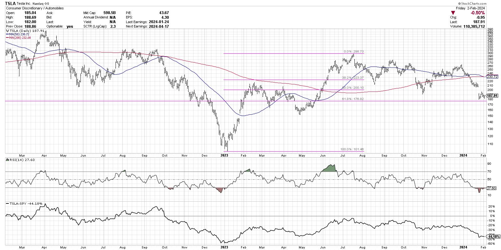
Applying a Fibonacci framework to the last seven months shows a 38.2% retracement around $223, right about where the first swing low occurred in August 2023. The next downswing stalled out around the 50% retracement level at $200, which also pushed just below the 200-day moving average. The most recent downswing, which has basically been the story of early 2024 for Tesla, has pushed the price down to almost the 61.8% retracement level of around $177.
Tesla is currently oversold, with an RSI below 30 for the last couple weeks. Previous swing lows in August and October 2023 also involved an RSI around these levels. Will we see another oversold bounce off Fibonacci support? We think so. But now, let's combine the price momentum with a gauge of price trend.
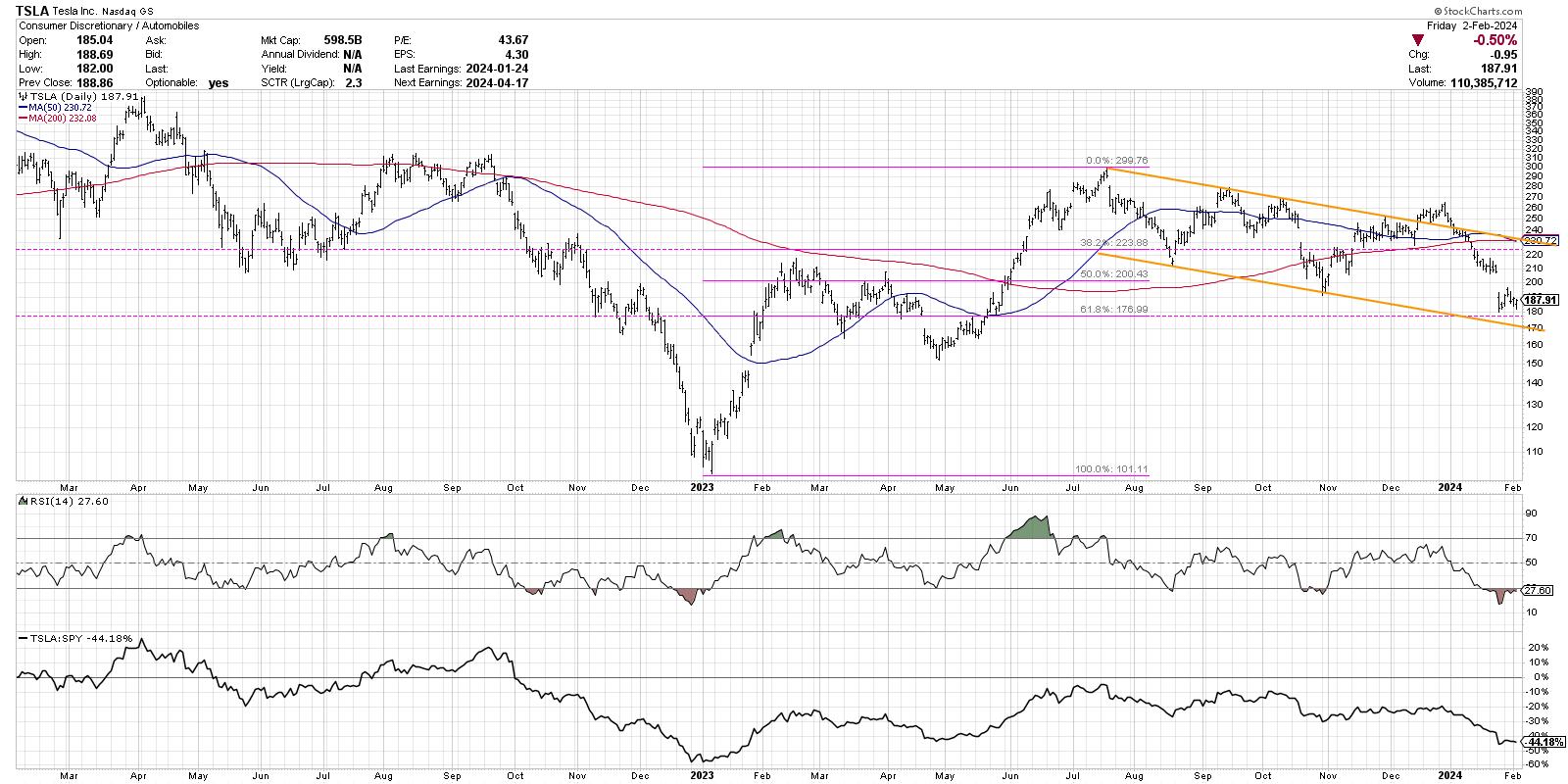
Starting from the July 2023 high, I've drawn a trendline connected to the peak two months later in September. That trendline coincides well with subsequent highs in October and November, confirming the validity of this visual trend gauge. Note the failed breakout in late December, which certainly had me speculating that Tesla was beginning to mount a serious recovery. It was not to be, as the price soon returned to the downtrend channel.
See how the price has now pushed back to the lower boundary of this trend channel? Now we have another charting technique confirming potential support around $170, not far from the Fibonacci level of $177. So a stock is oversold as it tests support generated from two different technical approaches!
If we do see a countertrend bounce here, the real question will be whether this is the beginning of a broader advance, potentially leading back to the July 2023 high around $300. But the problem here is we have a confluence of resistance around the $225-230 range. That's the 38.2% retracement we mentioned earlier, as well as the upper edge of the trend channel. The 50-day and 200-day moving averages are actually right around that same level as well! So, while the current oversold conditions suggest a short-term bounce is imminent, I would need to see a break above that confluence of resistance to consider a retest of the 2023 high as a real possibility.
Mindful investors recognize that investing is not just about finding one indicator, or one approach, and then just sitting back and reaping the rewards of its buy and sell signals. Technical analysis is more about the weight of the evidence, considering the lessons of market history, and recognizing the importance of when multiple techniques line up. For now, the charts suggest Tesla may be ripe for a decent countertrend bounce.
RR#6,
Dave
P.S. Ready to upgrade your investment process? Check out my free behavioral investing course!
David Keller, CMT
Chief Market Strategist
StockCharts.com
Disclaimer: This blog is for educational purposes only and should not be construed as financial advice. The ideas and strategies should never be used without first assessing your own personal and financial situation, or without consulting a financial professional.
The author does not have a position in mentioned securities at the time of publication. Any opinions expressed herein are solely those of the author and do not in any way represent the views or opinions of any other person or entity.
|
| READ ONLINE → |
|
|
|
| Larry Williams Focus On Stocks |
| MEMBERS ONLY |
| Home Prices and Stocks | Focus on Stocks: February 2024 |
| by Larry Williams |
|
Let's begin this month with a look at ... Home Prices and Stocks Most people have the majority of their money in homes and/or stocks. Thus, I thought that this month, I would take a look at what should be happening in the real estate market...
|
| READ ONLINE → |
|
|
|
| Art's Charts |
| Gold is Making Waves within a Long-Term Uptrend |
| by Arthur Hill |
 Gold is not the most exciting asset at the moment, but it is in a long-term uptrend and perhaps the strongest commodity out there. There are also signs that the January decline is ending as RSI hits a momentum support zone and a bullish continuation pattern forms. Note that GLD was first highlighted in our Chart Trader report/video on Tuesday, 30-January. Gold is not the most exciting asset at the moment, but it is in a long-term uptrend and perhaps the strongest commodity out there. There are also signs that the January decline is ending as RSI hits a momentum support zone and a bullish continuation pattern forms. Note that GLD was first highlighted in our Chart Trader report/video on Tuesday, 30-January.
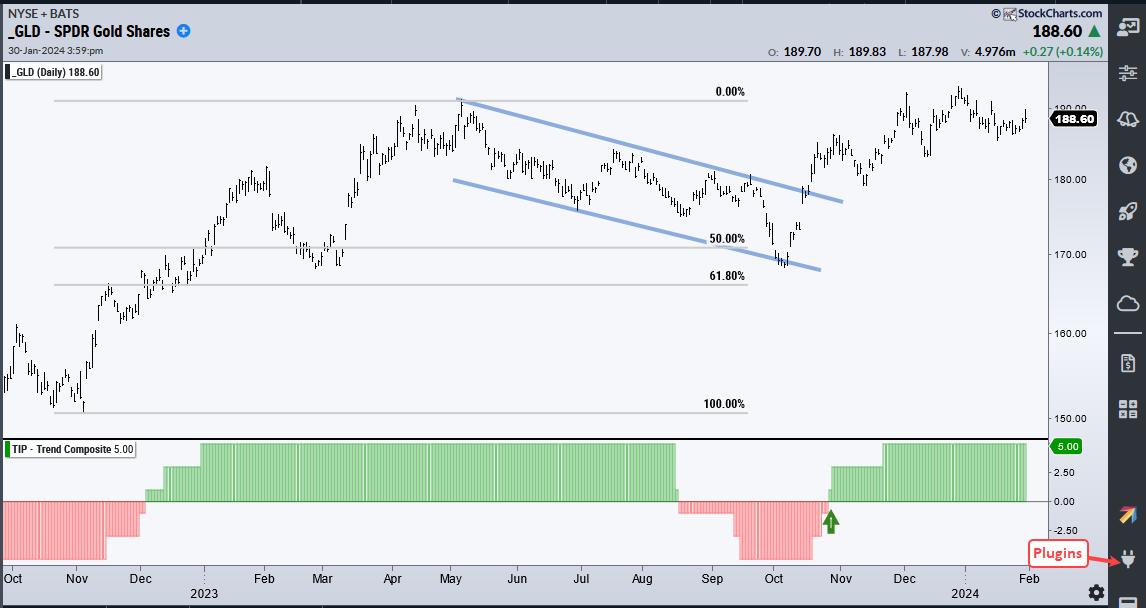
The first chart shows the Gold SPDR (GLD) since October 2022, when it was trading around $150. GLD advanced to the 190 area by May 2023 and then corrected into early October. I am calling this a correction because a large falling channel formed (blue lines) and the decline retraced 50-61.8 percent of the prior advance. GLD broke out of the channel in mid October and hit a new high in late December.

The indicator window shows the Trend Composite turning bullish on October 26th (green arrow), which is about a week after the channel breakout. This indicator aggregate signals in five trend-following indicators. It started at +1, moved to +3 and is currently at +5. This means all five inputs are in bull mode. The Trend Composite and 10 other indicators are part of the TIP Indicator Edge Plugin for StockCharts ACP (here).
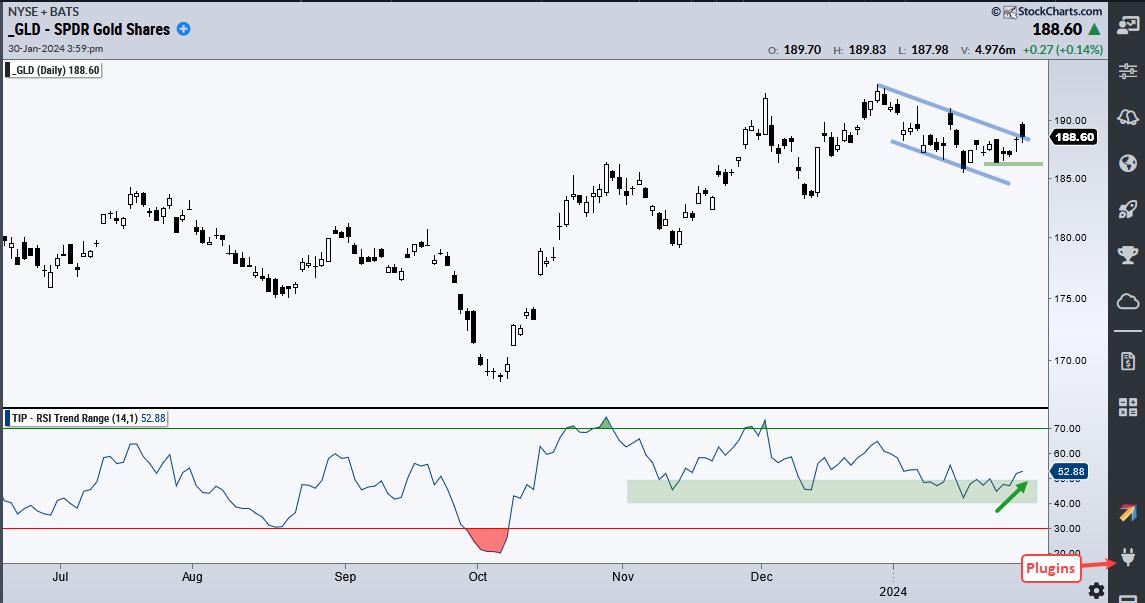
The next chart shows GLD correcting after hitting a new high. GLD hit a new high in late December and then fell back in January. This decline formed a falling channel and retraced around 2/3 of the December advance. GLD is making waves with bounce and breakout the last two days. The green line at 186 marks re-evaluation support.

The indicator window shows RSI(14) exceeding 70 in October, late November and early December. This shows strong upside momentum during the fourth quarter advance. RSI fell back to the 40-50 zone in mid November, mid December and mid January (green shading). This area acts as momentum support in an uptrend. There are signs that RSI is turning up from this area and improving momentum supports the channel breakout.
The Chart Trader offering at TrendInvestorPro provides broad market analysis and carefully curated trading setups for stocks and ETFs. We focus on bullish continuation patterns, such as the one in GLD. Reports are published every Tuesday and Thursday before the open and each report includes a video. Click here to learn more.
///////////////////////////////////
|
| READ ONLINE → |
|
|
|
| RRG Charts |
| Discretionary vs. Discretionary, a Fierce Battle Under the Hood |
| by Julius de Kempenaer |
Cap-Weighted vs. Equal-Weighted
Sometimes, you need to look a little further. And concerning the rotations in Consumer Discretionary stocks, this is one of those "sometimes".

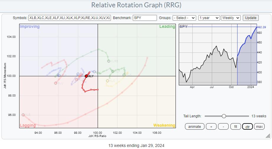
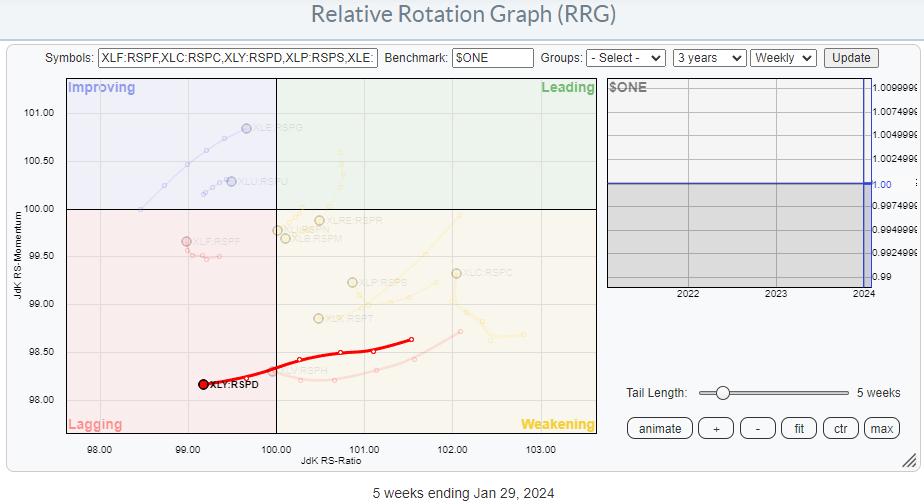
On this Relative Rotation Graph, holding the cap-weighted sectors, XLY is making a nasty turn back down into the lagging quadrant after a brief period inside improving. At first glance, this would lead to the suggestion or conclusion that Consumer Discretionary stocks are rotating out of favor and are setting up for a new down-leg in an already established relative downtrend.
However...

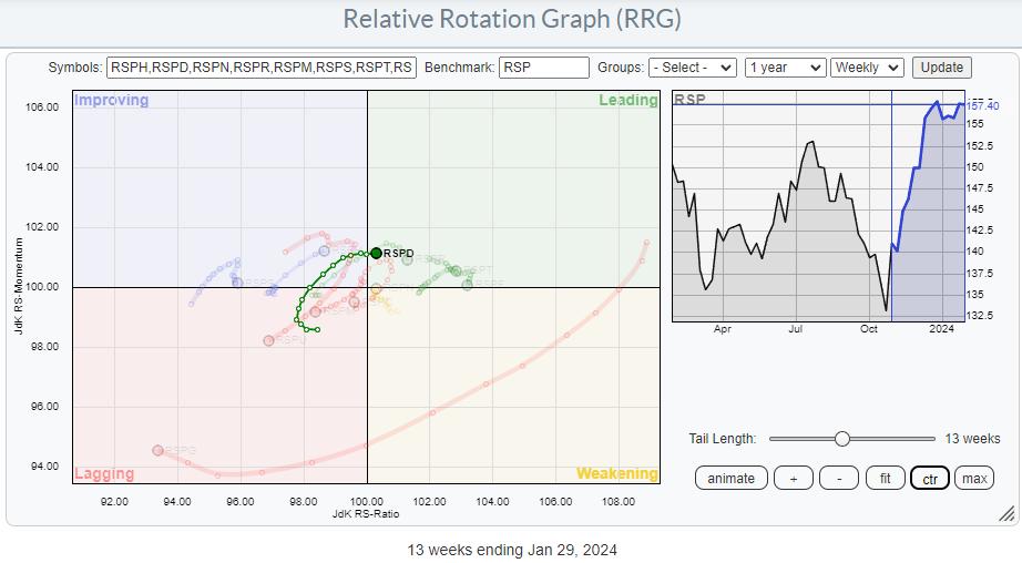
Looking at the RRG that shows the equal weight versions of the S&P sectors the tail on Consumer Discretionary is travelling at a completely different path. It's much more positive.
RSPD just rotated into the leading quadrant after a period through lagging and improving.
From this rotation, the Consumer Discretionary sector looks much healthier than the cap-weighted rotation of XLY.
Mega-Caps Are Dragging XLY Down
The first takeaway from this observation is that the heavy-weight names inside XLY are dragging the cap-weighted sector down. As a result, we can conclude that the second or third-tier stocks in this universe are doing pretty well.
Another way of visualizing this relationship, not only for Consumer Discretionary but for all cap-weighted vs. weighted sectors, is by plotting their rations on a Relative Rotation Graph and using $ONE as the benchmark.

This shows the tail for XLY:RSPD is rapidly moving into the lagging quadrant, confirming that rotation favors non-large/mega-cap stocks in the consumer discretionary sector.
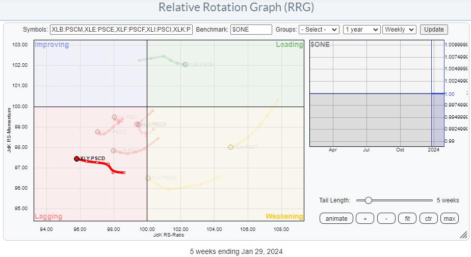
Finally, we can look at the relationship between large- and small-cap Consumer Discretionary similarly.

This shows the XLY:PSCD tail also moving deeper into the lagging quadrant.
Looking For Stocks
With this knowledge, I want to see if I can find some stocks worth looking at. Therefore, my pool of stocks to go through is stocks that are either in the S&P 400 (MidCap) or S&P 600(SmallCap) AND in the Consumer Discretionary Sector.
I can easily find those by using the advanced scan workbench.

Running this scan returns 172 symbols. So I need to trim this list down a little further. I am going to do that by adding a simple requirement, like the RSI needing to be above 60. That ensures that the price is already moving higher, and I am adding the requirement that the Close must be above its 10-day moving average AND that the RSI must be above 60.

Running this scan results in a list of 33 symbols, which is very manageable.
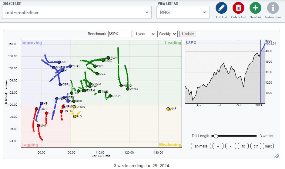
Plotting Them on a RRG
After saving that list as a ChartList, I can then plot them on a Relative Rotation Graph.

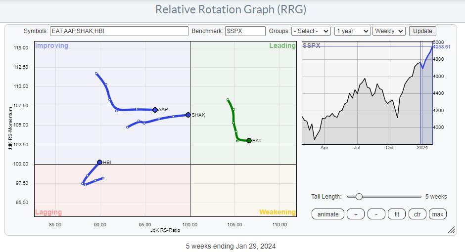
After visually inspecting the rotation of these tails and their price charts, I ended up with four potentially interesting stocks.

HBI - HanesBrands Inc.
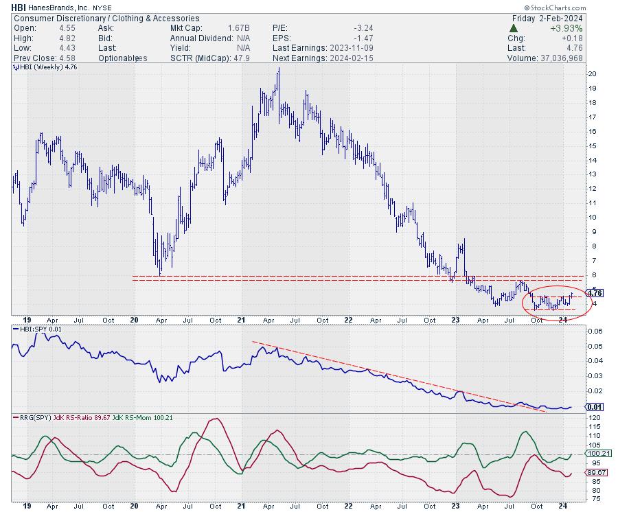
The chart that got my attention is HBI. On the RRG, it is showing a nice rotation back into a positive RRG-Heading and moving into the improving quadrant. Remember that the group as a whole is already showing strength, so HBI is trailing that development, which means that it has the potential to catch up within the sector.

After a long downtrend in which HBI lost around 80% of its value in three years, the stock started to bottom in the second half of 2023, and this week it broke out above the resistance offered by its previous two highs.
This move opens the way for a further rise towards the next resistance area, around 5.5-6.0. That is roughly 20% upside potential, with support only 5-6% below current levels.
#StayAlert and have a great weekend, --Julius
|
| READ ONLINE → |
|
|
|
| Martin Pring's Market Roundup |
| MEMBERS ONLY |
| Is Oil Going Up or Down? |
| by Martin Pring |
|
Oil is not only an important commodity in and of itself, but is also one has a substantial influence on commodity indexes in general. Its weight in the CRB Composite is 23%; for energy in total, it is 39%...
|
| READ ONLINE → |
|
|
|
| The MEM Edge |
| Strong Earnings Is Driving Sector Rotation Into These 2 Groups |
| by Mary Ellen McGonagle |
It was a sloppy push to new highs for the S&P 500 this week, after a sharp drop Wednesday on Fed news was followed by a recovery rally on the heels of strong earnings from select Magnificent 7 names. All three indexes posted a 4th consecutive week of gains amid a sharp rise in interest rates, due to strong jobs data today that showed a hot labor market with increasing wages.
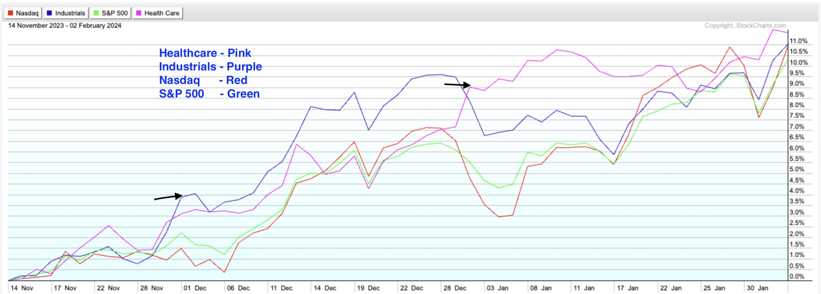
While this week's winner's list is led by Meta Platforms (META) which surged 20% after posting strong quarterly results and guiding growth estimates higher, the next 9 outperformers in the S&P 500 were stocks from 2 sectors that have been steadily outperforming the markets since early December. These winning names each gained more than 9% last week on strong earnings and a bullish outlook, and what may be surprising is that not one is from the Technology or Internet areas.
 Performance Comparison Of S&P 500, Nasdaq, Industrial and Healthcare Sectors Performance Comparison Of S&P 500, Nasdaq, Industrial and Healthcare Sectors
The chart above reveals those sectors, with Industrials (XLI) and Healthcare (XLV) both posting varying degrees of outperformance since early December. With headline news focused on megacap Tech names, it might have been easy to miss this rotation; however, subscribers to my MEM Edge Report were alerted when we began adding Medical stocks to our Suggested Holdings List earlier this year.
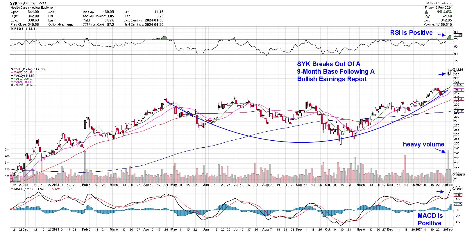
Among the top ten S&P 500 gainers in the Healthcare sector last week was medical and surgical equipment manufacturer Stryker (SYK), which gapped up into a 9-month base breakout following news that the company had posted earnings ahead of estimates, while guiding growth prospects higher for this year. Although the RSI is in an overbought position on the daily chart, the weekly chart points to further upside following a bullish MACD crossover from a relatively low level.
 Daily Chart of Stryker Corp. (SYK) Daily Chart of Stryker Corp. (SYK)
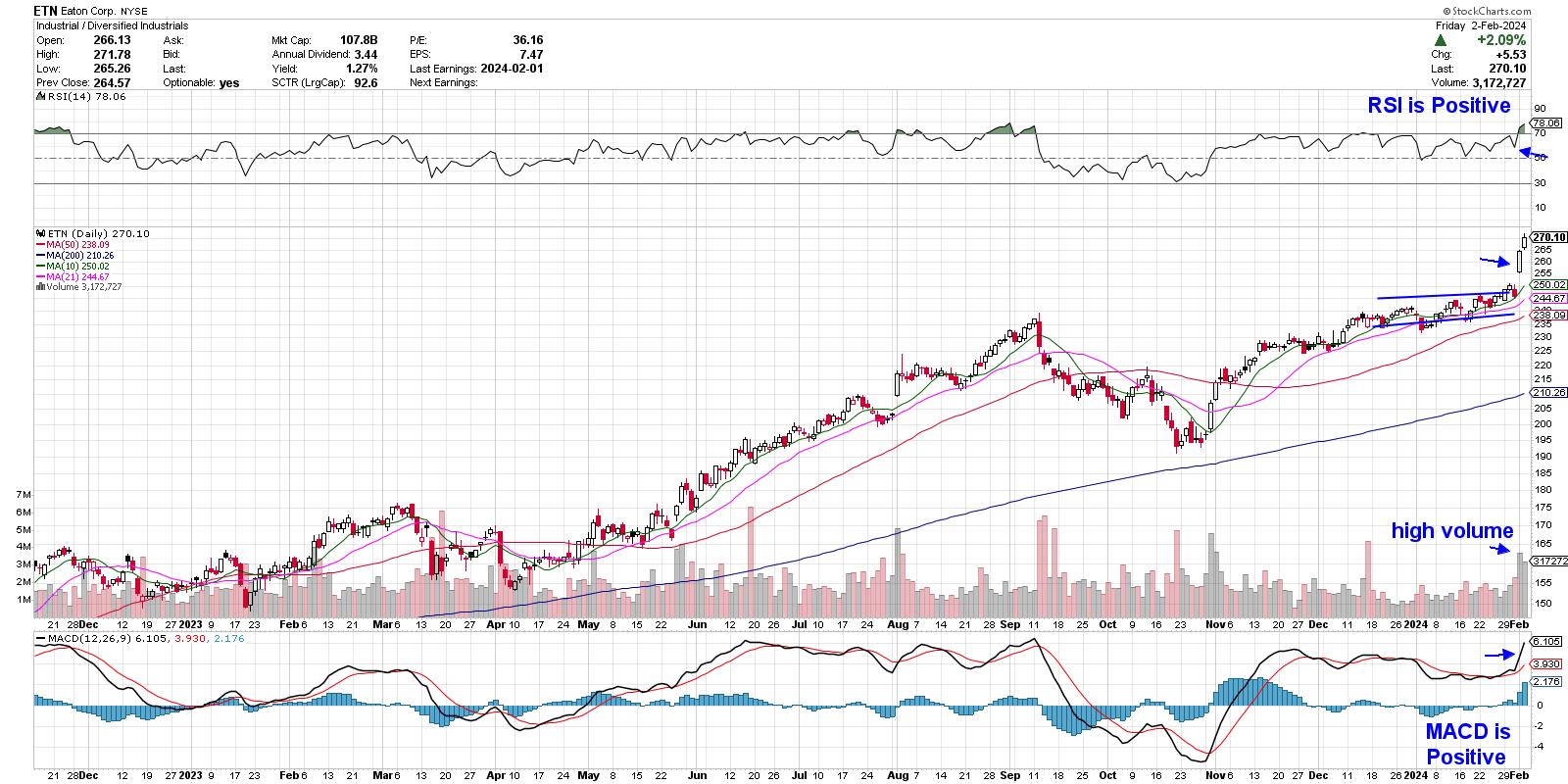
Another top ten gainer last week was Eaton (ETN), which is from the Industrial sector. The provider of electrical power and control equipment gapped up on heavy volume Thursday, after the company reported earnings ahead of estimates while guiding estimates higher for this year and next. Overall, electricity demand growth is projected to accelerate, thanks to data centers processing AI, EVs and heat pumps. The base breakout puts the stock in a position to trade higher from here.
 Daily Chart of Eaton Corp. (ETN) Daily Chart of Eaton Corp. (ETN)
Earnings season has often marked a period of sector rotation, as strong growth prospects attract money flows into specific areas of the market. From my many years at Willliam O'Neil & Co., and more recently with my own company, it's become crystal clear that earnings growth is the key driver among stocks that go on to far outpace the markets.
My MEM Edge Report has a select list of names on the Suggested Holdings List, and we've highlighted most of this year's big winners, such as Deckers (DECK) and Meta (META), which both gapped up on strong earnings today. This twice-weekly report also provides seasoned insights into the broader markets, which has helped investors stay with their winners despite sharp pullbacks such as last Wednesday. Use this link here to access a 4-week trial, as well as all previous reports.
I hope you'll take advantage of this offer. It's shaping up to be a game changing earnings season!
Warmly,
Mary Ellen McGonagle
MEM Investment Research
|
| READ ONLINE → |
|
|
|
| ChartWatchers |
| S&P 500, Dow Jones Hit All-Time Highs Again; Tech Stocks Back in the Spotlight |
| by Jayanthi Gopalakrishnan |

What a week! Mega-cap tech stocks, the Fed meeting, and January's nonfarm payrolls made headlines this week, creating an exhilarating week for investors. Friday's stock market price action was an unexpected, but optimistic end to the trading week.
Jobs, Jobs, Jobs
The January jobs report came in way better than expected, and you'd think that would lead to a selloff after Fed Chairman Powell's comments on Wednesday. Yet investor optimism prevailed, and the broader stock market indices closed higher, with the S&P 500 ($SPX), Dow Jones Industrial Average ($INDU), and Nasdaq 100 ($NDX) closing at an all-time high. It's beginning to sound like a broken record, almost as if the stock market is waiting for the Nasdaq Composite to catch up and notch a new record high.
The blowout jobs report from the Bureau of Labor Statistics showed that the US economy added 353,000 jobs, well above the 185,000 estimate. The unemployment rate was 3.7%, slightly lower than the expected 3.8%. Wage growth also rose.
Thus, a combination of more jobs and higher wages buries even the slightest probability of a March rate cut. May is still a ways away, and plenty of data will come out before then, but it would be surprising if anything moves the needle enough to warrant a rate cut in March.
A strong labor market is great for the economy. The question is whether it aligns with what the FOMC wants to see—a rebalancing of the labor market. It's possible that a rebalance between supply and demand of jobs will occur, given that hours worked per week fell to 34.1. If that continues to fall, and companies start cutting jobs, that would indicate a rebalancing. Another data point to focus on is the number of people working or available for work. If that also declines, it would be further confirmation that the supply and demand forces of the labor market are coming more into equilibrium. But we won't know that for a while, and investors seem to have shifted their focus to the present.
Tech Stocks Back In Focus
The stock market didn't seem worried about the stellar jobs report, and Chairman Powell's comments are now in the rearview mirror. The broader market indices closed higher, with big tech stocks in the spotlight. Earnings from Alphabet (GOOGL), Microsoft (MSFT), Amazon (AMZN), Apple (AAPL), and Meta Platforms (META) were mixed, but that didn't stop tech stocks from being the stars at the tail end of the trading week. AI is still the buzzword that fuels this market.
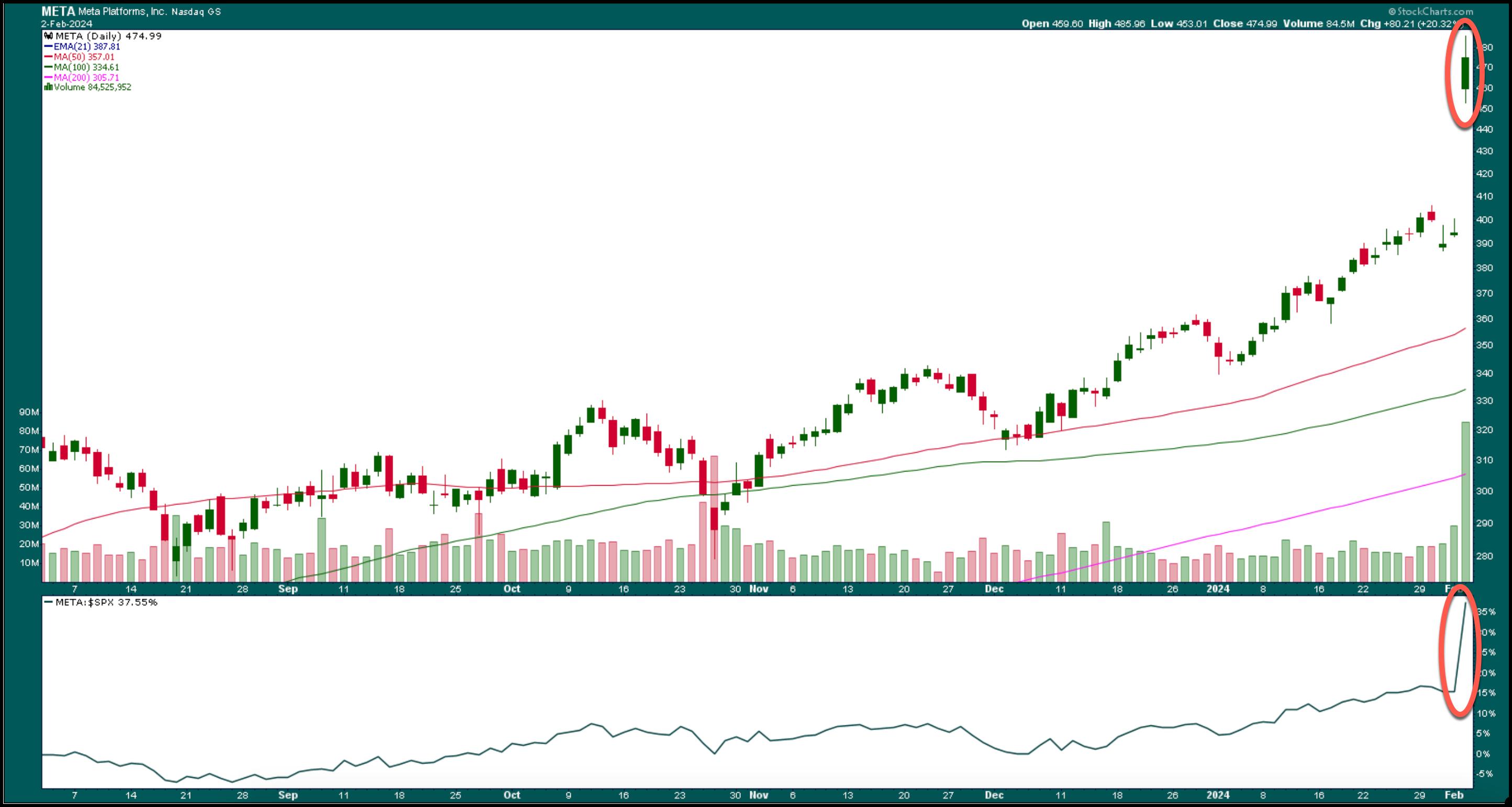
Consumer demand is strong, as reflected by Amazon's earnings on Thursday. And META, which reported strong Q4 earnings and positive Q1 guidance, soared after Thursday's close. But that wasn't all; META will be issuing a quarterly dividend of $0.50 per share for the first time. This news boosted the stock price higher, and META closed at $474.99 per share, up 20.32%, hitting an all-time high. That's a $197 billion addition to its market cap.

CHART 1. META STOCK SOARS ON EARNINGS AND DIVIDENDS. Meta notches an all-time high on strong earnings, guidance, and news of dividends to shareholders.Chart source: StockCharts.com. For educational purposes.
One area of the market that struggles to keep up with the broad indices is small caps. Small-cap stocks tend to perform better in a lower interest rate environment, and since rate cuts aren't on the Fed's radar at the moment, the S&P 600 Small Cap Index ($SML) was one of the few reds in the Market Overview panel in the StockCharts dashboard.
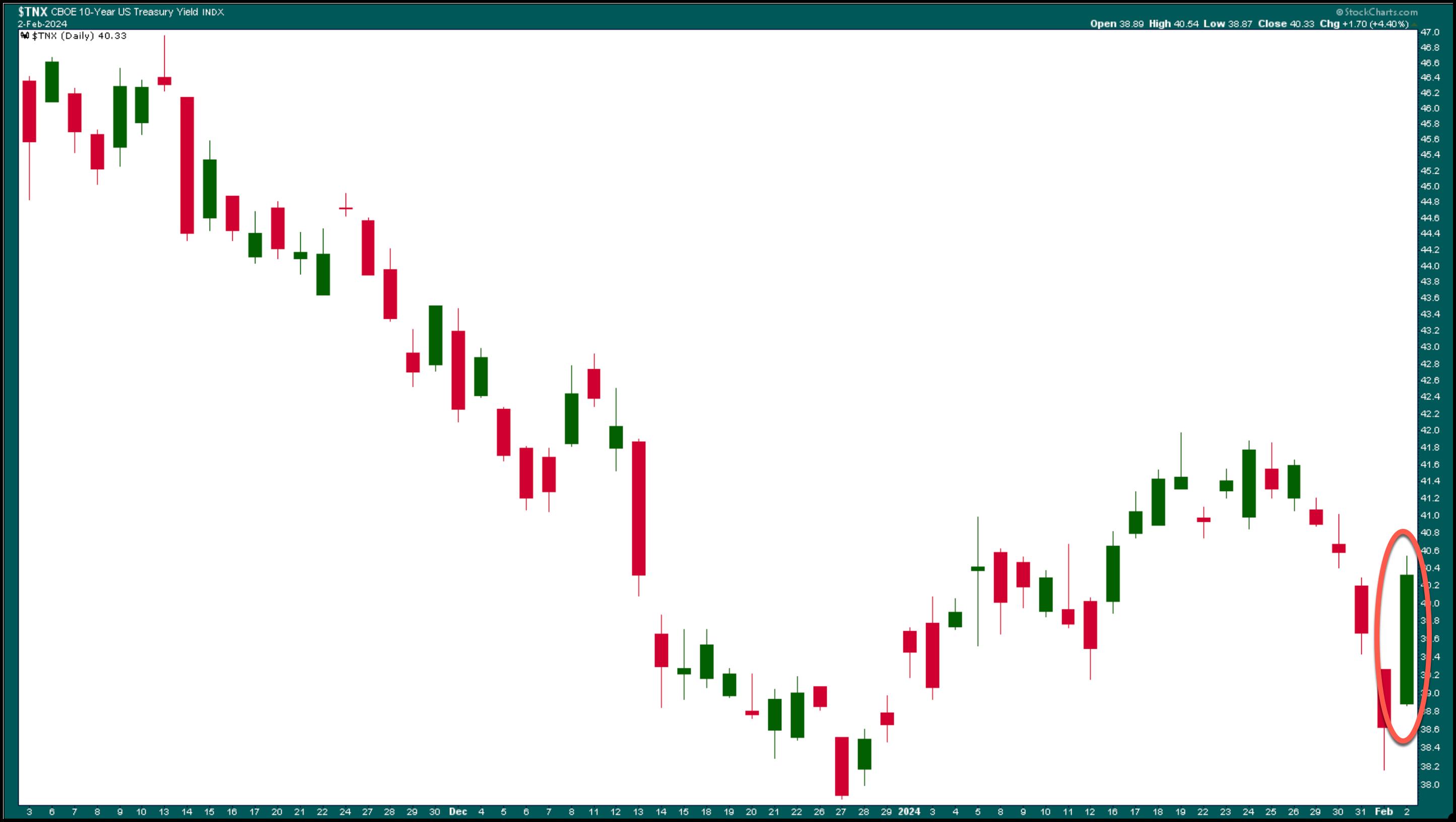
Speaking of interest rates, the 10-year US Treasury yield chart paints a good picture (see below). The 10-year yield is back above 4% after sharply falling and hitting a low of 3.817%.

CHART 2. 10-YEAR TREASURY YIELD SPIKES. The strong January jobs report sent the benchmark 10-year US Treasury Yield Index spiking. In spite of the big jump, the yield closed lower for the week.Chart source: StockCharts.com. For educational purposes.
Today's move in yields didn't help bond prices. The iShares 20+ Year Treasury Bond ETF (TLT) was down 2.21%.
The Bottom Line
Overall, 2024 has started positively, which is good for stocks. Hearing some of the takeaways from the Fed speeches next week will be interesting. After this week's performance, maybe the market won't be impacted by rate cut delays. This stock market just keeps going and going; if delaying rate cuts isn't going to stop it, what will?
Next week is another week. If you're considering adding positions to your portfolio, take advantage of any pullbacks while the market trends higher. Only if there's a drastic turn of events should you think otherwise.
End-of-Week Wrap-Up

- S&P 500 closes up 1.07% at 4,958.61, Dow Jones Industrial Average up 0.35% at 38,654.42; Nasdaq Composite up 1.74% at 15,628.95
- $VIX down 0.22% at 13.85
- Best performing sector for the week: Consumer Discretionary
- Worst performing sector for the week: Energy
- Top 5 Large Cap SCTR stocks: Super Micro Computer, Inc. (SMCI); Affirm Holdings (AFRM); CrowdStrike Holdings (CRWD); Veritiv Holdings, LLC (VRT); Nutanix Inc. (NTNX)
On the Radar Next Week
- Earnings week continues with Walt Disney Co. (DIS), Gilead Sciences (GILD), Alibaba Group Holding (BABA), Eli Lilly (LLY), and Snap Inc. (SNAP) reporting.
- January PMI and ISM
- Fed speeches
- November S&P/Case-Shiller Home Price
- Fed Interest Rate Decision
Disclaimer: This blog is for educational purposes only and should not be construed as financial advice. The ideas and strategies should never be used without first assessing your own personal and financial situation, or without consulting a financial professional.
|
| READ ONLINE → |
|
|
|
| DecisionPoint |
| This Week's Sector & Industry Group to Watch |
| by Erin Swenlin |
Before we get started today, I want to encourage you to subscribe to our new YouTube Channel for DecisionPoint. We post the recording of our weekly trading room there, and it is also full of educational videos that Erin has done over the years. Click on this LINK to subscribe now.
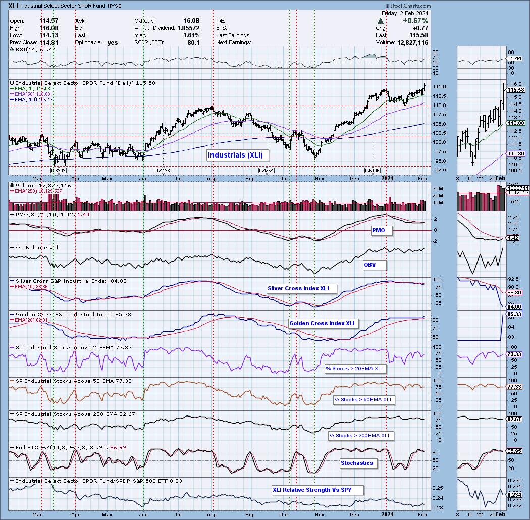
As part of the DP Diamonds subscription, on Fridays I give subscribers a "Sector to Watch" and an "Industry Group to Watch" for the following week. This week, it was somewhat difficult because I had a few sectors that looked interesting going into next week. It came down to Industrials (XLI) and Consumer Discretionary (XLY). Both charts look constructive, but I opted to go with Industrials this week.
Sector to Watch: Industrials (XLI)
We recommend keeping a close eye on the Industrials (XLI) sector. Today saw a fantastic breakout above the 2023 high. The indicators are lined up well, and looking at "under the hood" participation suggests there is more upside to follow for the Industrials.
The only part of the chart that isn't that positive is the Silver Cross Index, which is still in decline and could continue to decline based upon the fact that we have fewer stocks holding above their 20/50-day EMAs compared to the number of Silver Crosses within the sector. Remember, a Silver Cross is a 20-day EMA above the 50-day EMA; whereas a Golden Cross is a 50-day EMA above the 200-day EMA. The Silver Cross Index tells us how many stocks have a Silver Cross within the sector. The Golden Cross Index tells us how many stocks hold a Golden Cross.
Additionally, we have a positive RSI and nearing PMO Crossover BUY Signal well above the zero line. Participation is strong as far as %Stocks > 20/50/200-EMAs, and all of those indicators could accommodate more upside. The Golden Cross Index is angling higher and is above its signal line, giving us a Bullish LT Bias. We even see relative strength beginning to rise against the SPY.

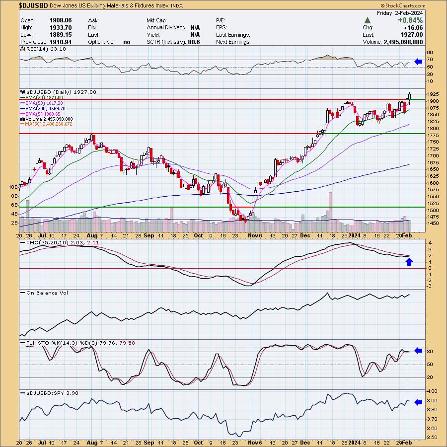
Industry Group to Watch: Building Materials ($DJUSBD)
I noticed while reviewing the Industry Groups within the Industrials sector that most are lined up to do well or are already doing well. I selected Building Materials primarily for the breakout, but the nearing PMO Crossover BUY Signal helped too. The RSI is positive and not overbought on this breakout move. Stochastics are almost back above 80 and look strong. Relative strength is also picking up for the group as a whole. A few symbols to consider from this area: BLDR, KNF and VMC.

Good Luck & Good Trading,
Erin
Learn more about DecisionPoint.com:
Watch the latest episode of the DecisionPointTrading Room on DP's YouTube channel here!

Try us out for two weeks with a trial subscription!
Use coupon code: DPTRIAL2 at checkout!
Technical Analysis is a windsock, not a crystal ball. --Carl Swenlin
(c) Copyright 2024 DecisionPoint.com
Disclaimer: This blog is for educational purposes only and should not be construed as financial advice. The ideas and strategies should never be used without first assessing your own personal and financial situation, or without consulting a financial professional. Any opinions expressed herein are solely those of the author, and do not in any way represent the views or opinions of any other person or entity.
DecisionPoint is not a registered investment advisor. Investment and trading decisions are solely your responsibility. DecisionPoint newsletters, blogs or website materials should NOT be interpreted as a recommendation or solicitation to buy or sell any security or to take any specific action.
Helpful DecisionPoint Links:
Trend Models
Price Momentum Oscillator (PMO)
On Balance Volume
Swenlin Trading Oscillators (STO-B and STO-V)
ITBM and ITVM
SCTR Ranking
Bear Market Rules
|
| READ ONLINE → |
|
|
|
| Don't Ignore This Chart! |
| Deciphering Gold's (GLD) Signals: Is Now the Time to Go Long on Gold? |
| by Karl Montevirgen |

The gold market saw a significant sell-off Friday morning, as unexpectedly strong job market data undermined investor hopes for imminent Federal Reserve rate cuts anytime soon. Of course, market conditions can change rapidly, and analysts' wide scattershot opinions on gold price targets in 2024 reflect this reality.
So far, the SPDR Gold Shares ETF (GLD), a proxy for the yellow metal, had a volatile run since bottoming out in October, but its uptrend remains intact. This is mainly due to its series of higher lows. But if you look at the highs, its momentum seems to have been stalling over the last three months, unable to close above its December high of $193.18. However, if you take a longer-term view, that resistance level (or "range") has held over the last four years.
Gold Prices Failing Four Times in Four Years!

CHART 1. WEEKLY CHART OF SPDR GOLD SHARES (GLD). Price has tried and failed to break above 195 over the last four years.Chart source: StockCharts.com. For educational purposes.
Analyst price targets for GLD in 2024 vary, ranging from between the low 180s to soaring past the $200 mark per share. Pinning down where it'll land is as murky as predicting the Fed's next move on slashing interest rates or forecasting when the BRICS might shake the US dollar from its global throne. But let's take a closer look at the near-term price action.
Gold (GLD) Price Today

CHART 2. DAILY CHART OF GLD. In a volatile and convoluted price environment, it helps to use volume, as well as support and resistance along with other indicators, to identify potential zones of "confluence" in a market's structure.Chart source: StockCharts.com. For educational purposes.
GLD's failure to challenge the November and December highs indicates that its uptrend may have shifted to a range-bound dynamic.
- When GLD bottomed out in October, note the significant shift from selling pressure to buying pressure on the Chaikin Money Flow.
- Peaking in mid-October, buying pressure has been steadily declining and is now in the negative, indicating that there may not be enough momentum to challenge, let alone close above, the November and December highs.
What You Should Look Out For if You're Bullish on GLD
If you're bullish on GLD, and if the pullback thesis is correct, what should you look out for?
- Note the largest bar on the Volume-by-Price indicator, which tells you that a large amount of trading occurred between $182.50 and $184.50.
- You can use this level to anticipate potential support, and you might want to set a price alert at $184.50 to alert you when the price has entered this range.
- The Volume-by-Price bar also coincides with May, June, and November resistance levels (see highest blue dotted line), the December swing low (see lower blue dotted line), and the 100-day simple moving average.
- You want the Stochastic Oscillator to get near or fall under the 20 line, signaling an oversold condition.
- Most importantly, you want to see a strong bounce upward with relatively high momentum and a CMF reading above the zero line before entering a long position.
Seasonality Warning
Seasonality is more of a contextualizing tool than a predictive tool. However, the historical consistency of the context can sometimes be predictive. If you're wondering how GLD might perform relative to the broader market, the seasonal picture gives a warning.

CHART 3. 10-YEAR SEASONAL PERFORMANCE OF GOLD VS S&P 500. For context's sake, note that GLD is entering into its weakest season months.
In short, GLD's strongest months, December and January, have passed. Look at the numbers at the bottom of the bars to see the 10-year average return of gold against the S&P 500 ($SPX). We're heading into a series of weak months, seasonally speaking. But again, this is context, not prediction. And given the volatile geopolitical situation, the conditions influencing gold prices can change on a dime.
How To Set a Technical Price Alert
Setting a technical alert at these support and resistance levels would be helpful as you weigh your potential entry points against any market developments that may influence your decision.
To access the Technical Alert Workbench, follow these steps:
- Log in to your StockCharts account.
- At the top of any page, click on Your Dashboard.
- Click the Alerts or the New button in the Your Alerts panel.
- Choose which type of alert you want to create from the Alert Type buttons at the top left. To create a price alert, select Price Alert as the alert type.
- Add GLD in the symbol box and set your price trigger.
- Choose how you wish to be notified and click the Save Alert button.
The Bottom Line
Friday's gold market nosedive, thanks to unexpectedly strong job data, dampened hopes for Fed rate cuts. Analysts have no clear consensus regarding price targets, as their predictions vary significantly. However, technical indicators can provide valuable insights in such situations. The Volume-by-Price indicator, alongside other indicators, suggests a reasonable means of locating potential support, which can be helpful to those looking to go long. However, it's crucial to consider the global context, as the monetary value and worldwide trading of gold can have long-term implications for its price.

Disclaimer: This blog is for educational purposes only and should not be construed as financial advice. The ideas and strategies should never be used without first assessing your own personal and financial situation, or without consulting a financial professional.
|
| READ ONLINE → |
|
|
|
| MORE ARTICLES → |
|


 Gold is not the most exciting asset at the moment, but it is in a long-term uptrend and perhaps the strongest commodity out there. There are also signs that the January decline is ending as RSI hits a momentum support zone and a bullish continuation pattern forms. Note that GLD was first highlighted in our