| THIS WEEK'S ARTICLES |
| The Mindful Investor |
| How Overextended Are You, QQQ? |
| by David Keller |
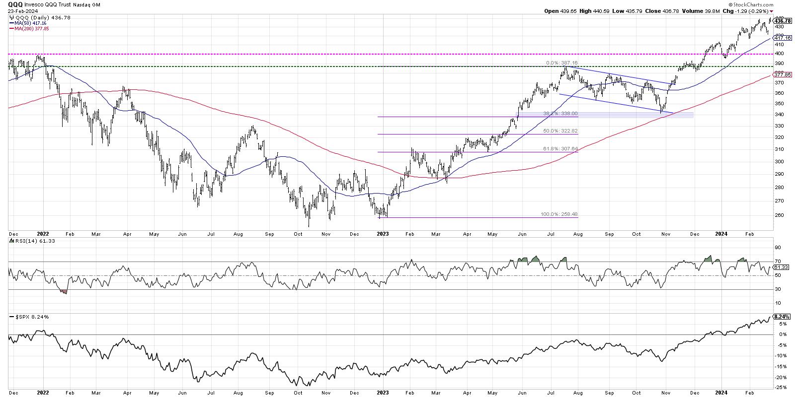
We've highlighted all the warning signs as this bull market phase has seemed to near an exhaustion point. We shared bearish market tells, including the dreaded Hindenburg Omen, and how leading growth stocks have been demonstrating questionable patterns. But despite all of those signs of market exhaustion, our growth-led benchmarks have been pounding even higher.
This week, Nvidia's blowout earnings report appeared to through gasoline on the fire of market euphoria, and the AI-fueled bullish frenzy appeared to be alive and well going into the weekend. As other areas of the equity markets have shown more constructive price behavior and volatility has remained fairly low, the question remains as to when and how this relentless market advance will finally meet its peak.
I would argue that the bearish implications of weaker breadth, along with bearish divergences and overbought conditions, still remain largely unchanged even after NVDA's earnings report. The seasonality charts for the S&P 500 confirm that March is in fact one of the weakest months in an election year. So will the Nasdaq 100 follow the normal seasonal pattern, or will the strength of the AI euphoria push this market to even further heights into Q2?
By the way, we conducted a similar exercise for the Nasdaq 100 back in November, and guess which scenario actually played out?
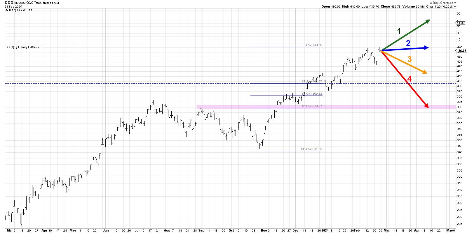
Today, we'll lay out four potential outcomes for the Nasdaq 100. As I share each of these four future paths, I'll describe the market conditions that would likely be involved, and I'll also share my estimated probability for each scenario. And remember, the point of this exercise is threefold:
- Consider all four potential future paths for the index, think about what would cause each scenario to unfold in terms of the macro drivers, and review what signals/patterns/indicators would confirm the scenario.
- Decide which scenario you feel is most likely, and why you think that's the case. Don't forget to drop me a comment and let me know your vote!
- Think about how each of the four scenarios would impact your current portfolio. How would you manage risk in each case? How and when would you take action to adapt to this new reality?
Let's start with the most optimistic scenario, involving even more all-time highs over the next six-to-eight weeks.
Option 1: The Very Bullish Scenario
The most optimistic scenario from here would mean the Nasdaq basically continues its current trajectory. That would mean another 7-10% gain into April, the QQQ would be threatening the $500 level, and leading growth stocks would continue to lead in a big way. Nvidia's strong earnings release fuels additional buying, and the market doesn't much care about what the Fed says at its March meeting because life is just that good.
In this very bullish scenario, value-oriented stocks, including Industrials, Energy, and Financials, would probably move higher in this scenario, but would still probably lag the growth leadership that would pound even higher.
Dave's Vote: 15%
Option 2: The Mildly Bullish Scenario
What if the market remains elevated, but the pace slows way down? This second scenario would mean that the Magnificent 7 stocks would take a big-time breather, and more of a leadership rotation begins to take place. Value stocks outperform as Industrials and Health Care stocks improve, but since the mega-cap growth names don't lose too much value, our benchmarks remain pretty close to current levels.
Dave's vote: 25%
Option 3: The Mildly Bearish Scenario
Both of the bearish scenarios would involve a pullback in leading growth names, and stocks like NVDA would quickly give back some of their recent gains. Perhaps some economic data comes in way stronger than expected, or inflation signals revert back higher, and the Fed starts reiterating the "higher for longer" approach to interest rates through 2024.
I would think of this mildly bearish scenario as meaning the QQQ remains above the first Fibonacci support level, just over $400. That level is based on the October 2023 low and also assumes that the Nasdaq doesn't get much higher than current levels before dropping a bit. We don't see defensive sectors like Utilities outperforming, but it's clear that stocks are taking a serious break from the AI mania of early 2024.
Dave's vote: 45%
Option 4: The Super Bearish Scenario
Now we get to the really scary option, where this week's upswing ends up being a blowoff rally, and stocks flip from bullish to bearish with a sudden and surprising strength. The QQQ drops about 10-15% from current levels and retests the price gap from November 2023, which would represent a 61.8% retracement of the recent upswing. Defensive sectors outperform and investors try to find safe havens as the market tracks its traditional seasonal pattern. Perhaps gold finally breaks above $2,000 per ounce, and investors start to talk about how a break below the October 2023 low may be just the beginning of a new bearish phase.
Dave's vote: 15%
What probabilities would you assign to each of these four scenarios? Check out the video below, and then drop a comment there for which scenario you select and why!
RR#6,
Dave
P.S. Ready to upgrade your investment process? Check out my free behavioral investing course!
David Keller, CMT
Chief Market Strategist
StockCharts.com
Disclaimer: This blog is for educational purposes only and should not be construed as financial advice. The ideas and strategies should never be used without first assessing your own personal and financial situation, or without consulting a financial professional.
The author does not have a position in mentioned securities at the time of publication. Any opinions expressed herein are solely those of the author and do not in any way represent the views or opinions of any other person or entity.
|
| READ ONLINE → |
|
|
|
| Martin Pring's Market Roundup |
| MEMBERS ONLY |
| Emerging Markets Getting Closer to a Breakout |
| by Martin Pring |
|
Last November I asked the question "Are emerging markets about to emerge?" Using the iShares MSCI Emerging Markets ETF (EEM) as our benchmark, I concluded that more strength was needed in order to push the indicators into a bullish mode...
|
| READ ONLINE → |
|
|
|
| Art's Charts |
| Capturing the Momentum Phenomenon - Nvidia vs Tesla |
| by Arthur Hill |
 The momentum phenomenon has been a fixture in the US equity markets for decades. There are two types of momentum to consider: absolute momentum and relative momentum. Absolute momentum refers to the underlying trend, up or down. Relative momentum quantifies the strength of the uptrend and compares it to other stocks in the index. A dual-momentum strategy uses both types of momentum to trade the strongest stocks in an index. Let's look at two examples. The momentum phenomenon has been a fixture in the US equity markets for decades. There are two types of momentum to consider: absolute momentum and relative momentum. Absolute momentum refers to the underlying trend, up or down. Relative momentum quantifies the strength of the uptrend and compares it to other stocks in the index. A dual-momentum strategy uses both types of momentum to trade the strongest stocks in an index. Let's look at two examples.
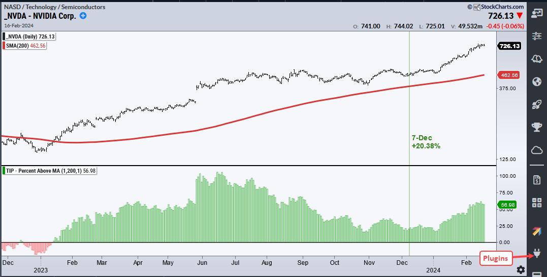
The chart below shows Nvidia (NVDA) with its 200-day SMA on the price chart and the Percent above MA (1,200,1) in the indicator window. NVDA moved above its 200-day SMA in January 2023 and remains well above this long-term trend indicator. Absolute momentum is bullish, which means the stock is in an uptrend.

We now need to quantify the strength of this uptrend. The indicator window shows the percentage difference between the close and the 200-day SMA. This indicator gives us a "number" we can use to measure the uptrend and compare performance. For example, the close was 20.38% above the 200-day SMA on December 7th. Percent Above MA is one of 11 indicators for the TIP Indicator Edge Plugin (here)
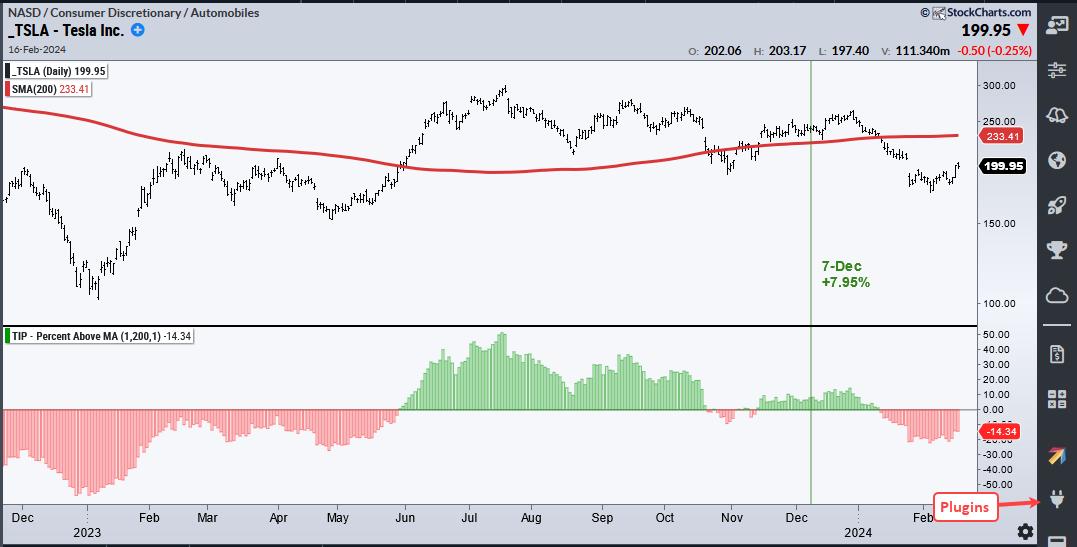
The next chart shows Tesla (TSLA) for a comparison. TSLA was also above its 200-day SMA on December 7th and in an uptrend (absolute momentum). Relative to NVDA, however, TSLA was not as strong because it was only 7.95% above its 200-day SMA.

I chose December 7th because that is when the Composite Breadth Model at TrendInvestorPro turned bullish and our momentum strategies became fully invested. We run Dual Momentum Rotation Strategies for Nasdaq 100 and S&P 500 stocks. Both strategies chose NVDA as one of the ten stocks for their respective portfolios.
These strategies performed very well from early December to mid February with big gains coming from AVGO, CRWD, PANW, LLY, META and NVDA. Like the broader market, these strategies are extended and ripe for a pullback (drawdown). I am not looking to time a pullback or drawdown, but would note that drawdowns can provide opportunities to enter strategies. Click here to learn more about our strategies and see detailed performance metrics.
/////////////////////////////////////////////
|
| READ ONLINE → |
|
|
|
| RRG Charts |
| SPY Uptrend Intact, But Mixed Sector Rotation Signals Hesitation |
| by Julius de Kempenaer |

BETA
One of the Risk ON/OFF metrics I like to keep an eye on is BETA.
From Investopedia:
Beta (β) is a measure of the volatility—or systematic risk—of a security or portfolio compared to the market as a whole (usually the S&P 500). Stocks with betas higher than 1.0 can be interpreted as more volatile than the S&P 500.
I have updated my spreadsheet with last year's data for this article. And I want to take a look at the current (sector) rotations with the BETA for each sector.
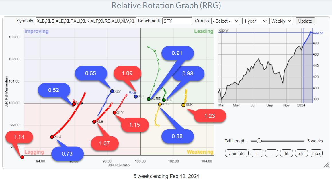
On the Relative Rotation Graph above, you will find the 12-month BETA values for all sectors.
Before diving into the sector rotation part, a quick look at the BETA values. As said the RRG at the top shows the 12-month BETA values.
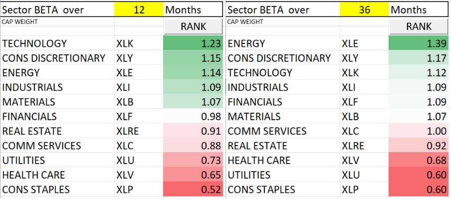
The tables below show 12- and 36-month BETAs side by side.

Note that there are only minimal position switches among sectors. There may be some significant differences in BETA values over time. Most notably, the energy sector which has a BETA of 1.39 over 36 months but "only" 1.14 over 12 months.
Nevertheless, the top three sectors did not change. The same goes for the bottom three sectors.
My expectation regarding rotations is that I would expect the high-BETA sectors to show strong rotations during strong periods for $SPX and strong rotations for low-BETA sectors during weak periods for $SPX.
No Dominance On Either Side
Looking at that RRG, I do not see a dominant direction for either high-BETA or low-BETA sectors as a group.
The highest BETA sector (1.23) has the highest reading on the RS-Ratio scale and just dropped into the weakening quadrant, while Energy (1.14) is deep inside, lagging but starting to curl back up. Discretionary (1.15) is clearly inside, lagging and heading further into that quadrant.
In the low-BETA group, we see Utilities (0.73) nose-diving deeper into the lagging quadrant, while Staples (0.52) is static at a low RS-Ratio reading. Health Care (0.65) is the exception here, with a strong trajectory into the improving quadrant at a strong RRG-Heading.
The RRG image is mixed, with no clear preference for either group.

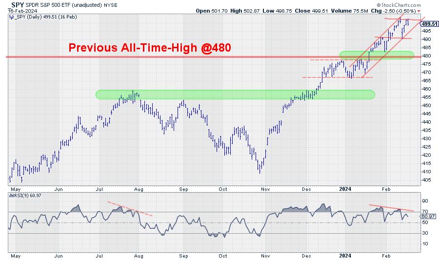
Bringing that observation to the SPY chart (daily) helps interpret the index's recent price action.
SPY Outlook
Breaking the previous all-time high (January 2022) was obviously a bullish sign. New ATHs are not a sign of bear markets, right?
And so was the rally that followed after the break. A regular rhythm of higher highs and higher lows took SPY to a new ATH at 503.50. Even the shock decline last Tuesday has not damaged this up-trend yet.
However, the mixed rotations on the RRG, combined with a negative divergence building up between SPY and its RSI, signal some hesitation. At least something to be aware of.
Downside risk seems limited, with the former resistance at 480 now expected to return as solid support in case of a decline.
Clearly, a push beyond 503.50 will again be a bullish signal for the market. On the downside, I am watching the lower boundary of the new short-term channel and the previous low at 490. Breaking these levels subsequently will very likely trigger a decline back to the breakout level near 480.
What happens there will be crucial for further development in the coming months.
For the time being, the uptrend is still intact, with limited near-term risk. (4-5%)
#StayAlert. --Julius
|
| READ ONLINE → |
|
|
|
| "Fill the Gap" with the CMT |
| Decoding 10-Year Treasury Yields: A Monthly/Secular Perspective Overview |
| by Stewart Taylor |
I begin each year by reviewing the long-term technical positions and behaviors of the "Big Four" — 10-year yields, S&P 500 ($SPX), Commodities, and the US Dollar. I believe that interest rates, particularly in a credit-dependent/leveraged system, generally drive economic and market cycles. And, since by profession I am a rates/credit portfolio manager, strategist, and trader, I always begin there.
Granted, a macro view doesn't often inform short-term trading, but anything that helps me understand the ebb and flow and interconnectedness of markets is helpful. More importantly, recognizing markets aligned for significant macro change can be invaluable, particularly in terms of risk management.
Since most good technical analysis is fractal, the same techniques used to describe the macro ebb and flow can often translate to shorter time frames. For the first two decades of my trading career, I kept a manual grid of the Big 4 plus a few other markets (gold, oil, 2-year Treasury, and so forth) that I updated hourly with price and the change from the prior hour. Doing so taught me a great deal about market interactions and interrelationships.
Monthly 10-Year Note Yield

CHART 1. MONTHLY CHART OF 10-YEAR TREASURY YIELDS Over the last four decades, bond yields had consistently and reliably made lower highs and lower lows. The entire bull market was defined by a broad declining channel (A–B, C–D). The A–B downtrend line represented the "stride of demand," or the zone where buyers consistently emerged, and the C–D line represented the "overbought line," or the zone where supply or sellers consistently emerged.
Take Note. Falling bond yields are synonymous with higher bond prices. In other words, a downtrend in yield = a bull market in bonds.
From 2012 forward, there were growing signs that the long downtrend was aging. Four things stood out.
- The repeated failure to push to the oversold line (C–D).
- The flattening out of the decline, where each push to a new yield low only covered around 100 bps.
- The 2018 spike to 3.24% that weakened the primary A-B downtrend.
- The bond push to the area around the center of the channel, and failure to push beyond the midline, much less into the overbought line (C–D), in March 2020. This change of behavior strongly suggested that demand was tiring. Multiple visible changes in behavior strongly suggested that the 40-year downtrend was in danger of terminating.
The clear break and acceleration above the A–B downtrend have moved the long trend from bullish to neutral. While it's likely that the move above the November 2018 pivot at 3.24%, coupled with the prior behavior changes, mark the beginning of a long-term bear market, a higher low (perhaps forming in 2024) is needed to complete/confirm that change.
Note the additional changes in behavior. The 459 bps move from 0.39% to 4.98% represents the single largest bearish move since the inception of the bull market in September 1981, and the MACD oscillator level far exceeded the levels that marked yield highs throughout the entire bull market.
10-Year Yield Monthly With MACD
After producing the most overbought reading since the 1980s, the oscillator is trying to roll over and is displaying a small negative divergence (suggesting lower yields and higher price). While not a definitive roll, it suggests that there is some potential for a meaningful turn.

CHART 2. MONTHLY CHART OF 10-YEAR NOTE YIELD.
10-Year Yield Weekly
With this next chart, I will work with the weekly perspective, five and ten-year charts, and yield curves.

CHART 3. WEEKLY CHART OF 10-YEAR YIELD.
The following are several key fundamental points around rates:
- The defining macro characteristic of the 40-year bull market has been the continual fall in the inflation rate. If that is changing (I believe it has), the secular bond trend is likely also to change.
- If the trend in inflation changes, the negative correlation between bonds and equity that drives 60/40 allocation and risk parity investing is likely to flip and become positive. In other words, bonds and equity would, outside of periods of panic or economic distress, rise and fall together, destroying the diversification benefit. This has been the historical norm, and I expect the market to move in that direction gradually.
- The caveat: Quantitative easing removed the value proposition from bonds; when equities began to decline in 2022, bonds couldn't provide a safe haven. They were already far too expensive, particularly in the context of a Federal Reserve aggressively tightening monetary policy. That is no longer the case. Bonds, while still expensive, can again provide a tactical hedge should risk assets or the economy weaken dramatically.
- At first glance, this seems at odds with the change in correlation discussed above, but it is a difference between the secular tide versus the intermediate wave.
- Most substantive bond rallies result from a crisis that creates a flight-to-quality. In an overly financialized and levered economy, rising rates often break the weakest link in the economic chain, creating a new crisis and a subsequent flight-to-quality rally. While there is little evidence of a systemic crisis, the lagged effect of the rapid increase in rates in an overly financialized system must be top of mind.
The Bottom Line
While there is still more work to be done to confirm the trend change, I believe the bond trend is finally changing, as the world moves from the deflationary backdrop of the last several decades to an inflationary backdrop. I will be a much better seller of rallies and bearish technical setups in the weekly/intermediate perspective.
Disclaimer: Shared content and posted charts are intended to be used for informational and educational purposes only. The CMT Association does not offer, and this information shall not be understood or construed as, financial advice or investment recommendations. The information provided is not a substitute for advice from an investment professional. The CMT Association does not accept liability for any financial loss or damage our audience may incur.
|
| READ ONLINE → |
|
|
|
| ChartWatchers |
| S&P 500's Sensational Rally Keeps On Going Thanks to NVDA — What You Need to Watch |
| by Jayanthi Gopalakrishnan |

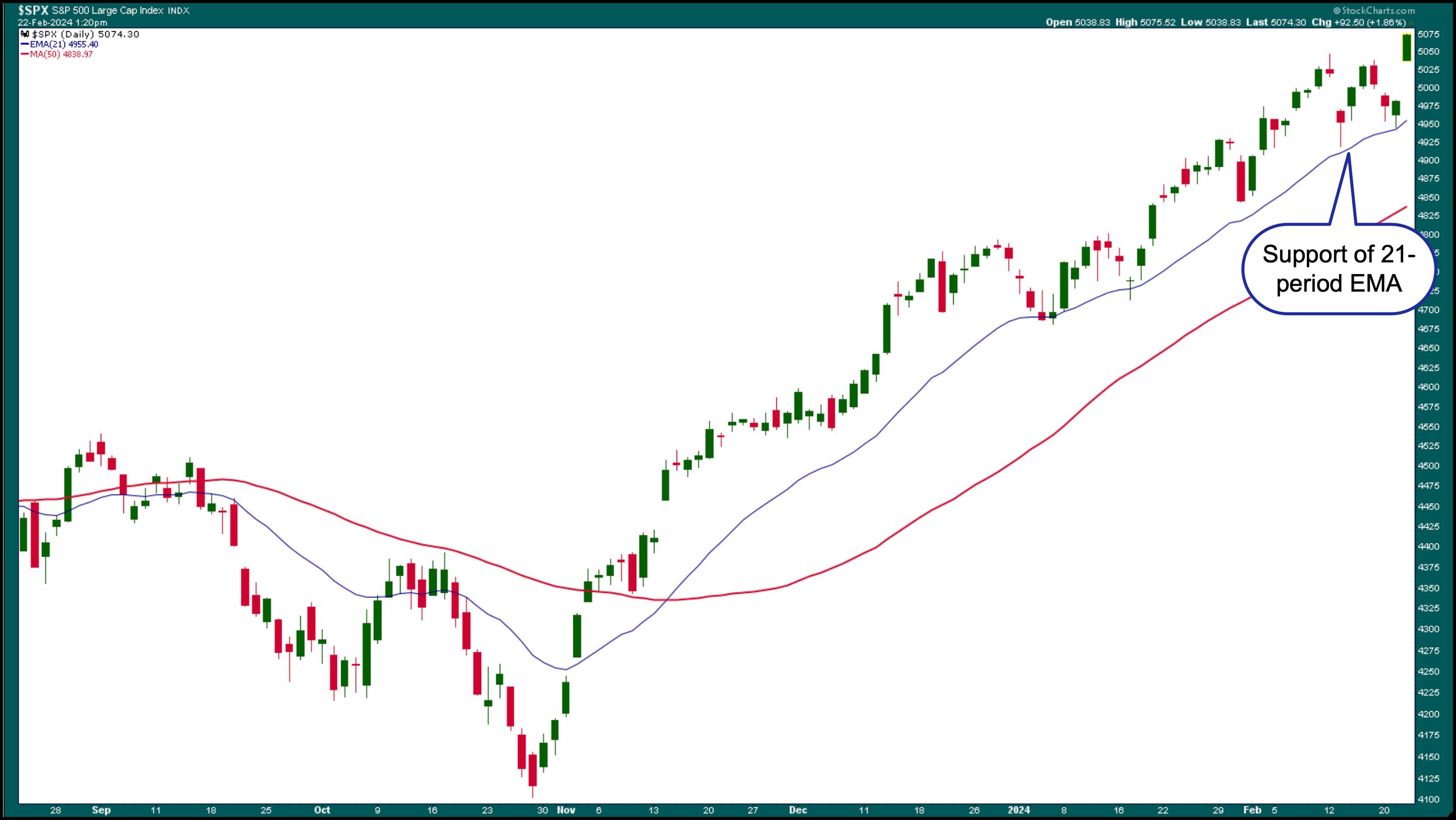
Well, Nvidia did it! A stellar earnings report from NVDA brought back optimism in the stock market. When a stock rises around 15% (for NVDA, that's about a $100 rise in its price), it's an indication that investors still have tons of optimism. Equity futures were up ahead of the open on Thursday. The S&P 500 ($PX) gapped up, hitting a new all-time high. Looking at the daily chart of the S&P 500, the index has bounced off its 21-day exponential moving average (EMA) a few times since the beginning of its steep rally in November 2023.

CHART 1. DAILY CHART OF THE S&P 500 ($SPX) INDEX. From November 2023, the index has been holding on to the support of its 21-day exponential moving average as it keeps hitting new highs.Chart source: StockCharts.com. For educational purposes.
Consider the 21-day EMA as a first support level. If the EMA support holds, you can consider the market in a bull rally. NVDA's strong guidance for the next two years shook off all investor worries. It almost seems that interest rate cuts are no longer front and center of investors' minds. Even Thursday's higher-than-estimated jobless claims number didn't sway investor optimism. The worries will likely surface if the S&P 500 breaks below the 21-day EMA, at which time you'd have to look for that next support level, which could be the 50-day simple moving average.
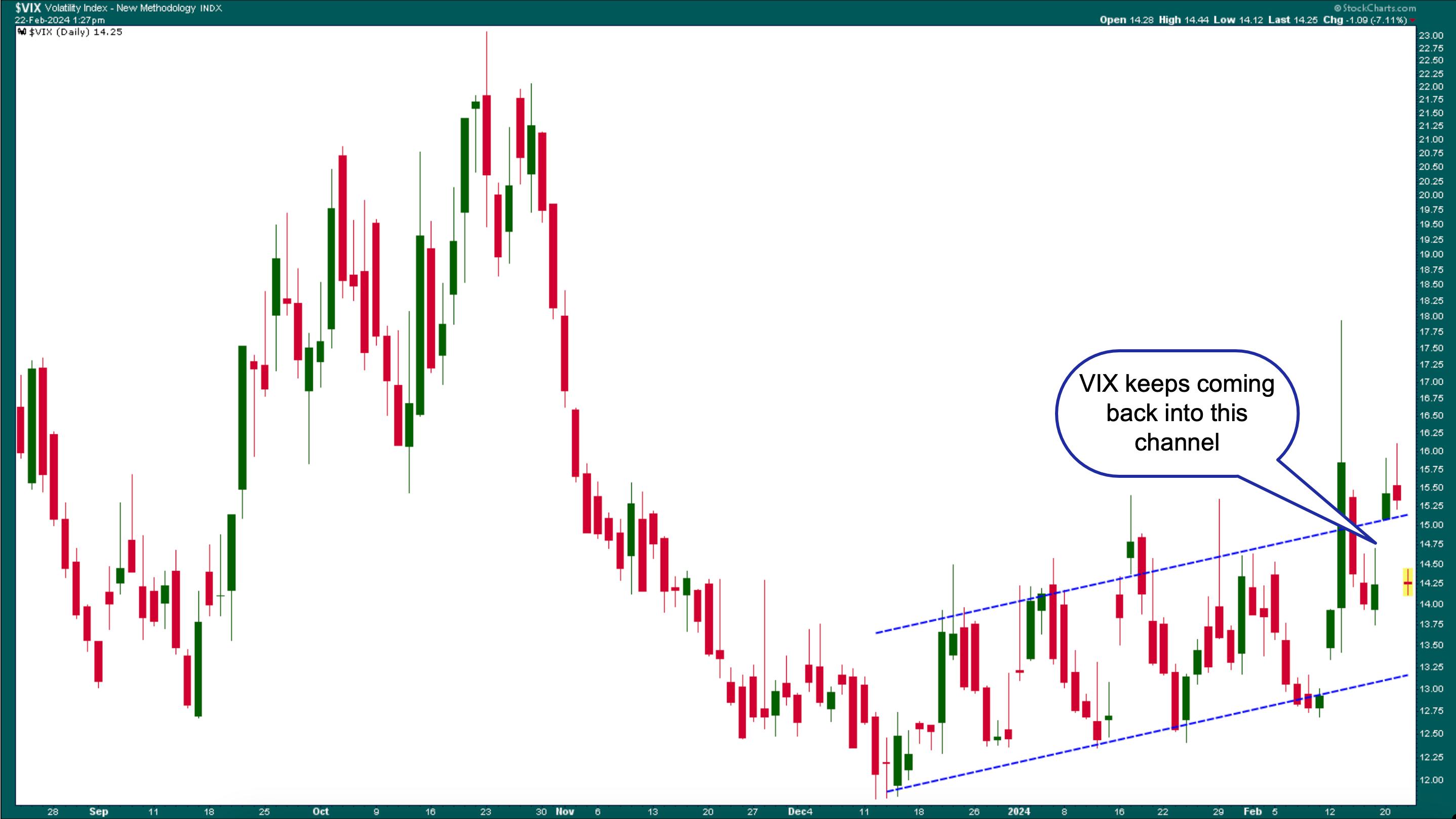
The CBOE Volatility Index ($VIX) slowly rose and gapped lower on Thursday. The VIX has shown some exciting movement in the last few months, with wide-ranging days and lots of up-and-down movement.

CHART 2. DAILY CHART OF THE CBOE VOLATILITY INDEX ($VIX). The VIX has had some wide-ranging days, with many up-and-down movements that appear to be moving within an upward channel.Chart source: StockCharts.com. For educational purposes.
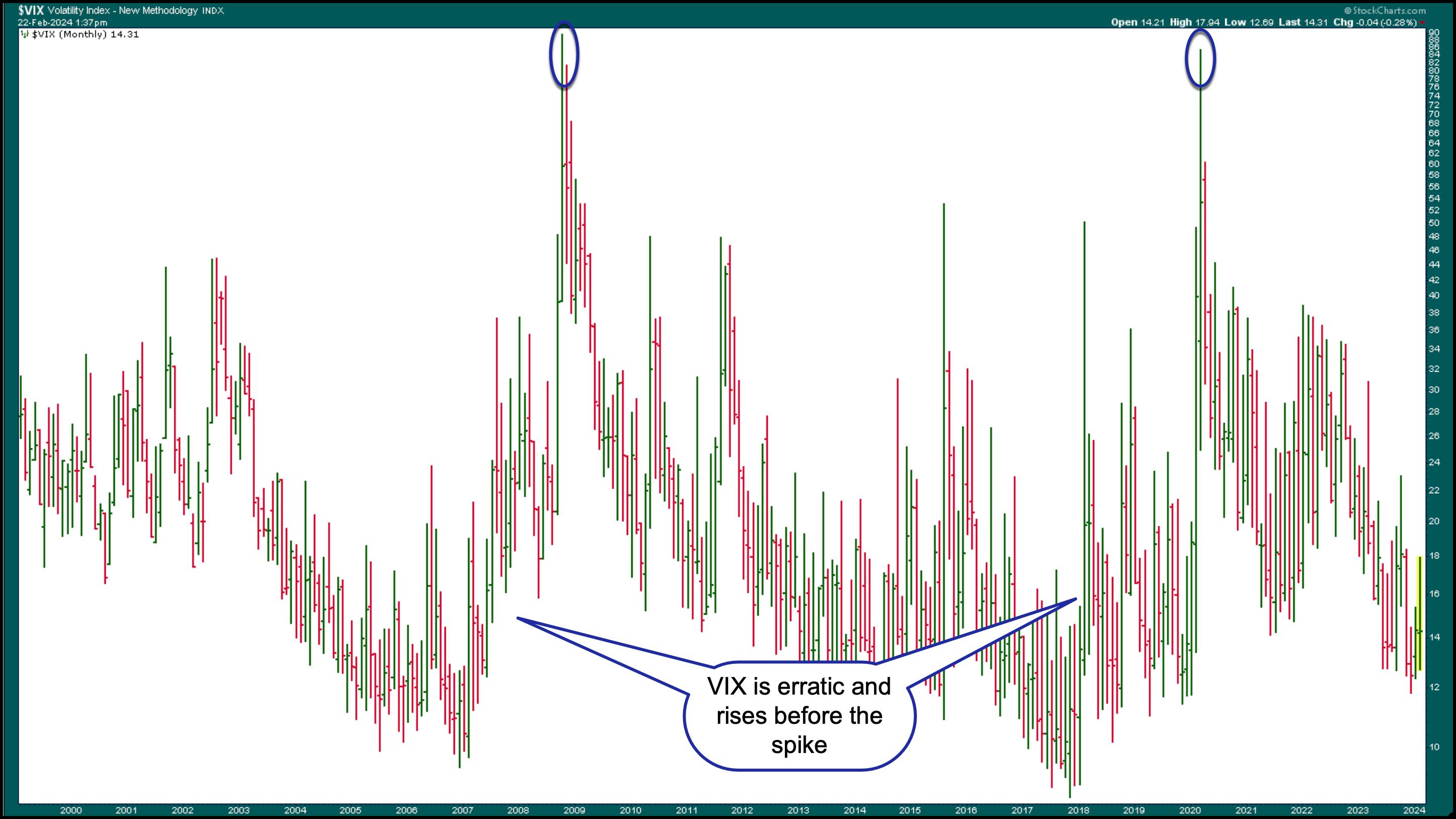
The slightly upward trending move in the VIX is not evident when you look at a longer-term chart of the VIX. When you view a monthly chart from 2000, before the most recent spikes—the Great Recession in 2008 and the COVID Crash in 2020—the VIX was much more volatile than it is now. Note that it rose before spiking >80. There are no similar signs of that right now, but watching the VIX regularly is always a good idea, as it can tell plenty about investor sentiment and send warning signs before a crash.

CHART 3. MONTHLY CHART OF VIX FROM 2000. Note the erratic movements in the VIX before the spikes; it also starts rising before the spike. These are two main reasons to keep an eye on the VIX.Chart source: StockCharts.com. For educational purposes.
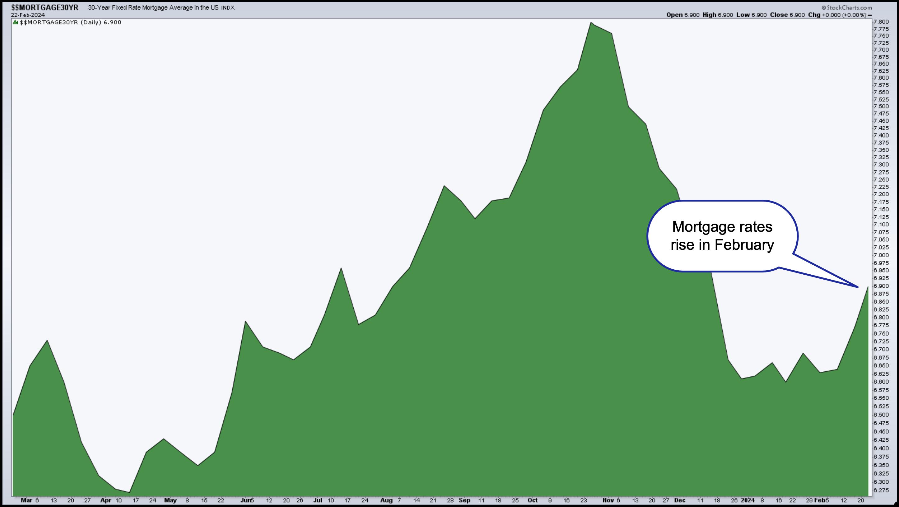
In other news, existing home sales in January rose, another sign the economy is still healthy. One month's data doesn't make a trend and, given that mortgage rates have risen, there may be a decline in February's number. Or maybe not. The chart below of the US 30-year Fixed Rate Mortgage shows a slight increase in mortgage rates in February.

CHART 4. 30-YEAR FIXED-RTE MORTGAGE AVERAGE IN THE US. After a sharp decline, mortgage rates rose in February. Will this rise have an impact on home sales?Chart source: StockCharts.com. For educational purposes.
The Bottom Line
Equities are the favorite among investors and will likely remain this way as long as AI continues to excite investors. And if NVDA continues to rise the way it has this year, the S&P 500 will ride along with it.

Disclaimer: This blog is for educational purposes only and should not be construed as financial advice. The ideas and strategies should never be used without first assessing your own personal and financial situation, or without consulting a financial professional.
|
| READ ONLINE → |
|
|
|
| ChartWatchers |
| Is Energy About to Undergo a Strong Seasonal Sector Surge? |
| by Karl Montevirgen |

When we think about sector rotation, we think about fundamentally-based forecasts linked to the stages of the economic cycle (i.e. business cycle). In contrast, when we think of seasonality forecasts, we think of a technically-based context defined by average historical price performance, typically on a monthly basis.
Combining both approaches might be an effective way to identify near-term trading opportunities. In short, you'd be looking for sectors which analysts expect to perform well in the coming months, while drilling down on a sector's seasonality patterns to anticipate historically strong months which may be tradable. Finally, you'd check these projections against the current price action to see whether the technicals are favorable for trading.
Sectors with the Strongest Near-Term Seasonal Performance
Using the SPDR Select Sector ETFs as sector proxies, the three sectors with the strongest seasonal performance in the near term are Energy Select Sector SPDR Fund (XLE), Utilities Select Sector SPDR Fund (XLU), and Materials Select Sector SPDR Fund (XLB).
In terms of fundamentals, all three are expected to see growth in 2024. Energy faces volatility driven by geopolitical and renewable energy transitions, while the utilities sector is seen as a more stable investment, with a focus on renewables and infrastructure. The materials sector could witness growth, benefiting from favorable supply-demand dynamics, anticipated interest rate changes, and attractive valuations.
Seasonal Performance vs. the S&P 500
When you're making investing or trading decisions based on seasonality patterns, it's always a good idea to check an asset's seasonal performance against the broader market. Even if an asset (or, in our case, a sector) performs well in a given month based on its own history, that might not mean much if it underperforms the S&P 500. You're facing an opportunity cost in which you might benefit from trading another asset.
XLE, XLU, and XLB all have strong 10-year seasonal performance in April, which is coming up soon. Let's take a broader look at their performances and compare it with the broader market (see table below).

Looking at the stats above, XLE is the strongest performer. While XLB's average return is higher than XLU, when compared with the S&P 500, XLB underperforms XLU. Let's focus on the top performer, XLE.
XLE's Seasonality Profile
Using StockCharts' Seasonality Profile chart, let's take a closer look at XLE's 10-year performance.

CHART 1. XLE'S 10-YEAR SEASONALITY PROFILE. Just because a given month has a higher close percentage doesn't mean it's a favorable month to trade. You have to look at its average return (bottom of the bar) and compare both figures across all other months. Chart source: StockCharts.com. For educational purposes.
While XLE has a higher-close rate of 67% in both March and April over a 10-year period, its average return in April (6.1%) far exceeds the average negative return (-1.2%) in March. April is XLE's strongest seasonal month.
But what do these stats mean when compared with the S&P 500? Does it outperform or underperform the broader market?

CHART 2. XLE'S 10-YEAR SEASONAL PERFORMANCE COMPARED WITH THE S&P 500. When you view seasonality using relative performance, things can sometimes change drastically. In the case of XLE, March is still weak, April is still its strongest month, and the higher close rate in April is the same compared to the S&P 500.Chart source: StockCharts.com. For educational purposes.
Looking at XLE's relative seasonal performance against the broader market, you can see that it outperforms the S&P 500 in the month of April (4.2%) while maintaining its 67% rate of higher closes.
Is XLE's March Weakness a Setup for an April Surge?
Looking at a daily chart of XLE, you can see that it has been trading sideways since the middle of October.

CHART 3. DAILY CHART OF XLE. All indicators on the chart serve a purpose in terms of support and confluence: gauging momentum, buying pressure, and identifying a potential support range. Chart source: StockCharts.com. For educational purposes.
While prices have surged, XLE also closed above the upper Bollinger Band® earlier in the week. A close above the band (2nd standard deviation) signals a strong potential for prices to decline, possibly toward the middle band.
There's also a bearish divergence in the Stochastic Oscillator (see blue dashed line), which has declined while still giving an overbought signal. Both signals indicate the likelihood that XLE may be dipping soon.

On the bullish side, you can also see from the Chaikin Money Flow (CMF) that buying pressure has ramped up and is still far above the zero line. Meanwhile, an Ichimoku Cloud is plotted in the chart to provide some trend context (which is slightly bullish) and a possible range for support.
So, if you're bullish on XLE and agree with the seasonal March weakness and April strength thesis, you'd probably wait for prices to fall between $83 and $84 in the coming month. Set a price alert at $85 to alert you to a potential trade.
The $83 to $84 level would coincide with the lower or middle Bollinger Band (if prices decline) and the cloud itself (the space between Senkou Span A and Senkou Span B). Preferably, you'd see a decline in the Stochastic Oscillator while the buying pressure on the CMF maintains itself above the zero line. Next, you'd look for an upward reversal on strong momentum before deciding where, exactly, to place your buy stop (there are many ways to determine this, and it depends on your trading methodology).
The Bottom Line: The Challenge of Using Seasonality Profiles
StockCharts' Grayson Roze, in his video explaining how to use the company's seasonality charts, makes it clear that seasonality is an effective tool for contextualization. This means that you already have a trade idea, and you use its seasonality profile to gain more information that may help you evaluate the odds of your trading thesis.
However, starting with the seasonality chart to generate trading ideas can prove more challenging and problematic when the technicals don't suggest an immediate trading opportunity. Nevertheless, if seasonal consistency takes place, you've potentially unlocked an opportunity that other traders might not have expected.
Sectors rotate on a long-term basis in relation to the business cycle and on a short-term basis in relation to the intra-year supply/demand situation of the businesses they comprise. So, there may be an adequate reason to trade sectors on a short-term basis in response to their seasonal demand.
It may be difficult to decipher at times. Still, if a seasonality reading gives you an edge in anticipating a potential near-term move, it might be well worth the small effort it takes to analyze its seasonality profile.
How to Access the StockCharts Seasonality Tool
There are different ways to access the seasonality tool in StockCharts.
- Click the Charts & Tools tab at the top of the StockCharts page, enter a symbol in the Seasonality panel, and click "Go."
- Enter the symbol in the ChartBar at the top of the page and select "Seasonality" from the dropdown menu on the left.
- From Your Dashboard, in Member Tools, click on Seasonality.
- Below the seasonality chart, you'll find links to instructions and quick tips that give more detailed instructions.
Disclaimer: This blog is for educational purposes only and should not be construed as financial advice. The ideas and strategies should never be used without first assessing your own personal and financial situation, or without consulting a financial professional.
|
| READ ONLINE → |
|
|
|
| MORE ARTICLES → |
|


 The momentum phenomenon has been a fixture in the US equity markets for decades. There are two types of momentum to consider: absolute momentum and relative momentum. Absolute momentum refers to the underlying trend, up or down. Relative momentum quantifies the strength of the uptrend and compares it to other stocks in the index. A dual-momentum strategy uses both types of momentum to trade the strongest stocks in an index. Let's look at two examples.