| THIS WEEK'S ARTICLES |
| The Mindful Investor w/ David Keller, CMT |
| Three Market Sentiment Indicators Confirm Bearish Phase |
| by David Keller |
While the S&P 500 and Nasdaq experienced a decent upside bounce this week, they still remain down 3.2% and 4.4% respectively for the month of August. A quick review of market sentiment indicators tells me that further downside is much more likely before a sustainable recovery becomes a real possibility.
VIX Signals Extreme Volatility
The VIX hit 65 on an intraday basis this week, representing the third highest reading since the Great Financial Crisis in 2008. In fact, the indicator has only pushed above 40 a handful of times in the last ten years, usually during a significant corrective period.
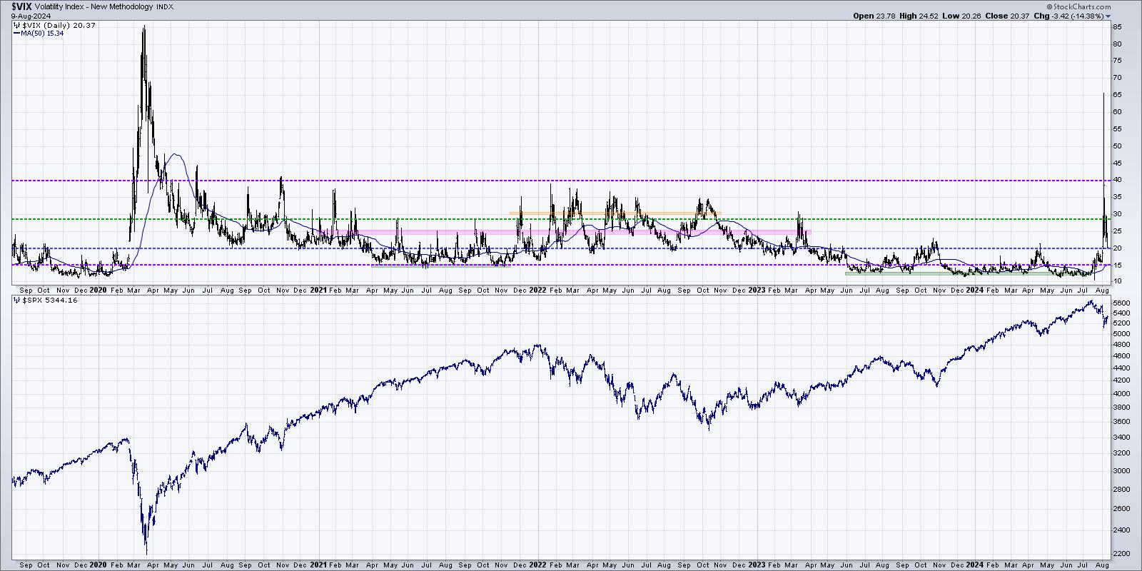
While there is plenty of debate about how 0DTE options have impacted this classic sentiment gauge, it's worth noting that any spike in the VIX has almost always coincided with weaker price action, at least in the short-term. So as long as the VIX remains above 20, investors should brace for a noisy tape and, most likely, further deterioration for equity indexes.
AAII Survey Shows Bulls Still Outnumber Bears
Our second indicator uses the weekly survey results from members of the American Association of Individual Investors (AAII). I tend to look for two main signals here, the first being a bullish reading of over 50%. The chart shows how this occurred in early July.
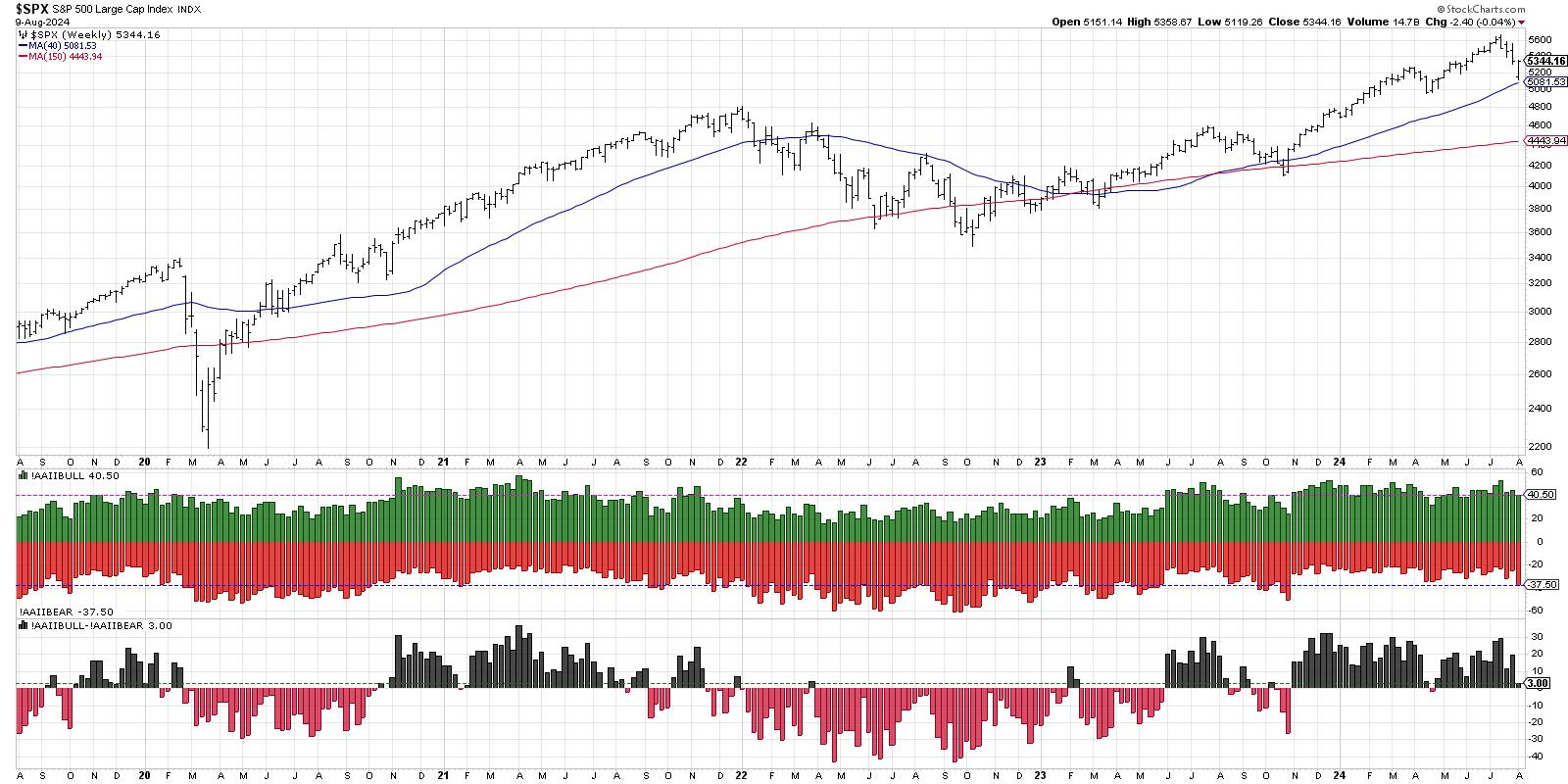
Now a high bullish reading on its own just represents extreme optimism, but it also tells me to look for signs of a bearish rotation. In the last three weeks, we've seen the bullish percent come down to around 41%, while the bearish reading has increased to above 38%. As the bottom panel shows, the last time that bears outnumbered bulls in the survey was at the April market low. You may also notice that more protracted market declines also started with a rotation from bullish to bearish sentiment. This chart tells me to consider the market "guilty until proven innocent", especially if the survey results show a higher bearish reading in the coming weeks.
NAAIM Exposure Index Confirms Defensive Rotation
What about the "smart money" as represented by money managers? The NAAIM Exposure Index shows the results of a weekly survey of the National Association of Active Investment Managers, with the number representing an average allocation to equities in their client portfolios. When the indicator is above 100%, as it was in late June, it suggests a euphoric reading and a higher likelihood of corrective market action.
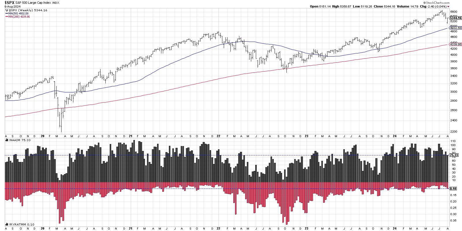
It's worth noting here that the NAAIM Exposure Index was pushing lower in early July, while the AAII survey was still reading a very high level of bullishness. This suggests that the "smart money" was already lightening up equity exposure before the market decline really began to accelerate. Now, we see the indicator has come down to around 75%, confirming that money managers in this survey are finding elsewhere to park their capital to weather this period of market turbulence.
I consider an analysis of price action as the most important piece of a well-defined technical analysis process. But I also feel that market sentiment indicators can provide an excellent window into the mindset of other investors, helping to clarify when extreme optimism or pessimism may be taking hold. This analysis of three comment sentiment indicators shows remarkable similarities to previous bear phases, and tells me to brace for a potential further decline for stocks.
RR#6,
Dave
P.S. Ready to upgrade your investment process? Check out my free behavioral investing course!
David Keller, CMT
Chief Market Strategist
StockCharts.com
Disclaimer: This blog is for educational purposes only and should not be construed as financial advice. The ideas and strategies should never be used without first assessing your own personal and financial situation, or without consulting a financial professional.
The author does not have a position in mentioned securities at the time of publication. Any opinions expressed herein are solely those of the author and do not in any way represent the views or opinions of any other person or entity.
|
| READ ONLINE → |
|
|
|
| Larry Williams Focus On Stocks |
| MEMBERS ONLY |
| When Does This Selloff End? |
| by Larry Williams |
|
In my last newsletter, I discussed cycle projections for the S&P 500, i.e., a rally and then down into a mid-September low. The recent price action in the stock market may have many of you wondering when to open long equity positions...
|
| READ ONLINE → |
|
|
|
| ChartWatchers |
| S&P 500 Teetering On 100-Day Moving Average Support |
| by Jayanthi Gopalakrishnan |

A sigh of relief? The US stock market started the week on a pessimistic note, but changed course toward the end of the week, ending in a more positive tone.
Last week's weaker-than-expected jobs report scared investors into thinking that perhaps the Federal Reserve was too late in cutting interest rates. However, last week's ISM Services report and Thursday's jobless claims eased those concerns.
Stock Market Indexes Are Better, Technically
While the charts of the S&P 500 ($SPX), Dow Jones Industrial Average ($INDU), and the Nasdaq Composite ($COMPQ) are showing signs of strength, it's too early to declare that it's beginning to rally to the upside. Let's analyze the charts of all three indexes in more detail and see where they stand.
The Mega-Cap S&P 500 Index
The S&P 500 held the support of its 100-day simple moving average (SMA) and its 50% Fibonacci retracement (from the April low to July high). While the S&P 500 looks like it's trying to move higher (see chart below), the next resistance level isn't too far off. The 38.2% Fib retracement at 5400 was a support level for some previous lows. If the S&P 500 reaches that level, the August 2 gap will be filled.
Until the index breaks above the 5400 level, you can't call this week's price action a bullish rally. All the more reason to watch the price action in the S&P 500.
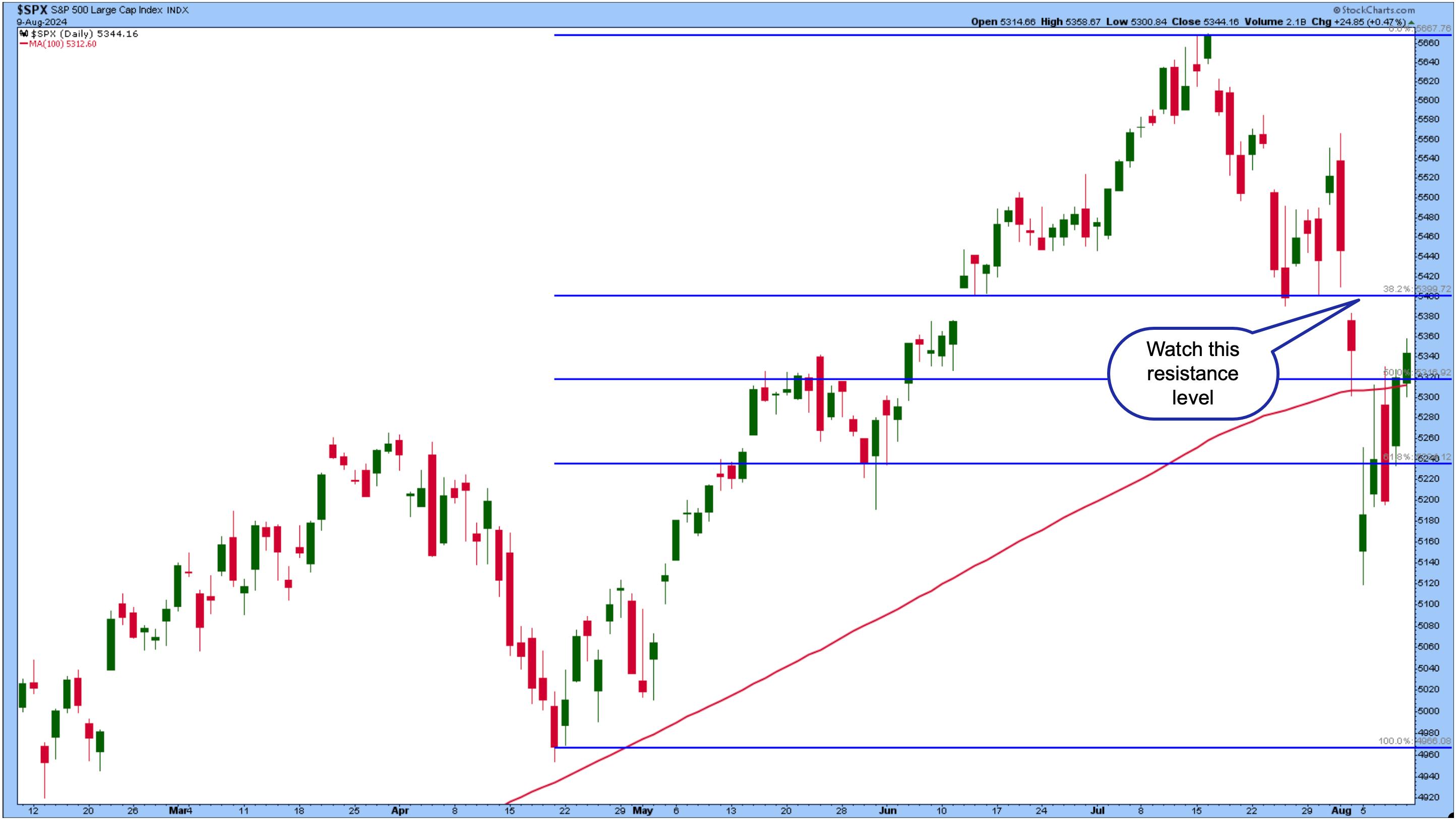
CHART 1. DAILY CHART OF THE S&P 500. The index ended the week closing above its 100-day moving average and its 50% Fibonacci retracement level, but it's too early to call this a bullish move.Chart source: StockCharts.com. For educational purposes.
Tech-Heavy Nasdaq Composite
The Nasdaq Composite is also improving, but hasn't reached the ranks of the S&P 500. From a technical standpoint, the Nasdaq Composite is approaching its 100-day SMA and 50% Fibonacci retracement level (from April lows to July high), which could act as a resistance level (see chart below). Looking back, you can see that level was a resistance and support level in the past.
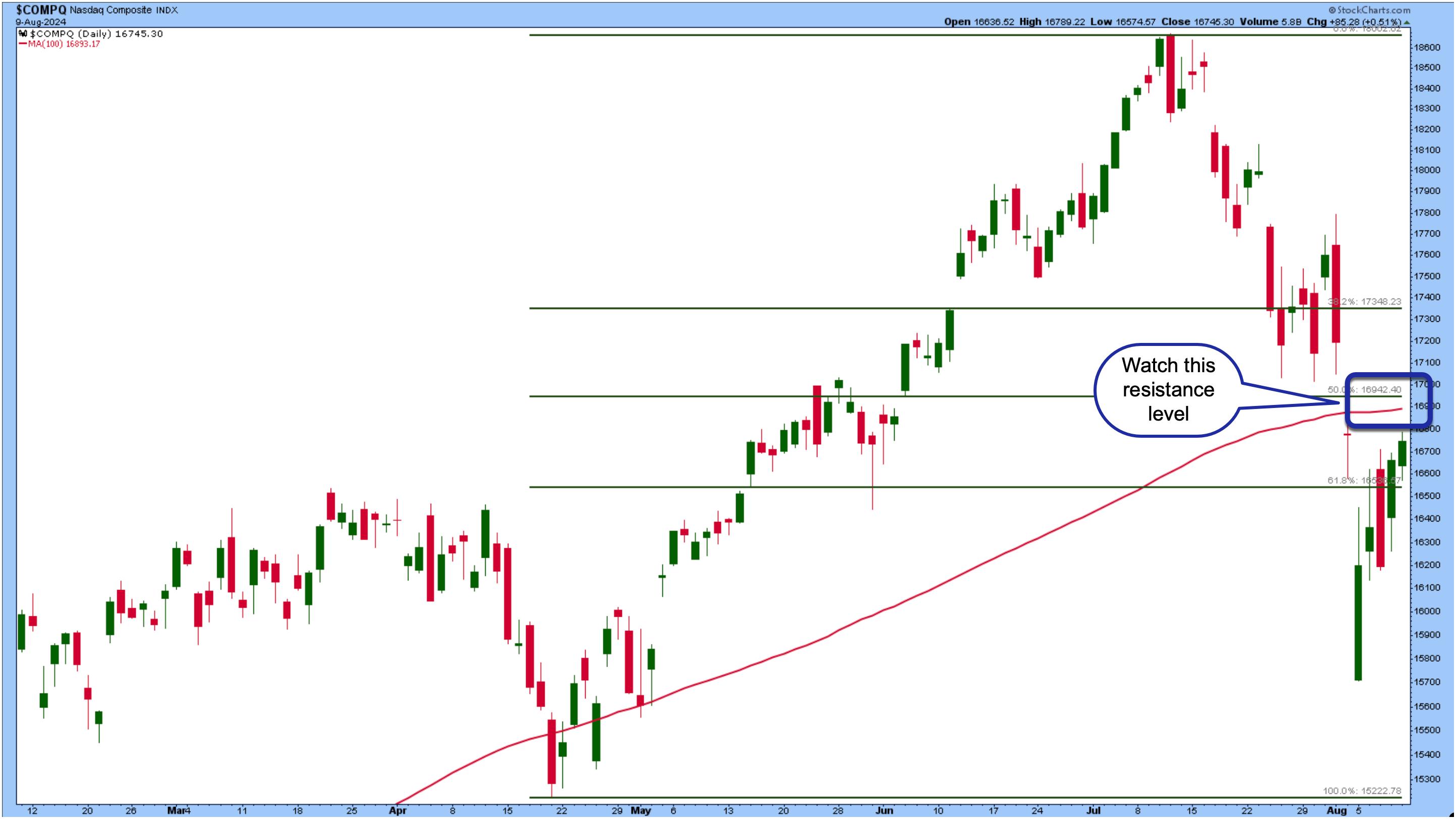
CHART 2. DAILY CHART OF NASDAQ COMPOSITE. Watch the resistance level that's close by. Will the index break through this level, or will it be a resistance level that it'll have a tough time pushing through?Chart source: StockCharts.com. For educational purposes.
The Dow Jones Industrial Average differs slightly from the S&P 500 and Nasdaq, but also looks better technically (see chart below). It peaked on July 18, declined a few days later, and tried to reach the previous peak.
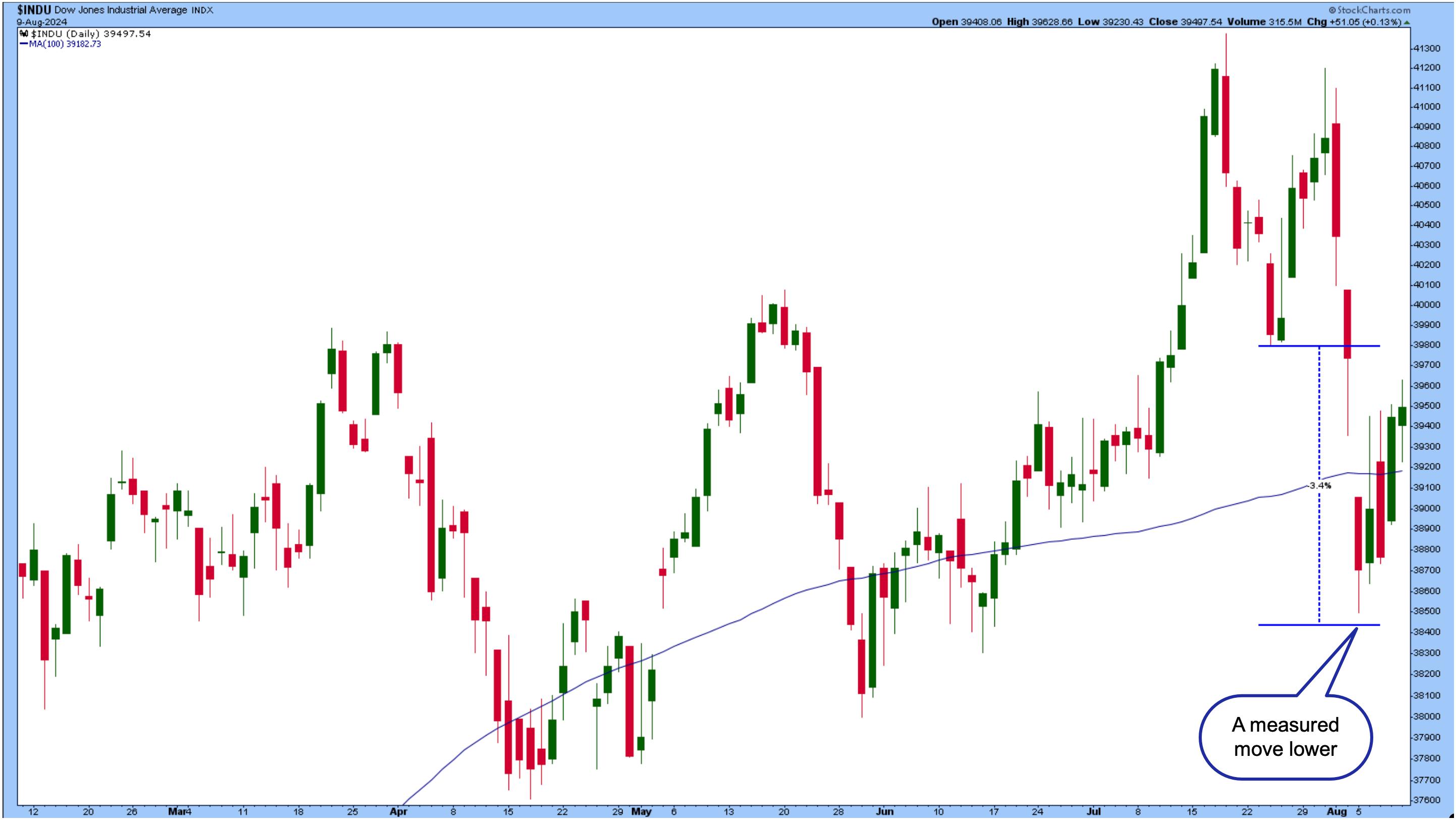
The price action is almost like a double top pattern. What's interesting is that the index almost reached its measured move lower. The measured move from the July 18 high to July 24 trough was 3.4%. From the chart below, you can see that a 3.4% decline from the July 24 low would bring the index to 38,438. The Dow went as low as 38,499 before moving higher.
Overall, it seems that equities are trying to recover. But will the recovery be sustained?
Recession worries may be in the rearview mirror for a while, but investors continue to walk a fine line. On Monday, the CBOE Volatility Index ($VIX) went as high as 65.73. The last time we saw those levels was in March 2020, when COVID was a concern.
Volatility has come down significantly, but is still above 20. It's too early to say the market is done with fear; we've only started to see a change. Remember, it was just a few days ago when the stock market saw an excessive selloff. Next week, there are important reports on consumer and producer inflation, retail sales, and consumer sentiment.
Inflation Data: What To Know
With rate cut expectations on the radar, you'll want to stay on top of next week's inflation data. The Federal Reserve Bank of Cleveland estimates a year-over-year percent change of 3.01% for headline CPI and 3.33% for Core CPI. If the data shows that inflation is coming down as it has been in the last few months, investors could sigh a huge relief. Conversely, if the data comes in hotter than expected, it could throw things off. But that's unlikely since a rate cut in September is very probable. That's not to say it's not possible, though.
Watch the price action in bonds ahead of the US inflation data. Bond prices showed signs of leaving the start line but have retreated. The daily chart of the iShares 20+ Year Treasury Bond ETF TLT below shows the ETF bounced off a support level.
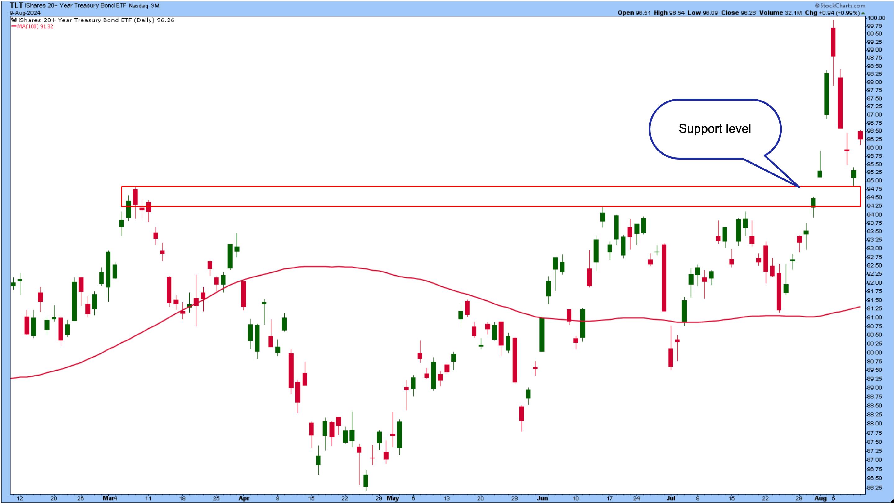
Which direction will TLT move? If the inflation data supports a September rate cut, then TLT will move higher, possibly before the report is released.
Another note is that the CME FedWatch Tool shows the probability of a 50 basis point rate cut in September at 49.5. That's a significant drop from the end of last week, when the probability was close to 90%.
Closing Position
Proceed with caution. We've seen how quickly the market can change direction. Any piece of negative data could send volatility through the roof again. The stock market is hanging on, and the best you can do is note the important support levels in the broader indexes, sectors, and individual equities. If equities can hang on next week, they'll be on more solid footing. Right now, you need to have a safety net close by.
End-of-Week Wrap-Up

- S&P 500 closed down 0.04% for the week, at 5344.16, Dow Jones Industrial Average down 0.60% for the week at 39,497.54; Nasdaq Composite closed down 0.18% for the week at 16745.30
- $VIX down 12.91% for the week closing at 20.37
- Best performing sector for the week: Industrials
- Worst performing sector for the week: Materials
- Top 5 Large Cap SCTR stocks: Insmed Inc. (INSM); Carvana Co. (CVNA); FTAI Aviation Ltd. (FTAI); Sprouts Farmers Market (SFM); SharkNinja, Inc. (SN)
On the Radar Next Week
- July Producer Price Index (PPI)
- July Consumer Price Index (CPI)
- July Retail Sales
- August Michigan Consumer Sentiment
- July Housing Starts
- Fed speeches from Bostic, Harker, Musalem, Goolsbee,
- Earnings from Walmart (WMT), Cisco Systems (CSC), Home Depot (HD), among others.
Disclaimer: This blog is for educational purposes only and should not be construed as financial advice. The ideas and strategies should never be used without first assessing your own personal and financial situation, or without consulting a financial professional.
|
| READ ONLINE → |
|
|
|
| Martin Pring's Market Roundup |
| MEMBERS ONLY |
| The Great Rotation: Not What You Think |
| by Martin Pring |
|
Just so we are on the same page, I looked up "Great Rotation" on Microsoft's Copilot and came away with this definition: ... a rotation out of big U.S. growth stocks (think "The Magnificent Seven") and into small, cheap, and international stocks...
|
| READ ONLINE → |
|
|
|
| Art's Charts |
| TLT Turns the Corner and Starts to Lead |
| by Arthur Hill |
The 20+ Yr Treasury Bond ETF (TLT) is turning the corner as a long-term trend indicator turns bullish and price extends on a breakout. TLT is also starting to outperform the S&P 500 EW ETF (RSP), for the first time in a long time.
The first chart shows TLT with the 5-day SMA (green), the 200-day SMA (red) and the Percent above MA (5,200,1) in the lower window. This indicator shows the percentage difference between the 5 and 200 day SMAs. Note that I placed signal thresholds at +3% and -3%. This means I want the 5-day SMA to be at least 3% above/below the 200-day SMA for a signal.
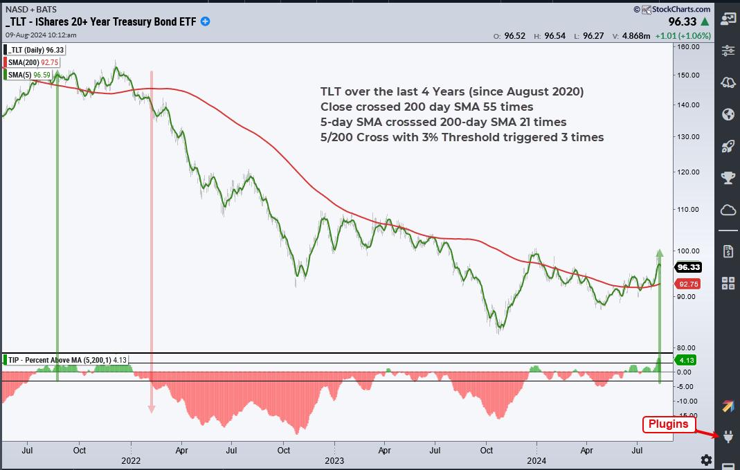
We cannot totally eliminate whipsaws, but we can reduce them with smoothing and signal thresholds. In the window above, we can see the indicator turning green and red as the 5-day crosses above/below the 200-day. There were at 21 crosses over the last four years. There were only three crosses using the 3% signal thresholds. Note that a 3% signal triggers with a move above 3% and remains valid until a move below -3%. Percent above MA(5,200,1) exceeded +3% this week to signal the start of a long-term uptrend. Note that Percent above MA is one of 11 indicators in the TIP Indicator Edge Plugin (here).
As featured at TrendInvestorPro, the next chart shows TLT with some classic technical analysis at work, and a breakout to boot. First, TLT surged some 22% from late October to December. It then declined with a falling channel that retraced around 2/3 of this advance. TLT managed to hold well above the October low and break out of the channel. This higher low shows buying pressure stepping in at higher prices (above the October low). The breakout signals a continuation of the 22% advance and targets a move to the next resistance zone (109). Support is set at 90.
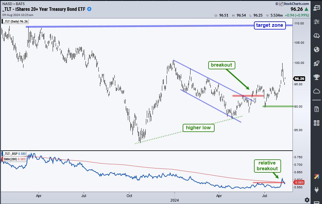
We are also seeing TLT outperform the S&P 500 EW ETF (RSP) for the first time in over a year. The indicator window shows the TLT/RSP ratio flattening out in spring-summer and breaking above its June high (red line). It also broke the 200-day SMA. Admittedly, the relative breakout is still a work in progress. The breakout on the price chart, however, looks solid.
We featured the breakout in TLT over a week ago and will continue to monitor it at TrendInvestorPro. This week we covered the significance of a surging VIX and widening yield spreads. We also covered deteriorating breadth and put forth a target zone for SPY going forward. Click here for immediate access.
//////////////////////////////////////////////////
|
| READ ONLINE → |
|
|
|
|
|
| Wyckoff Power Charting |
| Who Let the DOG Out? |
| by Bruce Fraser |
 In the classroom we would have students alter their view of charts they were evaluating to gain fresh perspective and possibly enhance their analysis. Students often had Ah-Ha moments after freshening their interpretation of a chart they had previously laid eyes on many times. Stock chart analysis heavily emphasizes the left hemisphere of the brain which is considered the logical side. The right hemisphere is associated with creativity, art, intuition and imagination. By characterizing charts and data in different modes the right side of the brain can be engaged. By employing a ‘whole brain' study, aspects of the brain are engaged that can enhance perspectives of stock market and trading analysis. Whole brain thinking can also improve problem solving technique when developing and enhancing indicator and methodology development. Traders and analysts will often describe this as bolts of intuition. My teaching partner Dr. Hank Pruden called this process ‘Chart Reading in the R-Mode'. He dedicates a section of his book ‘The Three Skills of Top Trading' to these chart reading methods (pages 202-211). To learn more about Hank's book and to purchase it (click here). In the classroom we would have students alter their view of charts they were evaluating to gain fresh perspective and possibly enhance their analysis. Students often had Ah-Ha moments after freshening their interpretation of a chart they had previously laid eyes on many times. Stock chart analysis heavily emphasizes the left hemisphere of the brain which is considered the logical side. The right hemisphere is associated with creativity, art, intuition and imagination. By characterizing charts and data in different modes the right side of the brain can be engaged. By employing a ‘whole brain' study, aspects of the brain are engaged that can enhance perspectives of stock market and trading analysis. Whole brain thinking can also improve problem solving technique when developing and enhancing indicator and methodology development. Traders and analysts will often describe this as bolts of intuition. My teaching partner Dr. Hank Pruden called this process ‘Chart Reading in the R-Mode'. He dedicates a section of his book ‘The Three Skills of Top Trading' to these chart reading methods (pages 202-211). To learn more about Hank's book and to purchase it (click here).
There are many ways to engage the right hemisphere. Here is one that was a favorite of students, and easy to employ.
So, let's get a little playful with the charts while we engage our R-Mode. In the classroom we would take a standard stock chart and flip it over to view the chart through the back of the sheet. This would invert the scale so that a downtrend was upward, and an uptrend was declining. In those days we would place the page on the window so light would illuminate the chart on the reverse side of the page. Then we would do the chart analysis on the back of the sheet. Students often found that when inverting the chart, they would see aspects of the chart structure that were hidden to them with their prior traditional analysis. Thus, the benefits of Reading Charts in the R-Mode.
The good news is that StockCharts.com has made it easy to invert Sharp Charts and conduct the analysis. More on that below.
Here is a case study of chart reading in the R-Mode:
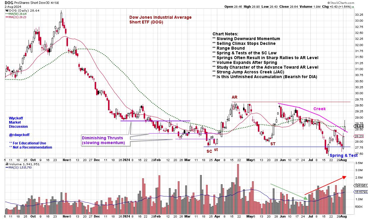
 ProShares Short Dow 30 ETF (DOG) ProShares Short Dow 30 ETF (DOG)
This chart is not actually inverted. It is the unleveraged short ETF of the Dow Jones Industrial Average (DOG). It is not an exact duplicate of the DJIA cash index, so please compare and contrast. Now engage your R-Mode and allow this chart to wash over you. A first step would be to generate a DJIA chart ($INDU or DIA) and refresh yourself on the current chart position of the index, then study the DOG chart above with annotations. How does your perspective of the present position of the DJIA change with the inversion of the chart? Did you see chart attributes that were previously obscured? Did it influence your view of the DJIA?
In my case the Wyckoff structure was immediately evident in the DOG chart. The annotations reflect what stood out.
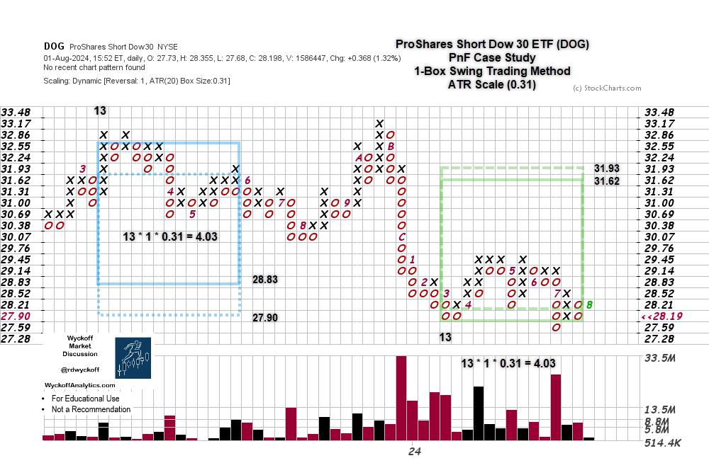
 ProShares Short Dow 30 ETF PnF Case Study ProShares Short Dow 30 ETF PnF Case Study
The swing PnF of the structure we just analyzed nearly counts to the overhead resistance. The structure appears to be unfinished. A rally to Sign of Strength (SoS) above 29.45 and then a reaction, called a Last Point of Support (LPS), would complete an Accumulation structure. The unfinished count suggests the potential for a meaningful correction of the DJIA.
Chart Notes:
- PnF count of the prior distribution (in blue) came within one box of fulfilling the down count. As this is an inverted chart, the count objective reached to one box from the ultimate high, so far.
- The current count is unfinished and must be considered a preliminary count. Until the reversal is confirmed we must hold open the idea the current trend is still in force.
Chart Reading in the R-Mode can enhance your analysis, and it is easy to do. In SharpCharts put a Minus Sign in front of a symbol to invert the scale. I do this often and it is very helpful to my chart studies.
All the Best,
Bruce
@rdwyckoff
Disclaimer: This blog is for educational purposes only and should not be construed as financial advice. The ideas and strategies should never be used without first assessing your own personal and financial situation, or without consulting a financial professional.
Wyckoff Resources:
Distribution Definitions (Click Here)
Wyckoff Power Charting. Let's Review (Click Here)
Additional Wyckoff Resources (Click Here)
Wyckoff Market Discussion (Click Here)
For additional resources and to learn more about Dr. Hank Pruden (Click Here)
|
| READ ONLINE → |
|
|
|
| DecisionPoint |
| Substantial Deterioration in Number of IT BUY Signals |
| by Carl Swenlin |
DecisionPoint tracks 26 market, sector, and industry group indexes, and we monitor moving average crossovers for those indexes to assess the bullish or bearish condition of those indexes. A Silver Cross BUY Signal is generated when the 20-day exponential moving average (EMA) of a price index crosses up through the 50-day EMA. This gives a strong indication that the price index is in a bullish configuration.
The left column of the following table shows the IT signal status of the indexes we track. The right column is for the longer-term Golden Cross signals (50/200-day EMA crossovers), which are not an issue now. This is how the table looked on July 31, 2024:

The next table shows the signal status as of today, and we can see that there is considerable deterioration in the market status. Nine of the indexes have changed from a BUY Signal to NEUTRAL, which is when the 20-day EMA crosses down through the 50-day EMA (Dark Cross) above the 200-day EMA. (It would be a SELL Signal if the 20/50 EMA downside crossover took place below the 200-day EMA.) Of the remaining IT BUY Signals, all but three are liable to switch to NEUTRAL within the next few weeks. The three that look safe (for now) are Consumer Discretionary, Real Estate, and Utilities.

Concluding Thoughts
The stock market is experiencing broad-based intermediate-term deterioration. Nine indexes have lost BUY Signals, and most of the rest are likely to lose their BUY Signals in a week or so unless the current rally continues and broadens out.
Learn more about DecisionPoint.com.
Watch the latest episode of the DecisionPointTrading Room on DP's YouTube channel here!

Try us out for two weeks with a trial subscription!
Use coupon code: DPTRIAL2 at checkout!
Technical Analysis is a windsock, not a crystal ball. --Carl Swenlin
(c) Copyright 2024 DecisionPoint.com
Disclaimer: This blog is for educational purposes only and should not be construed as financial advice. The ideas and strategies should never be used without first assessing your own personal and financial situation, or without consulting a financial professional. Any opinions expressed herein are solely those of the author, and do not in any way represent the views or opinions of any other person or entity.
DecisionPoint is not a registered investment advisor. Investment and trading decisions are solely your responsibility. DecisionPoint newsletters, blogs or website materials should NOT be interpreted as a recommendation or solicitation to buy or sell any security or to take any specific action.
Helpful DecisionPoint Links:
Trend Models
Price Momentum Oscillator (PMO)
On Balance Volume
Swenlin Trading Oscillators (STO-B and STO-V)
ITBM and ITVM
SCTR Ranking
Bear Market Rules
|
| READ ONLINE → |
|
|
|
| Don't Ignore This Chart! |
| Will USO Soar to $83? Here Are the Key Levels to Watch! |
| by Karl Montevirgen |

Oil prices are climbing after the EIA reported a surprise inventory crunch. Adding fuel to the fire? Tensions in the Middle East.
WTI Crude has been trading in choppy motion since March 2023. While macroeconomic and geopolitical factors weighing on price are mixed at best, might there be an opportunity for some upside, considering the current inventory declines, seasonality factors, and continuing geopolitical uncertainties?
Let's examine the United States Oil Fund ETF (USO) as the WTI crude oil proxy. Over the last five years, what has its seasonal performance looked like relative to the S&P 500?
USO: 5-Year Seasonal Performance Relative to S&P 500
When it comes to seasonality, September is USO's star month. It might not have the highest closing rates (just 50%), but it shines in average relative return, boasting a solid 5.5%.

CHART 1. SEASONALITY CHART OF THE UNITED STATES OIL FUND (USO) RELATIVE TO THE S&P 500. Note the differences between the higher-close rates (numbers above the bars) and average relative return (numbers at the bottom of each bar). Chart source: StockCharts.com. For educational purposes.
You can't use this as a crystal ball to predict USO's moves since many other factors impact crude oil prices. But it does offer some steady context. The real question: Is USO gearing up for another climb this September? And if so, how high could it go?
Let's switch to a weekly chart for a macro perspective on USO's price action.

CHART 2. WEEKLY CHART OF UNITED STATES OIL FUND (USO). When looking at a longer-term chart of USO, the price action seems relatively flat and choppy.
The volume-weighted Money Flow Index (MFI) suggests that USO is on the lower end of its cyclical range. The Bollinger Bands® indicator also supports this notion but from a smaller time frame.

Note that the range is slightly narrowing and that the MFI and Bollinger Bands suggest the possibility of an upside in USO—a reversion to the mean or toward the upper band. Historical resistance suggests a possible move to the $83 range, which has been a tough resistance level to break (tested and failed three times over the last year). The upside also coincides with the seasonality thesis discussed above.
Keep an eye on those swing points at $92.50 and $57.50 (blue dotted lines). It's a wide range, but if prices break out from the current $70–83 zone, expect strong support and resistance at those higher and lower levels. Additionally, note that below $70, there's another support level at $65, which marks the next swing point: the November–December lows of 2023.
If you're interested in taking advantage of the potential upside if only for a swing trade, you need to zoom in to look at the price action from a daily chart perspective (see chart below).

CHART 3. DAILY CHART OF UNITED STATES OIL FUND ETF PRICE. There are clear support and resistance levels, which are important to watch for swing trades.
Looking at the daily chart, you can see how buying pressure, though not very strong, has been positive during the last few weeks of USO's decline. The magenta rectangle on the Chaikin Money Flow (CMF) highlights this somewhat bullish divergence. Does this signal accumulation during USO's price decline?
The Stochastic Oscillator suggests that USO has entered oversold territory, indicating a potential move up. The September seasonality, inventory declines, and geopolitical factors all indicate near-term strength. If you're looking to trade this cyclical range, you'd probably enter the market now with a tight stop at around $70. Your upside target would be between $81 and $83.
Despite the uncertainties in this market, if you had entered a long position at $74, you would be risking a loss of $4 for a potential gain of $9. Your reward-to-risk ratio would be 2.25:1. Still, tread carefully. If USO continues higher, check to see if the trade is still worth it based on your trading goals and risk tolerance.
Closing Bell
Oil prices are rising with a surprise inventory crunch amid ongoing Middle East tensions. USO, a proxy for WTI crude oil, shows a favorable seasonality in September with a 5.5% average relative return, though it's not a perfect predictor. Technical indicators hint at a possible price move toward $83. If you're eyeing a swing trade, proceed with caution. Respect the target and stop levels discussed above. Good luck!
Disclaimer: This blog is for educational purposes only and should not be construed as financial advice. The ideas and strategies should never be used without first assessing your personal and financial situation, or without consulting a financial professional.
|
| READ ONLINE → |
|
|
|
| MORE ARTICLES → |
|


 In the classroom we would have students alter their view of charts they were evaluating to gain fresh perspective and possibly enhance their analysis. Students often had Ah-Ha moments after freshening their interpretation of a chart they had previously laid eyes on many times. Stock chart analysis heavily emphasizes the left hemisphere of the brain which is considered the logical side. The right hemisphere is associated with creativity, art, intuition and imagination. By characterizing charts and data in different modes the right side of the brain can be engaged. By employing a ‘whole brain' study, aspects of the brain are engaged that can enhance perspectives of stock market and trading analysis. Whole brain thinking can also improve problem solving technique when developing and enhancing indicator and methodology development. Traders and analysts will often describe this as bolts of intuition. My teaching partner Dr. Hank Pruden called this process ‘Chart Reading in the R-Mode'. He dedicates a section of his book ‘The Three Skills of Top Trading' to these chart reading methods (pages 202-211). To learn more about Hank's book and to purchase it (