| THIS WEEK'S ARTICLES |
| Larry Williams Focus On Stocks |
| MEMBERS ONLY |
| A New Way of Forecasting Crude Oil | Larry's "Family Gathering" August 22, 2024 Recording |
| by Larry Williams |
|
What to make of the market as we near the end of August? Larry presents his thoughts in this edition of the Family Gathering video. In this month's Family Gathering video, Larry begins by presenting a new way of forecasting for Crude Oil...
|
| READ ONLINE → |
|
|
|
| ChartWatchers |
| The SCTR Report: Workday Rises on Strong Earnings Results and Rising Technical Strength |
| by Jayanthi Gopalakrishnan |

When a stock surges based on a strong earnings report, analyst upgrade, or other fundamental factors, it's tempting to jump into the stock. But often, when a stock's price spikes due to a one-off fundamental event, there'll be a pullback, one that will present a better technical picture of the stock. For this reason, it's best to scope out stocks that have the potential to be an attractive investment, and then set an alert for when the price hits a certain threshold.
Workday Inc. Stock Has Potential
The StockCharts Technical Rank (SCTR) ranked Workday Inc. stock as the highest Top Up in the Large Cap category (this can change during the trading day).
 STOCKCHARTS SCTR REPORT IDENTIFIES TECHNICALLY STRONG STOCKS. STOCKCHARTS SCTR REPORT IDENTIFIES TECHNICALLY STRONG STOCKS.
Workday Stock's Price Action
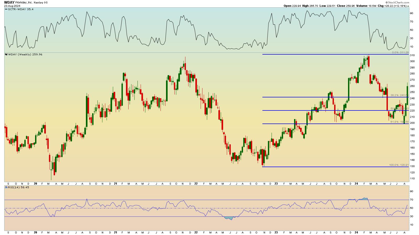
The weekly chart of Workday, Inc. (WDAY) below shows the stock has seen pretty choppy action. As a result, WDAY may be an appropriate intermediate-term trade rather than a long-term investment.

CHART 1. WEEKLY CHART OF WORKDAY STOCK. The stock price has broken above its 38.2% Fibonacci retracement level. If an uptrend (series of higher highs and higher lows) is established, the stock could rise as high as $310.Chart source: StockCharts.com. For educational purposes.
Applying the Fibonacci retracement levels from the most recent low in October 2022 to February 2024 high, WDAY has broken above its 38.2% retracement level. The stock has yet to show an uptrend (series of higher highs and higher lows). Although the relative strength index (RSI) has moved above 50 (lower panel), its SCTR score is relatively low at around 35, though it's spiking (top panel). The stock has the potential to reach $310; however, there are a few resistance levels along the way WDAY has to overcome.
When Should You Buy WDAY?
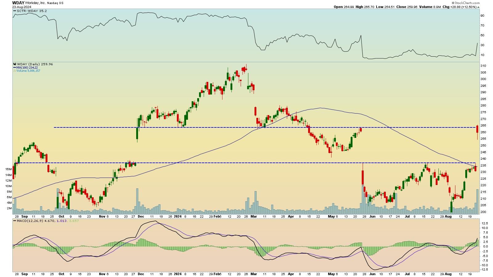
The daily chart shows that WDAY broke out of a trading range with a massive upside gap (see chart below). Before the gap, the stock price was at its 100-day simple moving average (SMA), which looked like a strong resistance level. Note the 100-day SMA is trending downward.

CHART 2. DAILY CHART OF WORKDAY STOCK. The stock price gapped higher on a strong earnings report. Is it enough to push the price higher toward its all-time high?Chart source: StockCharts.com. For educational purposes.
Had it not been for the strong earnings report, the stock may have fallen. The one-day gap up in price makes it difficult to determine when to enter a long position in WDAY stock. The candlestick bar suggests that the stock is trying to move higher, but faces greater selling pressure. This indicates there could be a pullback in price together with slowing momentum. You want to see momentum increase before buying a stock, so it makes sense to add a momentum indicator, such as the Moving Average Convergence/Divergence (MACD), to your analysis.

In the daily chart, the MACD line crossed above the signal line (lower panel) and has moved above the zero line. The height of the MACD histogram bars is also increasing. All these point to increasing buying pressure, but it's in the early stages.
Looking at the overall chart, if WDAY stock price falls and fills the gap, look for an entry point just above the lower blue dashed line as long as the momentum remains strong. If the momentum weakens, there's no reason to enter a trade.
Conversely, the stock price could continue to rise above the upper blue dashed line. There needs to be an increase in momentum so there's follow-through in the upside price movement. If accompanied by a rise in the SCTR score above the 70 level, it could make for a profitable position trade, given that WDAY's stock price could go as high as $310. Always place a stop-loss order a little below your entry price, and if the stock price moves in your favor, use a trailing stop.
When Should You Exit WDAY?
Since this is a position trade, don't let your emotions get in the way. Any time your entry conditions are violated, exit the trade. There are always opportunities in the stock market. There's no reason to tie your capital into one trade that's not going the way you want it to go.
The bottom line. Save WDAY to your ChartList and set an alert for when the SCTR score crosses above 70.
Setting alerts using SCTR is straightforward. Enter the following when creating a new advanced alert:
Alert for WDAY SCTR crossing above 70
[symbol = ‘wday']
and [sctr > 70]
|
| READ ONLINE → |
|
|
|
| Martin Pring's Market Roundup |
| MEMBERS ONLY |
| This Market is On Track for a 45-Year Breakout |
| by Martin Pring |
|
It's not very often that any market experiences a 10-year breakout, let alone a 45-year one. That, however, is what Chart 1 says is about to materialize for the inflation-adjusted gold price...
|
| READ ONLINE → |
|
|
|
| Art's Charts |
| This Housing-Related Stock Just Printed a 5 for the Trend Composite |
| by Arthur Hill |
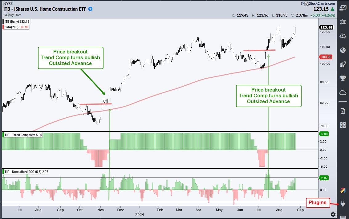
The Home Construction ETF (ITB) is leading the market as it surged to a new closing high this week. While this high is certainly bullish and points to upside leadership, the real signal triggered back in early July as the Trend Composite turned bullish with an outsized move. Let's review this signal and then look at a recent signal in Home Depot.
The chart below shows ITB with the Trend Composite and Normalized ROC. The Trend Composite aggregates signals in five trend-following indicators. Normalized ROC is the 5 period point change divided by ATR(5), which shows price moves in ATR terms. Values greater than +3 indicate that price advanced more than 3 ATR(5) values in five days. This is an outsized move that can kick start an extended uptrend. Note that these indicators are part of the TIP Indicator Edge for StockCharts ACP (here).

The chart above shows three signals coming together in mid November 2023 and mid July 2024. Notice how ITB broke resistance with an outsized move in early November and the Trend Composite followed with a bullish signal in mid November. ITB corrected into early July and another bullish trio triggered in mid July. This most recent signal was highlighted in the ChartTrader reports at TrendInvestorPro.
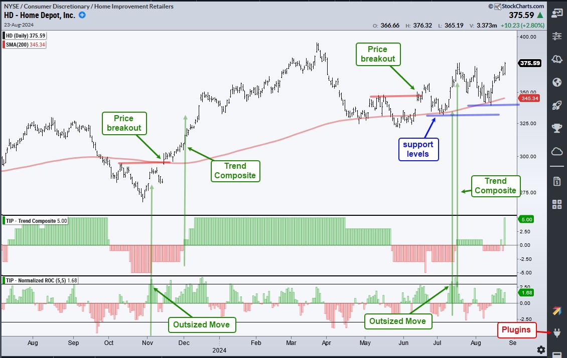
The next chart shows Home Depot with the signal trio occurring in November-December and June-July. Rarely do we get all three signals at the same time. Usually the price breakout and outsized move occur first. The Trend Composite is a trend-following indicator that triggers when there is upside follow through.

All trend-following indicators lag and produce some whipsaws. The Trend Composite is no different as it whipsawed with by turning negative twice in August. This is normal given the broad market volatility we saw over the last six weeks. The Trend Composite surged to +5 on Friday and this means all five indicators are on bullish signals. The blue lines show support levels from July and now August.
ChartTrader recently introduced two new market timing models in our weekly report and video. One model covers the broad market and the other focuses on timing the Nasdaq 100. Our weekly report/video also covers the charts, setups and signals for SPY, QQQ, MAGS, TLT, GLD, key tech names and more. Click here to take your analysis process to the next level.
//////////////////////////////////////////////////
|
| READ ONLINE → |
|
|
|
| RRG Charts |
| RRG-Velocity Jumping on XLF Tail |
| by Julius de Kempenaer |

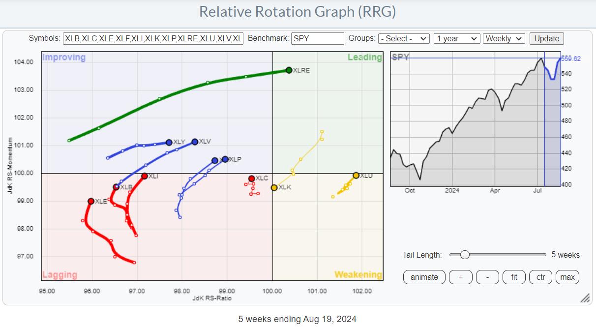
On the weekly Relative Rotation Graph, the rotation still favors almost every sector over Technology. I discussed the opposite rotations between weekly and daily RRGs in last week's video, which you can find here.
Real Estate
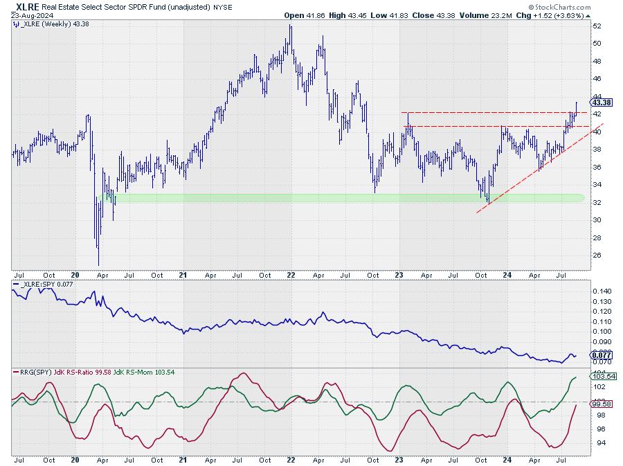
Working off this weekly chart, many tails are drawing attention to themselves. First of all, XLRE has the longest tail and is powering into the leading quadrant, showing that there is a lot of strength behind this move.

This is confirmed on the price chart, where XLRE is breaking above horizontal resistance, which frees the way for further appreciation. The next target for XLRE is the peak at 46, which was set in August 2022.
Utilities
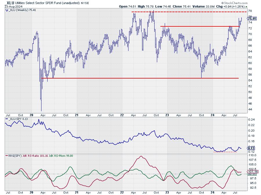
The second one is Utilities, whose tail has sharply rotated back up toward the leading quadrant, signaling the start of a new up-leg within the already established relative uptrend.

Utilities broke above horizontal resistance a few weeks ago and managed to hold up well, and they now seem to be accelerating higher, targeting the all-time-high level near 78.
The long downtrend in relative strength has stalled, with a potential double bottom in the making. The RRG-Lines are both bottoming out and starting to move higher.
Financials
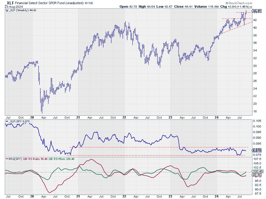
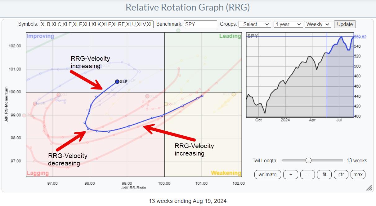
The financials sector, XLF, is just crossing over into the improving quadrant from lagging as the price is breaking to new all-time highs.

Relative Strength is still captured inside a long trading range, but is on its way to the upper boundary. That is causing the RRG-Lines to turn back up. JdK RS-Momentum has already exceeded 100, and JdK RS-Ratio is closing in on that level.

What is interesting about this particular tail is that it is getting longer. RRG-velocity* is increasing, which suggests an acceleration of the rotation.
*RRG-Velocity measures the distances between the nodes on a tail. By adding up distances, we can calculate the tail length, and by comparing the different distances, we can evaluate whether the rotation is speeding up or slowing down.
Financial - Industries

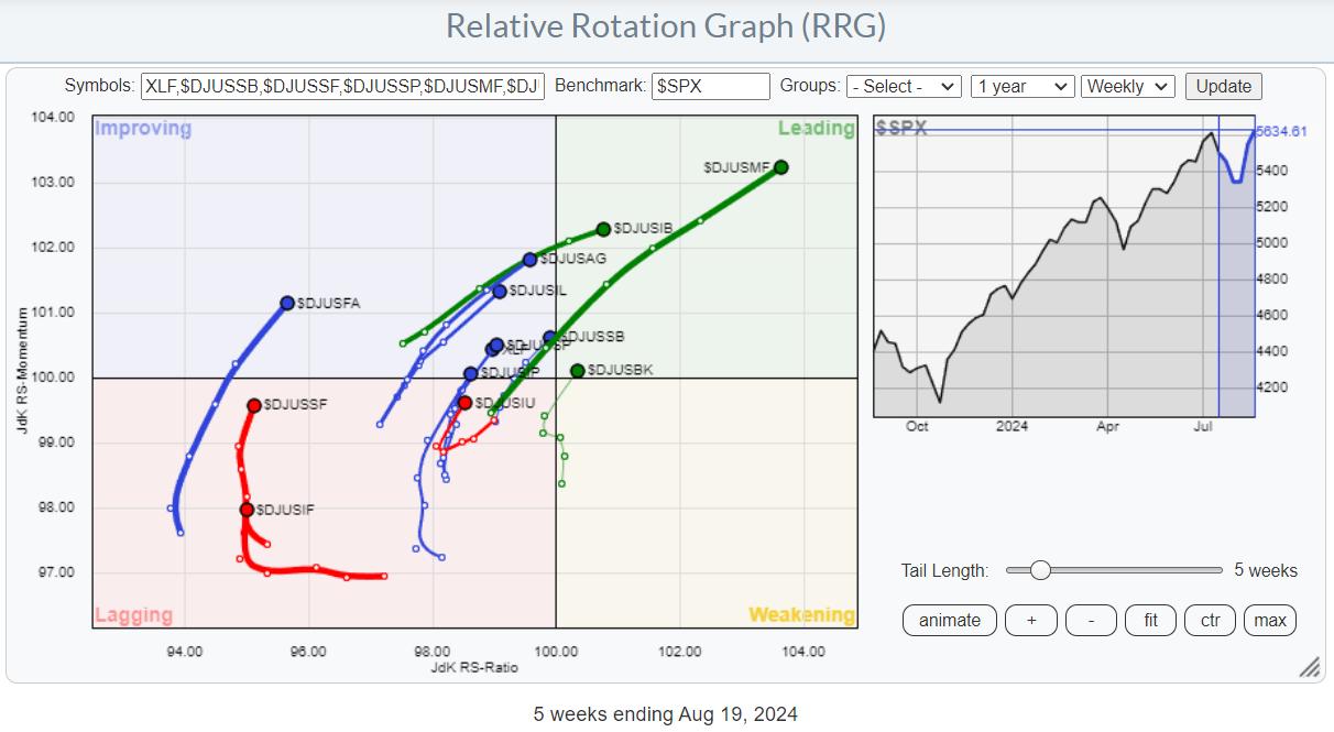
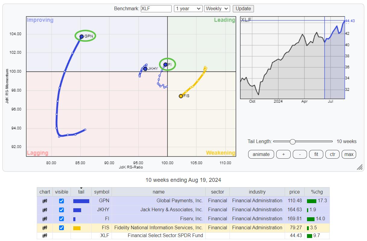
The RRG above shows the industries inside the financial sector against the S&P 500 as the benchmark. The improvement of relative strength is visible in all groups, as they are all on a positive RRG-Heading between 0-90 degrees. We need to change the benchmark to the financial sector index to find the most promising groups.

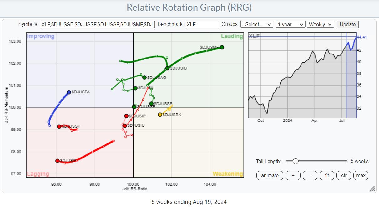
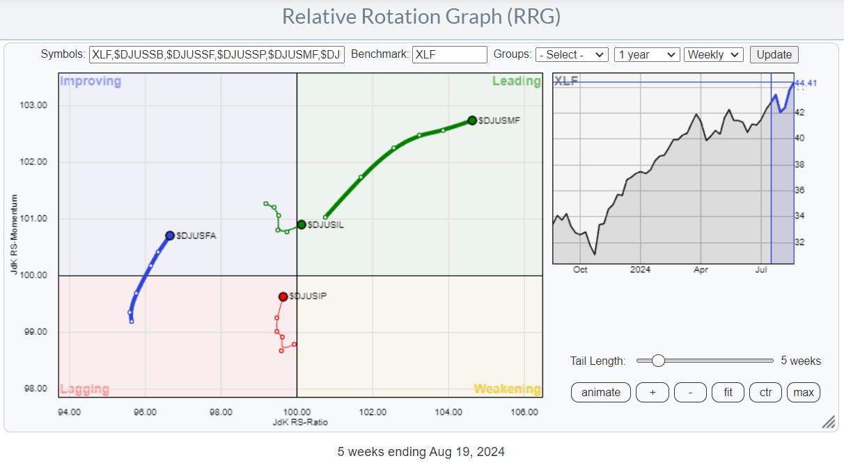
This gives a more balanced image of the various industries moving around the sector index (XLF). Where all the industries were on a positive RRG-Heading when benchmarked against $SPX, only four remain when using XLF as the benchmark.

Financial Administration
Going over the individual charts of these four groups, I like the one for $DJUSFA - Financial Administration.
This group halved in value from mid-2021 to mid-2022, then started trading in a range until now. This week, $DJUSFA closed above its previous high, clearing the path for a further rise. This price improvement has also led to an improvement in relative strength, with both RRG lines now rising. This makes it the group that could potentially lead the financials sector in the coming weeks.
This is a small group that holds only four S&P 500 stocks.

Out of these four, when compared to XLF, only FI and GPN show a positive rotation.

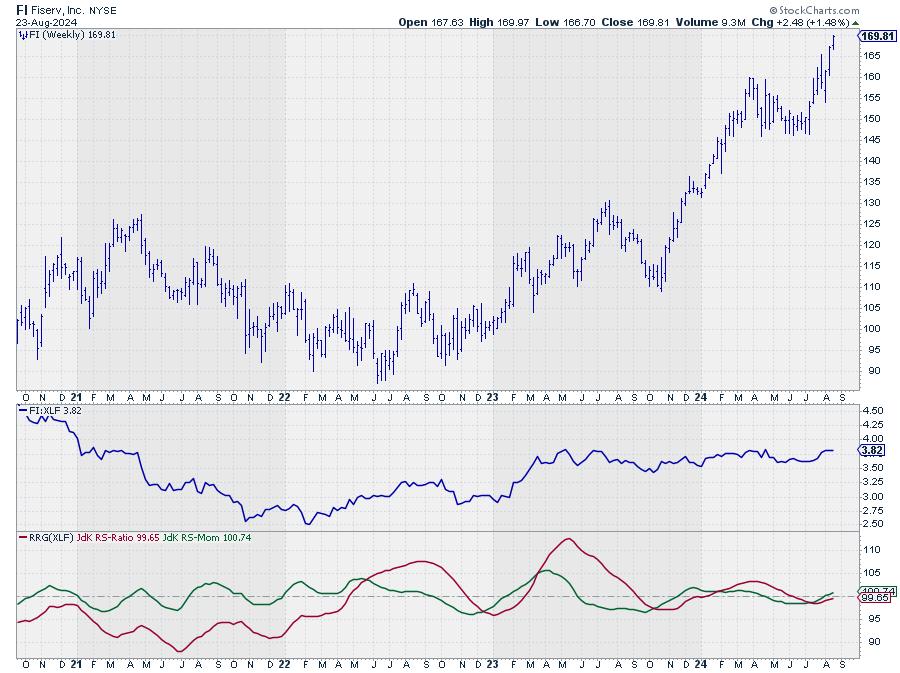
Fiserv recently confirmed its uptrend by breaking beyond its most recent peak, around 160, while relative strength seems ready to move out of its trading range.

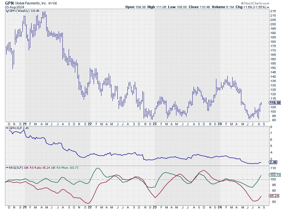
GPN tested solid support just above 90 twice this year and completed a double bottom from where price is now rallying. The upper boundary of a broad trading range can now be pegged near 140, creating well over 20% upside potential.
#StayAlert and have a great weekend. --Julius
|
| READ ONLINE → |
|
|
|
|
|
| Don't Ignore This Chart! |
| Is Peloton Stock the Next Big Turnaround? What You Need to Know Before It's Too Late |
| by Karl Montevirgen |

Peloton's (PTON) stock soared over 38% on Thursday after the company posted positive free cash flow for the second quarter in a row—a first since 2021. Is the turnaround working? Maybe. But investors aren't waiting around—they're hopping on.
Peloton came to my attention while reviewing the Market Movers panel on the StockCharts dashboard on Thursday. Simply put, it's an easy way to find extraordinary market moves.

We all remember Peloton's pandemic glory days. But as the world reopened, Peloton's stock took a nosedive—and the weekly chart below tells the story.

CHART 1. WEEKLY CHART OF PELOTON STOCK. The picture of this massive 97% plunge tells the entire story.
Under new leadership, Peloton crafted a turnaround strategy in 2022. Now, the results are finally rolling in, and the latest earnings hint that the company could be pedaling back into profitability.
Zoom in to a daily chart covering the last nine months, and you'll see Thursday's dramatic spike much more clearly. But you'll also see that Peloton has several technical headwinds on the way up.

CHART 2. DAILY CHART OF PELOTON. Caution: there's a lot of resistance above.
Still, if Peloton gets its house in order, this price spike may be the earliest technical entry point for what could be a potential "multi-x" return. Assuming this is the case, what are the levels to watch?
In addition to the daily chart seen above, let's examine a few important levels from a tactical perspective.

CHART 3. DAILY CHART OF PELOTON WITH ADDED INDICATORS. Notice the rectangle formation, which should provide context in terms of support and resistance.
First, notice the spike in the StockChartsTechnicalRank (SCTR), from a low 20 to nearly touching the 90 line, which signals bullishness across multiple indicators and timeframes.

Next, look below the chart at the Chaikin Money Flow (CMF). That, too, jumped to a level higher than the previous nine months, indicating a surge in buying pressure.
Now, look at the price action itself. You can still see the resistance levels above, the first of which ($4.80) price is about to be challenged. Check out the rectangle formation (highlighted in orange). If you're holding shares, you're hoping the price doesn't drop back into the middle—ideally, it'll bounce off support at the top.
If the price dips, there's another entry point at the bottom of the formation. With Peloton at its lowest amid a turnaround, a bounce is likely—unless Peloton fumbles the ball, so to speak.
If the price closes below the rectangle, more downside could be in play. How much further down before penny stock territory? It's anyone's guess. But now, the rectangle formation may serve as yet another cloud of "technical" resistance following a "fundamental" fail.
At the Close
Peloton is riding that fine line between potential turnaround and pitfall. With some evidence of early success, investors are betting on a multi-x recovery. But technical headwinds loom large ahead of its current breakout. Whether Peloton breaks out or dips back down hinges on its ability to execute its turnaround strategy. Stay sharp—this could be a make-or-break moment and a ground-level market opportunity.
Disclaimer: This blog is for educational purposes only and should not be construed as financial advice. The ideas and strategies should never be used without first assessing your personal and financial situation, or without consulting a financial professional.
|
| READ ONLINE → |
|
|
|
| DecisionPoint |
| Gold Miners' Performance vs. Gold -- Does It Say Sell Gold? |
| by Carl Swenlin |
In Monday's DecisionPoint Trading Room video, we were asked why we cover Gold Miners (GDX) as well as Gold (GLD). There are two reasons:
- Some people prefer to own the commodity, Gold, and others prefer to own an operating company that benefits from the price of Gold, such as Gold Miners. For a profitable mining company, when Gold increases in value, most of the increase goes straight to the bottom line because cost of goods is already paid for.
- Other people prefer Gold Miners because they may pay a dividend, and typically they out-perform Gold by a lot. That applies to movement in both directions. That is to say, Gold Miners will typically go up faster than Gold, but Miners also go down a lot faster than Gold.
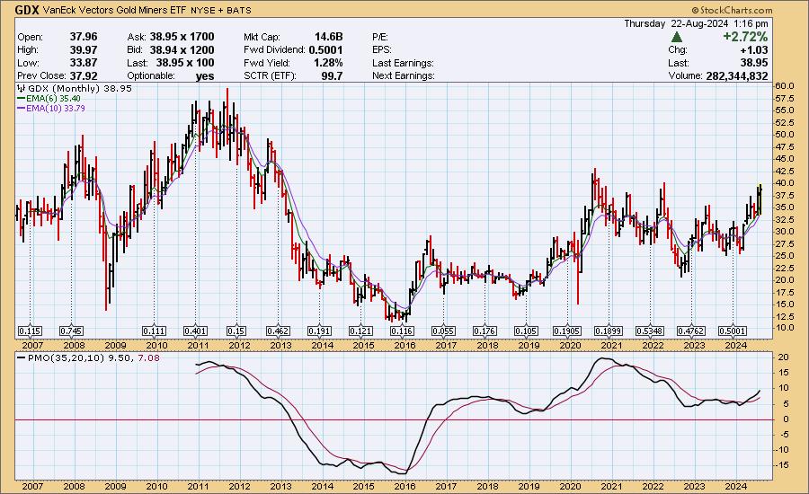
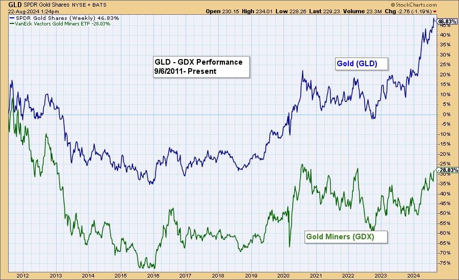
This morning, I heard a money manager who asserted that people who own Gold should be selling it because, while Gold has been making all-time highs, Gold Miners need to advance another +50% to equal its 2011 all-time highs. The chart confirms that, but there is more to consider in this regard.

Here is a performance chart comparing the two from the 2011 top to the present, and we can see that GDX has underperformed GLD by about half.

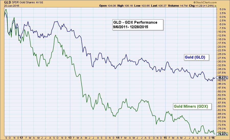
But let's look at just the decline from the 2011 top to the 2015 lows. We can see that GDX fell at an accelerated rate, driven by the negative sentiment associated with GLD's decline.

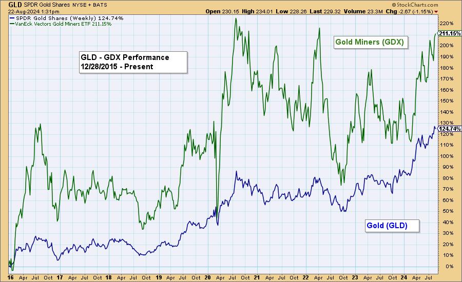
The chart showing the performance from the 2015 lows shows that GDX has out-performed GLD by a lot, as we would expect; however, GDX took a -45% hit in 20 because of the securities bear market. Also, GLD had a rather tedious two-year sideways episode in 2020 to 2022, which would have been uninspiring to potential Miners investors. Nevertheless, GDX is still out-performing GLD by a considerable amount.

Conclusion: While the assertion that GDX underperformance since the 2011 all-time high justifies avoiding Gold, I think the premise does not consider all the evidence. Most important was the 2022 hit, which drove GDX down over -2.5 times more than GLD. That had less to do with Gold's prospects than it did with general bear market panic.
Introducing the new Scan Alert System!
Delivered to your email box at the end of the market day. You'll get the results of our proprietary scans that Erin uses to pick her "Diamonds in the Rough" for the DecisionPoint Diamonds Report. Get all of the results and see which ones you like best! Only $29/month! Or, use our free trial to try it out for two weeks using coupon code: DPTRIAL2. Click HERE to subscribe NOW!
Learn more about DecisionPoint.com:
Watch the latest episode of the DecisionPointTrading Room on DP's YouTube channel here!

Try us out for two weeks with a trial subscription!
Use coupon code: DPTRIAL2 Subscribe HERE!
Technical Analysis is a windsock, not a crystal ball. --Carl Swenlin
(c) Copyright 2024 DecisionPoint.com
Disclaimer: This blog is for educational purposes only and should not be construed as financial advice. The ideas and strategies should never be used without first assessing your own personal and financial situation, or without consulting a financial professional. Any opinions expressed herein are solely those of the author, and do not in any way represent the views or opinions of any other person or entity.
DecisionPoint is not a registered investment advisor. Investment and trading decisions are solely your responsibility. DecisionPoint newsletters, blogs or website materials should NOT be interpreted as a recommendation or solicitation to buy or sell any security or to take any specific action.
Helpful DecisionPoint Links:
Trend Models
Price Momentum Oscillator (PMO)
On Balance Volume
Swenlin Trading Oscillators (STO-B and STO-V)
ITBM and ITVM
SCTR Ranking
Bear Market Rules
|
| READ ONLINE → |
|
|
|
| MORE ARTICLES → |
|


