| THIS WEEK'S ARTICLES |
| Larry Williams Focus On Stocks |
| MEMBERS ONLY |
| A Deeper Dive into the Dollar | Focus on Stocks: September 2024 |
| by Larry Williams |
|
Let's get this out of the way... In our last Family Gathering, I announced I am doing my best to retire. That means we will have our September Family Gathering, the October newsletter and mid-month Family Gathering. After that, "Focus on Stocks" is all over...
|
| READ ONLINE → |
|
|
|
| Martin Pring's Market Roundup |
| MEMBERS ONLY |
| Is the Multi-Month Dollar Index Trading Range About to be Resolved? |
| by Martin Pring |
|
Last June, I wrote an article whose title was more or less the same as this one. At the time, the Index was bumping up against the top of a major trading range, and it looked very much as if it was about to experience an upside breakout...
|
| READ ONLINE → |
|
|
|
| The Mindful Investor w/ David Keller, CMT |
| What Would a Top in Semiconductors Mean for the S&P 500? |
| by David Keller |
After Nvidia (NVDA) dropped after earnings this week, investors are once again reminded of the importance of the semiconductor space. I think of semis as a "bellwether" group, as strength in the VanEck Vectors Semiconductor ETF (SMH) usually means the broader equity space is doing quite well. Today, we'll look at a potential topping pattern forming for the SMH, what levels would confirm a top for semiconductors, and what weakness in this key group could imply for our equity benchmarks.
Presenting the Dreaded Head-and-Shoulders Top Pattern
Ralph Edwards and John Magee, in their classic text Technical Analysis of Stock Trends, laid out the analytical process for defining a head-and-shoulders top. I've found that any price pattern like this consists of three important phases.
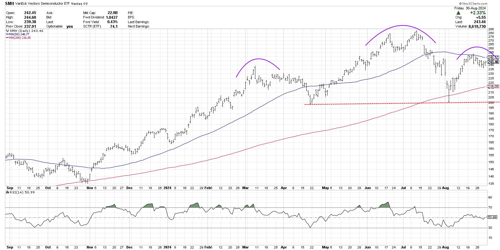
First, we have the "Setup" phase, where the price action begins to take on the appearance of a certain phase. This is when your brain tells you, "This is definitely a head and shoulders topping pattern." In this case, we're looking for a significant high surrounded by two lower highs, creating the appearance of a head and two shoulders.
We can clearly observe the setup phase on the chart of the SMH, with the June and July highs forming a somewhat nontraditional, but still valid, head. The lower peaks in March and August complete the picture. It's worth noting here that, in each of those peaks, we can see a bearish engulfing pattern, serving as a wonderful reminder for longer-term position traders: ignore candle patterns at your own risk!
What Would Confirm This Topping Pattern for Semis?
But the setup phase only means there is a potential pattern forming here. Next we need the "trigger" phase, where the price completes the pattern by breaking through a key trigger level on the chart. For a head-and-shoulders top, that means a break below the neckline, formed by drawing a trendline connecting the swing lows between the head and two shoulders.
Using the bar chart above, that would suggest a neckline around $200, over $40 below Friday's close. Another school of thought involves looking at closing prices only, for a cleaner perspective and more simple measurements.
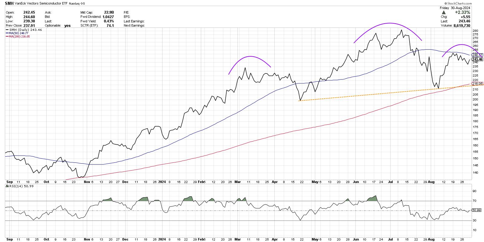
Using closing prices, we get an upward-sloping neckline which currently sits just below the 200-day moving average around $215. In either case, until we break below neckline support, this is not a valid head-and-shoulders topping pattern. The third phase, which I call the "confirmation" phase, involves some sort of follow-through beyond the breakout level. This could mean another down close after the break, or perhaps a certain percentage threshold below that support level. And once all three phases are complete, then we have a valid topping pattern.
Gauging Potential Broad Market Impact
So let's assume that semiconductors do indeed complete the topping pattern. What would that mean for the broader equity landscape?
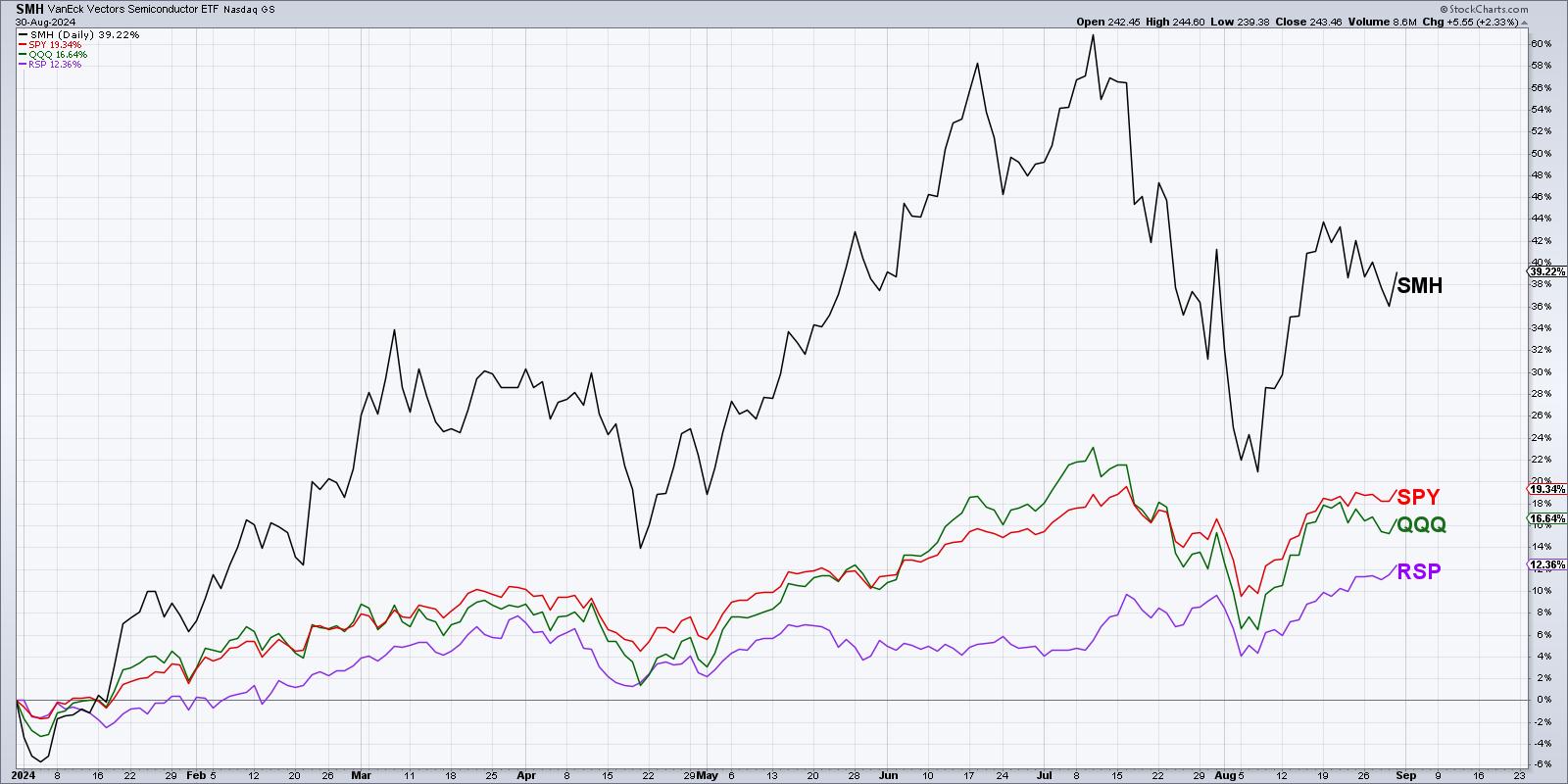
As of Friday's close, the SMH is up about 38.2% year-to-date. That compares to the S&P 500 (SPY) at +18.9%, the Nasdaq 100 (QQQ) with +16.2%, and the equal-weighted S&P 500 (RSP) at +12.1%. So semiconductors have certainly been a stronger leadership group in 2024. But what about since the July market peak?
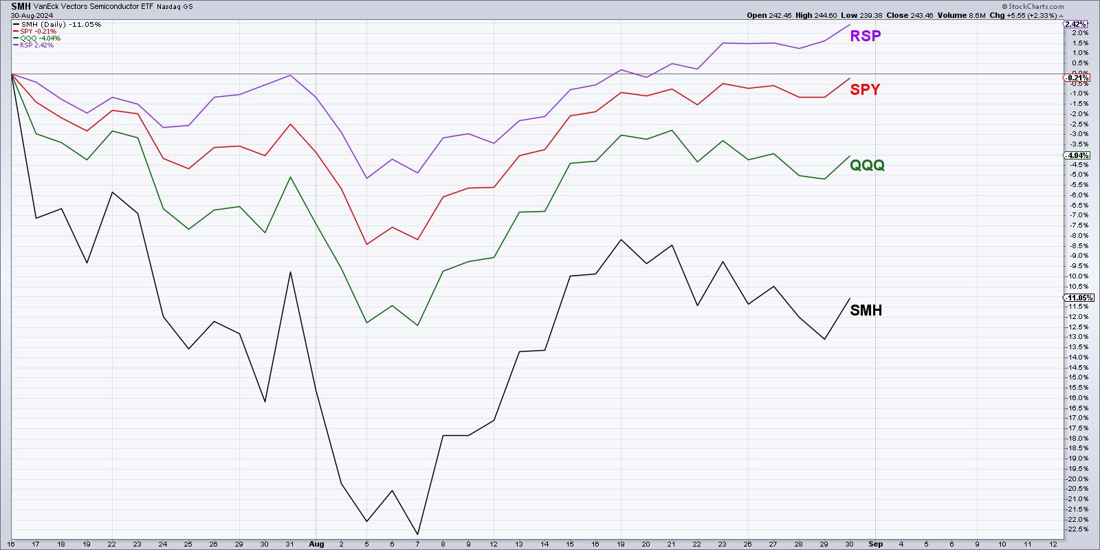
Now we can see that, while the S&P 500 is almost back to its July peak, the Nasdaq is still 4% below that day's close and semis are a full 11% below the market peak in July. And the equal-weighted S&P 500 is actually above its July peak already, speaking to the strength that we've observed in non-growth sectors off the early August low.
There is no doubt that semiconductors are looking a bit vulnerable after Nvidia's earnings this week. But given the strength that we're seeing outside of the semiconductor space over the last two months, weakness in the SMH does not necessarily mean weakness for stocks. Remember that it's always a good time to own good charts!
RR#6,
Dave
P.S. Ready to upgrade your investment process? Check out my free behavioral investing course!
David Keller, CMT
Chief Market Strategist
StockCharts.com
Disclaimer: This blog is for educational purposes only and should not be construed as financial advice. The ideas and strategies should never be used without first assessing your own personal and financial situation, or without consulting a financial professional.
The author does not have a position in mentioned securities at the time of publication. Any opinions expressed herein are solely those of the author and do not in any way represent the views or opinions of any other person or entity.
|
| READ ONLINE → |
|
|
|
| ChartWatchers |
| Charting Forward: Opportunities You Can Seize in September |
| by Jayanthi Gopalakrishnan |
It's a quiet end to August, with the broader stock market indexes wavering higher and lower. The Market Overview panel on the StockCharts Dashboard shows equity indexes closing higher. And yes, the Dow Jones Industrial Average ($INDU) closed at a record high.
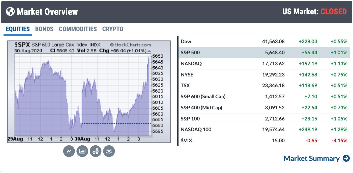 FIGURE 1. MARKET OVERVIEW PANEL IN THE STOCKCHARTS DASHBOARD. All broader indexes were up on Friday.Image source: StockCharts.com. For educational purposes. FIGURE 1. MARKET OVERVIEW PANEL IN THE STOCKCHARTS DASHBOARD. All broader indexes were up on Friday.Image source: StockCharts.com. For educational purposes.
Stock Market Outlook
With August behind us, we now prepare for one of the worst months in the stock market. PCE data came out today, and it was pretty much in line with estimates. This means an interest rate cut in the next FOMC meeting is pretty likely. The Fed's next meeting isn't until September 18, and, given historical seasonality patterns, don't expect too much upside in the first half of the month.
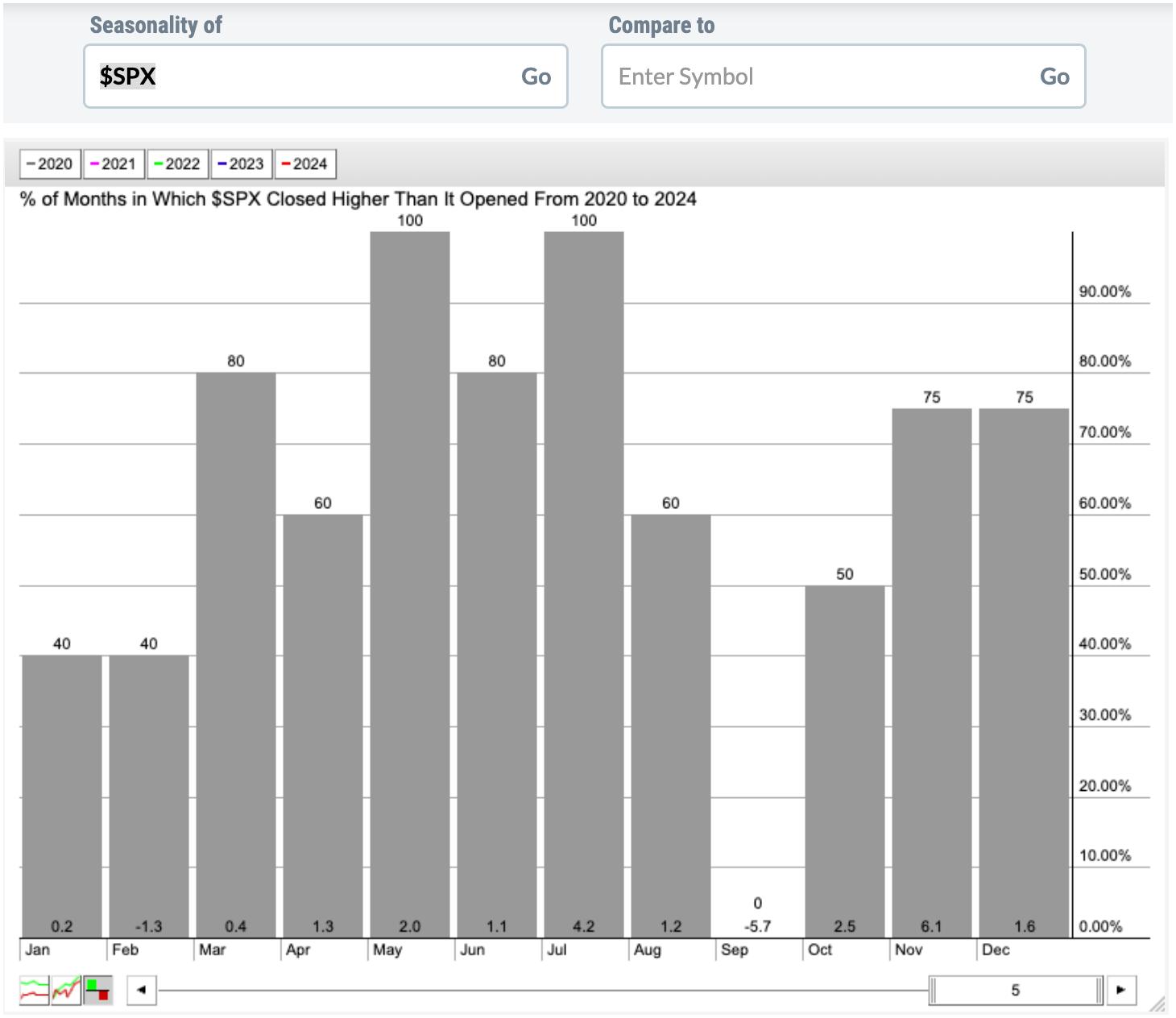
FIGURE 2. SEASONALITY CHART OF THE S&P 500 INDEX ($SPX). September is usually a weak month for large-cap stocks. Image source: StockCharts.com. For educational purposes.
The seasonality chart for the S&P 500 shows that August typically sees a 1% rise in the index. In 2024, the index's performance was slightly higher, with a 2.28% rise. September looks dismal, but this is an election year, so things may turn out differently.
The S&P 500 has recovered from its August pullback, breaking a downtrend line (see chart below). Since then, the index has been trading sideways, refusing to reach its July 16 all-time high. Yet it's trading above its 21-day exponential moving average, which is trending up.
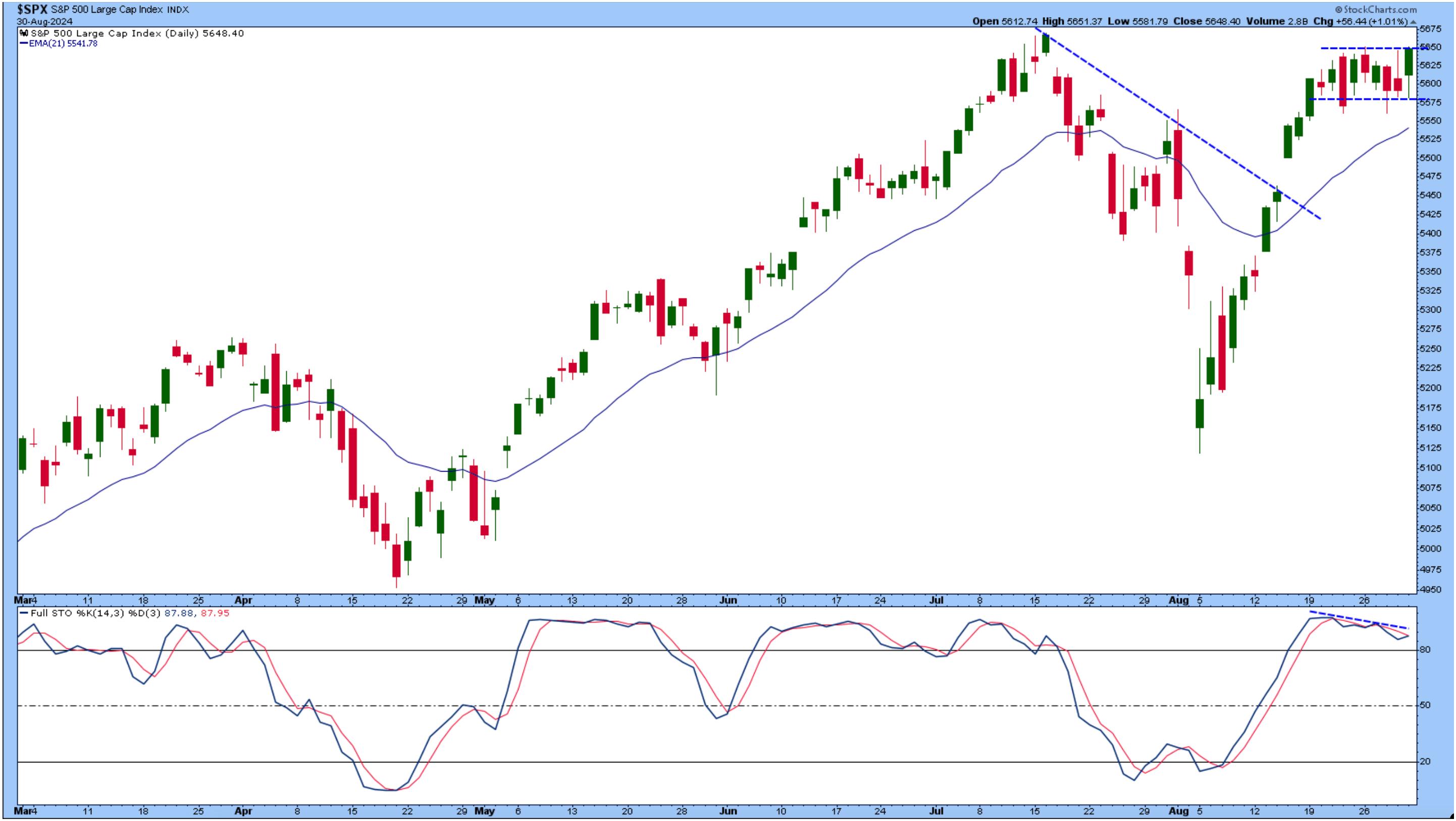
FIGURE 3. DAILY CHART OF S&P 500 INDEX. The index is trading sideways, close to its all-time high. The Stochastic Oscillator indicates that momentum is slowing slightly.Chart source: StockCharts.com. For educational purposes.
The stochastic oscillator is displaying some slowdown in momentum, as the oscillator shows a slight decline amidst the relatively flat movement in the S&P 500.
More interesting is the S&P 500 Equal Weighted Index ($SPXEW), which hit all-time highs. The relative strength index (RSI) and moving average convergence/divergence (MACD) indicate there could be room to rally. This suggests that investors are rotating out of the mega-cap stocks and into smaller-cap ones.
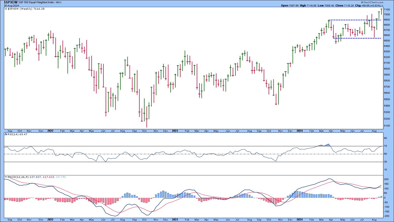
FIGURE 4. WEEKLY CHART OF S&P 500 EQUAL-WEIGHTED INDEX. The index is at a new all-time high. The RSI and MACD indicate there's room for more upside move.Chart source: StockCharts.com. For educational purposes.
This begs the question of how mid-cap stocks perform. The daily chart of the S&P 500 Mid Cap Index ($MID) shows that mid-caps are trading sideways, but the index is close to its all-time highs, which happen to be close to the upper end of the trading range.
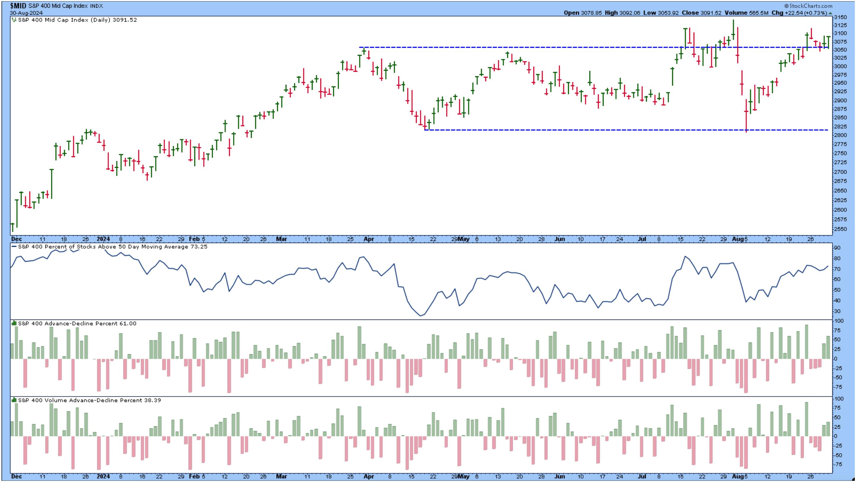
FIGURE 5. S&P 500 MID-CAP INDEX ($MID). The index is trading sideways but is trading close to the top of the range. Market breadth is also expanding, favoring bulls.Chart source: StockCharts.com. For educational purposes.
Market breadth in the mid-caps looks to be broadening, with 73.25% of mid-cap stocks trading above their 50-day simple moving average. The advancers also outnumber the decliners.
You'll likely find a similar situation with the S&P 600 Small Cap Index ($SML).
StockCharts Tip!
Click the above chart of $MID and change the symbol to $SML. Voila! You'll get an updated chart specific to $SML.
So, which stocks in the mid and small-cap asset class should you focus on? This is when it helps to revert to the seasonality chart. Going through all the sector ETFs, Energy, and Utilities tend to be the leaders in September. Out of the two, the chart of Utilities Select Sector SPDR (XLU) shows a well-defined trend.
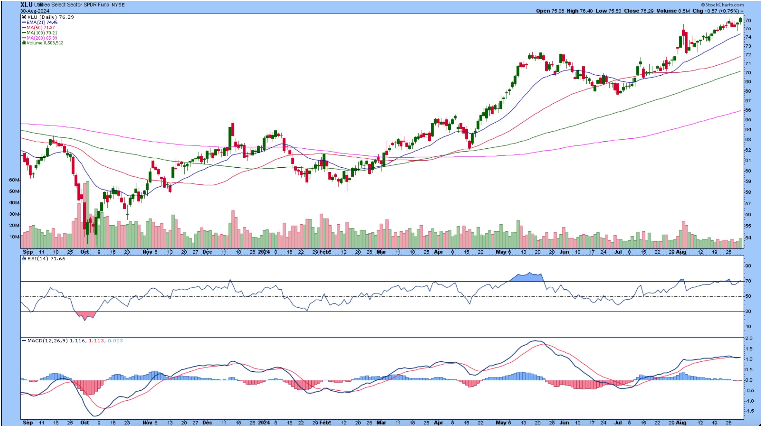
CHART 6. DAILY CHART OF XLU. Utilities have been in a sharp uptrend. The RSI and MACD indicate there's room for more upside. Chart source: StockCharts.com. For educational purposes.
All moving averages overlaid on the chart are trending higher. The RSI and MACD also support the upward trend.
Closing Bell
So, while large-caps typically decline in September, it makes sense to consider investing a portion of your portfolio in mid and small-cap utility and energy stocks.
- On Your Dashboard, click the Sector Summary link (bottom right of Sector Summary panel).
- Select One Month from the Period dropdown menu.
- Click Utilities Sector Fund in the Name column.
- Click the name of the top-performing Industry within the sector.
- Sort the columns by Universe (U column) by clicking the up and down arrows to the right of U.
- Scroll down to the mid-cap stocks and analyze away.
Enjoy your Labor Day weekend, and be ready for market action to resume on Tuesday.
End-of-Week Wrap-Up
- S&P 500 closed up 0.24% for the week, at 5648.40, Dow Jones Industrial Average up 0.94% for the week at 41,563.08; Nasdaq Composite closed down 0.92% for the week at 17713.62
- $VIX down 5.42% for the week closing at 15
- Best performing sector for the week: Financials
- Worst performing sector for the week: Technology
- Top 5 Large Cap SCTR stocks: Insmed Inc. (INSM); FTAI Aviation Ltd. (FTAI); Carvana Co. (CVNA); SharkNinja, Inc. (SN); Tenet Healthcare Corp. (THC)
On the Radar Next Week
- Aug ISM Manufacturing PMI
- Aug S&P Global Services PMI
- Aug ISM Services PMI
- Aug Non Farm Payrolls
- Fed Beige Book
Disclaimer: This blog is for educational purposes only and should not be construed as financial advice. The ideas and strategies should never be used without first assessing your own personal and financial situation, or without consulting a financial professional.
|
| READ ONLINE → |
|
|
|
| Art's Charts |
| This Housing-Related Stock Just Printed a 5 for the Trend Composite |
| by Arthur Hill |
The Home Construction ETF (ITB) is leading the market as it surged to a new closing high this week. While this high is certainly bullish and points to upside leadership, the real signal triggered back in early July as the Trend Composite turned bullish with an outsized move. Let's review this signal and then look at a recent signal in Home Depot.
The chart below shows ITB with the Trend Composite and Normalized ROC. The Trend Composite aggregates signals in five trend-following indicators. Normalized ROC is the 5 period point change divided by ATR(5), which shows price moves in ATR terms. Values greater than +3 indicate that price advanced more than 3 ATR(5) values in five days. This is an outsized move that can kick start an extended uptrend. Note that these indicators are part of the TIP Indicator Edge for StockCharts ACP (here).
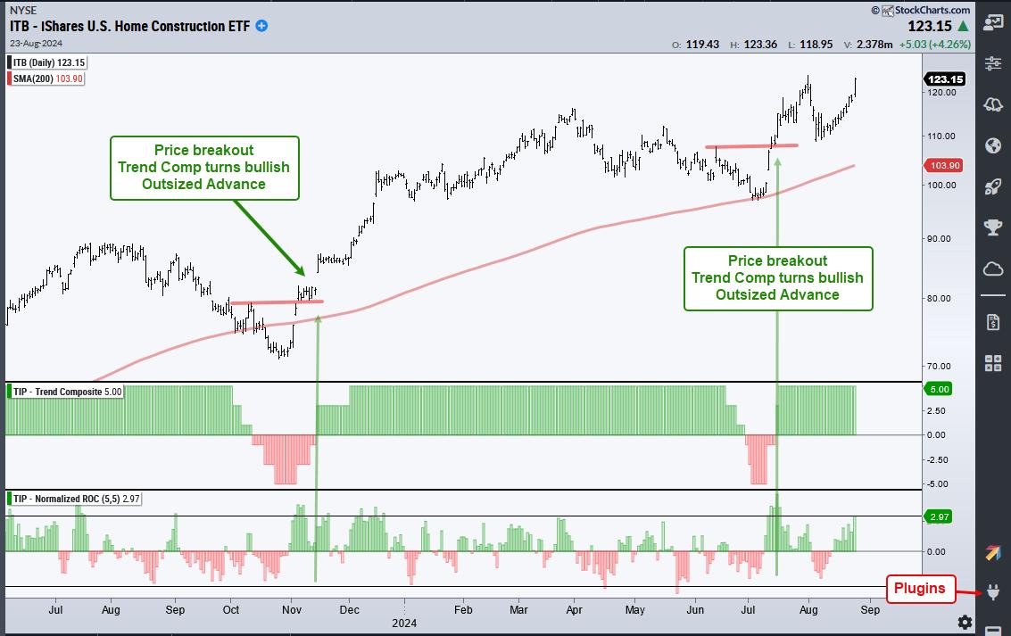
The chart above shows three signals coming together in mid November 2023 and mid July 2024. Notice how ITB broke resistance with an outsized move in early November and the Trend Composite followed with a bullish signal in mid November. ITB corrected into early July and another bullish trio triggered in mid July. This most recent signal was highlighted in the ChartTrader reports at TrendInvestorPro.
The next chart shows Home Depot with the signal trio occurring in November-December and June-July. Rarely do we get all three signals at the same time. Usually the price breakout and outsized move occur first. The Trend Composite is a trend-following indicator that triggers when there is upside follow through.
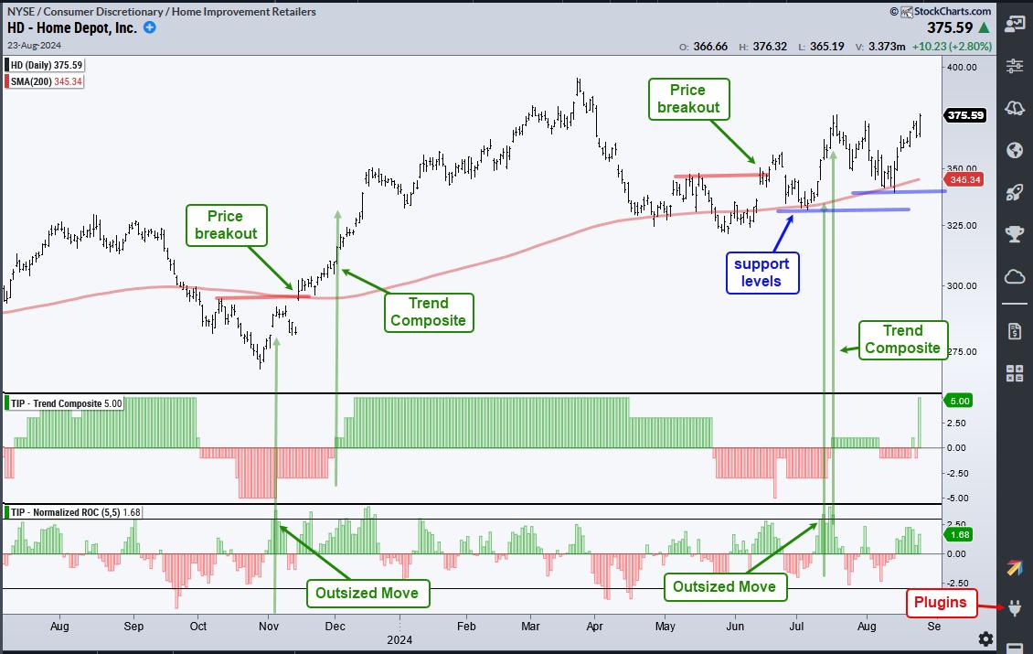
All trend-following indicators lag and produce some whipsaws. The Trend Composite is no different as it whipsawed with by turning negative twice in August. This is normal given the broad market volatility we saw over the last six weeks. The Trend Composite surged to +5 on Friday and this means all five indicators are on bullish signals. The blue lines show support levels from July and now August.
ChartTrader recently introduced two new market timing models in our weekly report and video. One model covers the broad market and the other focuses on timing the Nasdaq 100. Our weekly report/video also covers the charts, setups and signals for SPY, QQQ, MAGS, TLT, GLD, key tech names and more. Click here to take your analysis process to the next level.
//////////////////////////////////////////////////
|
| READ ONLINE → |
|
|
|
|
|
| OptionsPlay |
| PayPal Stock Price Breaks Out: How to Take Advantage of the Price Rise |
| by Tony Zhang |

Earlier this year, in April and June, I laid out a bullish thesis for PayPal Holdings, Inc. (PYPL)—the stock price was bottoming and had the potential to break out. Since then, PYPL has improved. Earlier this week, it finally broke out from its two-year consolidation, triggering a new bullish signal for investors to seek further exposure in PYPL.
On the weekly chart below, you can see PayPal's stock price has decisively broken through a major resistance at $68, a level it struggled with during its two-year consolidation phase. This breakout, coupled with improving momentum and outperformance relative to the market (see Relative Strength Index in the lower panel) suggests that PYPL is poised for a continuation higher. The next upside target for this bullish trend is around the $90 level.
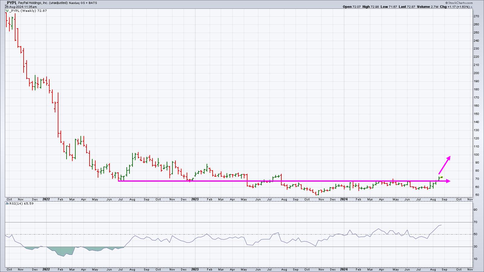
5-YEAR WEEKLY CHART OF PYPL. The resistance level is displayed as a horizontal line drawn @ $68. The lower panel displays the Relative Strength Index (RSI), which is rising.Chart source: StockCharts.com. For educational purposes.
Despite past challenges, PYPL remains fundamentally undervalued. PYPL trades at only 15X forward earnings, which is attractive given its future EPS growth rate, 14% revenue growth rate of 8%, and competitive net margins of 14%. These metrics indicate that PYPL is not only undervalued relative to its growth potential, but well on its way for its turnaround.
The Call Vertical Strategy for PYPL
To capitalize on the breakout higher, I suggest buying the October 18, 2024, $70/$80 Call Vertical for a $3.63 debit. This entails the following:
- Buying the Oct 18 $70 calls
- Selling the Oct 18 $80 calls
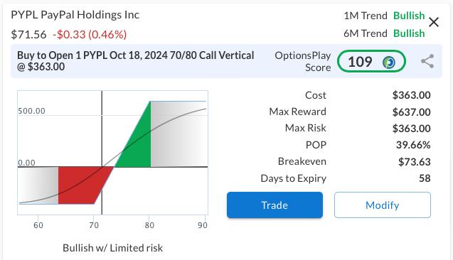
PYPL CALL VERTICAL STRATEGY RISK GRAPH. You're risking $363 for a maximum reward of $637 for this position.Image source: OptionsPlay.
This call vertical spread allows you to benefit from the bullish trend while limiting risk. The total potential profit on this trade is $637 per contract if PYPL is above $80 at expiration, with a maximum risk of $363 per contract if PYPL is below $70 at expiration.
The strategy aligns with our bullish technical and fundamental thesis for PYPL. Explore the options chain for PYPL to view real-time prices.
|
| READ ONLINE → |
|
|
|
| RRG Charts |
| NVDA is Not the Only Semiconductor Stock Out There |
| by Julius de Kempenaer |
It's All Still Relative
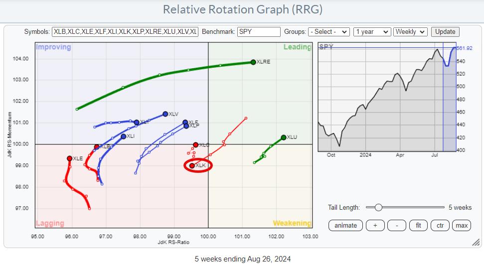
The weekly Relative Rotation Graph, as it looks toward the close of this Friday (8/30) shows a clear picture -- out of Technology, into everything else.
Simple enough, right? However, this is a relative comparison, so it only tells us whether a sector is in a relative up- or downtrend or whether its relative trend is improving or weakening. This means that when SPY starts to move lower, these sectors will likely outperform SPY, but their prices will still go down.
When just looking at the JdK RS-Ratio value as a gauge, there are only two sectors on the right-hand side of the graph with a reading above 100. These are Real Estate and Utilities. All other sectors are below 100 on the RS-Ratio scale and, therefore, technically still in a relative downtrend vs. SPY.
However, except for XLK, all these other sectors are on a positive RRG-Heading, between 0 and 90 degrees, which is a positive takeaway. There is still a risk that these tails may roll over while still inside the improving quadrant and continue their relative downtrend, but XLV, XLF, and XLP are looking especially strong, as they are getting close to crossing over into the leading quadrant.
XLY, XLI, XLB, and XLE are still too low on the RS-Ratio scale for consideration, imho.
SPY is Hitting Resistance
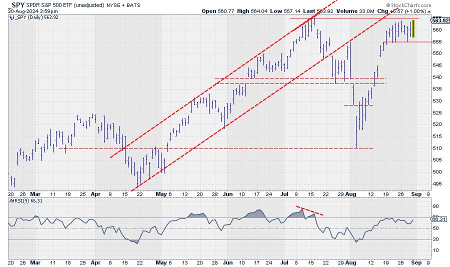
SPY pushing against resistance is creating an interesting situation. 565 is clearly a very important overhead resistance level for SPY. Only when this barrier can be convincingly broken will there be new upside potential for SPY to continue the longer-term uptrend. However, it is questionable whether SPY can break that barrier without the help of the technology sector. At the end of the day, that is now more than 30% of the total market capitalization of the S&P 500.
Over the last few weeks, SPY started to trade in a range between 555 and 565. When 555 gives way to the downside, significant downside risk will be unlocked, targeting the recent gap area between 545-548, followed by intermediate support around 537.5-540 and then 510, which is the level of the last major low.
Given the importance of the tech sectors in the current environment, I see the risk of a break below 555 as greater than the potential of a break above 565.
Semis / Tech Are Key
So, the tech sector, and especially the group semiconductors, will play an important role in the coming weeks to determine the faith direction of the general market.
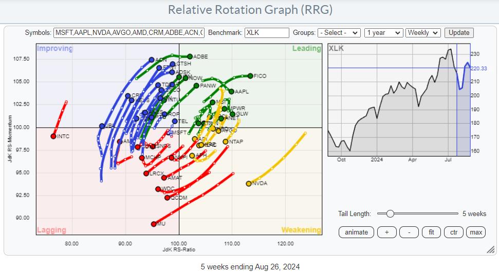
This RRG shows the members of the Technology sector. The big elephant NVDA is clearly visible inside the weakening quadrant and rotating toward the lagging quadrant at a negative RRG-Heading.
The semiconductors and semiconductor equipment group is now the largest industry inside the technology sector, weighing more than 40%. NVDA itself is now the second-largest stock in the technology sector, with a weight of 20%. So when it moves, it moves, making the industry and the sector move.
NVDA is BIG, But Not the Only Semiconductor Stock
When I isolate the semiconductor stocks on the RRG, we see this image:
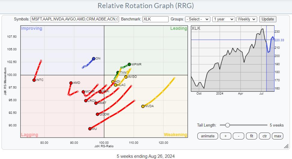
Most of these stocks are moving in the same direction as NVDA, on a negative RRG-Heading, weighing in on the industry and then on the sector. However, this is an extremely important group of stocks that deserves at least a minimal allocation in each portfolio "just in case it all turns around and starts to go up again." From that perspective, it makes sense to look for alternatives as long as NVDA is rotating on a negative heading, digesting its recent gains and relative outperformance.
Searching for stocks on a positive RRG-Heading provides a few potentials.
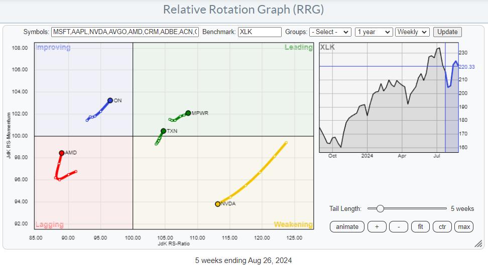
Combining the positions on the RRG and looking at the individual charts. MPWR and TXN could be interesting alternatives if NVDA maintains its negative RRG-Heading.
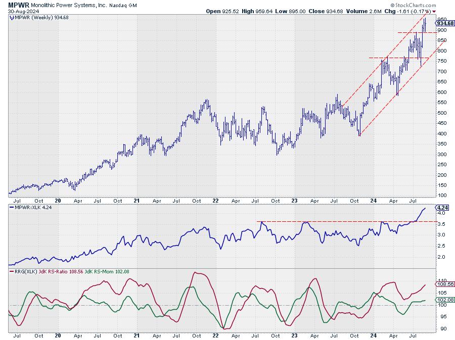
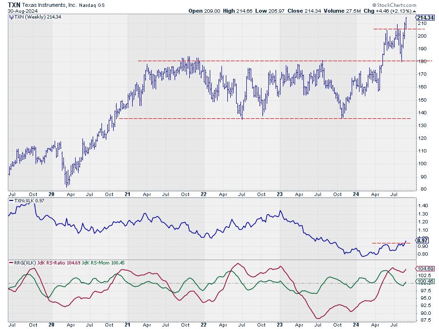
#StayAlert and have a great weekend. --Julius
|
| READ ONLINE → |
|
|
|
| ChartWatchers |
| New Highs, But Danger Looms—Is XLF Heading for a Big Fall? |
| by Karl Montevirgen |
 Financial sector stocks are at an all-time high, fueled partly by earnings beats, a favorable and higher interest rate environment, and sector sentiment. Investors are seeing value buying opportunities in many beaten-down financial stocks. Should you follow their lead? Financial sector stocks are at an all-time high, fueled partly by earnings beats, a favorable and higher interest rate environment, and sector sentiment. Investors are seeing value buying opportunities in many beaten-down financial stocks. Should you follow their lead?
According to Fed Chief Powell's latest remarks, rate cuts are on the horizon. Lower interest rates can cut both ways, narrowing net interest margins and pressuring bank earnings while boosting the broader market and lifting stocks, including financials.
When navigating such fundamental uncertainty, it helps to step back and consider the broader patterns at play. Consider seasonal trends and how technical price action might inform your short-term strategy. Let's start with seasonality.
5-Year Seasonality Chart of XLF
The StockCharts seasonality chart can help you identify how XLF performs each month and the average price change (see below).

CHART 1. FIVE-YEAR SEASONALITY PROFILE FOR XLF. Note September's negative performance.Chart source: StockCharts.com. For educational purposes.
The numbers above the bar signify the percentage of higher closes. The numbers at the bottom of each bar signify the average % return for the time period being analyzed -- in this case, five years.
Key points from the XLF seasonality chart are as follows:
- September is the worst month for XLF, averaging zero higher closes over the last five years with a return of -4%.
- October, November, and December make up XLF's strongest quarter with a higher-close rate of 50% and 75% and an average return of 4%, 7.2%, and 2.4%, respectively.
That's the seasonality profile over the last five years, and the recent economic environment weighs in heavily on the data. But what happens if you zoom out to 10 years, which includes economic activity before the pandemic and inflationary pressures that shaped the last five years?
10-Year Seasonality Chart of XLF

CHART 2. 10-YEAR SEASONALITY PROFILE FOR XLF. September's still a doozy.Chart source: StockCharts.com. For educational purposes.
Accounting for the sector activity before the economic challenges that came about during and after the pandemic, you can see that September is still an awful (though not the worst) month for XLF, raking in an average return of -1.6% with a higher-close rate of only 22%.
Like the five-year profile, October through December still comprises the strongest quarter, with November standing out as the strongest month with an 89% higher close rate and an average return of 6.2%.
Looking at these seasonality profiles, should you anticipate September's weakness as a potential bullish setup for a strong fourth quarter?
Financials—A Sector Breadth Perspective
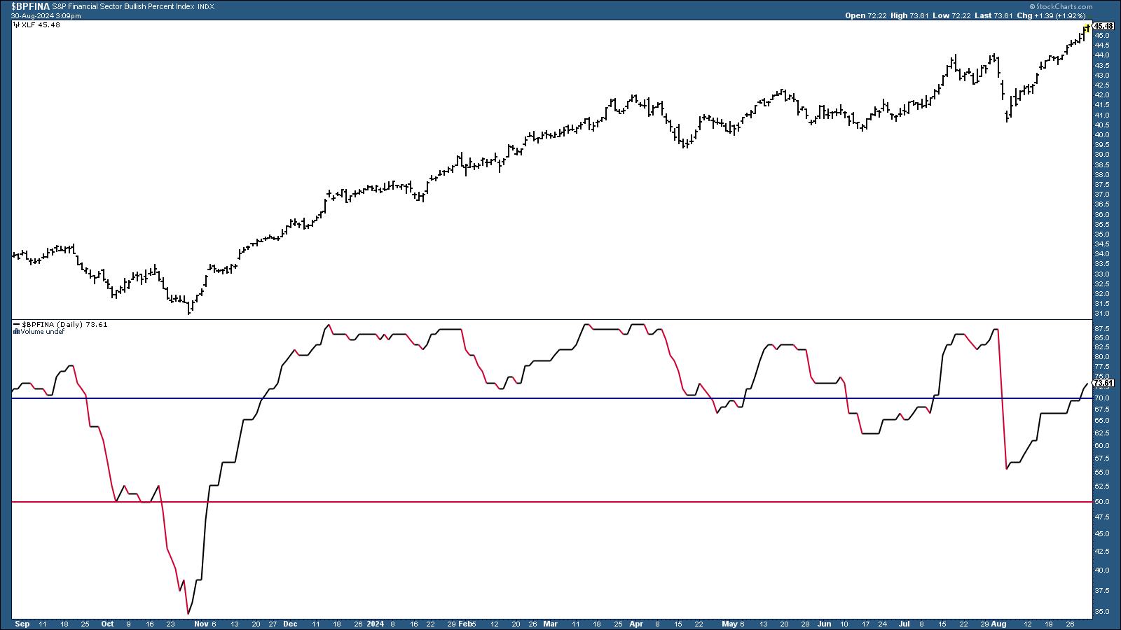
It helps to analyze the financial sector in terms of breadth and assess how many financial stocks within the ETF are participating in the uptrend versus those that aren't. Below is a chart of the S&P Financial Sector Bullish Percent Index ($BPFINA) and XLF.

CHART 3. S&P FINANCIAL SECTOR BULLISH PERCENT INDEX. This indicator is entering oversold territory but can remain above 70 for an extended period if XLF continues trending higher.Chart source: StockCharts.com. For educational purposes.
StockCharts Tip!
To recreate the chart, click on the above chart or follow these steps.
- Enter the symbol, in this case $BPFINA, in the symbol box.
- Select your preferred chart settings, such as chart style, time frame, log scale, etc.
- Enter horizontal line overlays using different parameters, i.e., 70, 50, and 30.
- Under Indicators, select Price from the dropdown menu, enter XLF in the parameters box, and position it above, below, or behind the BPI.
As XLF continues to trend higher (see price chart above the BPI chart), the financial sector as a whole is also entering overbought territory, according to the Bullish Percent Index (BPI).
Generally, a BPI line above 50% favors the bulls, while below 50% favors the bears. However...
- A rise from below 30% (oversold) indicates potential bullishness.
- A decline from above 70% (overbought) suggests bearishness.
If the seasonality trend plays out, what might you anticipate in the weeks ahead? Let's shift to the daily chart of XLF.
A Closer Look at XLF's Daily Price Action

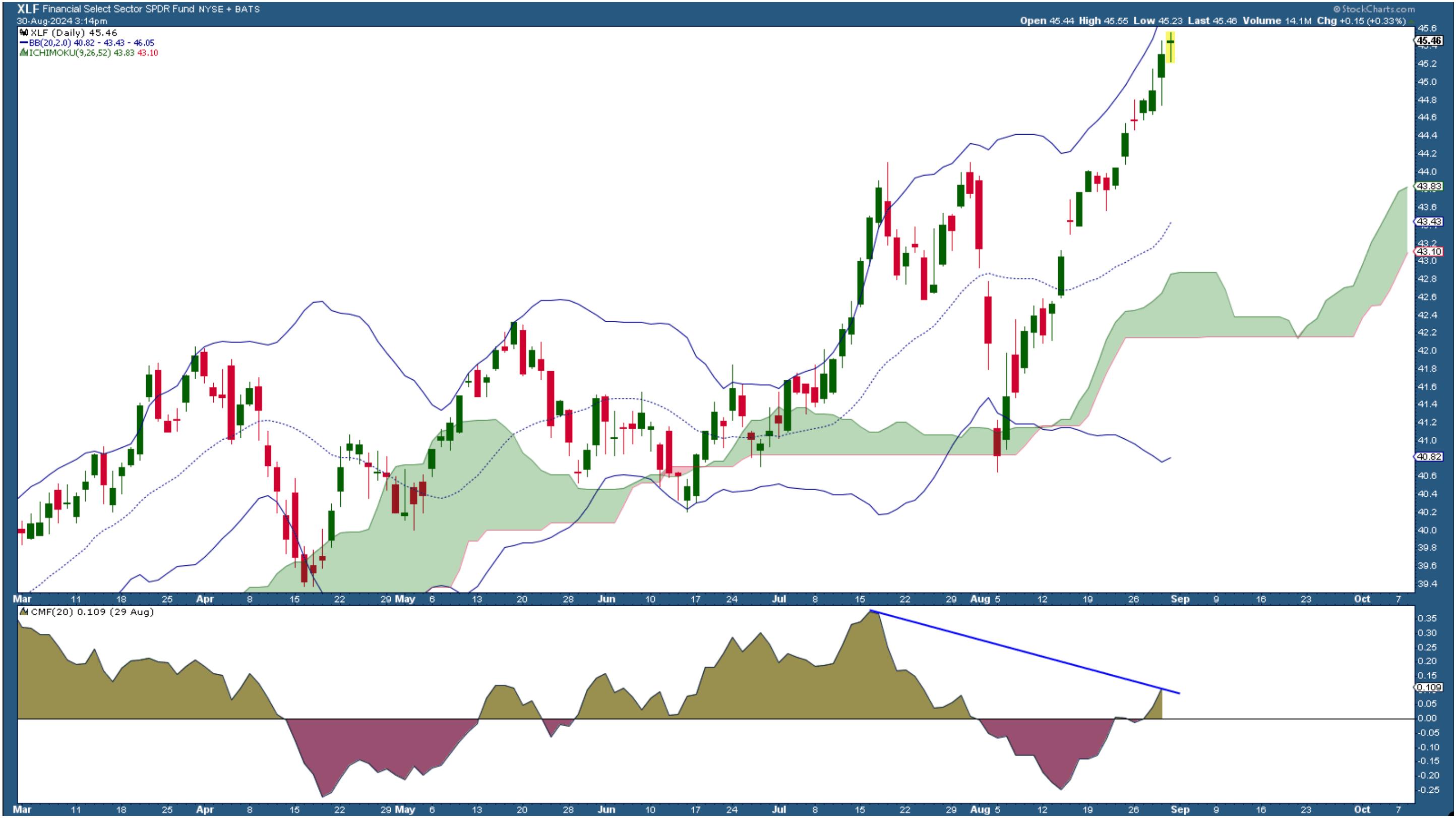
CHART 4. DAILY CHART OF XLF. No signs of stopping, yet note the divergence in CMF momentum.Chart source: StockCharts.com. For educational purposes.

In a nutshell:
- XLF shows no sign of slowing, yet the near-term surge is going parabolic.
- The Chaikin Money Flow (CMF) shows that buying pressure is picking up, but note the divergence between it and the price trend, suggesting that momentum may or may not be sufficient to fuel a continued rise.
- Price is hugging and nearing the top of the Bollinger Bands; price tends to revert back toward the middle, which, coincidentally, will likely meet the "kumo" level of the Ichimoku Cloud indicator.
In short, it's a wait-and-see moment. XLF's entry into overbought territory, coupled with declining momentum, aligns with the seasonal tendency for September's weakness. If a dip occurs and the fundamentals remain stable, a pullback toward the middle Bollinger Band or the "cloud" could present a strong buying opportunity.
Closing Bell
XLF is riding high (like, very high), but with September's seasonal weakness and its low-momentum entry into overbought territory, it's important to remain cautious. Keep an eye on how financial stocks perform in the coming weeks. If the anticipated dip happens and fundamentals stay solid, this could be your chance to buy in before the expected Q4 strength kicks in.
Be sure to save XLF in one of your StockCharts ChartLists.
Disclaimer: This blog is for educational purposes only and should not be construed as financial advice. The ideas and strategies should never be used without first assessing your own personal and financial situation, or without consulting a financial professional.
|
| READ ONLINE → |
|
|
|
| ChartWatchers |
| Stock Market Today: NVDA Reports, Tech Lags, Financials Take the Lead |
| by Jayanthi Gopalakrishnan |
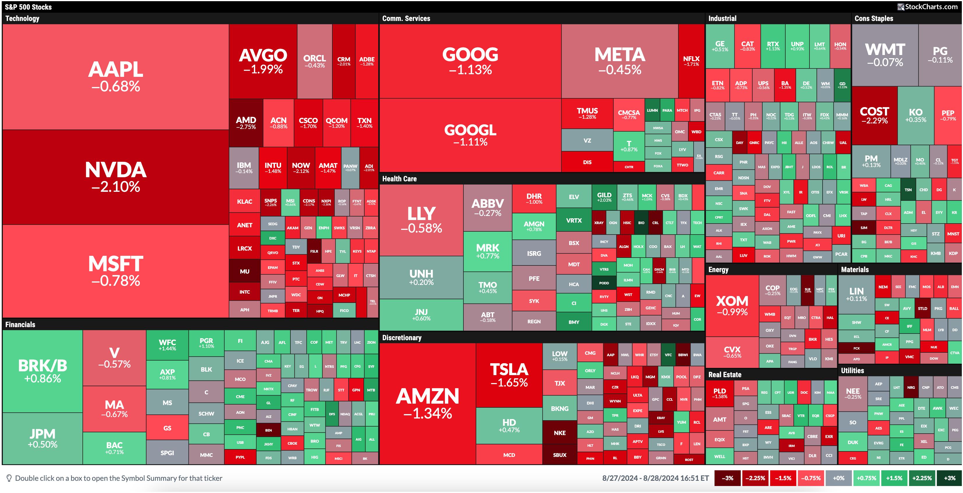
Today's MarketCarpet was a sea of red with just a few dabs of green. Financials took the lead, followed by Health Care and Utilities.

FIGURE 1. A SEA OF RED. Today's stock market action was dominated by selling pressure, but some sectors saw more buying.Image source: StockCharts.com. For educational purposes.
The Technology sector, yesterday's leader, is at the bottom today. The three stocks with the largest market cap in this sector, Apple (AAPL), Nvidia (NVDA), and Microsoft (MSFT), sold off, with NVDA trading 2.10% lower. This is ahead of NVDA's earnings, which were reported after the close. Even though NVDA beat estimates and provided strong guidance, the stock was extremely volatile, with more selling pressure.
Given that NVDA makes up about 7% of the S&P 500 ($SPX) and 8% of the Nasdaq Composite ($COMPQ), the indexes follow NVDA's path. We'll have to wait till tomorrow's open to see if things settle down.
Finding Investment Opportunities
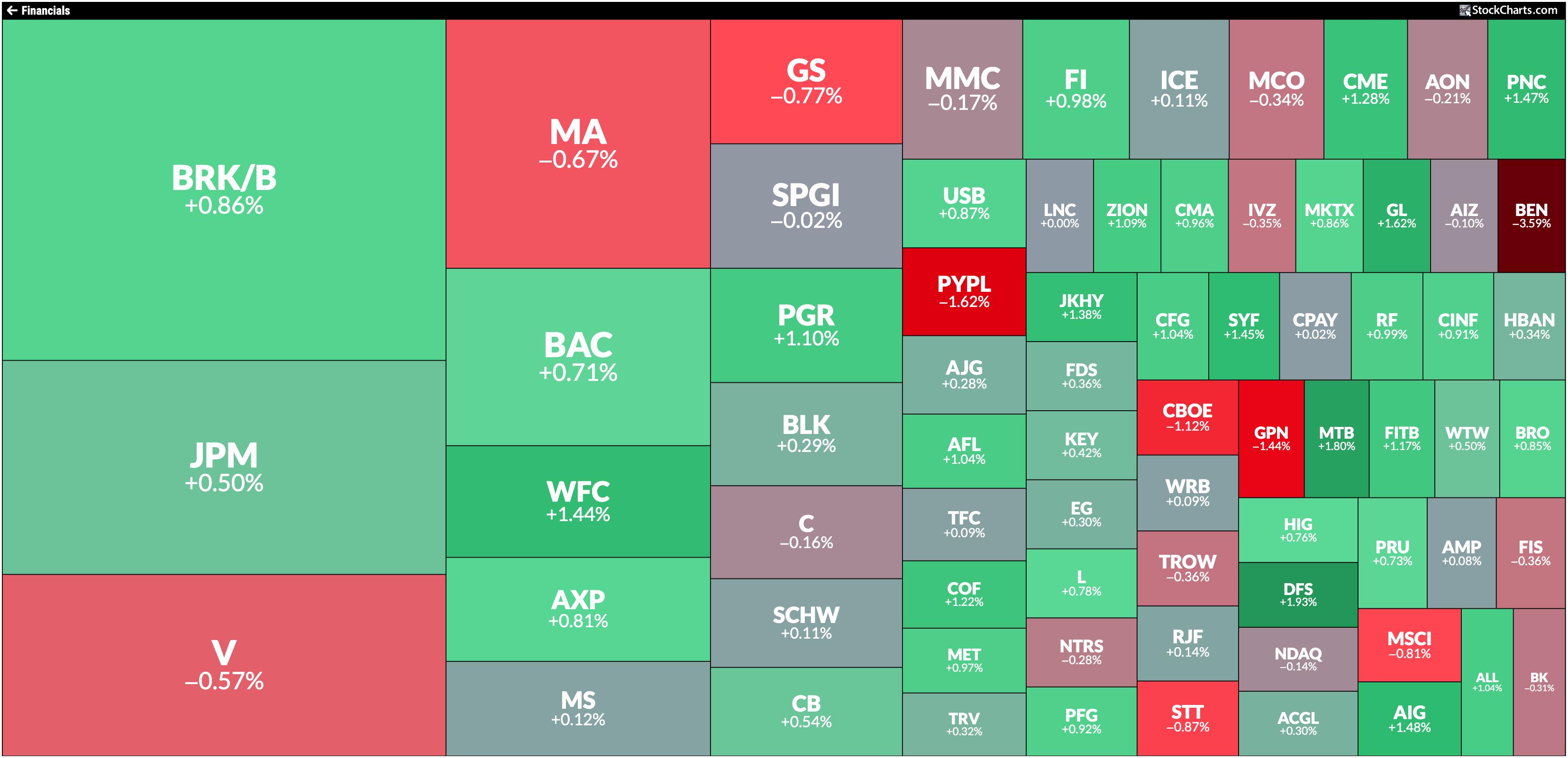
In the meantime, let's pinpoint areas in the stock market that show stability. The one sector that stands out is Financials. In yesterday's post, the focus was on the Financial Select Sector SPDR Fund (XLF), which continues to hit all-time highs. The Financials quadrant in today's MarketCarpet shows that Discover Financial (DFS) led the pack with a 1.94% rise.
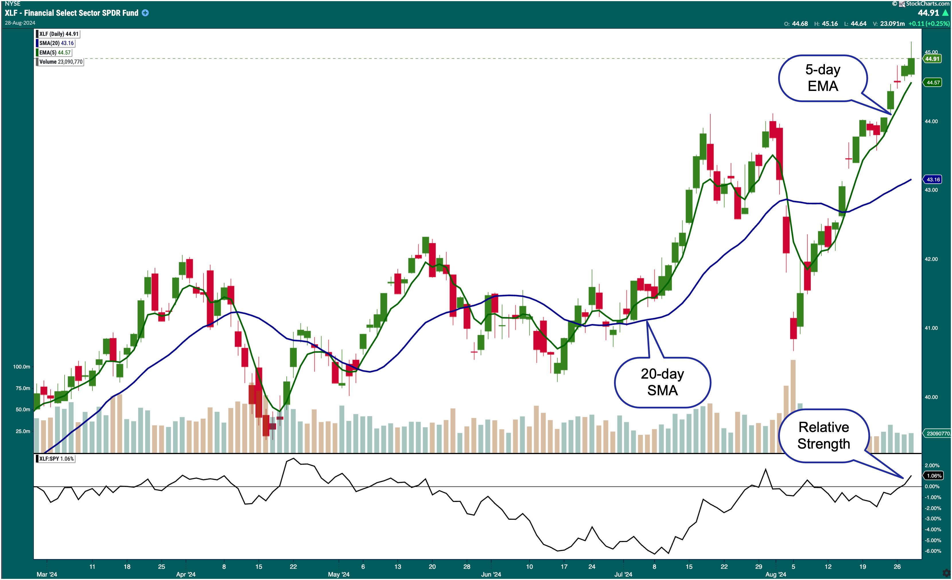
The daily chart of XLF below shows that XLF is trading above its 5-day exponential moving average (EMA) and its 20-day simple moving average (SMA).

FIGURE 2. DAILY CHART OF FINANCIAL SELECT SECTOR SPDR FUND (XLF). Relative to the SPDR S&P 500 Fund (SPY), XLF is starting to gain strength. The ETF is also trading above its one-week EMA and 20-day SMA.Chart source: StockChartsACP. For educational purposes.
Also, note that, relative to the SPDR S&P 500 Fund (SPY), XLF is gaining strength. It's now outperforming SPY by a modest 1.06%.
While all the attention was on technology, communication services, and consumer discretionary stocks, financial stocks were quietly gaining strength. Given the next FOMC meeting is a few weeks away, XLF could continue rising higher. After Fed Chair Jerome Powell's speech in Jackson Hole on August 23, where he suggested that the Fed is prepared to cut interest rates, XLF has consistently been hitting new all-time highs. With interest rate cuts expected this year—there's a possibility of a target rate of 4.25%–4.5% by December according to the CME FedWatch Tool—think of how high XLF could go!
If you're weary of investing in exchange-traded funds, consider selecting a handful of stocks in the Financial sector. Click the Financials header in the MarketCarpet to see the stocks in the sector.

FIGURE 3. FINANCIAL SECTOR MARKETCARPET. The largest squares represent the largest stocks by market cap, whereas the darkest green squares represent stocks with the largest gains.Image source: StockCharts.com. For educational purposes.
At the Close
The stock market can be extremely volatile, especially close to big earnings report releases. To avoid getting caught up in all the market noise, identify sectors that are showing stability. Right now, it may be the Financial sector. But that can change, so be flexible and, when you see things changing, be prepared to sell your positions.
StockCharts Tip.
Create a ChartList of the 11 sector ETFs StockCharts uses as sector proxies.
Disclaimer: This blog is for educational purposes only and should not be construed as financial advice. The ideas and strategies should never be used without first assessing your own personal and financial situation, or without consulting a financial professional.
|
| READ ONLINE → |
|
|
|
| MORE ARTICLES → |
|


 Financial sector stocks are

