| THIS WEEK'S ARTICLES |
| Market Roundup |
| Global Stocks Join Global A/D Line Above Key Trend Lines |
| by Martin Pring |
Editor's Note: This article was originally published in Martin Pring's Market Roundup on Tuesday, April 9th at 1:08pm ET.
Global stocks, represented in the form of the MSCI World Stock ETF (ACWI), peaked in January of last year and gradually worked their way lower into late December. However, a remarkable turnaround has enabled the price of this ETF to complete a 6-month inverse head-and-shoulders and crash through its bear market trend line. In addition, Chart 1 shows that my Global A/D line has completed a 12-month consolidation pattern and broken out decisively on the upside. This broadly-based advance suggests supports the idea that the that the ACWI breakout is for real. Even though several measures of market momentum are currently overstretched on the upside, I am going to assume that’s the case - that is, unless the price experiences a daily close under the previous minor low and two breakout trend lines in the $70.50-$71 area.
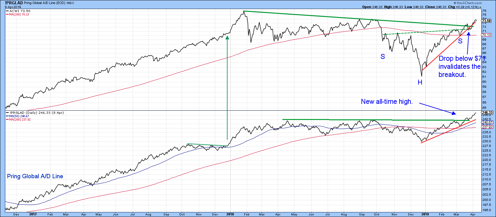
Chart 1
Chart 2 indicates that the Dow Jones Global Index ($DJW) has also experienced a breakout. The chart also features my Global Diffusion indicator, calculated by monitoring a basket of individual country ETFs that are above their 40-day MAs. That indicator has just triggered a buy signal by crossing above its 10-day MA. Note that the signal is obviously happening at a very high, and therefore risky, level. However, the three green arrows, which track buy signals triggered at a similar level, were all followed by higher prices due to strong upside momentum at the time.
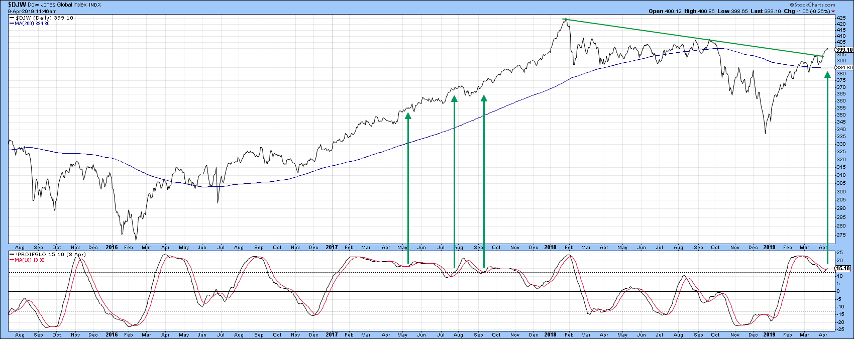
Chart 2
Chart 3 features a 14-day RSI for the Global Index. The pink shadings indicate bear markets, in which upside momentum is typically constrained at lower levels than during the course of a bull market. Note that, once the bear gets underway, the RSI is not able to exceed the dashed green horizontal line at the 60 level. During the course of a bull market, by contrast, the RSI does not operate under these constraints as it frequents the blue overbought zone. A high RSI reading, therefore, offers one sign that the trend has changed from bear to bull. This rule does not work for every security, which means that, if you want to adopt this approach, it’s important to check at least 10 years of history for the item in question. Firstly, you'll want to see whether it behaves differently in a bull than a bear market. Secondly, you'll need to get a feel for the specific ranges at play. In the case of the $DJW, it seems that a rally in the RSI above the 65-zone (solid green line) is sufficient to confirm that a primary bull market is underway. The three previous instances have been flagged with the green arrows. While some of these signals came well after the low, each was followed by a significant advance. In the current situation, the RSI has rallied to the 61 level but has yet to trigger that magic 65. Given the breakout in both the price and A/D Line, I think there is a good chance that it will.
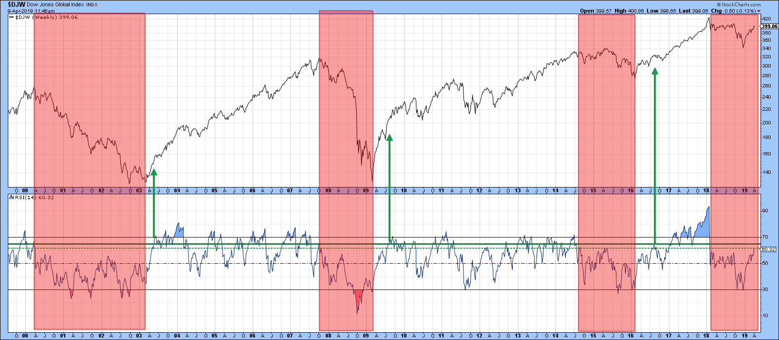
Chart 3
Chart 4 compares the relative performance of several regional ETFs to the MSCI World ETF itself. The chart shows that the US, in the form of the SPY, has been out-performing the world. As long as SPY can maintain a position above the 2010-2019 red uptrend line, I am going to assume that is still the case. Should that line be violated with a break below the 38 level, that would suggest that leadership had been transferred to other parts of the world for the first time in a decade. We will only know which region is favored when the technical position actually changes. Right now though, the emerging market space seems to be the most likely, as it is closer to a trend line violation than either Europe or Asia.
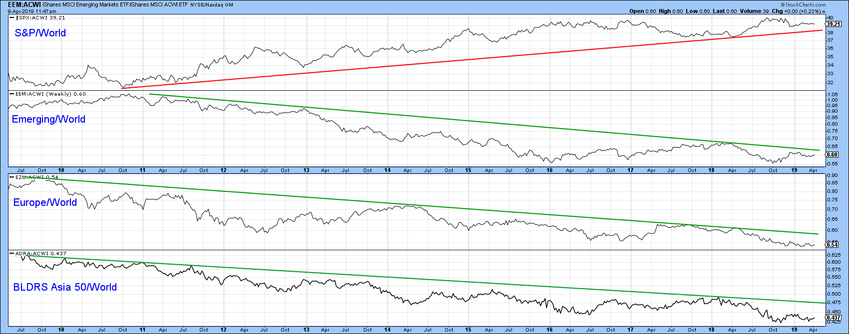
Chart 4
Good luck and good charting,
Martin J. Pring
The views expressed in this article are those of the author and do not necessarily reflect the position or opinion of Pring Turner Capital Group of Walnut Creek or its affiliates.
|
| READ ONLINE → |
|
|
|
 |
| The Mindful Investor |
| An Aggressive Projection for the Dow |
| by David Keller |
Have you ever played devil’s advocate in a group discussion? That's the situation where everyone comes to one conclusion, so you take the opposite side just to provide an alternative hypothesis and argue its merits.
We often avoid this sort of “outside the box” thinking because of confirmation bias. Once we’ve decided we’re bearish, we assign greater importance to any new bearish evidence because it supports our predetermined thesis.
One way to combat this is to play devil’s advocate with your own process. Once you’ve drawn a conclusion, force yourself to take the opposite side of the argument. What would need to happen to make your thesis completely incorrect?
To be clear, I’m overall bearish on US equities here. I’m not “the world is ending” bearish, but I’m more in the “I just can’t see much further upside from here” camp. I wouldn’t be surprised if we end the year within 5% of where we’re at right now.
But what if stocks go dramatically higher from here? What would have to happen for my flat-to-down thesis to be incorrect?
This idea came to me when I looked at a daily chart of the Dow after the close on Friday, shown below:
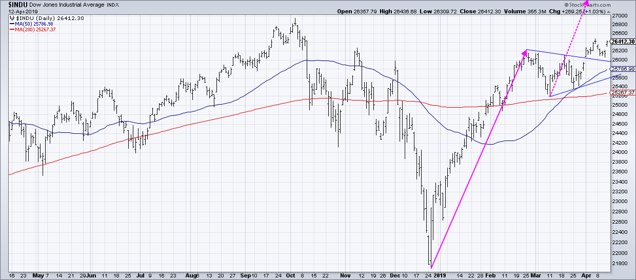 I decided that the month of March looks like a pretty classic pennant pattern: a long uptrend followed by a short-term consolidation with lower highs and higher lows. I decided that the month of March looks like a pretty classic pennant pattern: a long uptrend followed by a short-term consolidation with lower highs and higher lows.
If that was a pennant, which resolved to the upside the first week in April, then what would the upside target be for the Dow? Based on the length of the flagpole, that would mean an upside objective of 30,466, about 15% higher than current levels. Take a similar measurement on the S&P 500 (which did not have a pennant, but you figure if the Dow goes up that much, then it's fair to say the S&P could go up a similar amount) and that gives you a target of 3265.
Wow.
So what would we need to see for the market to get to that level? Here’s a laundry list of bullish tells that would have to persist for quite a while:
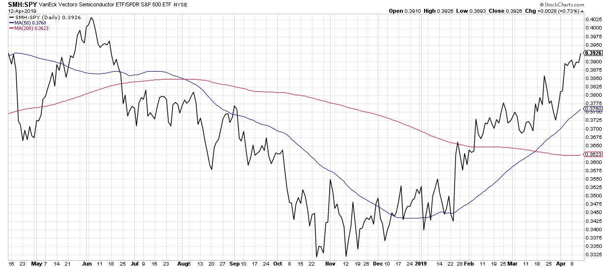
1. Technology, and especially semiconductors, would have to remain leadership. However, it's highly unlikely that the market could move that far without semis being a big part of the upside.
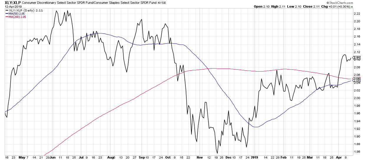
 2. Offense would need to prevail over defense in the consumer sectors. The Consumer Discretionary vs. Consumer Staples broke to new highs earlier this month. We would need to see further outperformance by the traditional offense in the space. 2. Offense would need to prevail over defense in the consumer sectors. The Consumer Discretionary vs. Consumer Staples broke to new highs earlier this month. We would need to see further outperformance by the traditional offense in the space.
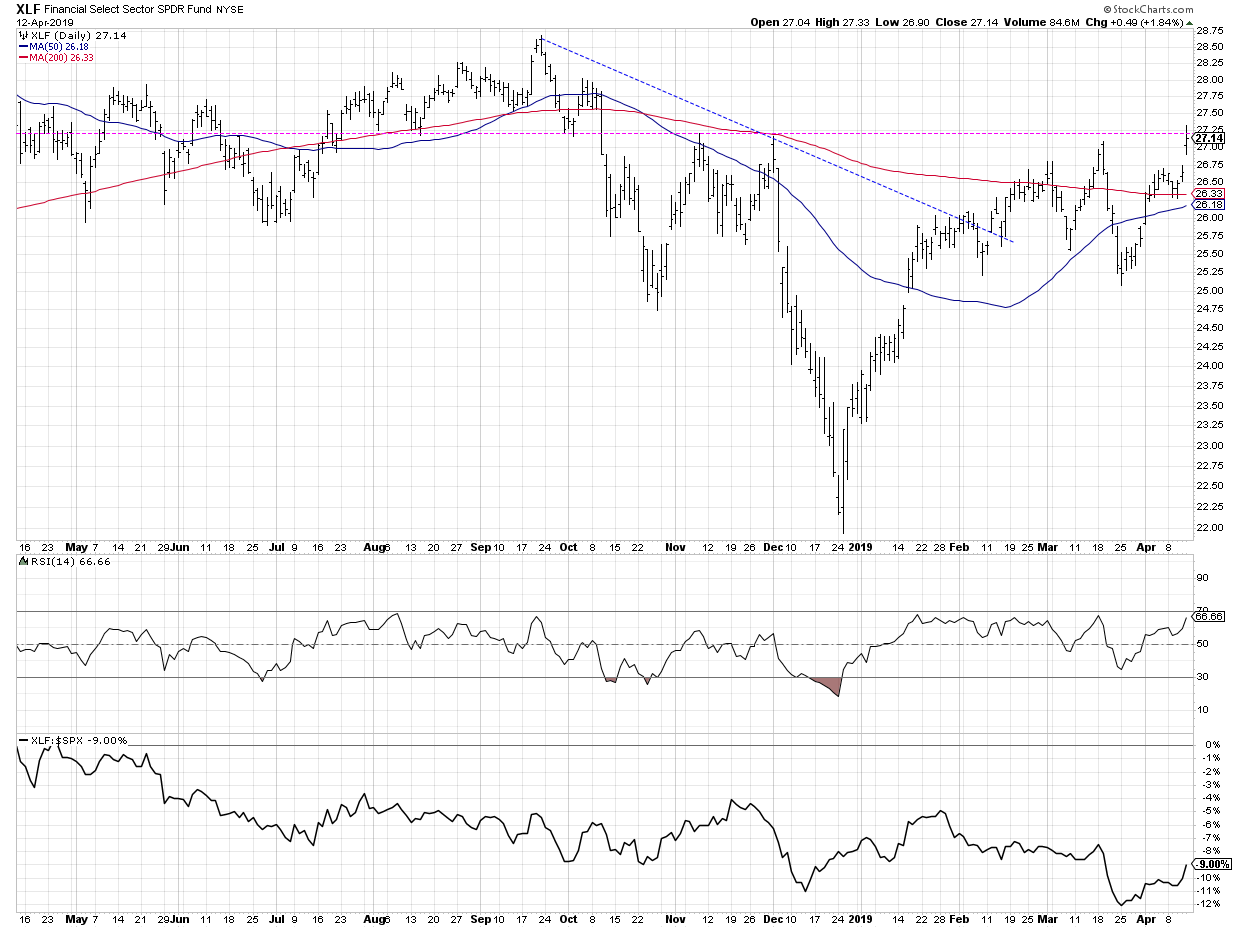
 3. Financials would need to join in the bullish party. The big banks are just starting to report earnings; they would have to impress to move these charts to more bullish configurations. 3. Financials would need to join in the bullish party. The big banks are just starting to report earnings; they would have to impress to move these charts to more bullish configurations.
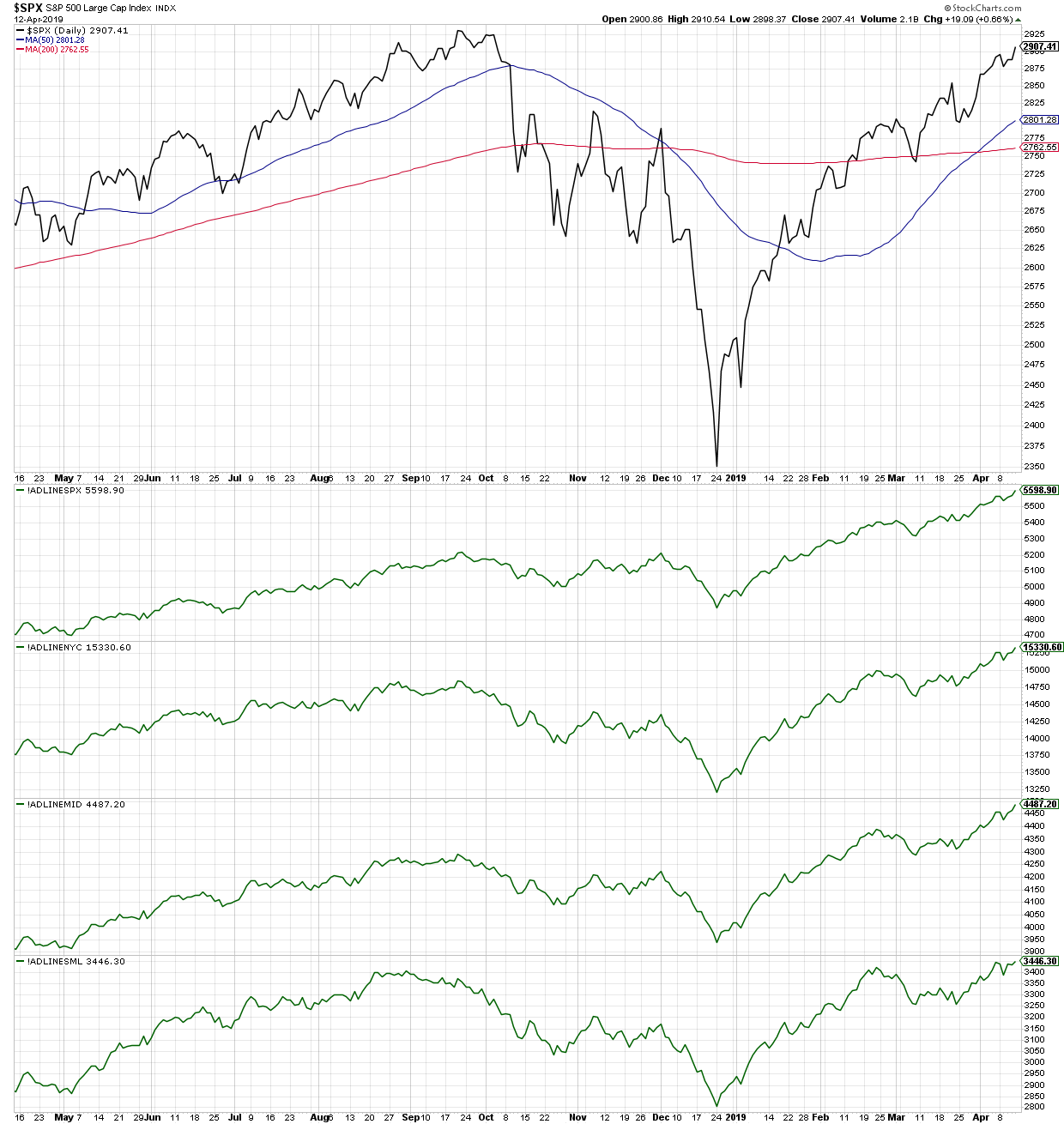
 4. Breadth would need to remain positive across the board. I wrote earlier about the breadth in mid and small cap names vs. large caps. At this point, all cap tiers have seen positive breadth into the weekend. Those trends would need to remain higher. 4. Breadth would need to remain positive across the board. I wrote earlier about the breadth in mid and small cap names vs. large caps. At this point, all cap tiers have seen positive breadth into the weekend. Those trends would need to remain higher.
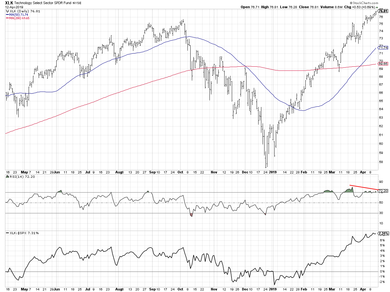
 5. Bearish divergences would need to completely blow out. One of the bullet points in my bearish thesis is the bearish divergence for lots of technology names as they test all-time highs. Those signals would need to fail as the XLK moves further up. 5. Bearish divergences would need to completely blow out. One of the bullet points in my bearish thesis is the bearish divergence for lots of technology names as they test all-time highs. Those signals would need to fail as the XLK moves further up.
 6. The equity markets would need to ignore traditional seasonal tendencies. We’re soon entering the seasonally weakest part of the year. Equities would need to ignore that pattern or at least have a limited drawdown before continuing the uptrend. 6. The equity markets would need to ignore traditional seasonal tendencies. We’re soon entering the seasonally weakest part of the year. Equities would need to ignore that pattern or at least have a limited drawdown before continuing the uptrend.
So are all six of those points possible? Absolutely. Are they likely? I honestly don’t think so. But by going through this exercise, I now have a checklist of things to watch for which would confirm that the “ultra-bullish” thesis is starting to play out. If the market begins to achieve these bullish objectives, I may have to mentally prepare for much further upside in stocks.
Take a look at your current positions. Play devil’s advocate on one of those stocks. What would you need to see to validate the opposite case and invalidate your current position?
RR#6,
Dave
David Keller, CMT
President, Sierra Alpha Research LLC
Disclaimer: This blog is for educational purposes only and should not be construed as financial advice. The ideas and strategies should never be used without first assessing your own personal and financial situation, or without consulting a financial professional.
The author does not have a position in mentioned securities at the time of publication. Any opinions expressed herein are solely those of the author, and do not in any way represent the views or opinions of any other person or entity.
|
| READ ONLINE → |
|
|
|
|
|
| Trading Places |
| Here Are The Industry Groups Flying Into Earnings Season |
| by Tom Bowley |
Analysts routinely visit management teams of public companies to see how their quarters are progressing. Based on the knowledge they gain, they return to their offices and their firms issue recommendations to buy or sell. It's the reason that we do what we do. By analyzing price action, we begin to get a feel for which areas of the market we're likely to see a rapidly improving earnings environment. To that end, I'd suggest taking a look at the following groups based on their recent relative outperformance:
 The green shaded area shows that each of the above industry groups have performed extremely well on a relative basis over the past month. However, I want to focus on the areas that have been outperforming since the December market bottom. Blue directional lines highlight these "better" relative performers, while the red directional lines suggest we might want to be a bit more cautious on the others. The green shaded area shows that each of the above industry groups have performed extremely well on a relative basis over the past month. However, I want to focus on the areas that have been outperforming since the December market bottom. Blue directional lines highlight these "better" relative performers, while the red directional lines suggest we might want to be a bit more cautious on the others.
Specialty finance ($DJUSSP) is one of my favorite areas heading into earnings season as it's the only group above that's broken out to fresh relative highs. Don't be surprised to see some blowout reports in this group.
Happy trading!
Tom
|
| READ ONLINE → |
|
|
|
| DecisionPoint |
| EARNINGS: 2018 Q4 Finalized; S&P 500 Still Overvalued |
| by Carl Swenlin |
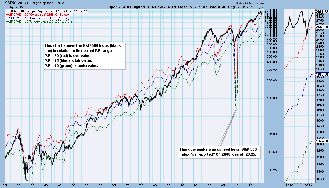
S&P 500 earnings for 2018 Q4 have been finalized, and with a P/E of 21.4, the market is above the normal value range and very overvalued. The following chart shows us the normal value range of the S&P 500 Index. It shows us where the S&P 500 would have to be in order to have an overvalued P/E of 20 (red line), a fairly valued P/E of 15 (blue line), or an undervalued P/E of 10 (green line). There are three hash marks on the right side of the chart to show where the range bands are projected be at the end of 2019 Q4. If earnings estimates hold and price doesn't change significantly, the market could be back in the normal range by year end, but it will still be overvalued.
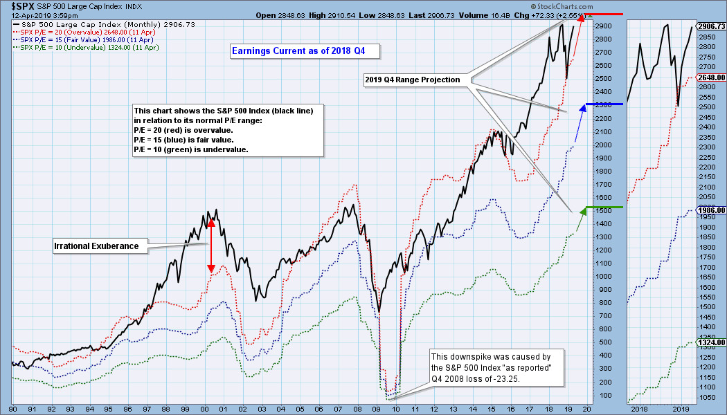
Historically, price has usually stayed below the top of the value range (red line); however, since about 1998 it is not uncommon for price to exceed normal overvalue levels. The market hasn't been undervalued since 1984.
The table below shows how earnings are expected to improve going forward, but the drop in P/E shown is only possible if price doesn't rise significantly. In the best case shown (2019 Q4), the market will be close to fair value, but this depends upon price being about the same level as it is now.
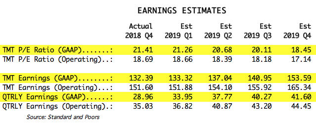
The following table shows where the colored bands will be using forward earnings.

CONCLUSION: These earnings charts are intended to provide an historical context for current earnings, and to demonstrate that overvaluation is not your friend. The S&P 500 is back outside the normal value range, and it is very overvalued. Historically, overvalued conditions leave the market vulnerable for a large correction or bear market, but valuation assessment is not a precise timing tool.
Technical Analysis is a windsock, not a crystal ball.
Happy Charting!
- Carl
Helpful DecisionPoint Links:
DecisionPoint Chart Gallery
Trend Models
Price Momentum Oscillator (PMO)
On Balance Volume
Swenlin Trading Oscillators (STO-B and STO-V)
ITBM and ITVM
SCTR Ranking
|
| READ ONLINE → |
|
|
|
| The MEM Edge |
| Trading Stocks Before They Report Earnings - Tips to Improve Your Success Rate |
| by Mary Ellen McGonagle |
Earnings surprises can move a stock substantially, leading to either huge gains or big losses in your portfolio. Today, I’ll be reviewing how you can trade during earnings season to your benefit. There is no single absolute way to do this; rather, as you’ll see, it will depend on your willingness to put the work in before a company reports.
For those of you more averse to the inherent risk of buying into the release of earnings, I’ll be reviewing profitable ways to trade a stock after it reports in my next ChartWatchers article (2 weeks from now!).
Before we review some basic tips for successfully navigating earnings season, it’s important to assess the technical and psychological health of the broader markets, as this will determine your course of action. For those of you who watch my weekly MEM Edge show (which airs live Monday mornings on StockCharts TV), you’ll know that, currently, my work shows that the markets are in a bullish uptrend and poised to trade higher. This healthy backdrop makes it safe to proceed.
Now that you have a solid sense of the market’s condition, the next assessment can be even more important; you must ask, "How are investors responding to positive or negative earnings reports that have already been released?" Are positive reports being rewarded and bid up? This is bullish action, as opposed to strong earnings being ignored. Are negative reports being shrugged off, or causing only slight damage? That's another bullish sign.
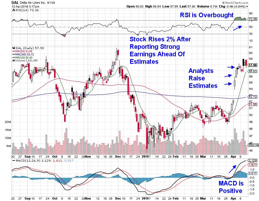
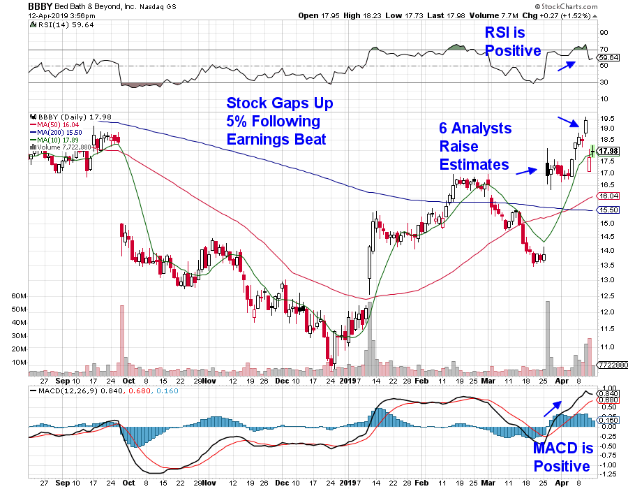
Below are two stocks that reported positive earnings this week, both of which traded up on the news. Their charts are marked up with 1 of 3 positive characteristics to look for before a company reports. These will each be reviewed below.
DAILY CHART OF DELTA AIR LINES (DAL)
DAILY CHART OF BED, BATH & BEYOND (BBBY)
Additional stocks that have reported positive earnings this week and jumped up on the news include JP Morgan (JPM) and Fastenal (FAST), among others. Overall, this points to a bullish bias in the markets.
Now, on to selecting possible stock candidates for purchase before they report. Studies done by Zack’s Research have shown that companies where management pre-announces upbeat earnings prospects prior to reporting have a much better chance of putting in positive results. This was seen last quarter with several Retail stocks that pre-announced positive earnings following robust holiday sales results. Most notable was Lululemon (LULU) which gapped up 14% recently on strong earnings and sales results. Management guided the stock higher in an announcement earlier this year.
The second characteristic from their studies shows that, when analysts are revising earnings estimates upward going into their report, the companies in question also have a statistically higher rate of coming in with results ahead of estimates. These analysts' upward revisions can occur as much as 4 weeks out, but tend to become more relevant closer to the report.
Here’s a third element that will help tip the odds in your favor - when the company has a history of coming in ahead of estimates. In other words, does management keep expectations in check while consistently reporting exceptional results? Over time, you’ll uncover companies that repeatedly have this tendency. Nasdaq.com does wonderful job of providing a chart (as well as a table) that provides historical earnings insights.
Beyond the 3 characteristics listed above, the remaining considerations are true of any stock you might consider for purchase. Number one is making sure your stock is technically sound. This is where StockCharts.com comes in. In addition to taking advantage of the website's exceptional charting tools, pay attention to a stock's SCTR. For those of you not familiar, this is the Stock Charts Technical Rating system developed by John Murphy. Generally speaking, the higher the number, the better, with 99 being the highest.
You also want to make sure the stock you’re considering is in an area of the market that’s outperforming the broader markets, as that’s a sign of strength. Again, StockCharts.com will be your guide as you access their Sector Summary information. Sorting the sectors by performance over the last week to the last month can quickly show you what areas are in favor.
While uncovering a stock with the characteristics we’ve reviewed doesn’t guarantee that your stock will have a positive report, historical precedent shows it certainly tips the scales in your favor.
- Mary Ellen McGonagle
Founder, MEM Investment Research
|
| READ ONLINE → |
|
|
|
| RRG Charts |
| When Tails Remain On One Side Of A Relative Rotation Graph, What Does That Mean? |
| by Julius de Kempenaer |
Relative Rotation Graphs are a great tool to use to visualize sector rotation, along with other asset rotations in various universes.
If you have used RRGs regularly and have monitored multiple rotational patterns, you may have noticed that the rotations do not always travel through all four quadrants in sequential order. Understanding what happens in these situations will help you to read and better understand Relative Rotation Graphs.
Typical Rotational Pattern
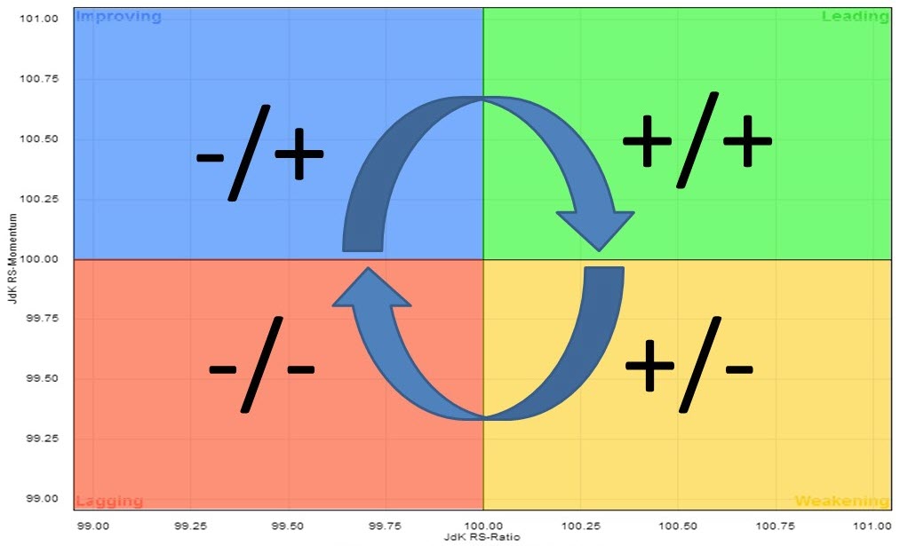 The usual rotation on a Relative Rotation Graph tracks a clockwise pattern starting in the LEADING quadrant. Here, you will find sectors that are in a relative uptrend against the benchmark (i.e., SPY) as the JdK RS-Ratio is above 100. Since the JdK RS-Momentum reading is also above 100, this relative uptrend is still pushed higher (accelerating) due to strong momentum. The usual rotation on a Relative Rotation Graph tracks a clockwise pattern starting in the LEADING quadrant. Here, you will find sectors that are in a relative uptrend against the benchmark (i.e., SPY) as the JdK RS-Ratio is above 100. Since the JdK RS-Momentum reading is also above 100, this relative uptrend is still pushed higher (accelerating) due to strong momentum.
The first thing that will happen is that that relative momentum will decrease, flatten and eventually drop below 100, indicating that relative momentum is now negative. At that time, the sector will move from the leading quadrant into the WEAKENING quadrant. This quadrant contains the sectors that are still in a relative uptrend, but decelerating. RS-Ratio is still above 100, but the JdK RS-Momentum indicator being below 100 indicates that this uptrend is now losing strength. When this happens, you will be able see on a regular price graph (in combination with the RRG-Lines) that the RS-Ratio line has peaked and started to move lower, though still above 100.
As this deterioration continues, the sector will move into the LAGGING quadrant. Here, you will find the sectors that are in a relative downtrend. In this section, said relative downtrend is getting pushed further down by weak, accelerating downward momentum.
The first thing that will happen is that relative momentum will level off and turn upward, before then moving into the IMPROVING quadrant. This quadrant contains the sectors that are still in a relative downtrend, with a JdK RS-Ratio below 100, but where that trend is turning around (decelerating).
On a regular price graph, in combination with the RRG-Lines, you will see the RS-Momentum line above 100 and moving higher, while the RS-Ratio line, though still below 100, has put in a low and has started to move higher from that low.
Eventually, a further improvement of relative strength, in combination with relative momentum, will lead to a rotation back into the LEADING quadrant, which completes a full rotation.
This was the theory, anyway. Unfortunately, reality does not always match theory - ahummm ;) - and markets will, more often than not, keep throwing us curve balls.
One-Sided Rotations
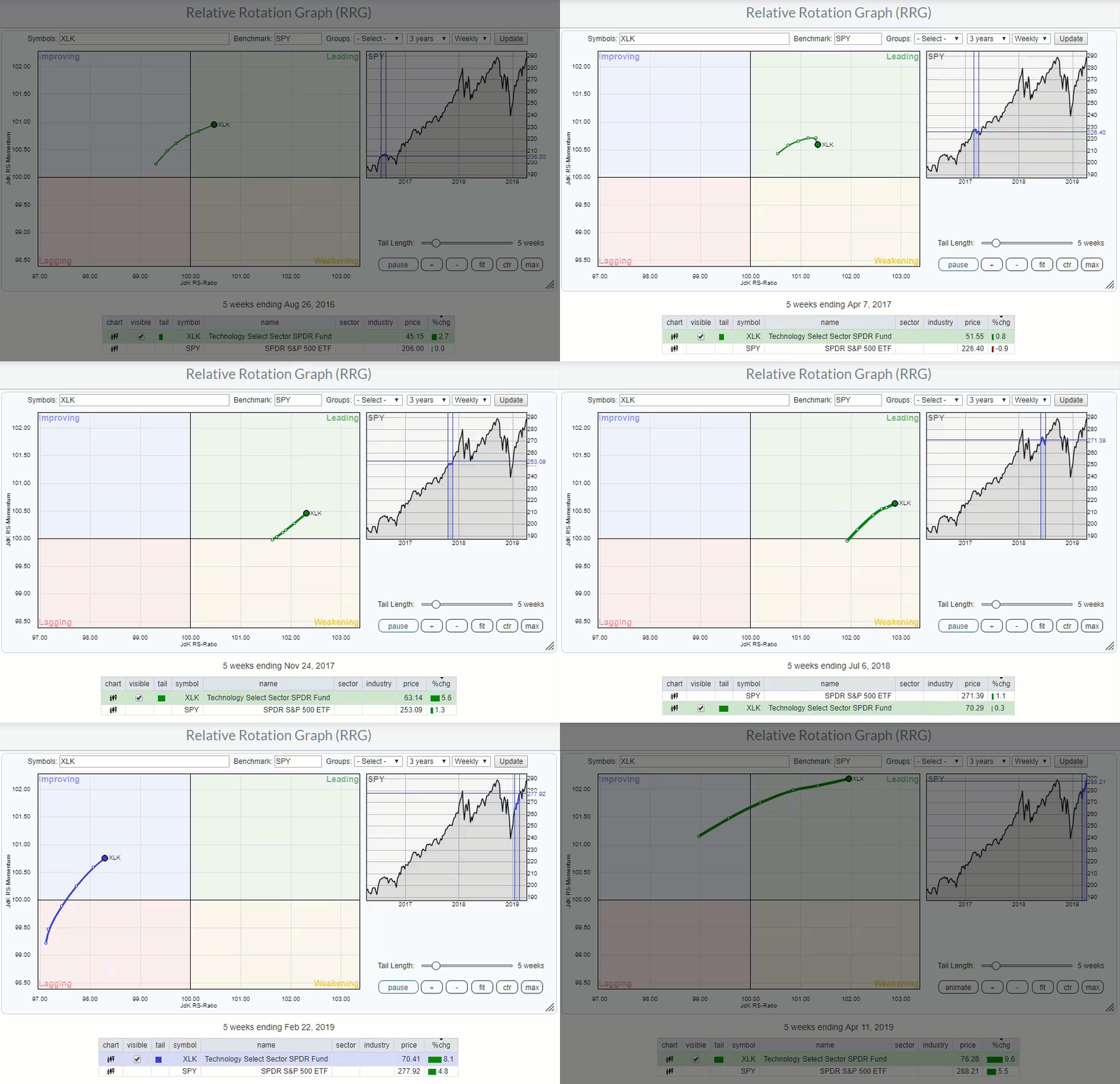
One of these curve balls is a situation wherein the rotation does not travel through all four quadrants as described above, but remains on one side, left or right, of the Relative Rotation Graph. The RRG at the top of this article shows the animated rotation of the Technology sector (XLK) against SPY. (If you click the animated image and open the live version, you will be able to control the speed of the animation by either dragging the slider in the benchmark graph or by using the left and right arrow keys.)
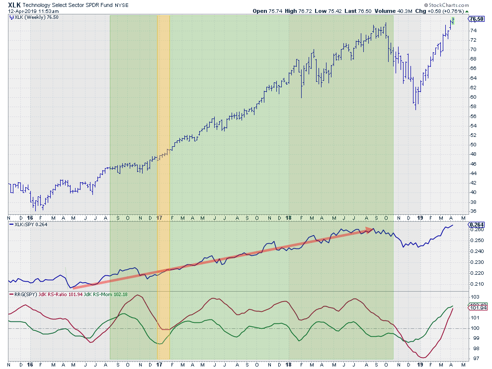
The animation starts in August 2016, where XLK crosses over from improving into the leading quadrant. XLK then moves through the leading quadrant until late November, where it crosses into the weakening quadrant. During the week of January 13, XLK passes into lagging, but almost immediately starts heading back up, returning directly to the leading quadrant without hitting improving. From 17 February 2017 onward up to the week of November 9, 2018, XLK remains at the right-hand side of the Relative Rotation Graph.

These periods are highlighted in the price graph above, combined with relative strength and RRG-Lines. The shaded area matches the uptrend in relative strength, indicated with the red arrow and perfect hindsight, with a small delay.
As you can see, the uptrend in relative strength is powerful, but still does not form a straight line. Just like every other trend, this one also has occasional dips to deal with. These dips result in higher lows after higher highs, causing the JdK RS-Momentum line to drop below 100 even as the RS-Ratio line remains comfortably above 100. This indicates that the uptrend is still intact.
The uptrend ends in November 2018 when the JdK RS-Momentum line fails to come back above 100, peaking lower 100 and subsequently dragging the JdK RS-Ratio line below 100 as well. That's the moment when XLK crosses over into the lagging quadrant, starting a 20-week journey through lagging and improving before returning to the leading quadrant just three weeks ago.
The ability to relate the rotational patterns on the RRG back to the price and to relative movement on a regular chart will help you better understand the interaction between the various sectors and their benchmarks.
I hope this article will help give you a better understanding of these relationships.
My regular blog is the RRG Charts blog. If you would like to receive a notification when a new article is published, simply Subscribe using your email address.
Julius de Kempenaer
Senior Technical Analyst, StockCharts.com
Creator, Relative Rotation Graphs
Founder, RRG Research
Want to stay up to date with the latest market insights from Julius?
– Follow @RRGResearch on Twitter
– Like RRG Research on Facebook
– Follow RRG Research on LinkedIn
– Subscribe to the RRG Charts blog on StockCharts
Feedback, comments or questions are welcome at Juliusdk@stockcharts.com. I cannot promise to respond to each and every message, but I will certainly read them and, where reasonably possible, use the feedback and comments or answer questions.
To discuss RRG with me on S.C.A.N., tag me using the handle Julius_RRG.
RRG, Relative Rotation Graphs, JdK RS-Ratio, and JdK RS-Momentum are registered trademarks of RRG Research.
|
| READ ONLINE → |
|
|
|
| MORE ARTICLES → |
|


 I decided that the month of March looks like a pretty classic pennant pattern: a long uptrend followed by a short-term consolidation with lower highs and higher lows.
 2. Offense would need to prevail over defense in the consumer sectors. The Consumer Discretionary vs. Consumer Staples broke to new highs earlier this month. We would need to see further outperformance by the traditional offense in the space.
 3. Financials would need to join in the bullish party. The big banks are just starting to report earnings; they would have to impress to move these charts to more bullish configurations.
 4. Breadth would need to remain positive across the board. I wrote earlier about the breadth in mid and small cap names vs. large caps. At this point, all cap tiers have seen positive breadth into the weekend. Those trends would need to remain higher.
 5. Bearish divergences would need to completely blow out. One of the bullet points in my bearish thesis is the bearish divergence for lots of technology names as they test all-time highs. Those signals would need to fail as the XLK moves further up.
 6. The equity markets would need to


 The usual rotation on a Relative Rotation Graph tracks a clockwise pattern starting in the LEADING quadrant. Here, you will find sectors that are in a relative uptrend against the benchmark (i.e., SPY) as the JdK RS-Ratio is above 100. Since the JdK RS-Momentum reading is also above 100, this relative uptrend is still pushed higher (accelerating) due to strong momentum.