GOLD, It's making us work hard !
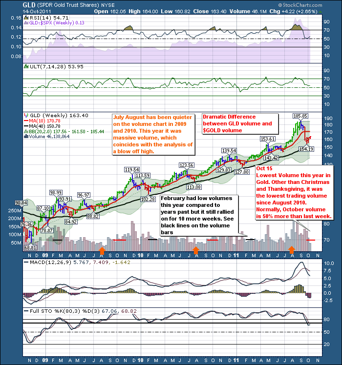
Well, below are all of the signals I see in GLD. It really needs to get some upside volume going right away if higher highs are coming.
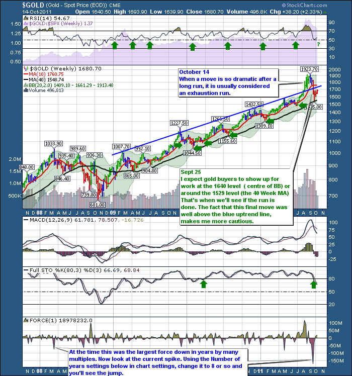
This is the Weekly:
Here is GLD. A few things to compare. Notice the volume difference this week between GLD and $GOLD. Very different meanings. I like the ETF volume as it is an easily traded ETF rather than at the CME.
I find the spike down on the $GOLD chart to be ominous. This takes the difference in the price from the close of one week to the close of the current week and multiplies it by the volume traded. I have set the indicator to a 3 week average so it is very responsive. On The $GOLD chart, that ominous spike on the left side of the chart was way out of scale compared to previous moves.It marked the start of a significant pullback which ended up being 34% off the previous high.
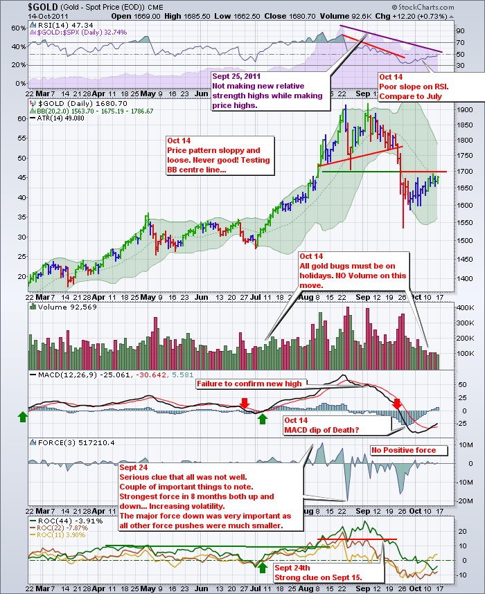
Here is the daily $GOLD
On the weekly chart, it looked like things were not well, but not all weeks are easy to read. This $GOLD daily chart, has enough illnesses to make one call a doctor. The long term ROC line in green is below zero, that's not good. The fact that the force index has not recorded a surge higher in 3 weeks while gold has been trying to make higher highs is very discomforting. The MACD has not lost this much momentum since the fall of 2008. The current price pattern has higher intraday volatility as well as lots of sloppy price action. Notice how the bars overlap a lot now coming off the recent low. In July, they accelerated higher and the volume climbed every day. Now we are seeing the opposite behaviour. (Canadian spelling of behaviour). I find this sinking volume very concerning especially while the market is trying to rally.
The fact that the RSI has made 2 lower lows leads me to believe this is more of an intermediate top than just a pullback. The anemic slope of the RSI compared to the July RSI is also confirming the lack of firepower in $GOLD. The purple SPURS area chart at the top of the chart shows continuing loss of relative strength compared to the SP500. If a stock, commodity or ETF is underperforming the SP500, it is hard to attract capital from funds that are constantly trying to outperform the SP500.
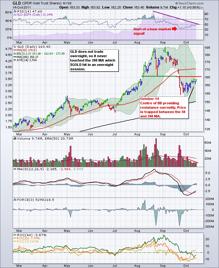
Let's check GLD.
On this chart, I notice a few things are in trouble much like the $GOLD chart. The ROC long term has gone negative and an upward thrust is very difficult while the rate of change is negative. The longest period gives you the primary direction for this time frame. The double force smackdowns show aggressive signs of selling. Compare that to the July lows, when the price dipped below the 50 day. The MACD held up at the zero line. The volume, while higher on the last 2 up days, has been less than half of the 50 EMA. Look what the volume did in July when the price pulled back below the 50 DMA. The start of the bear market signal on the RSI does not bode well. I would expect an upside move to be limited to 65 or lower. If you look at an intraday chart of GLD, almost all of the gains have been in premarket, not during the regular trading hours. Where are the buyers? On Holidays?
What would it take to get going positive? We need volume of 30 Million a day on up days regularly like we saw in July. We would like to see the market take the price higher when the GLD is open for trading during the day. We want to see the 44 Period ROC get into positive territory again. We want to see GLD start to outperform against the SP500 which is the purple SPURS on the top of the chart. We want to see aggressive slope on the RSI, and the force indicator start showing some upside surges. We need to see the RSI make it into overbought territory to cancel the bear market signal of September.
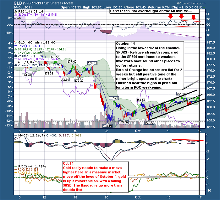
Lets check the intraday of GLD (can't check $GOLD intraday).
Well, what's your take on the intraday. Mine is still bearish. The RSI can't make it into overbought even though the overall market is surging ahead. The Intraday SPURS confirms the price weakness hour by hour. The fact that no volume showed up as the price moved past $161 and $162 is ominous. The MACD barely in positive territory and flat at best is very weak. While the ROC indicators are above zero, they have been for at least a week, and are making no price progress to speak of. While the price is trading in the uptrend channel, it is trading in the lower half of the channel. The Bollinger Bands have pinched in to the tightest range on the chart. It is going to break soon. Upside or downside. Currently the probabilities are weighted to the downside on every chart.
If we wanted to do further review, we could compare the GDX:GLD ratio.
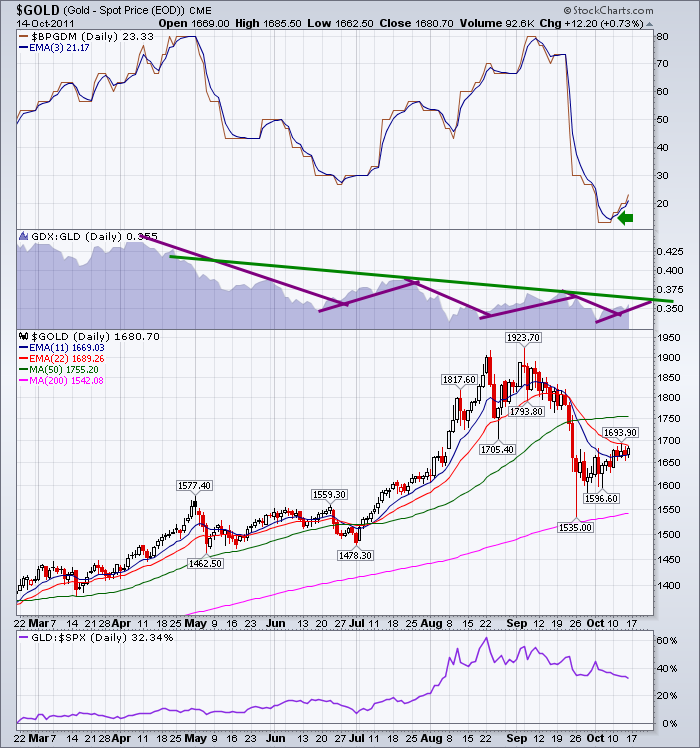
I included this chart, which has some bullish reasons to be long Gold here. Matthew Frailey who has a chartlist on the Public Chartlist, introduced me to some of these settings.
1) The Bullish percent has turned up and is above the 3 EMA.
2) The GDX:GLD ratio is currently improving (very short term, last upsloping purple line) which means investors are starting to move into Gold miners again. This is usually positive. However, the longer term trendline in green shows this weakening through the recent top in $GOLD. When investors are not buying the stocks of the miners but $GOLD is still going higher, it is time to look for the exit. We need to see this ratio get back above the green line and break the downtrend.
3) The 11 and 22 day EMA's are getting ready to cross to the upside. That's a good thing!
4) The underperformance of the GLD compared the SP500 was throughly discussed above. If that trend starts to change, we can probably get back onto the $GOLD train. It will have to start on the 60 minute, then the daily to get moving upside.
Well, that is a very long post, but a trade most of the world is watching. Every hour adds another data point. We could start intermarket analysis and go into the $USD...
I strongly recommend looking through the Public Chartlist from the links section of the homepage of Stockcharts.com. There are some brilliant chartists there complete with great education.
Click on the pictures for a current chart you can work with that is also larger. If you are in The Canadian Technician blog site, you can click on subscribe to get this message posted to your inbox, or use the RSS feed. You can also find it on stockcharts.com Facebook page. Click below to go to the correct page.
Good Trading,
Greg Schnell CMT.

