One of the things that make the markets most difficult, is they start to drop long before the earnings do, and they start to rise well before the earnings. The markets rally when you feel hopelessly beaten up, you stop looking at your charts, because everything is bad. You feel euphoric because your account is finally starting to make some progress, and the whole thing comes apart in 12 days in May.
One of the things I love about charts is the ability to see after what I didn't see before. Over time, you start to try and look ahead to at least be aware of what you want to see and what you don't want to see. That is when being a technician becomes profitable.
It's earnings season...what do we want to see? Stop listening to talking heads and let's look at price action.
Start with a good question.
Do markets go up into earnings or fall apart? Is it random? Is it predictable? What do they do after Options Expiration in Earnings seasons?
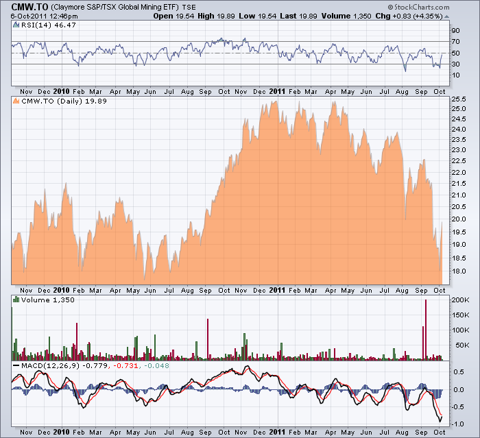
Here is a chart of the miner's index by Claymore, but pick whatever index you want. I saw this one on BNN this morning, so that is how I chose the chart rather than a strategy to prove myself right. (I track the Nasdaq 100 specifically for seeing how growth is being treated). So I pulled up a two year chart and I want to see what happens around earnings and specifically options expiration around earnings. I'll show a few here.
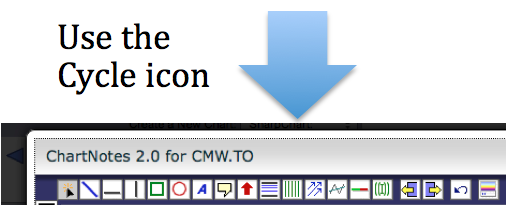
Doesn't mean much. Let's put some reference points on the chart. Open the Annotate tool. Add cycle lines that happen roughly mid month in October, January, April, July which are the months called earnings season. The third Friday (Options Expiration) is anywhere from the 15th of the month to the 21st.
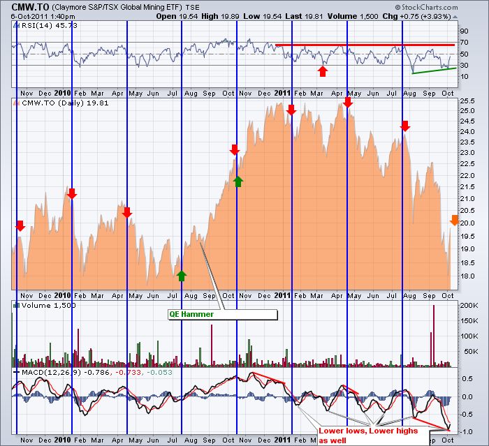
When you are done it should look like this.
You can click on the chart to make it larger. I just can't stop annotating. So look to the left and right of the cycle lines. What I notice is it likes to run up into earnings season and fall down after options expiration. May take a few weeks, but it does weaken. On the Right hand side of the Chart, notice how the MACD is still making lower lows, and the RSI is making higher lows. While this may not be the ultimate low, it's creating some divergence.That is this sector.
The only time this didn't happen on the mining chart was when Bennie Bernanke and the Banks played another symphony of money printing. All the economists jumped on the "band" wagon spewing optimism throughout that the GDP would soar to 4 %. Well GDP never did soar. But the market rallied like it was a real economic change. The global economy had most emerging economies topping in November of 2010 shortly after the start of QE2 and the TSX was sideways to down from March. Which would have been a better clue? The US charts topped May 2. The money printing didn't change the economy but it did relieve the pessimism. We are at that point that the band is about to start playing again. So watching our charts for a bottom is very important.
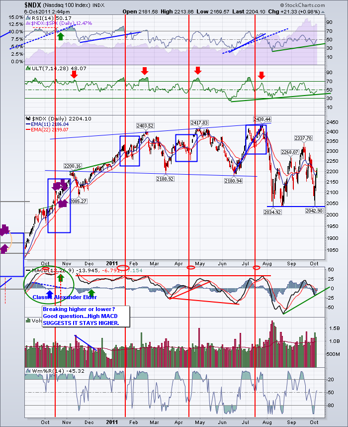
Try it on the $TSX or the $NDX or the $SPX. If you want to keep an accurate one, plot a vertical line on Options expiration in each of the four quarters. It doesn't magically change on that day, but it's pretty close. Use google and search for Options Expiration dates.
Here is my $NDX one.
Look when the $NDX made a new high. Notice the positive divergence on both the RSI and MACD. Notice how the Ultimate oscillator is getting more bullish. If growth is starting to be bought here, It could be a nice ride. The MACD is almost in Positive territory. That's bullish behaviour. Check your sectors. It might be time to strike.
If you are in The Canadian Technician blog site, you can click on subscribe to get this message posted to your inbox, or use the RSS feed. You can also find it on stockcharts.com Facebook page.
Good trading.
Greg Schnell, CMT
Twitter : Schnellinvestor

