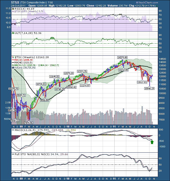
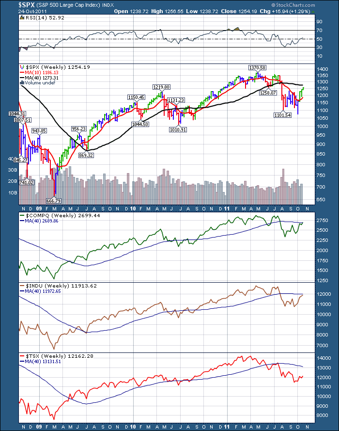
Well that was a bullish Monday, with almost 15 days straight up. This TSX market is really underperforming the US markets. On each chart, check the location of the price compared to the 10 week or 40 week MA (Moving Averages).
You can always click on a chart to make it larger, add your own settings and save it.
Here is the $TSX finally moving above the 10 week line. Notice the gap between the price and the black 40 week line. MACD is finally trying to cross.
Here is the SPX, COMPQ, INDU compared to the TSX. I have put the 40 week MA on each of the charts. Now you can see how much the TSX at the bottom is lagging under its 40 week MA. I would suggest this means our typical commodity markets are not being bought relative to the diversity of the US Indices.
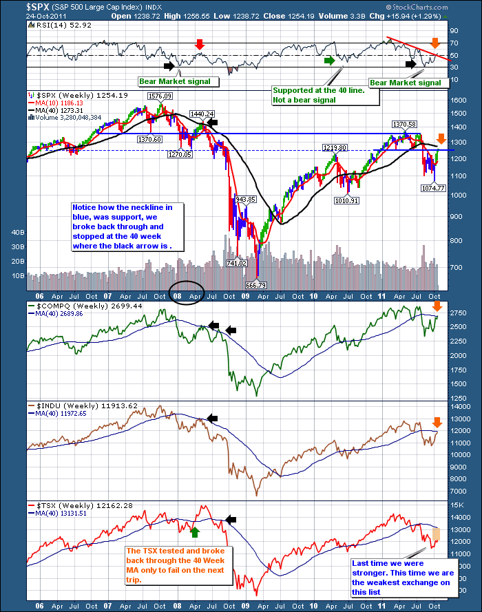
Now let's compare this with the 2007 top briefly. We broke down through the support of the topping pattern, which was a head/shoulders pattern, and then bounced back up and tested the neckline. In 2007 the neckline was a little below the 40 week MA. It made it through the neckline but the 40 week MA became resistance. It is technically an important point on the chart. What is the answer, we don't know. Just use this space to be cautious.
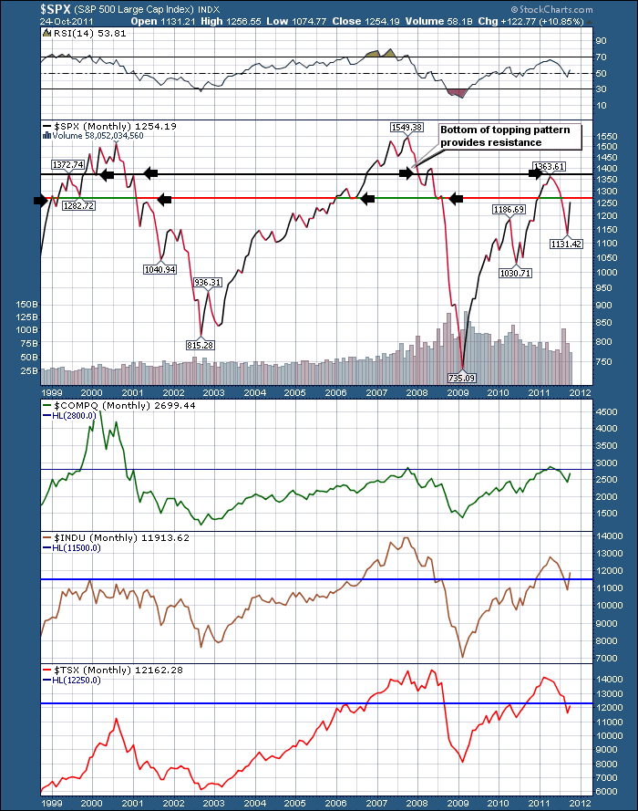
Here is a very long term chart.. This is a monthly close line chart. Notice how the lines are drawn at levels that have been difficult to get through from either direction. We are approaching this line in the US markets.At the same time we are approaching the 200 DMA or the 40 Week MA. When we get a confluence of technical resistance signals at a certain level, it makes it more difficult to break through. We could add Fibonacci patterns (the 61.8 retracement is at 1257 on the SPX), trend lines, BBands, etc. One other confluence is the pattern of the 2000 top, the 2007 top and this current top have been Head/Shoulders topping patterns. The lower side of the topping pattern that was support holding the market up. Now it is friction for going higher.
This doesn't make it a ceiling, but historically it can take months or minutes to push through these major resistance levels.
We can make a case that the $USD is breaking down so that is why everything is rallying. We are expecting more stock market nourishment from government officials in some form of QE from europeans, the brits and the american markets. That was pretty bullish stuff last fall. We want to be on the right side of the trade. Currently the sIgnal is bullish, with friction immediately above. Be prepared for big moves both directions. Why caution?
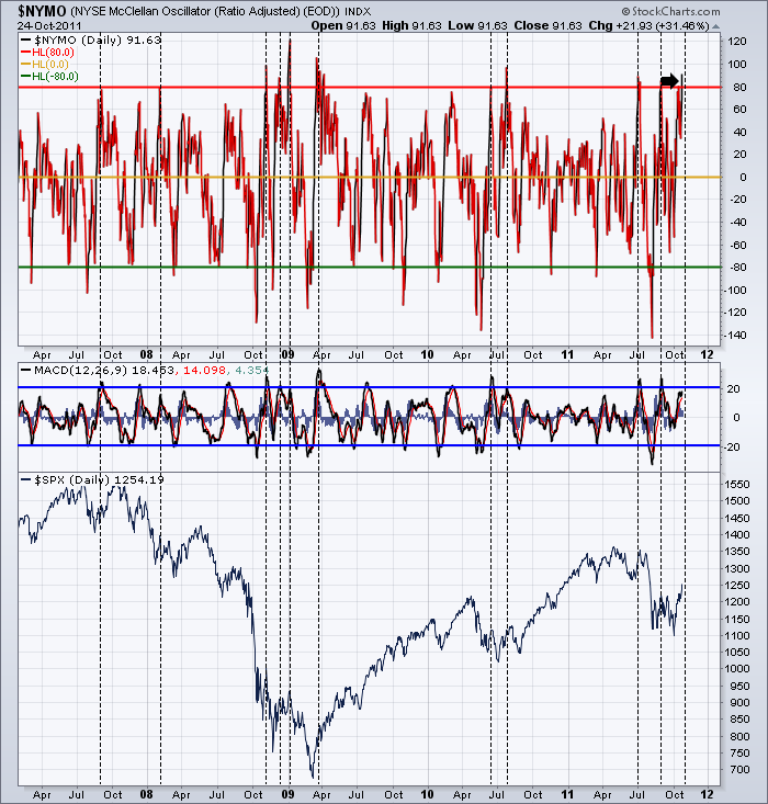
Check out the NYMO Oscillator. For more information on the Momentum Oscillator, check the stockcharts chartschool. It has only made a reading above the 80 level about 10 times in the last 5 years. Food for thought. Ignore the scribbles for today. Just check the extremes. There are a lot more of those overbought readings on many charts.
Click here and go to the top right of the page if you would like to subscribe.
Good Trading,
Greg Schnell CMT

