I use a variety of indicators grouped together to help me spot trend changes. The stockcharts website has some great indicators. How you use them is up to you. I'll try and show a few that I like. I have a list of 20 or so. Then I like to look the Bullish Percent indexes as well.
Fortunately, when all the charts point to the floor, it definitely shows the trend. But the interesting time is when all the indicators reach extremes and would normally turn around. How to know when to close the trade, and when to hold.
Arthur Hill posted his trend monitor in the blog this week. Mine is a little more complex unfortunately. But all of us are a little bit analytical...ROFLMAO...ok remove a little bit.
I keep searching for Nirvana. It doesn't show up that easily.
Let me post a few odd indicator charts here, and see what you think. Posting the common ones won't help you much!
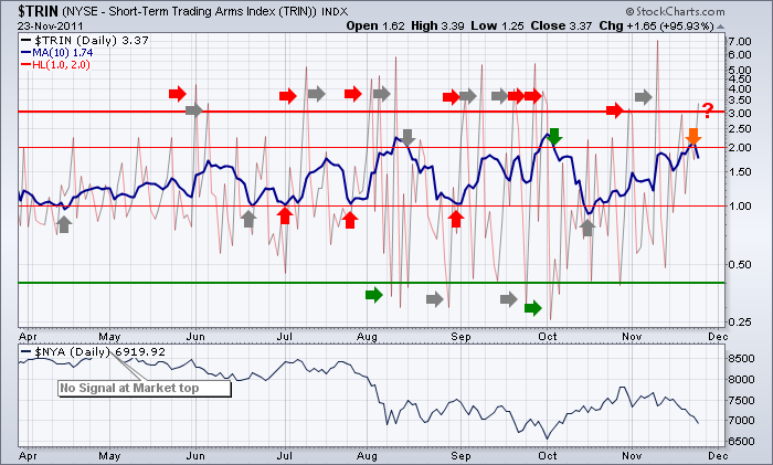
Here is the TRIN. The signals show up at the extremes. I put grey arrows where the signal was of no value. You can see it happens a lot. I have also tried a Moving average to help.
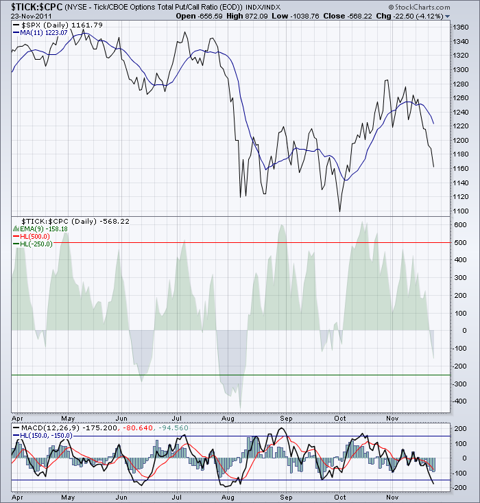
Here is one that I like to use the MACD rather than the actual data feature. But notice in July the MACD stayed near the bottom for 2 weeks. An early exit would be good if you use the crossovers on the MACD signal lines and a bullish crossover to buy. Again, lots of false signals. Using it near the extreme waves on the MACD helps more than closer to the centre line.
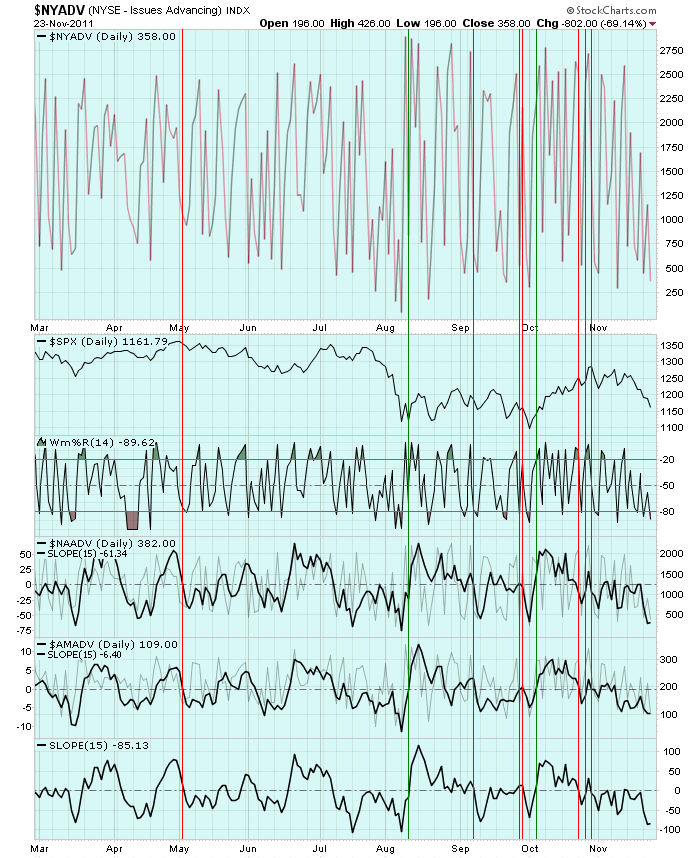
Here is one that I use the slope feature on top of the Advancing stocks indicator.
When all three go positive, you want to be long. When all three are below zero, you want to be short or protected. Again, lots of whipsaws. But this one marked May 2 exactly, and October 27th exactly. It also caught the October 4th low. Not bad.
I deal with some of the whipsaws by finding a common consensus on the trend change. I find it helps if I just record bullish or bearish on each chart of 20 for the day. I prefer to record it in an excel spreadsheet. I have created a list of charts I look at and analyze the results as a group rather than an individual chart. Essentially, the Majority of the charts have to swing to the other signal to give me a trend change I will rely on. Say 60% have to swing. It still may whipsaw you, but I find a lot of them are minimized. The experts will have been whipsawed too! It will help hold you in your trend trade longer. It prevents one day or 2 day moves that shake you out. When you start to trade, it may help you be on the right side of the trend more often. When you are an investor, rather than a trader, this may not be of value. But it can also help you find a place where you might buy put insurance or protection on your portfolio. It can also help as to when you want to sell that insurance.
I have listed 3 different ones above, but obvious ones are the NYMO, NASI, NYSI, NYADV, NAADV, SPX, COMPQ, $NDXA50R etc. I like to use the MACD on lots of these rather than the indicator or chart itself. Slope is also interesting. My previous published blog on the $NDXA50R combined with the $NDXA200R is another example of finding extremes.
You can find a massive list of ideas in the public chartlists. I would encourage you to build your own. As the market changes and you get extreme signals, I have become more in tune with staying in the trade or exiting. The discipline comes in doing it often enough to help with the results. That is harder.
Tom Demark has a book called Demark Indicators. This man has studied more candles and the relationship between them than almost any other chartist.
While everyone wants a list published for them, my experience is that when I give it to fellow traders, they don't trust it or change it to work for them. The problem with that is they did not understand it as they did not create it. So to publish my list won't help you but I encourage you to create your own checklist. You'll find things that move faster and slower. As an example, the $TRIN, $VIX, $TICK, NYSI, NASI all move at different speeds. I sort them in order of fickleness!
Tom Bowley from Invested Central does some great work with the CPCE. That can be another chart.
Stockcharts has a breadth summary link on the home page right under the chart on the left.
Here is a sample of the link.
I encourage you to set up your own charts in a chartlist. Number each chart in the title to control the sort order. This process will help you see when the markets are stretched to extremes. More importantly, you'll be able to exit the trade with more confidence when a group of indicators you build creates a signal you have tested. Especially at extremes. It's never perfect. But the more time you spend trying to figure it out, the better understanding you will have of NYMO, NASI, TICK, TRIN, CPCE, CPCI, CPC, $NDXA50R, $NDXA200R, etc. Read through the chartschool. Expand out to 15 year timelines so you can see what extremes are. Then come back and look at the current market. We also have the benefit of the 2007 market crash, the May 2010 Flash crash, the 2001 top, the 2003 bottom. The 2008 Commodity peak. What signs were in $GOLD when it Dropped from $1000 into the $600's. History is a great guide to help you see extremes.
Today I have extremes on a lot of the charts from their move down recently.
The MACD on the $TICK as an example.
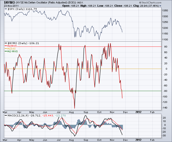
Or check out the NYMO oscillator. It is at an extreme right now.
"If a stock is near its high, 90% of TV commentators like it. If it is near its lows, 90% of them hate it." - Michael Burke
Does that sound true? Well, now you can become optimistic when all the indicators are in the tank and selling when all your indicators top out. Waiting for the top to form and roll down 10% is a painful exit strategy. Lifting your stops near the top is a much more valid strategy.
Check out the public chartlist for more great ideas. Send me feedback so I can understand if any of this information helps. Thanks for reading the blog today!
Happy Thanksgiving everyone!
Good Trading,
Greg Schnell, CMT

