Today, Let me present a simple chart of the $SPX from February 1 to August 1,2011. Then let's use the logic for the TSX. Then we'll take it back to the SP500.
If we narrow down a chart to a specific time period which marks the top of the market previously, can we use that data to help us find points of resistance in current markets? Let's find out.
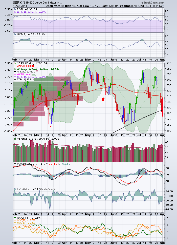
Above is the $SPX for the time the $SPX top took to build in 2011.
By doing this, we can find out the volume by price information to see where the centre point might be. This tells us where the crowd is looking to exit if 'it can just get back to what I paid'.
The range is from 1300 to 1335. See the large bars pushing in from the left.
Secondly, If you have the SPURS information on your chart, it will draw a centreline. See the red arrow.
That is the median of price action. If the market can really get going here, these will be blown through. If it is testing a whole bunch of resistance, it might get rejected here.
That line is about 1308.
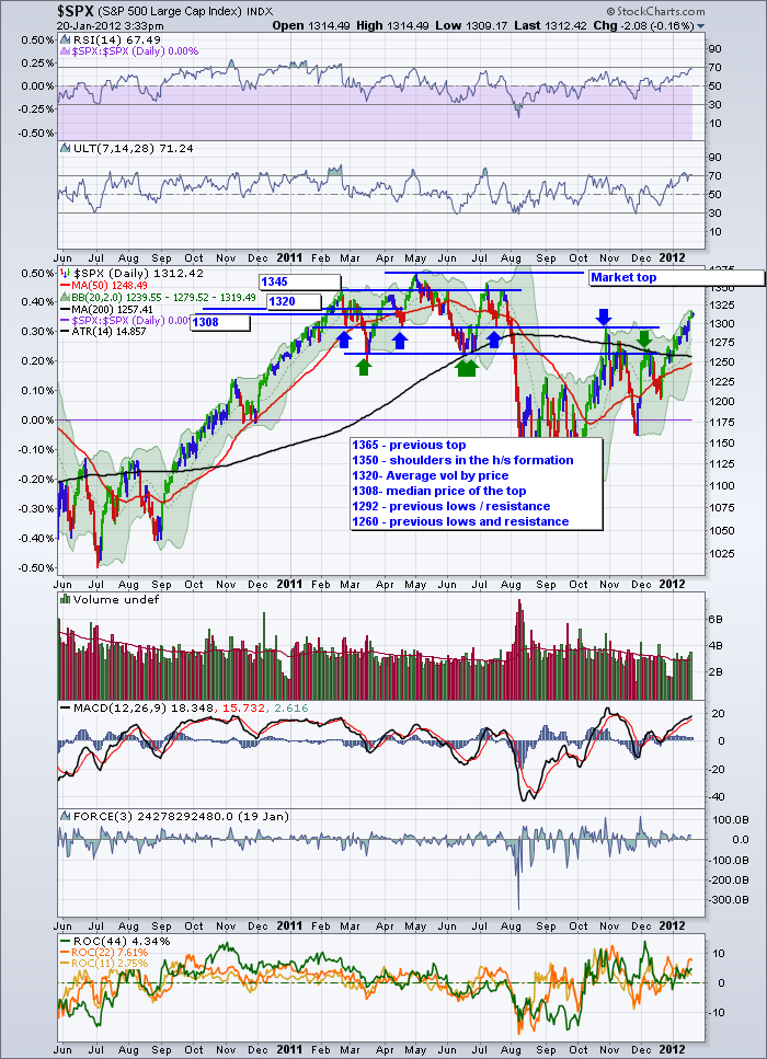
Now let's look at the current SPX.
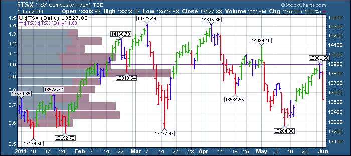
Now the $TSX
Here is the 2008 top.
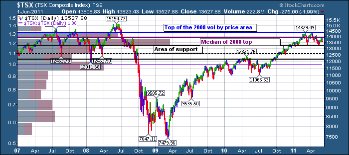
Interestingly, the centre of the price area was around 13950. (remember this is a log scale chart). The area where most price activity took place in the top is between 12700 and 14300. Which makes the centre around 13500. Some other interesting areas are at 13200,12500, and 12100.
Well, this is the top 3 years later.
Where did it meet resistance? did any numbers match?
Only the dotted line didn't matter much. All the others were important. Ok. So why do we need this today?
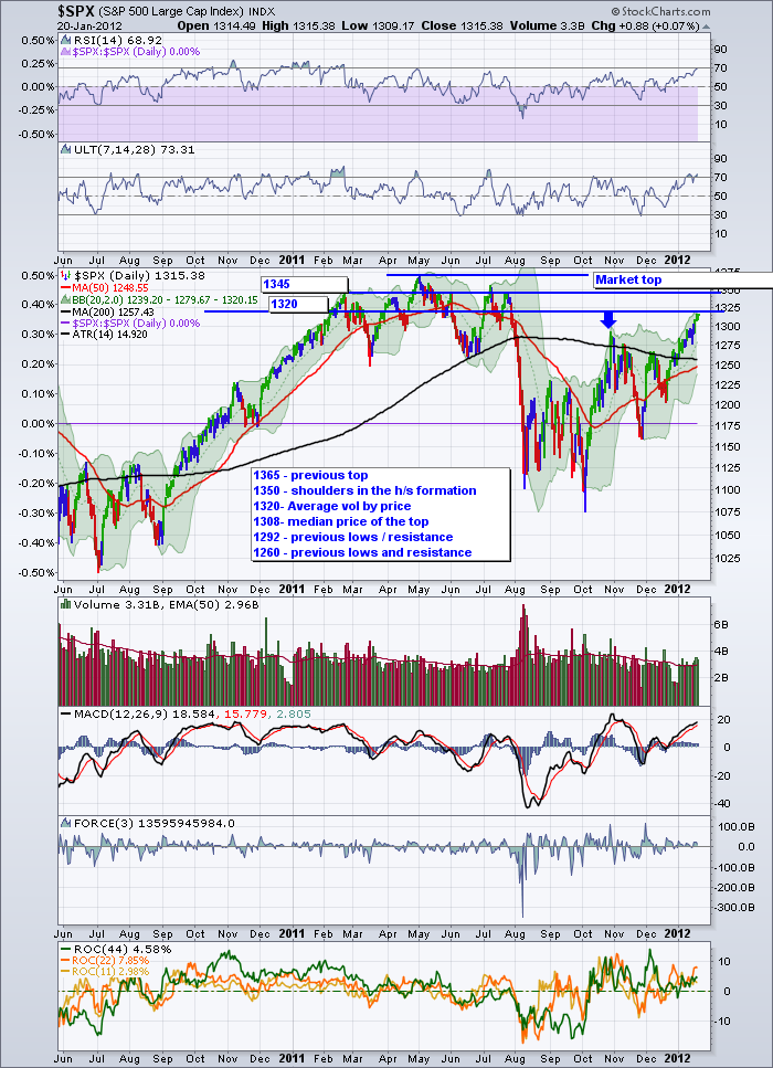
Because the SP500 is approaching these levels in the current run. It may blow right through and shock all of us. But if it did find resistance these levels are valuable clues. Let's draw it up.
Taking the chart from above and drawing it up, the most likely level to look for a stop is 1345. It may stop at the median high around 1320, but I think it might be even stronger.
As you can see below, we have no real divergence in the short term on the RSI on the daily chart. The MACD has a little between the October and January peaks.
Maybe we walk right on by? I don't know but I know I will be really cautious as we get there.
Good Trading,
Greg Schnell, CMT.

