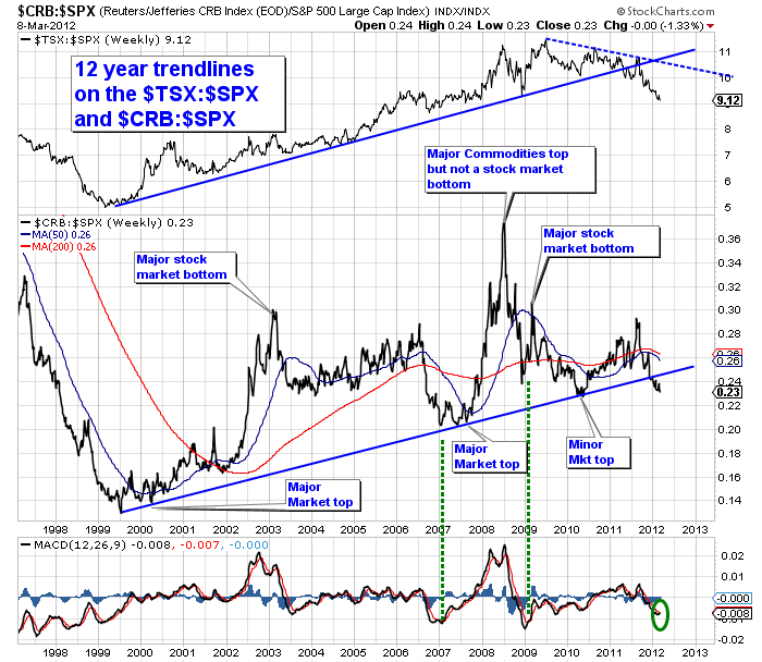
I got a comment back on the Long Term $TSX chart from earlier in the week. One of our fellow CSTA members from Ontario, Bob Hunziker, sent in this great chart. Why is it great? When we spend too much time on short term charts we fail to see the big picture. Stepping back can be really helpful. Martin Pring told me that the longest trend is always dominant. That makes sense but I usually use 3 year weekly or daily in my daily reviews. So a regular trip to the 10 year view helps.
Firstly, lets discuss trendline length. A trendline on an hourly chart has relevance in that time frame. If we expand it out to daily, we see the value of the trendline as the recent 40 day trendline was important support. Moving to weekly, a trendline that lasts for a year can be an excellent place to look for a support. Well, the two trendlines above are 12 years long. That is significant. More significant is that one is on the Commodities index and the other is on an equities index for a country. This trendline break is reading across multiple asset classes.
Secondly, there are minor cycles and major cycles. One of the longer cycles is the 18 year commodity cycle. So 12 years up, and 6 years down. This is normally considered as 2/3 up and 1/3 down. Hummm, that just seems to match. 12 years up, and a 12 year trend line.
Well, if the commodities were going to underperform the $SPX, you want to know as the chart breaks the trendline, not after 6 years. So let's do some homework here. It could be very timely. I think it is time to pay attention.
I made notes (Blue text) on the commodity chart above that the commodities usually had their lowest relative strength compared to the stock market when the market hit it's highs and reversed. Commodities either didn't fall as much or continued to accelerate as the stock market fell as in 2008. That is interesting to me. But remember, this measures the commodities not the stocks of the commodity companies. So as an equities investor, you may see the stocks fail to hold support before you see the commodities pull back. That makes sense as that is commonly one of the topping signs for a commodity: the commodities stocks may make lower highs and lower lows for weeks before the commodity finishes its run. Meanwhile, the rest of the equites market is moving lower too.
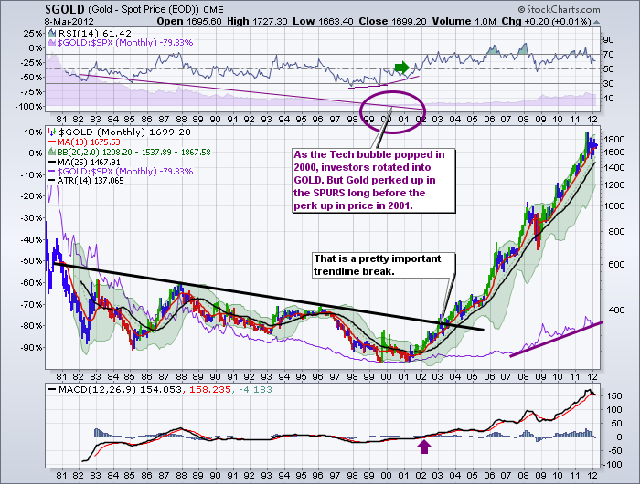
Onto Gold, here is an important trendline that broke in the price of $GOLD to move higher at the start of the century. Whether you use the relative strength break which came first, or the positive MACD or the monthly RSI above 50 or the actual price trendline, eventually this was telling you good things were coming.
Currently the $GOLD chart has just had the MACD roll over which is a negative signal.
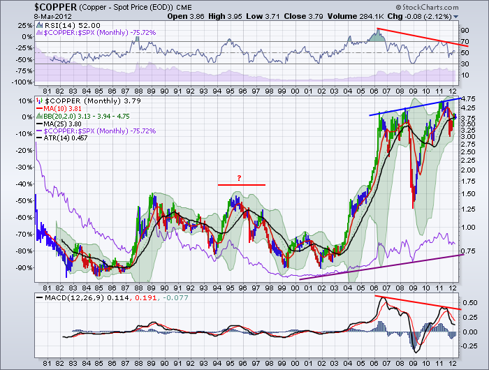
Here is the copper chart... What I like is the MACD looks like it is trying to bottom on this weekly chart. A cross would be bullish obviously, but a move towards the red signal line on the MACD and then failing to cross, would be very bearish and would probably confirm a problem in China as a guess or maybe just the obvious Eurozone Recession. Doesn't matter...if it goes up it is good, and if it goes down it is not. Lets watch. What I don't like is the negative divergence on both the MACD and the RSI. The good news is $COPPER pushed up to $3.79 which is almost at the 200 DMA ($3.80) again today. Copper had a similar day to the equities today while the equity markets ran up. It moved up about 1%.
Remember the chart Bob sent in was a relative strength chart. Again, that means it was compared to the SPX, not it's raw price movement. But they give the earliest signals on most charts I see. So commodities could still go up. It's just that other sectors are going up faster which means the Canadian market and the commodities markets aren't going to get the same level of institutional investors. Its important to remember that the sector move accounts for 50% of a stock's price move usually. Institutional money trying to buy in is what pushes the sector up.
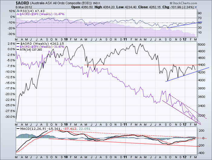
OK, so is it Canada specific? No I don't think so. Look at the Aussie chart. Same problem.
What is very interesting here, is the $AORD chart looks like it really is stretched to an extreme on the relative strength compared to the $SPX. Currently the charts for BHP, RIO, TCK, VALE, FCX are below the 200 dma. It has been a real barrier. We'll find out more in the next few weeks, but the 200 dma has been a significant source of resistance. We have been waiting for months, so what will pull it up now?
Are you wondering why I put the red line in the middle of the $COPPER chart? That area looks like the current price pattern of $GOLD on a daily.... An example of a fractal in commodities trading? I guess we'll find out.
Maybe the Fed has controlled commodity inflation relative to stock inflation? We won't enter that debate. It is a global village, and so far commodity charts, commodity based stock exchanges and commodity stocks from the world over including Vale from the red hot Brazil, have not been able to get above the 200 dma. Canada's $TSX tagged it again today and closed pretty much right on it. Interestingly Brazil $BVSP is up substantially. The $RTSI is above its 200 dma, but not nearly as strong as the $SPX as an example.
More importantly, based on the chart at the top, will the stock market top out like it did on Bob's chart to change the relative strength line to at least a base so it starts to improve? Riveting times to learn about the global commodities market and if it can recover to get on the uptrend.
Good Trading,
Greg Schnell, CMT

