The more you speak to the veterans in the industry, the more they talk about cycles and intervals. Recently, Tom McClellan of McClellan Oscillator was in Calgary to speak. He spoke of cycles and time shifted intervals. Cycles indicate a repetitive low - low pattern. Time interval theory suggests that time interval (eg 15 months) is important, but it may be a meaningful high or low. George Lindsay use time intervals that ended up spotting an exact date where multiple time intervals would converge and create a strong decision point on the charts. I spoke with Martin Pring this week and his use of cycles is very detailed. Ron Miesels is a Canadian chartist who uses phases and cycles. Lets go check some intervals out on an $SPX chart.
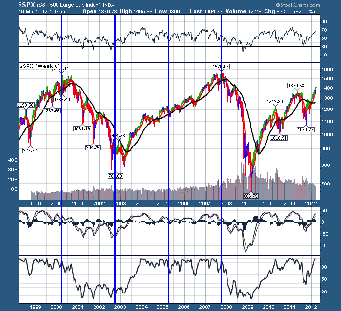
Here is the $SPX.
(I spent some time on the TSX this morning but I didn't find a lot of long term intervals that helped in the first review.) But the $SPX is pretty interesting. So lets stay with the $SPX.
Analyzing this $SPX chart to see what else it brings up in terms of gems. Lets continue the 'blue' interval lines to the right.
Well, that chart is very interesting. The 2009 lows are not on the interval lines, but the 2010 market top is right on the interval line. So based on this interval theory, the next important time would be in the fall of 2012 for a top or bottom.
Remember to click on the chart if you want to play with some of the parameter settings like setting the chart size to 1600 so the dates are defined.
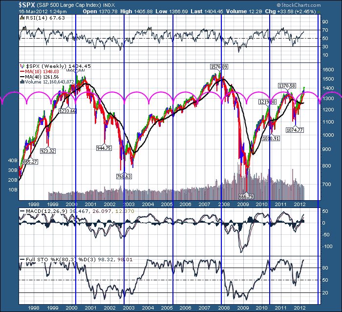
What are the pink waves running through the middle of the chart. Well, those are 1/2 cycle intervals. Is there a smaller interval that works as well? Probably, but lets try breaking our existing blue intervals into smaller ones. 1/2 seems like a good place to start. Well, this pink cycle does a pretty good job of timing highs and lows. It also does a good job of defining another important time frame on the chart other than the blue interval. The 1/2 cycle on the blue interval is important to watch.
However, this chart also provides some other clues. In bull markets, the stocks keep rising till 2/3 or 3/4 of the pink cycle, then pull back at the cycle time. So 2/3 up, 1/3 down. In a Bear market it is reversed. It bounces up off the low for 1/3 or less, and spends 2/3 of the time going down. These are general trends in a long business cycle.
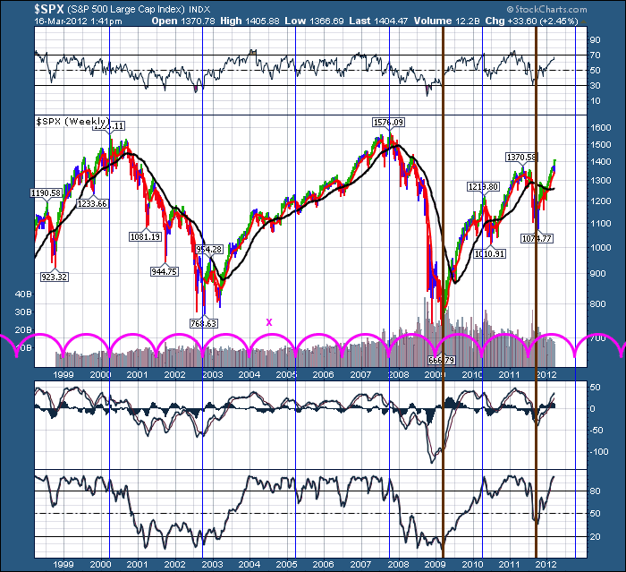
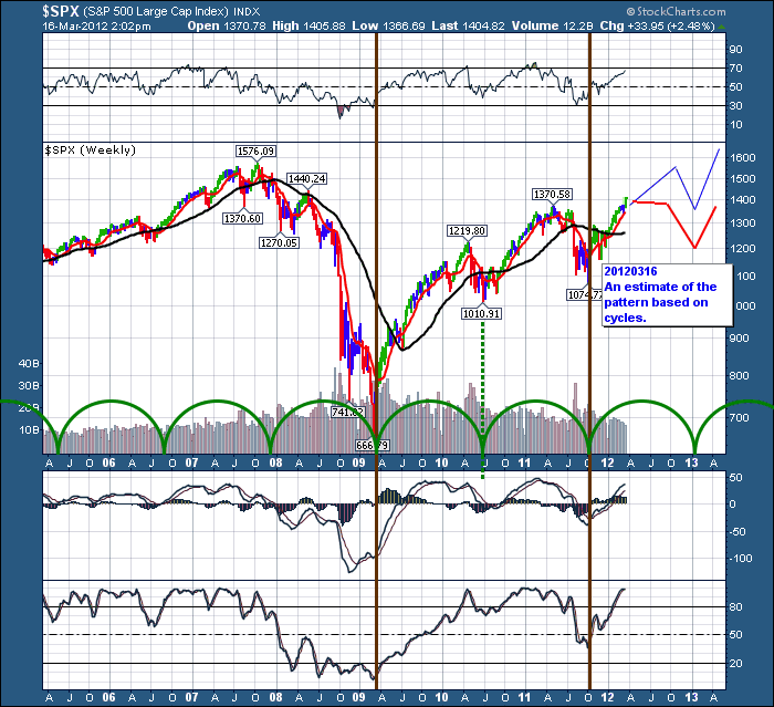
OK. Now lets focus on the 2009 lows. It doesn't map very well on the blue or pink intervals and I think it was an important one...just saying! Other than being 1/2 way between the blue intervals it is important as it was a great buy point. Thinking about it, I wondered if it would maintain the same interval length as the blue interval, but with a new start date. Lets draw those lines in brown and start them at the 2009 low.So they are the same time span as the blue.
Wow. That's pretty impressive. That same time interval of the blue lines is started on the 2009 lows using brown lines. Interesting how the time interval matched exactly with the 2011 lows.
What I have to wonder is how will these two dominate the trend going forward. That is a great question. Will it make lows on the PINK half cycle on the blue lines, or will it start a pink 1/2 cycle based on the brown lines? The brown lines are out of phase about 6 months. Well, looking at the pink lines from 2010, the lows did not match on the brown lines. Lets time shift the pink lines to bottom the brown intervals instead of the blue.
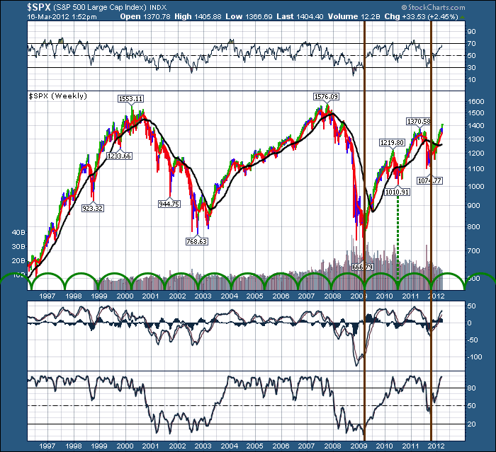
On the Chart below. I've removed the pink, and inserted green so it bottoms on the brown lines so there is no confusion.
OK. I really like the way that lines up. What I really want to know is what might happen next. Let's shrink the chart time so we can expand the data. we'll draw some hypothteical lines based on the green cycle.
Will the price action take the form of the top lines -( similar to spring 2010 )or the red line ( Similar to Spring 2011) or a different one? Good question but this time interval looks good.
But what is the bear case?
Feeding the bears, It could also mean a top any time now if you are in a bear camp with 2/3 down to go on our green cycle.
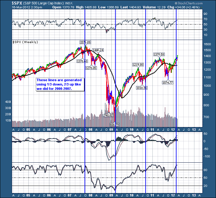
One other piece of meat for the bears.
The chart above suggests if you analyze how long the market took to come down, and double it to go up, we are pretty much at the top when everybody is starting to think the world is good. Volatility is low etc. In this case, the market has reached its point of inflection. Was today the top?
Lastly, I want to thank Tom McClellan for coming to Calgary. He put on a great presentation. We are now looking forward to getting together with Ed Carlson tonight and sharing ideas. Should be a stellar seminar tomorrow. Happy St. Patricks day everyone!
Good Trading,
Greg Schnell, CMT

