$USB - Sometimes the Bond market is a better clue to the future than the equities.
The bond market is just so big, it is very important to understand the sentiment towards holding bonds. Recently Warren Buffett's holding had a dramatic drop in Municipal bonds. Well, is that showing up in the 30 year yet?
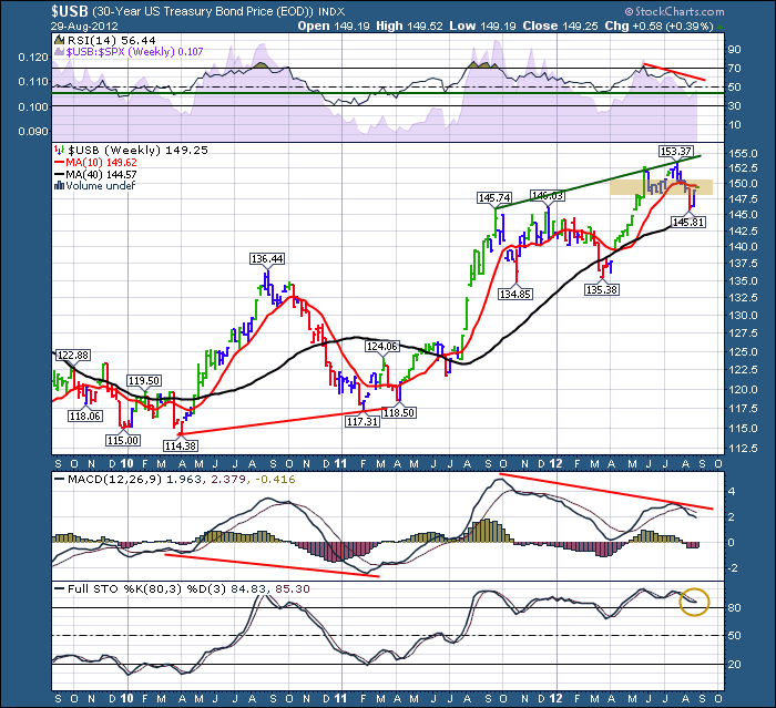
Based on the RSI, the bond market would still appear to be in Bull mode. Everyone talks about the low yields. But for a foreign buyer, they may also get the currency appreciation which helps them with their total return. As money leaves the troubled Eurozone, the realative safe harbour of the $USB is very attractive with the $USD on an uptrend.
The green line on the RSI is clearly a strong base level, and we appear to be holding above that for the last 6 quarters. The Negative Divergence on the RSI is a major caution so far.
The SPURS are demonstrating relative underperformance in the bond market compared to the $SPX. That is not a real surprise as the $SPX sits near new highs and the bond market has pulled back under the 10 week MA.
The price action is interesting. The $USB chart has not stayed below the 10 week very long, and dips below it were pretty strong buying locations in the last 6 quarters. Currently, it is up against the 10 week MA as resistance now. We'll need to see if that becomes significant. I shaded a light orange area on the chart identifying the support area for the recent top. You can see we have pushed back into it which would now be resistance for a push up from the bottom.
As well, the MACD shows major negative divergence, so is this the final top for bond prices? Look farther left on the chart and you will notice another period of negative divergence that did not play out. The MACD was making lower lows and the price was making a higher low. Since then, we went on to make higher highs and higher lows. Currently the MACD is above zero, so still looks like a safe place to park money.
The Full sto's are sitting nicely above 80, appearing to be trying to cross back up this week.
This chart seems to confirm the precipice the market finds itself on. Now we are sitting in the top of the range in the $SPX and the internals are getting weaker. This bond is poised to break down should the Fed shoot more QE, or up to continue its rise, should the $SPX market rally fail. The zone of resistance and support is now the dividing line.
If I was a bull, I would note the negative divergence on the $USB and the $USD. That seems pretty powerful! If I was a bear, I would note the negative sentiment towards commodities showing no sign of global market improvement. Iron ore plummeting, $copper moving sideways, Crude oil oversupply, Natgas at an interesting level on the Fibs, etc. etc. All this makes a market! We should get some clues to direction soon!
The big surge higher last week doesn't look like the desire to buy is slowing, But this week the movement has been minimal.
Good Trading,
Greg Schnell, CMT


