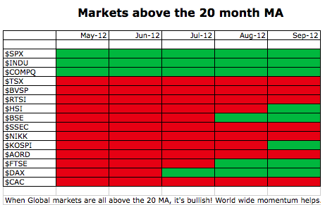
Here is my Global markets summary in just one slide.The table is demonstrating how the world markets are shifting from below the 20 month MA to above the 20 month MA. If you look at the $TSX chart farther down you can see why this is important. The 20 month MA is a long term average and large institutional managers like to look at this big picture. I like a few things on this grid. If the BRIC countries can turn green, we have a good chance of turning much higher. Brazil ($BVSP) was above and pulled back in September. The $SSEC is not close to turning up. Russia ($RTSI) is pretty close. The Indian market ($BSE) had a fabulous September. The list is roughly in order of the Americas (North and South), Asia and Australia, Europe.
So we have an interesting month ahead. If the markets can surge to new highs, a lot of these reds will be green very soon. We'll need that to hold for the close of October and November to confirm, but we want to be very bullish should the whole thing start to get better traction.
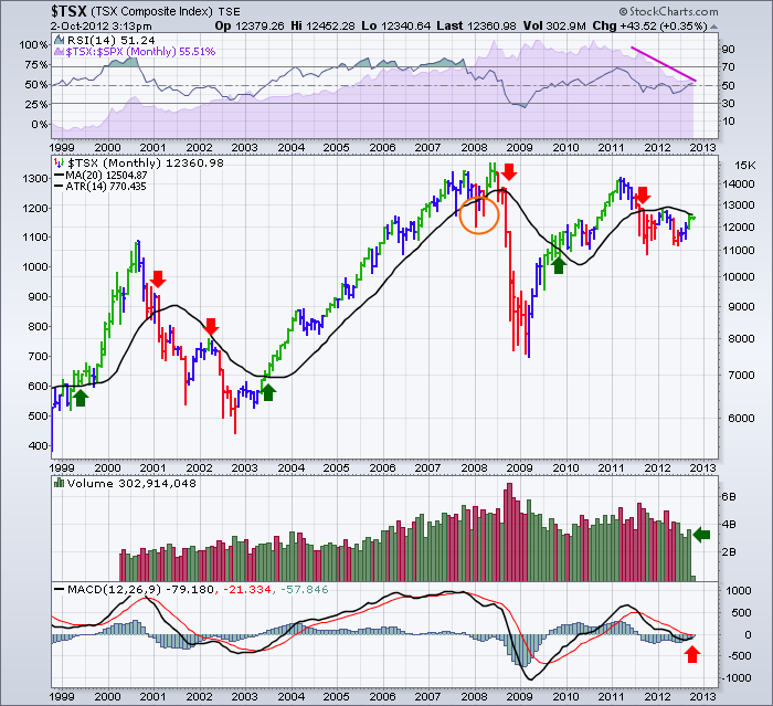
Here is the monthly chart of the $TSX.
3 Things are very important on this chart.
1) Look how the 20 month MA in Black defines being bullish. When its above, be long. When its below be cautious. Now look where it found resistance in September. Right at the level. We need to get through this level.
2) The Monthly MACD is trying to give a positive cross. That is good. It is very important that this doesn't fail here. This would confirm a major downtrend.
3) The increase in volume in September was nice. July and August had monthly volumes at levels previously seen in 2006. (there were a few similar lows.. December is Christmas related and February is a short month.) Interesting that the volume lows in JULY 2006 went on to a surge up in the markets for another year.
If the world is bullish, we'll find our retirement accounts looking healthier if we trade with the trend.
Good Trading,
Greg Schnell, CMT


