This blog today is discussing the value of reviewing past patterns. That is also what the Webinar yesterday was about. Past patterns. Here is the webinar link.
This blog today is not to beat up on the holders of a given stock. This blog is discussing how to learn about 'when to sell your big winners'. Apple just happens to be a great example and timely as its fresh.
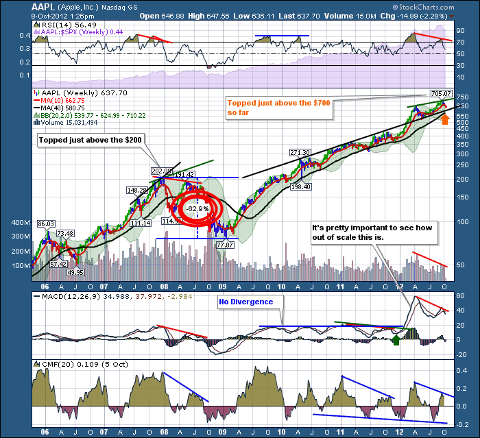
It was a long time back on October 08, 2012 when we talked about The Apple Starts to Soften. I got some of the meanest responses to a blog when I wrote that one. I was reminded by a friend yesterday about the blog.
It is just too eerie when you see the content of the January 1984 Superbowl Ad that ran on January 22, 1984. 30 years later, the ad is spooky. See the ad here.
Apple advertised itself as time to think differently. In the stocks final run up, everyone behaved like the inmates in the movie. They followed the lead of the others. Everyone is following everyone else down the Apple Mountain now, following the lead of others. Exactly 30 years later, on the next day, the investors behaved exactly like the ad again. Isn't that one of the strongest cases of irony ever?
I don't propose that the charts get everything right. I paper traded an option in Apple at $600 after it fell and expected a bounce. It did not happen!
In the top in Apple, the charts did a good job of mimicking previous exhaustion runs as demonstrated in the blog The Apple Starts to Soften. One Elliott Wave Chartist out of Seattle had plotted Apple to rise to $705 well in advance. Joe Terranova sold Apple on the day. Nice work to both of those technicians!
Here are two of the charts from that blog. There were many more and a good blog to read again.
Here was the daily.
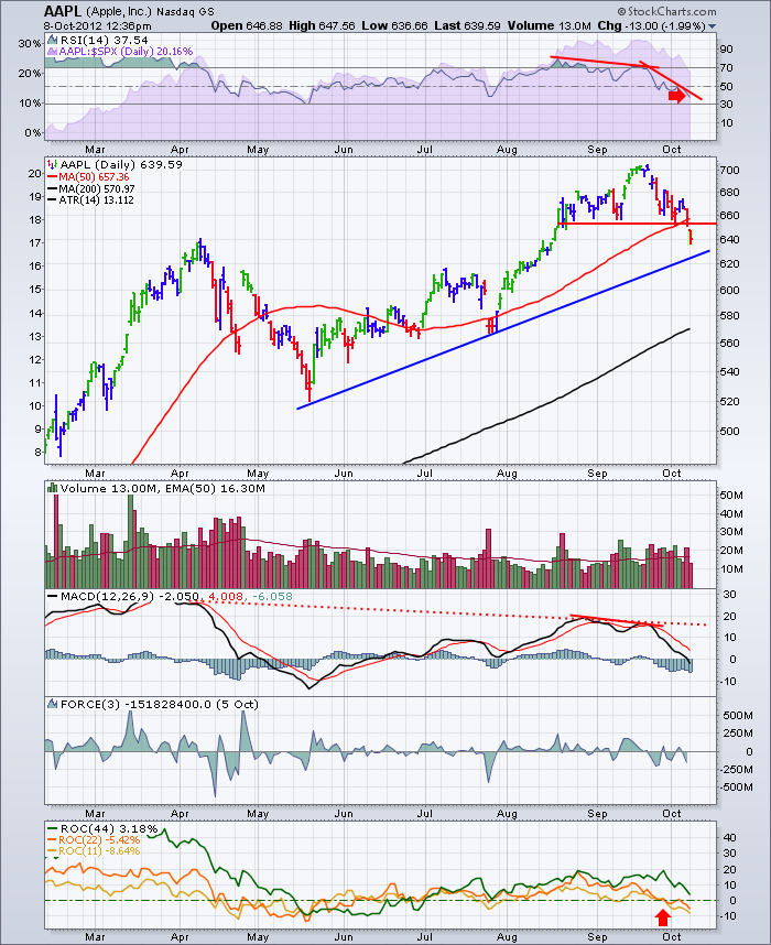
I remember reading the macdailynews website and reading fundamental analysis of why this could not be the top in Apple. The important lesson that we can learn from the charts is what can they tell us about the behaviour of investors, not necessarily the behaviour of the company. Apple is still a great company and I will be off to pick up some more Apple hardware in the near future. The charts can help us see major turning points in investor behaviour in strong stocks especially near the top and that is when we must think differently. THAT IS VERY HARD TO DO.
Starbucks had a similar crush after the leader left. Howard Schultz is now back and introducing the very products he never would have introduced in his first run. It will probably make an ultimate top again!
Times change and our investment thesis must be flexible enough to leave at or near the top when the momentum changes. Tax issues and the compounding of capital make this very hard to achieve with a clear mind. But this is a great stock for helping us learn how to identify a major top.
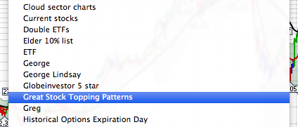
At some point Google, Amazon, Facebook, and stocks of the future like Twitter will all have a climactic run. We know that today. We just don't know when. Let's put the Apple chart in our Great Stock Topping Patterns chartlist so we can use it to compare.
This is one of my chartlist names. I have MSFT, RIMM, CROX etc in there.
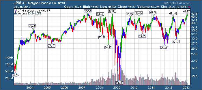
One of the ways to be a great trader is to review big winners. Or just review charts for how they behaved. I find every chart can show us something new. JPM has capped under $50 so many times. When that breakout occurs, I would expect a mountain of investment to surge into that stock.
Why? Because that is what usually happens when a major resistance level is broken on a chart. I may be wrong, but I'd rather take a position at $47.55 than at any number between $44.00 and $47.54 Why?
Because for some reason, someone is willing to pay more for the stock than at any time in the last 10 years. There must be something great going on.
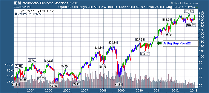
Let's look what happened to IBM after it finally broke out of a firm resistance area.
This is why understanding previous market patterns is so important.
Of the stocks I listed above, do you see any danger signs in any of those stocks? What about IBM now? Is this a Head/ Shoulders top? So far it looks like one. But I wouldn't want to comment until I could see other indicators and oscillators on the weekly chart and a daily chart.
So lets go back to the discussion about major tops. How about the Oil Stocks? This is not just about Technology stocks or Mining stocks. But there are different patterns for topping and basing. As Technicians we can make a lot more money when we know. We can look at POT from 2008 and see different traits. It was not as kind. It did not give us a much lower MACD bump to draw divergence. Neither were NFLX or CROX at the top. They had different topping patterns. We could call those the 'Splash Mountain' style like the ride at the Disney theme parks.
Good TA is about Pattern Recognition. Selling at the maximum euphoric moment, not at the maximum profit or earnings moment. The two are very far apart. RIMM topped at $148.13 but the first profit lower than the previous year quarter was when the stock reached under $25.
Just to show you pattern recognition, and how sometimes we ignore it...
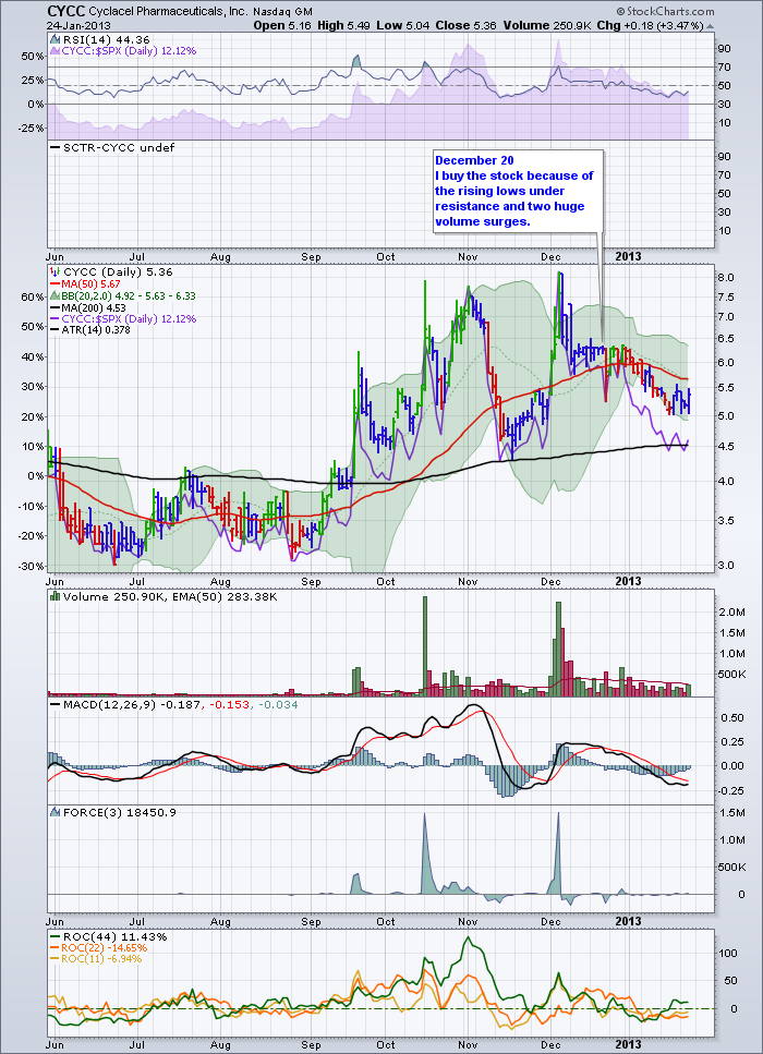
Here is a recent example of one of my errors.
In mid December it had a ceiling (flat top on multiple days) on the stock around $6.25. I loved the 2 huge volume breakouts on the stock. Remember ...volume before price! Absolutely swooning to be part of the next surge, I had a problem. I was going on vacation with a great bunch of friends from all over the world. We were meeting in Maui. 24 of us. I knew I would not be able to trade with agility.
So I bought the stock just before we left. I looked at it every day while on vacation but did not take action. It was a tiny position! Good thing. I should have put a buy on stop order for $6.50. If it hit, I am in, if it doesn't I'm still out. Greed suggested it would be an overnight announcement and I'd be missing out! Ever felt that way?
Here is the chart.
3 bad decisions.
Putting on positions before a holiday.
Not managing the position while on holiday.
Not using the first law of TA. Support and Resistance. I do not want to own this stock if it doesn't turn higher! Da...
Review your losers. They can teach as much as the big winners!
Calgary is Sold Out for our training next week. Look forward to meeting everyone!
Good Trading,
Greg Schnell, CMT

