In order to fully understand this article, you will need to read both previous related articles.
They can be found by clicking on the links below:
Ok. Lets dive right in. Here is the current market.
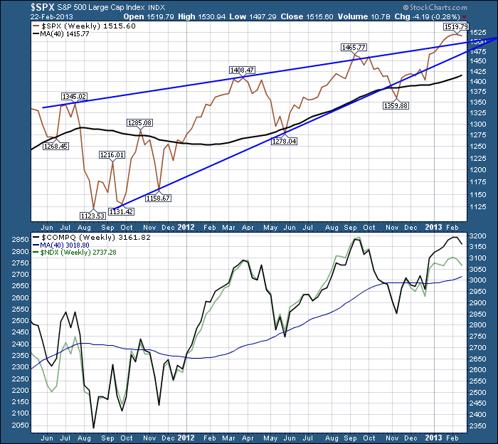
On the above chart, The $SPX is a series of higher highs. Currently the $SPX is testing meaningful resistance levels from both 2000 and 2007. In 2000, the highs were 1527 and 1520. In 2007, the market oscillated above and below 1520 a total of 8 times in May, June and July. In July it broke out above the range, failed and fell hard. In September 2007, it paused at 1520 then continued to new highs. On the way back down, a range around 1520 became the support and resistance layer as the market pulled back from the high. It ultimately crossed the 40 WMA at that same level. On the May rally, the high was 1515. So the $SPX has found substantial friction at the 1520 area. Recently, we wobbled at 1520, broke through and now have pulled back below. The 1520 level is a remarkable level to watch on the chart! What is also interesting is the way the market has behaved around the upper and lower trendlines. Broke out the bottom, surged back to break out the top all in the last 3 months. That was also how some of the historical wedges behaved in the past. An upsloping wedge usually breaks down hard so we call it a bearish wedge even though the price is rising. It still has the indecision of a pennant or a narrowing range as discussed with GOOG in 2007. There are different ways to draw the trendlines based on the artist and the amount of coffee. Currently this looks correct to me. You can draw the lines 2 different ways. One has an apex at April and the other has an apex in October. Currently a failure of 1475 would be technically significant. Like picking up dimes in front of a bulldozer significant.
The deep pullbacks in 2012 are reminiscent of the 1999 and 2007 market with large swings between the March highs and the Sept highs. On the next rise up, in this case the November rally, the largest tech stock has been unable to rally. This looks similar to the 2000 market top when MSFT let go with massive earnings just around the corner but the market sold the leader well in advance. So that is the primary driver for digging deeper into this market. This looks similar to AAPL letting go in 2007 even though everyone was expecting another great year. As well, the fact that AAPL hasn't been able to rally, off that November low encourages me to draw the wedge lines with an April apex which would mean the market has less time before pulling back.
A couple of other clues are aligning. All three of the indexes shown above have AAPL as part of the index. What is interesting is that the $COMPQ at this point has stalled at the previous high, which would appear to mark a double top. More concerning is the $NDX shown lightly in the background with a significantly lower high on the right peak of what appears to be a H/S top. We talked about non-confirmation in the earlier blogs and why it is meaningful for technicians. So to make it clear, the $NDX shown lightly in green is aligning to make a perfect H/S top. The $COMPQ is making a double top pattern here. The $SPX is clearly a higher high of equal proportion ot the previous two peaks.
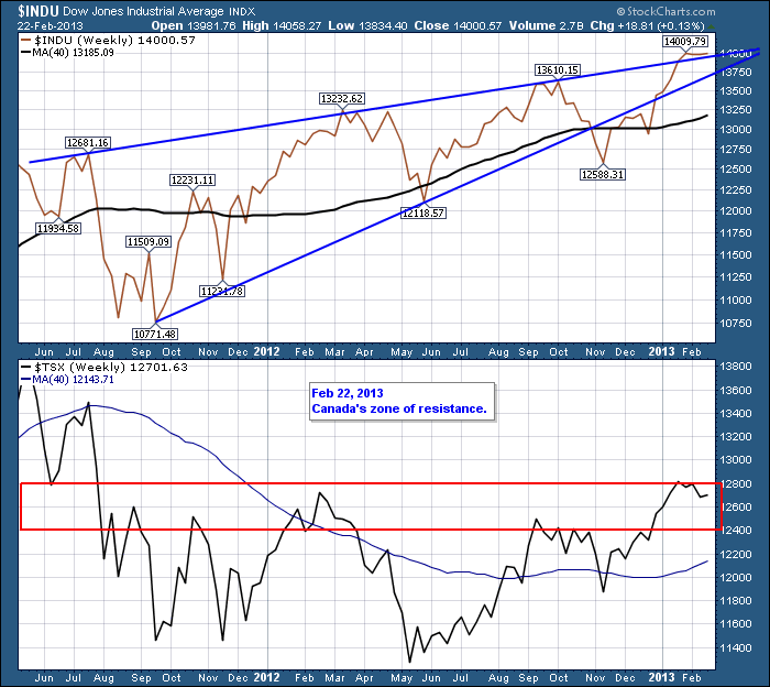
In the second blog, I included the $TSX and the $INDU. Neither have AAPL in them. Lets look at them now, to see what they look like.
You can see the Dow Industrials broke out the bottom side of the wedge on the last low. In typical wedge fashion, it rallied back inside the wedge and powered all the way through and out the top. The 14000 level has been extremely difficult for the Dow to break through. It was also the pinnacle level for the Dow market top in 2007. Once again, a prior high can be meaningful resistance. On the $TSX, this 12400-12800 level has been support or resistance for 7 years. Yes, 7 years. The bottom line is that both of these markets do not contain Apple but they also are struggling at critical resistance levels here.
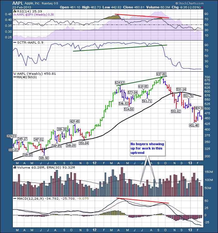
OK. Let's review the rest of the tech stocks. Lets start with AAPL .
I have reviewed the breakdown in AAPL before. We had negative divergence on both the RSI and the MACD. AAPL was clearly outperforming the $SPX as you can see on the SPURS (purple shaded area). The volume got very light from May to September. We have one more thing to look at now that is new to Stockcharts. This is the SCTR. It ranks a stock against the rest of the stocks in a given index. Currently AAPL sits at .9 which means 99 % of the stocks are doing better than AAPL. The SCTR trendline break was meaningful, especially when combined with the negative divergence.
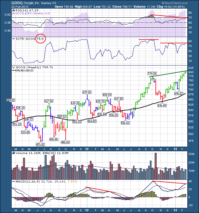
GOOG
So here we see the Google chart showing similar signs that the AAPL chart had before it broke down. IF the RSI, yes IF because it hasn't yet, breaks down here we will have confirmed the negative divergence we see on the chart. The fact that the SPURS are strong does not bother me. On almost every chart we looked at, the SPURS trend was outperforming. The last 3 of 4 weeks, the volume is less than average. No buyers showing up for work? Lastly, you can see the SCTR ranking is declinging on each rally. Currently GOOG is only outperforming 79% of the stocks which is down from the levels going into the September high. If we drew a trendline across the bottom of the SCTR Google is still well above the approximate 50 level.
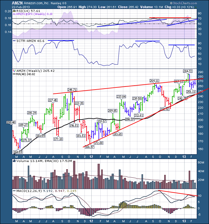
AMZN
Amazon is not showing a lot of divergence on the RSI. Very little in fact.It has broken the recent uptrend line and thats the only weakness I see on the RSI. The SPURS has been strong, but the recent multi month uptrend appears to be broken. The MACD is causing some significant negative divergence like we saw in AAPL. The fact that no buyers showed up this week is concerning as Amazon tried to go higher than last week and pulled back for a breakeven on the week. Based on the SCTR, having AMZN in the area below 50 when the $SPX is hitting new highs the same week, portends lower prices in my analysis.
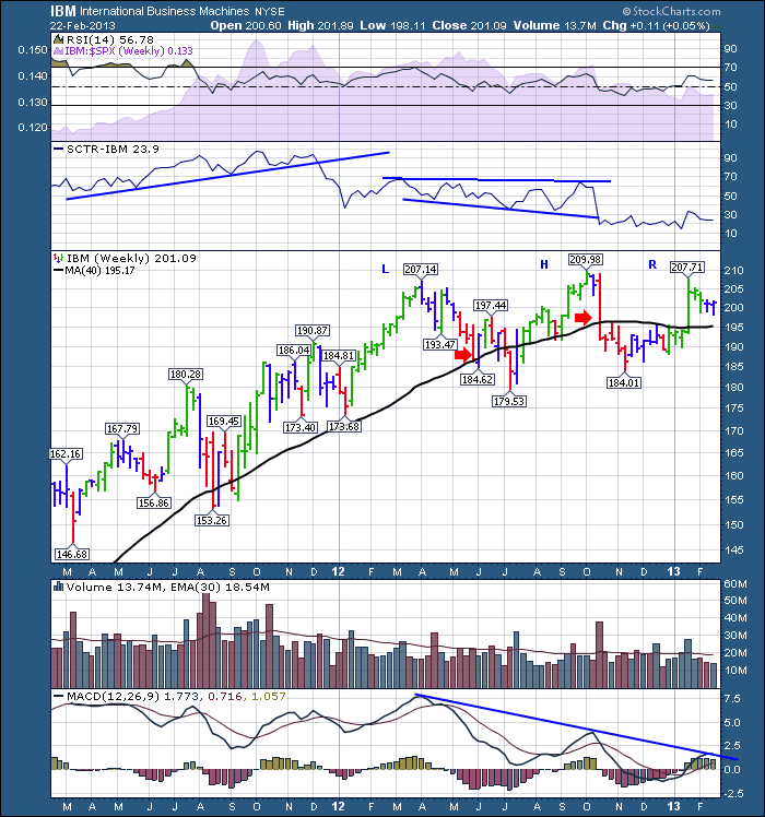
Here is IBM.
IBM spent most of 2012 going sideways. We can see the SPURS shows underperformance since September 2011. The RSI has stayed above 40 the whole period so that is still a bull trend but the momentum in IBM is waning. Look at the MACD. This is a very low MACD and a rollover here would confirm the H/S top. I'd rather be short than long if I was taking a position on this chart. Other than the earnings week, there has not been a lot of momentum in IBM. With IBM currently outperforming 23% of the stocks in the $SPX, this looks very ominous.
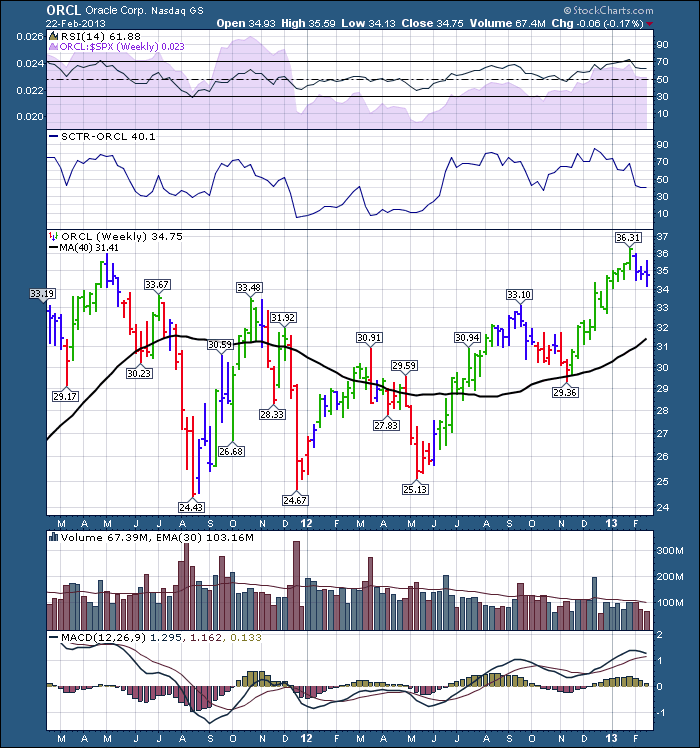
ORCL has been trending higher and looks better than the others. One concern I would have is making lower weekly closes 3 weeks in a row. We can see it tested the May 2011 highs and has pulled back from there. The moving average on volume has declined since the May 2012 lows but that is a trend seen across the market. The SCTR is not able to hold the 50% line so that worries me. To conclude, this chart could go either way.
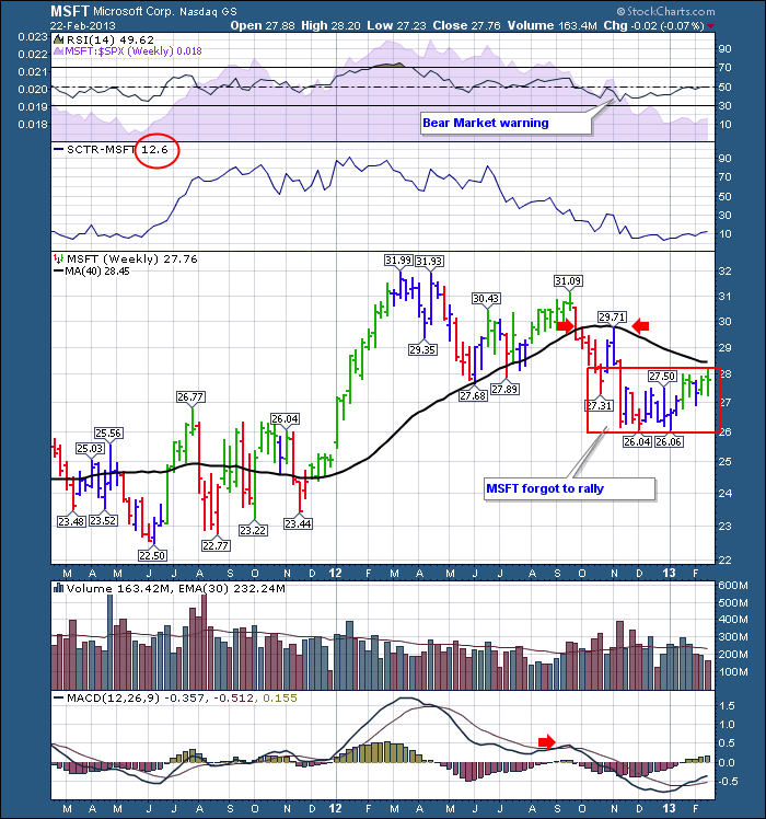
MSFT
We started with MSFT, lets look at it now. MSFT RSI is giving a bear market warning by going below 40 on the November low. We can see the SPURS broke down in May of last year and its been a train out of town for a while. The MACD below zero is very ominous especially with the other major tech stocks showing negative divergence. MSFT got rejected at its 40 WMA and is testing it this week. We'll see what happens.
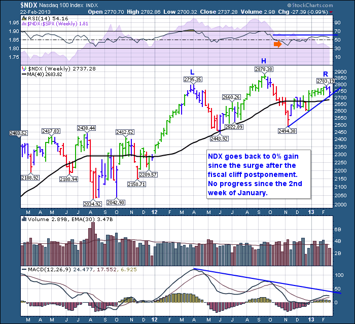
To wrap up, lets look at the $NDX H/S top.
Here is the final component of the thesis. At this point, we have the major stock 'unexplicably' letting go. More unexplicably, its not rallying either. The MACD is in perfect formation for a H/S top pattern. The RSI is as well. We recently got a bear market warning on the RSI. The SPURS topped on the September peak. The pullback in November did not get support at the 40 WMA which is quite surprising.
At this point, it would appear that having the top tech stock roll over and not recover on the next rally is very significant. The index has now formed a H/S top and created a divergence or failed to confirm compared to other indexes like the $SPX.
The bearish wedge on the $SPX, $INDU, $COMPQ and now a H/S top on the $NDX is particularly concerning. The market is showing me numerous signals of trouble ahead. But this blog is about a thesis of being aware when the major tech stock rolls over. Following that event, we must watch to see what the other tech stocks do on the next rally. It would appear at this point to be another valid signal. Facts show up long after blog is written, but I hope you find this as food for thought about where the markets are going. Something could happen to turn them higher, but at this point I am leaning to a significant pullback.
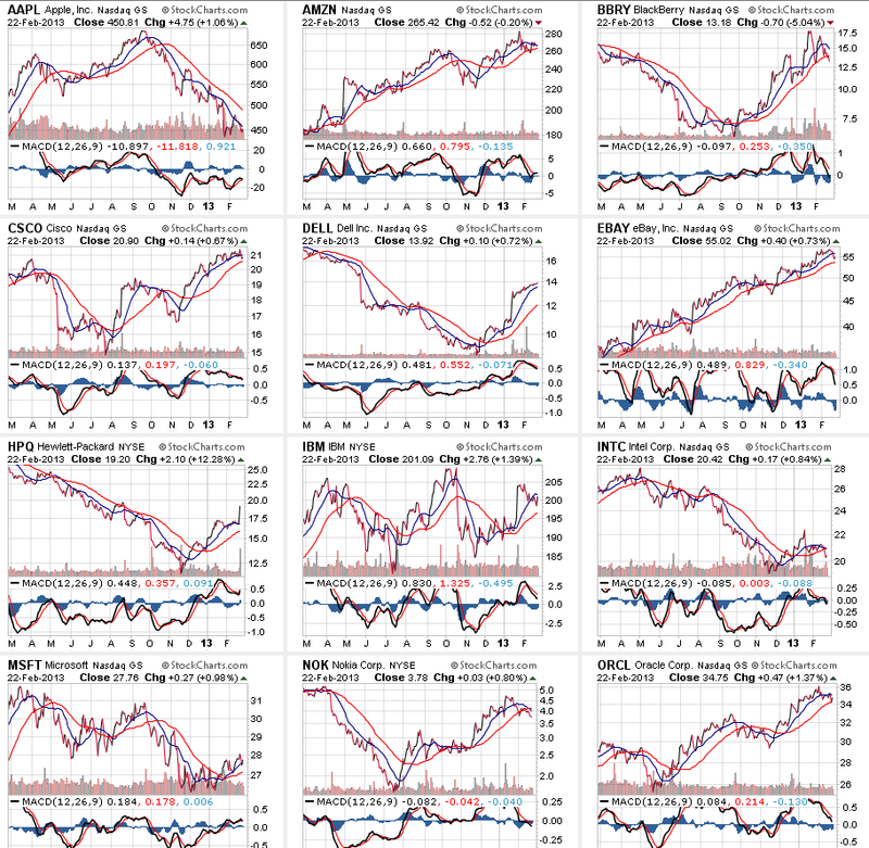
Below is a summary view of the top tech stocks. Just note the location of the MACD on most of the charts. Unfortuantely, these are daily only. But I think its timely enough for daily charts to help.
So to Review:
1) The Largest Market Cap tech stock has broken down - AAPL
2) It failed to rally on the next rally up.
3) Other parts of the tech market are now showing deterioration.
4) There are quite a few charts showing negative divergence as well as non confirmation of the other markets.
5) The $NDX has a very low MACD that would appear to confirm the H/S top in the price pattern.
6) Some of the other major tech stocks put their highs in even before AAPL, but some are still performing. This is not a reason to just ignore the 'top stock ' behaviour.
7) you do not need both the RSI and the MACD to have meaningful divergence.
What if I am wrong here? If this is all a huge coincidence, the markets will go to new highs and leave me behind. At some point I would notice my error.
So, if we hypothesize about being right, what now?
8) An early confirmation would be the failure of the $NDX to hold the 40 WMA. The main confirmation of all of this is a break of the neckline around 2500. My intention would be to find an exit long before the index gets to 2500 or my account gives up that much capital!
9) If that all happens, a measured move from the H/S pattern would have the $NDX bottom at 2100 or near the 2011 lows. I don't know at this time if any of this happens. I am just looking to estimate the size of the retracement. Because of the height of the pattern on the $NDX, it would point to significant low. This might take 18 months as an example.
10) There is significant support around 2450-2500 so a rally would be expected there before any move lower.
So the big picture is about using the tech giants to help us find major tops in the market. The little picture is that things are lining up to roll over in my view.
I'll blog later in the week about the long term currency charts. It's pay attention time on those charts too!
After writing all of this, hopefully you found it useful to review. I always appreciate your comments and would really like to hear back from you on your thoughts of this analysis and thesis.
Good Trading,
Greg Schnell, CMT.

