Over and over, the lesson in the markets is "Don't Fight The Major Trend".
Over and over, technicians keep watch for a change in the major trend.
The reason that stays true, is by the time the major trend is so obvious, the technicians are looking for the next one.
Under our feet, there has been a trend underway for three months but it feels like its just getting started.
Here are the major components of the dollar index. ( Plus the Aussie Dollar). Click here for the live chart. DOLLAR INDEX
Starting at the top, we can see the Japanese Yen has pulled back (ok, fell off the glacier..).
Then, the British pound started to do some olympic size diving.
The Canadian Dollar went heli skiing, then the Aussie dollar slid off Ayers Rock and the Swissy snowballed.
The Euro exhibited bipolar behaviour as the price mirrored the Jan 1- Feb 1 move up. No biggie, just seven cents up, and seven cents down.
Sweden must have internet issues, as they clearly haven't got the message.
But this is the short view. Yes, looking at 1 year charts is just too brief. Why?
Lets roll out a longer timeline. Here is a link to the live chart. Dollar Index Components
Lets start at the top again.
The Yen clearly announcing the trend it was in is a historical trend not to be visited any time soon.
The British Pound has just resolved a 5 year pennant. Measured move targets 115.
The Canadian Dollar just might be the single best large scale example of the irregular Head and shoulders pattern.
A trend line break here would be a big blow to the Canadian dollar. The Canadian Dollar target would be 84.
The Aussie Dollar is testing two very important trend lines. The horizontal trend line and the rising trend line.
A confluence of support should lead to a bounce.Should both of those fail, the pattern measurement would set a target for the Aussie dollar of 87.
The Swiss Franc has horizontal support at 105 as well as the uptrend line. So it might wobble there. We'll see.
The Euro looks like its going back to 120. Not much else to say. The larger wedge pattern still looks like it needs more time to resolve but we will see.
The Krona shows a Head/Shoulders top forming.
The Krona will be hunting support at 140 should the trend line break and there is some horizontal support for the Krona at that 140 level too.
Ok. These charts all look like they are ready to surge one way based on the fact that the Yen and the Pound have demonstrated these long term trends are in jeopardy.
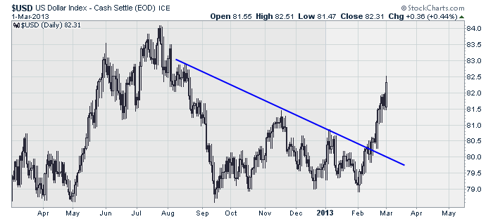
Perhaps, we should just look at the $USD chart. It must be obvious there too. Click here for the live chart $USD
Ok that's a pretty obvious short term.
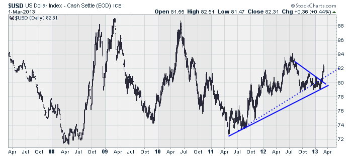
Let look longer term. 6 Year $USD
That's an interesting chart. Notice that the break through the dotted trend line probably pushed every trader bearish on the $USD.
Only to whipsaw and catch everyone on the wrong side of the trade.
So looking at the individual components helped us to see this trend develop and probably protected a loss.
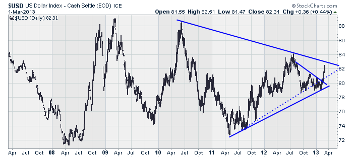
Ok. Lets try to figure out what happens next. If we add another trend line on the $USD chart, it looks like this. $USD Extra line
Looks like resistance just above here. So we can expect some near term turbulence in the $USD is my hunch.
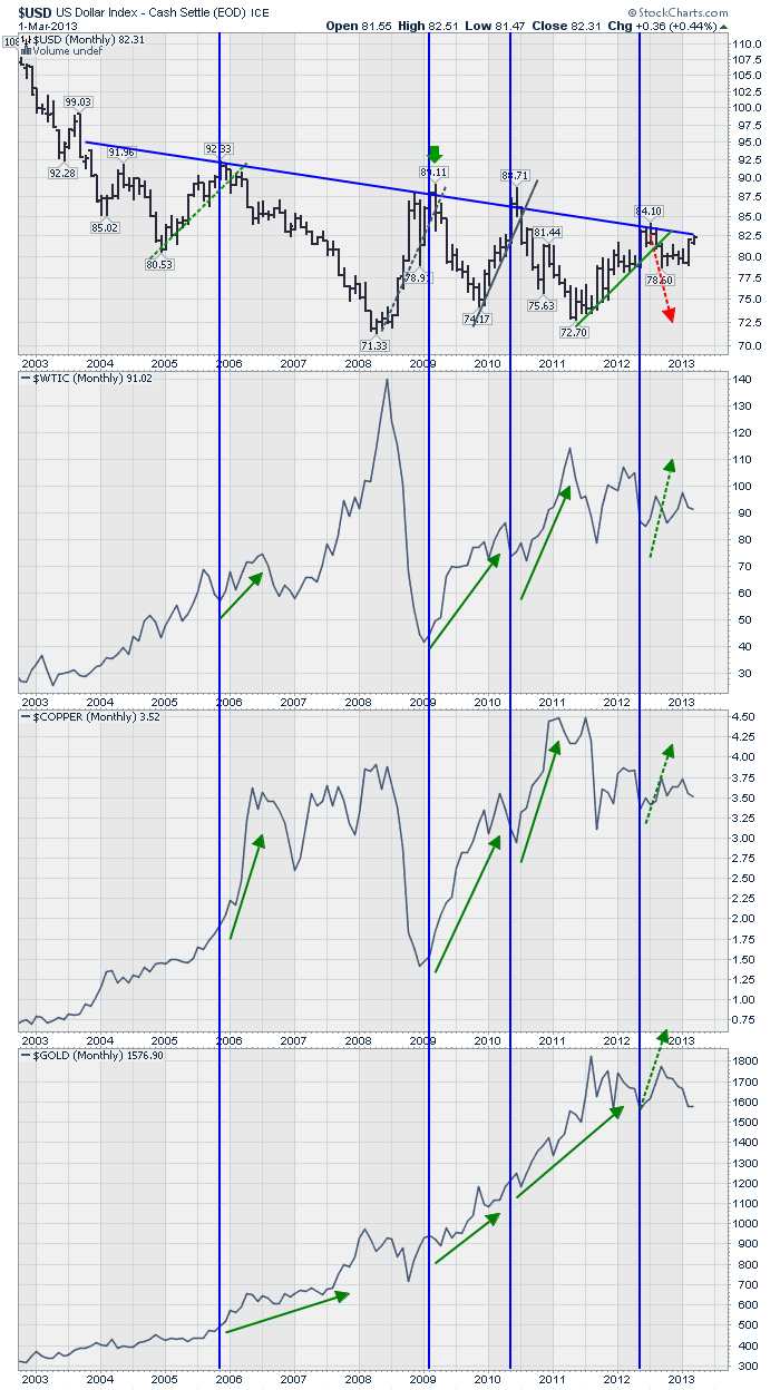
But wait, there's more! Click here for a 10 year view.$USD 10 Year. The candlesticks below are monthly.
This is a grand tell to me. Based on the blue lines, when ever the $USD hit the upper trend line, it reversed hard.
When it did, all the commodities soared. EXCEPT THE LAST TIME.
This is a meaningful problem. If the $USD didn't fall all the way down the last time, and is now retesting the breakout something has fundamentally changed.
Crude is in a pennant pattern, copper is too and the Gold chart looks like a sideways pattern at best.. perhaps a descending triangle?
Bottom line, all of these three could move huge if the 10 year $USD trend line is broken or if it forces a $USD reversal.
Primary Technicians Rule: The longer the trend line, the more important the trend. At this point we will need two major strategies, one for each result.
We had a hint of this this a few years ago on some other charts, but this is a long story already. Click here for one of them. $CRB
Now the question is: How will you play the move?
If the $USD gets stopped again at the 10 year trend line, what should you be buying?
If the $USD breaks through the trend line, what should you be buying?
That is what we get to discuss in a meaningful, long term way in the next few months.
Let me end this newsletter with the same sentence I started with.
Over and over, the lesson in the markets is "Don't Fight The Major Trend".
Over and over, technicians keep watch for a change in the major trend.
The reason that stays true, is by the time the major trend is so obvious, the technicians are looking for the next one.
This article is a great example of that. More importantly, it should help our timing immeasurably.
Good Trading,
Greg Schnell, CMT


