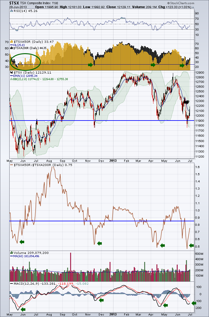
This is one of my favorite charts to help diagnose the market. Currently it is in a spot where we should be looking for going long. But it can stay this way for weeks. Here is the chart.
So lets start at the top. The RSI for the $TSX is oversold. Most of us would look for a bounce here.
The next one is a very interesting indicator I have written about before. The $TSXA50R is the % of $TSX stocks above the 50 day MA in Gold. In Black in the background is the % of stocks above the 200 DMA. The dark Gold area is where the % of stocks above the 200 DMA is behind the % of stocks above the 50 DMA. So when you start a market uptrend, stocks move above the 50 DMA first, then they move above the 200 DMA. On the way down, they move below the 50 DMA first, then the 200 DMA. Obviously at the top and bottom there will be a point where they cross over. As an example, notice in June of 2012 the $TSXA50R moved above the $TSXA200R while the price was still trapped in a range. Continuing on, we have had 4 lows where the number of stocks above the 50 DMA was below 25%. We just came out of that level. So rather than being too bearish, we should be looking for strong longs that may break out.
It is not a surprise that the Canadian stocks would bounce at the head/shoulders neckline drawn on the price chart in blue. The point of failure to watch for is probably the 20 DMA which is the dotted green line in the middle of the Bollinger bands. I marked it with a black arrow but it is hard to see. We need to see the $TSX get above the 20 DMA.
Below the price box is a chart with the ratio of the $TSXA50R to the $TSXA200R. What I like about this ratio is that you want to be bullish above the blue line or off deep retracements. If the ratio can not rally above the .85 level marked in blue, its usually a continuation down. Just a nice visual tool.
The month ending volume was just above average, but the restructuring of portfolios into month end was probably psrt of the action, so I am not too bullish yet.
The last indicator is the MACD and these deep drops have been good buying locations. We'll need to see it get above zero to get very bullish.
I continue to worry about the Rest of World charts. We have followed China more than America. So if the Asian markets can climb, I think that will help our $TSX.
If you are not receiving the Chartwatchers blog, you can sign up for it on the bottom of the Stockcharts.com home page. I wrote an article today summarizing the global situation. It is weaker than it has been in 6 months so it is an important time to focus there.
Remember the Toronto Stockcharts University courses are only 4 weeks away. Sign up now by clicking here. TORONTO
It is the first one on the list below the descriptions. I look forward to seeing you there!!!!!!!!
Good Trading,
Greg Schnell, CMT


