While writing my SCTR series of blogs this week, I was sidetracked by the changes in the market. I have thoroughly enjoyed watching the $TSX breakout and make a meaningful move to new 2 year highs. While I scrolled through my all encompassing market 'summary' chartlist, some major red flags started waving. There was a massive underlying change in the markets this week. Let me roll through these charts, because they contradict my views on a bullish global breakout.
The goal of Intermarket analysis is to see changes sooner than might otherwise be obvious. John Murphy's work is so substantial in this area. So lets focus on the currencies first. What we would expect is that commodity currencies would continue to strengthen if the global commodities demand is going to rise. Then, switching to commodities, we should also see the commodities rise in price. We should also see the stock indexes in the countries with the heightened demand for commodities perking up. We should also see bonds sell off. Of course, it is not a straight line. The world zigs and zags. The trick is to follow the charts to see where things are moving. When charts across the network all start to make moves in concert, the subtle changes become more obvious.
First of all, the currencies.
These charts were placed in this order a while back. It was the order that the major currencies pairs were breaking long term trendlines. Lets start at the bottom and work up. The $USD shown at the bottom, broke above the down sloping trendline. That's a big deal. Lets go to the top and work down.
The Yen is still trying to resolve its direction. But when it does resolve, I would expect significant fireworks. You can see I put a trendline with the same slope on all the European currencies. You will also notice that Australia is not in Europe. But the same slope works on that chart as well. That leaves the Canadian dollar. It is testing support here, which is odd considering the remarkable breakout on the $TSX. Notice the slope of the Canadian dollar is considerably flatter than the other charts. As you can see, the trendline does not fit perfectly on all these charts but by using the same slope over the same time period, it helps identify what is going on. I find the Swedish Krona very sensitive and sometimes an early warning. The Krona got stuck at resistance at 157-158. The Euro (60% weighting in the dollar index) made a new high and immediately failed. A failed breakout is important. When investors are no longer willing to pay higher prices, something is changing. The Euro needs to find support at this 134-135 level or this trend has changed. Bottom line is: With an inkling of a $USD reversal, These charts moved pennies in a week, against the current trend. That's a big deal in my mind. The Canadian currency didn't plummet but it has gone nowhere in the last while either.
The Weekly Currency chart shows something different. Long term support and resistance are still the drivers.
Starting at the top, the Yen has gravitated to the 100 Level. It is a very fluid situation in Japan. Abenomics vs. Debt. One of these will win, and it is unknown which direction has more support currently. The Yen chart is a great chart of long term trendlines. When they snap, it matters. The dotted line is interesting for many reasons. The collapse of Bear Stearns in 2008, the bottom of the stock market in 2009 is when the Yen was sitting around 100. Long term (20 Year) support for the Yen is closer to 97. When the Yen plummeted off the highs, where did it find support? At the long term support level. I would watch the Yen closely for 2 things here. A breakout or a fakeout. If it tries to break out one way and fails, I would expect it to move viciously the other direction. On many charts, a failed breakout is an even bigger directional indicator.
The British pound is one of the most interesting charts. It has continuously tried to break through the top of the thick green line. At this point it has not. Supporting this bullish position, is the break above the thin green line after going below. There is the converse opinion, that shows a slightly downward bias on the currency. It would appear to me that the pound is stuck inside this channel and with the $USD breakout shown above on the daily, this British Pound chart is likely to break downward to the 145 level. We'll keep watching.
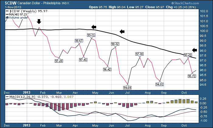
You can see the Canadian Dollar has built a massive topping formation. To those who would say 4 year patterns are too long to be relevant, I would refer them to the Yen chart at the top of the page. Back to the Canadian dollar chart, it recently (July) broke through the thick green line and got stuck below it in a range. It has clearly marked a horizontal support level with this sideways movement. Notice where the Canadian Dollar was when all hell broke loose in 2008. The 97.5 level was support. It stepped down to a lower level, and then unloaded. In 2013, we broke below 97.5 when it crossed below the green line. I was worried then. But the 95 level created support. Now 97.5 has become firm resistance. Resistance from the thick upsloping trendline as well as long term resistance. Very interesting and not very bullish.
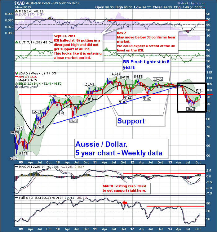
Now move down to the Aussie chart and get me all riled up. The Aussie chart snapped it's long term trendline in April and plummeted to 90. Then it got up off the floor and returned to the 97.5 level. I find no relevant data in the fact that both the Canadian and Aussie charts found resistance on the bounce at the same numerical level. What I do find compelling, is the Aussie chart had 97.5 as a pretty solid support level for the last few years and broke down through it. Just to add gasoline on a smouldering fire, 97.5 was also the level that the Aussie dollar found resistance at while trying to move higher when all hell broke loose back in 2008. I get zero comfort seeing the same levels that were relevant in 2008 on both commodity country charts on opposite sides of the world reappear again at this point in the cycle. You will understand my discomfort when you see the commodity charts.
The Swiss chart is a trendline artists interpretation of how to draw it. It could be horizontal, and show no breakout. I have had it down sloping for a year on this chart, so I left the line I had drawn and called it a breakout. With the intense daily action this week, gapping down all week, it doesn't have any support at this level, it would appear. I would expect a test of 105 should it go below the down sloping trendline.
As if the Eurozone doesn't have enough church spires, their currency charts are starting to print them! The latest one day push above the previous high was not supported with any conviction. The Euro lost over 3 cents since the spire. That's a significant reversal. One may suggest that my trendline is drawn too low. I moved it down below the 2011 peak because the numerous tests in 2011 continued to make lower highs, making that level more important. The more touches the more powerful the line is. So not only did the Euro fail compared to the Feb 2013 Church Spire top, it also failed on the long horizontal trendline. I would suggest the 137.5 is a big deal. Not shown is the 1995 high, the 2005 high in the Euro were both around 135. The major horizontal support/ resistance level on the history of the Euro is 135.
The Swedish Krona is building a massive pennant pattern. The range is down to 10 cents and we moved 5 cents this week. This would appear to be a bullish pennant on its own. Coupled with the rest of the Euro zone charts, I will need to be convinced by price action.
Lastly, the $USD. The currency received a substantial bounce this week. It could backtest the dotted green line at around 82 cents. This will be a very, very, very important mark on the charts for me. Should the $USD just keep marching through the 82 cent level going higher, I would expect a significant crushing of commodities. If the $USD stops and reverses there, after just whipping us around in the commodities world, I would be thrilled. Somehow, I don't expect it to be that kind.
The Fed has mentioned repeatedly it is trying to get inflation back up to a normal rate so the global economic engine can grow. The problem we are currently experiencing is the Fed measures have been unable to dent the slide in commodities demand. Recently, back in September, I had unbridled enthusiasm for a new bull market to re-emerge. Only last week I published a blog about how all the charts worldwide were moving to higher ground. I was concerned about the $NIKK, the $FTSE and the $SSEC. I still am.
However, the tone changes in the market this week leave my optimism dented.
Let me show you a few more charts relevant to this currency discussion.
Lets zoom in on Australia Currency for a minute. Let's look at the 5 year chart.
When you look at this chart....I am not seeing a lot of positive commentary. Its all red. The single largest point I want to emphasize is the action of the 40 Week Moving Average - 40 WMA. Inside the square box, it started to fall, earlier this year. The first rule of profitable investing with a down sloping 40 WMA is that these are bear market rallies to be traded not held. More importantly you are trading against the trend. After almost 2 years of a horizontal 40 WMA, this year it snapped into a downward trend.
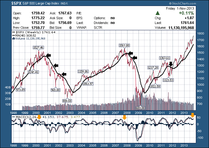
This chart below is a 16 year chart of the most common market in the world. The $SPX.
What I would like to point out on this chart is the slope of the 40 WMA. When up, it's bullish. When it's down its bearish. When the 40 WMA slope is negative or falling to the right, Price action is extremely important at the 40 WMA. Notice in 2000, the backtest from the underside of the flat or just starting down sloping 40 WMA. When the price failed to break through, it was a sign of bigger things to come.
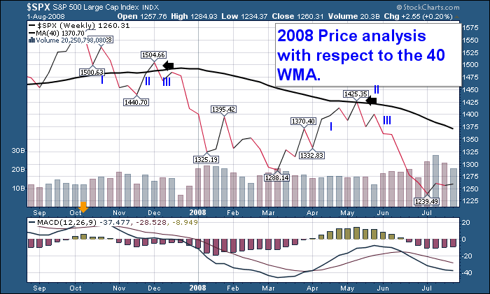
Moving to the middle of the chart, here is the zoom in on the 2008 top.
In 2007, the 40 WMA still had a slight upslope (I) The Market test the 40 WMA from the bottom. (II) It went above for one week. It failed to stay above. (III) The $SPX declined 200 points in the next 3 months. At the May 2008 retest of the 40 WMA, (I) It failed (II) and the market made a feeble retest (III) before unloading. What is extremely important in this example, (which was randomly picked), is the level the retest happened at. It was below or near the support level of the market top. This is identical to the pattern we see in the Aussie Dollar currently.
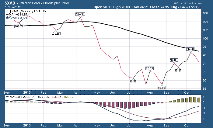
Lets use the same chart settings to examine the Aussie.
This is a rodeo I don't want to ride. Typical dang bear market rally. Sucks us in and goes the other way.
Let's change the setting and look a half a world away at the Canadian Dollar.
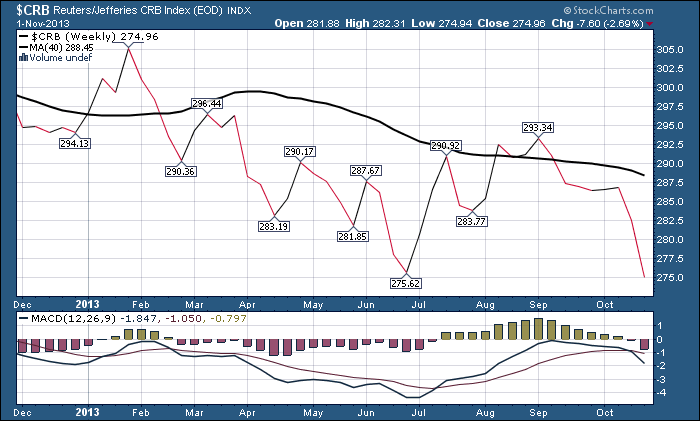
That is enough of a similarity for me. This price action is demonstrating significant weakness in the Commodity currencies. This blog is extremely long, but look at the $CRB. (39% weighting in $WTIC oil).
$CRB made a new 1 year low. Bad but not real bad. But do I see a trend here? Yes I do and I don't like it. Until the first of September everything was rolling along wonderfully on the $CRB. Now I can't figure out why oil would fall $17. It baffles me. In the meantime, the oil stocks surged. The $CRB couldn't make it back up into the price zone. It stopped roughly $1 below the $294 level. Now here is where I get up and go pour an 8 oz. espresso.
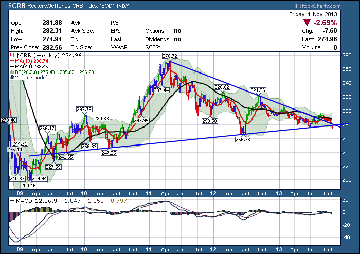
Here is the 5 year $CRB chart. It isn't over till its over. Its only below the line for one week. Maybe it gets support and reverses higher. Maybe the $USD reverses lower. Maybe the Canadian Dollar soars above big resistance. Maybe the Euro gets strength at long term support around 135. Maybe the slide in Oil stops right here right now. Maybe Gold goes up for a change. Maybe Copper resolves to the upside. Maybe the Aussie can turn around and bust through the resistance.
For me, I've started the remote car starter, and I'm putting on my parka. (Winter Coat for very cold temperatures). I am hunkering down for some trouble after this bear market rally in commodity currencies. I don't like the level they are stuck at. The Canadian dollar closed at 4 week lows last week. The Aussie retraced a full 4 weeks this week. That is an outside reversal at a critical point. I don't like that the commodity index confirms the rejection at the 40 WMA on the currencies. I don't like the major reversal in Euro currencies. I especially don't like vicious moves higher in the $USD. I don't like that England could not take out the May highs nor could Japan. Its only a week, but what a week. I don't like the fact that be it Australia, Europe, Canada or the $USD, they all made a serious signal at a crucial inflection point.
Maybe one week doesn't make a trend, and we may find reversal spires all over the place. The big trend took a major hit this week. Stay nimble would be my approach.
Good trading,
Greg Schnell, CMT


