Heads up on this one. You might need a coffee.
I continue to watch the global response to the Fed efforts to create inflation. Unfortunately, it isn't working. Commodities keep getted pushed down. I wrote a blog recently about the Commodity Currencies breaking down. Gold and Copper continue to struggle to find a bottom. That is with the $USD still holding around $0.81 which is near the lows of the past year. It would appear a breakout of the $USD to the upside will be extremely bearish for commodities. If the commodities can't get support with the dollar in a trading range, stay focused on a directional move in the $USD.
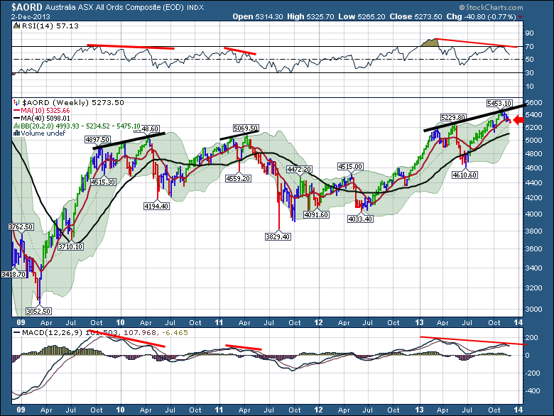
Here is why I am concerned. Look at this Aussie Chart.
This Australia stock market chart is rolling over. You can see this week is creating a negative histogram on the MACD. The negative divergence is significant on a spring/fall comparison. This is the first red candle for Australia since the June lows. It also coincides with breaking below the 10 WMA. If all is well in Asia, this should be demonstrating that.
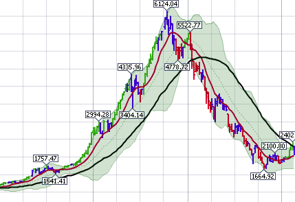
Everyone is bullish on the $NIKK. Well, let's look at a mystery chart first. This was also a major exchange.
On this chart, you can see after a parabolic move up, the market pulled back. Then 6 months later, it took a run at taking out the highs. It was near the January time frame denoted by the thicker chart grid line in the background. The 10 WMA was pulled down by the big price break off the high. So the failure to make a new high was very important after the big parabolic move.
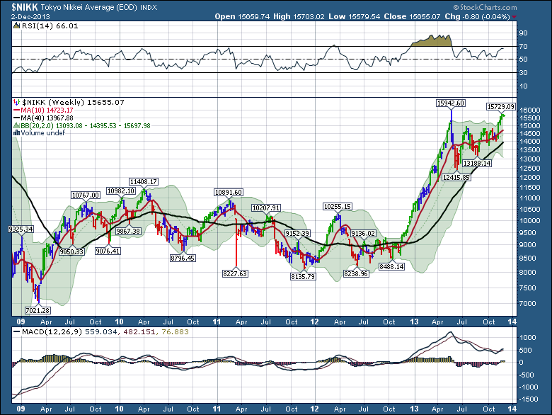
So here is the $NIKK. The $NIKK had failed in 2007 before the $SPX topped out. The final test on the $NIKK marked the July high on the $SPX.
We are at the test point. We have a test of the recent spring high going on right now. Notice the time of year on the $NIKK. We were heading into the end of year. We have a lower high on the MACD and a lower high on the RSI. I don't know which way it will break. If you are a wave counter, the April 2012 high is Wave 1. The wave 2 low is 8238. The wave 3 is 15942. Wave 4 should be different than wave 2. I would suggest 13188 is the end of wave 4. So this recent push higher looks like the big push inside Wave 5. It is a great place to be onboard if you think everything is going to work out in Japan. It is also the best place to watch the price action to add a short position if you think it fails.
Again both moving averages are still rising, so the trend is up. I think this month is crucial for Japan.
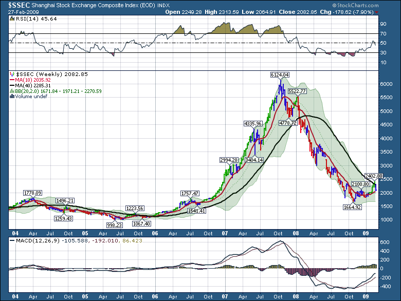
So what was the mystery chart? Look at the next chart. The $SSEC just before the 2008 plummet. Notice this market let go long before Bear Stearns and Lehman. But it was well above its 40 WMA on Jan 1 2008, while the US market was already below the 40 WMA.
Let's review the chart. After the final parabolic spike, the RSI pulled back to the 50. It tried to get back above 70, but got stuck at 65 right around January 1 2008. You can see the MACD was letting go.
I think the $NIKK needs to show real power here in December to fix all these comparisons and divergences. If Japan has a bad month here, the rush into the $USD will be very big.
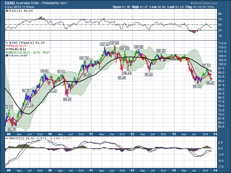
The reason I started the blog with Australia is that they are the supplier to Asia for commodities. That Aussie Chart does not look very good. Now here is the currency chart. $XAD. An Umbrella Chart. Look at the big rounding top pattern.
The MACD would appear to be crossing negative while both lines are still below zero. That is a very bearish signal.
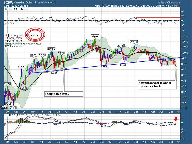
Now look at the Canadian Dollar. Another Umbrella chart.
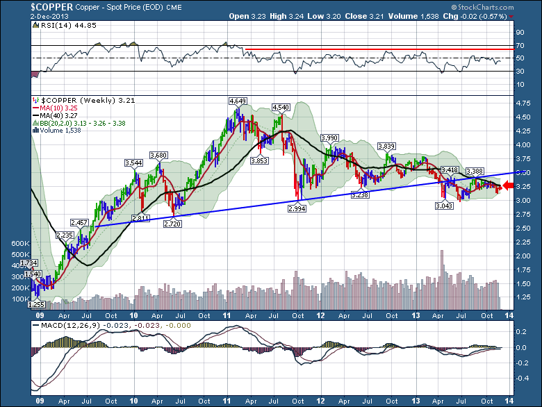
I don't have to show you the $GOLD chart. Here is the $COPPER chart. An Umbrella.
Watch $COPPER closely to see if it can finally break above the 40 WMA.
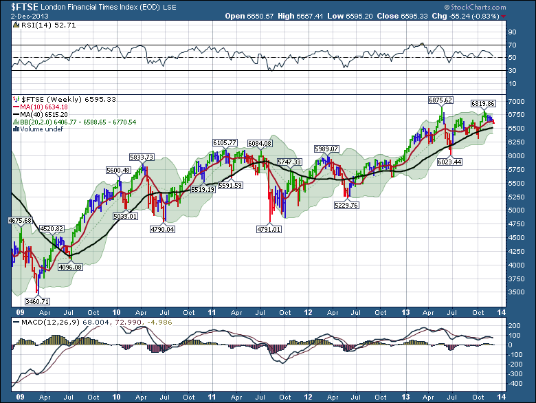
Here is London. Look at the chart. It could not make a new high. As of today, which will be shown on this chart after the market close, the $FTSE is around 6535. Just above the 40 WMA.
Notice the RSI with lower highs and the MACD with lower highs while hte price was testing the previous peak.
This is not the time for me to be overly bullish on commodities. Everything looks weak. December is a tricky month because we do not get the benefit of volume to help confirm the moves. The market has a very slow or low volume period between US Thanksgiving and the New Year.
All the ducks are lined up for the market to roll over here. Will it happen? I don't know. Maybe everyone gets optimistic (more optimistic) and we finally get demand. It is very important to be aware of the sensitive timing of the markets worldwide here. The divergences are showing up everywhere.
I still have big stock positions. With mental stops right under the price action. It looks like I'll have to make hard stops now.
Good Trading,
Greg Schnell, CMT
PS. Remember Vancouver Stockcharts SCU seminars. Jan 17, 18. SCU Link.

