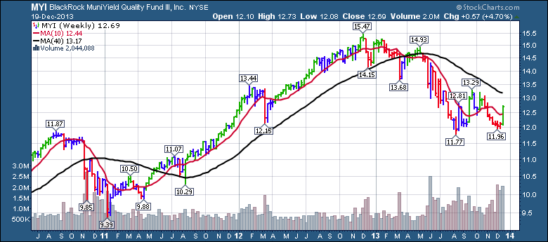
This chart has got it all. Just when you think the bond market is dead, this chart shows up. What are we looking at? This fund invests in Municipal Bonds for yield. The chart has been a great precursor for a lot of the bond action. We'll step through what I see in the chart.
First of all, lets review the basic rhythm of the chart. After a hard drop in late 2010, the fund rose from early January 2011 to Dec 2012, a two year run. In January 2013 it failed to make a new high and by March it had dropped below the 40 week moving average. After retesting the 40 WMA from below, it cascaded down. Now it appears to have made a double bottom with the big increase this week. It reversed above the 20 WMA again after making a previous attempt in September 2013. So what does this mean? Well, it tells me there is a probability of a $UST reversal to higher prices and lower yields.
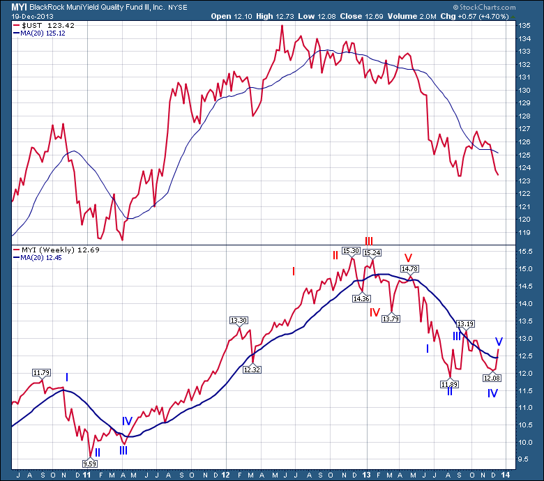
Let me move your attention to the chart below with the 10 year note price and the MYI fund. Let me walk you through the chart and show why I think there is a chance of a higher price coming in bonds. In September 2010, MYI failed to make a higher high, but $UST went on to a higher high. This is marked by the blue number I. At II, MYI put in the final low, where $UST made another low later. MYI made a higher low while $UST made a double bottom at III. At IV, MYI made higher highs before $UST. At each point in blue, MYI was first.
The numbers recorded in red are where both prices topped. The $UST was earlier at I,II,III. At IV, the MYI started to take a leadership role. It made lower lows in March. This would not have been much of a clue. But at V, the MYI could not get above the 20 MA when $UST did, then it could not hold a second week above the 20 MA. It was in full decline.
At the blue #I in July 2013, it kept declining while $UST rallied for a month. At II, MYI made it's low and reversed higher. $UST went on to make a lower low. At III, it was making a higher high. It also failed to hold the 20 WMA and rolled back over. At IV, it made a higher low while $UST is still in decline. Now at V, the MYI has moved above the 20 WMA and the $UST has not turned up yet.
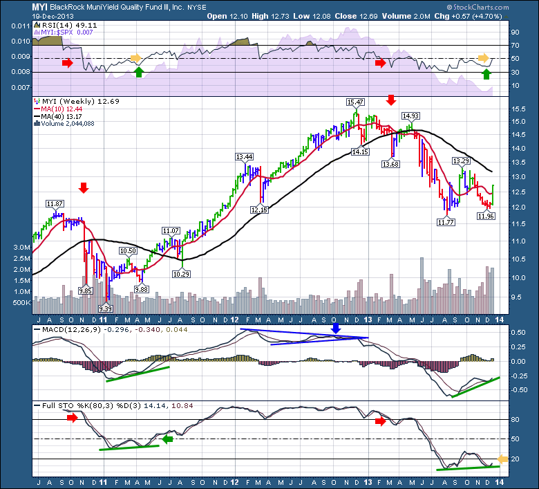
Let's compare some of the indicators on the MYI. The RSI in 2010 fell below 50. It spent almost 6 months under 50. It bounced off the 50, pulling back to the 40 at the green arrow in April 2011. After getting above the 10 WMA and the RSI proceeded to get above 50, it was the start of a new move higher. Bullish.
Lets compare that to the market action in 2013 when the RSI fell below 50 in March. After the RSI kept going down to 30 in August 2013, it bounced off the bottom. It bumped up against the 50 and on the recent pullback at the green arrow in November 2013, the RSI tested 40 and held. This week it pushed up and is testing near the 50 level. So it will be decision time in the next few weeks. We are above the 10 WMA and looking to make higher highs than the 13.29 over the next few months.
Both the MACD and the Full STO have put in a second higher low and are turning up. The one area of concern is the Full STO being under 20 this time rather than 50. Back above 50 is bullish, so the Full STO has a long way to travel to get to a bullish status on the Full STO indicator. Like the 2011 low, this second thrust seems more meaningful after making a double bottom.
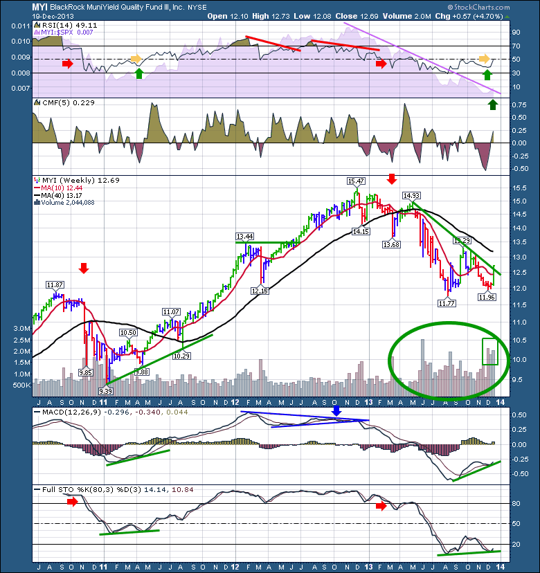
OK. The last chart below gets a little busy with even more markings on it, but by layering the information, hopefully you'll be able to follow along. First of all, look at the purple shaded SPURS behind the RSI in late 2013. It is trying to break above the purple trend line. That would be the MYI starting to outperform the $SPX. That would be bullish. You will notice at the 2012 top there was divergence. The second one worked out, but the first divergence in 2012 did not. The green downtrend line in 2013 has been broken today.
Look at the volume action in a relatively low volatility fund through 2013. When the fund could not stay above the 40 WMA, it was sell and sell fast. The volume has been huge. Look at the last 3 weeks while the market was making lows. The volume soared. The money flow (CMF) has really reversed from selling to buying and there is dramatic interest showing up.
For a market that everyone expects to go lower, there is good reason to expect a turn here. Will it work out? The probabilities appear to be in our favour and a stop can be placed very close, like 1/2 way down this weeks candle.
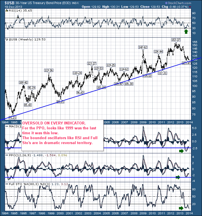
Lots of the bond charts have the MACD's making higher lows while the price action is testing double bottoms. Here is the 20 year chart of $USB.
In almost every case after the PPO made the major low, the second higher low (on the PPO) was usually the clue for a sudden reversal. We are there right now. Notice the last time the PPO had momentum this low, was right before the major top of 2000. In early January 2000, the bond market started a big 3 year move higher into the 2003 top at $121.27.
Time to watch closely, that's for sure. It could continue to blow right on by the 30 year trend line and have no reversal higher.
Good trading,
Greg Schnell, CMT

