In Intermarket analysis, the view created by all four investment categories can be very helpful, rather than just looking at one. Currencies, Bonds, Equities and Commodities.
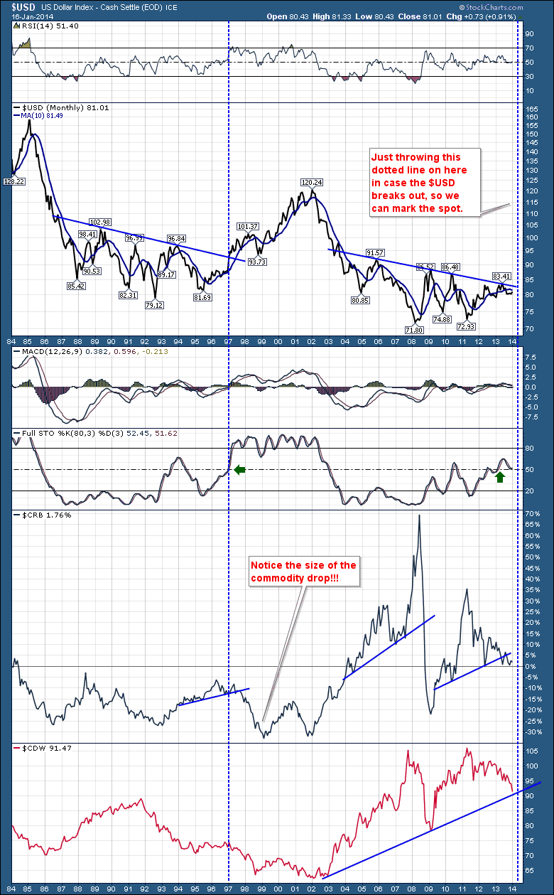
Let's review the 30 year chart of the $USD first. It usually has a big effect on the rest. We can see the RSI seems to have found support at the 50 line. Look back on the left where the RSI started to hold above the 50. Just before the blue line in 1996. Looking at the main price plot of $USD, you will notice the 10 year trendline from 1986 to 1996. In December 1996, the $USD shot up 7 cents in 60 days and 12 cents in 7 months. It was huge. The dotted vertical blue line marks the breakout through that trend line. The MACD went on to live above the zero line for a substantial period of time. From 1997 to 2003. This was a $USD bull market.
The Full Sto's moved above 50, and stayed in overbought for a long time. As the $USD fell in 2002, the Full Sto's also fell, which marked the start of the next bull run in commodities. $CRB really plummeted in 1997 as the $USD soared. The commodity index $CRB made a double bottom in 2002 that started a huge run as the $USD weakened. You'll also notice the Canadian Dollar was falling. We launched the $2 coin in Canada in 1996 and the currency plummeted. I don't think that was the cause. However, the Canadian $TSX kept rising with the strength of Nortel, JDSU, and other technology companies. In the meantime, the oil industry, the mining industry and the precious metals were all in a funk till the 2002 lows.
That pivotal turn in the $USD in 2002 and the Canadian currency rally also marked the start of the major commodity rally that went through 2002 to 2011.
You have probably surmised that the 10 year trend line on the right hand side of the $USD chart looks relatively similar. You may have also noticed that the Canadian Dollar has also started to freefall. We currently sit at a similar time of year as the breakout in December 1996 , January 1997.
So if you look through the chart above, the RSI, the $USD price, the MACD, the Full Sto's, the $CRB and the $CDW have all behaved very similarly to the late 1996 period. You will also notice the 2002 top in the $USD was also the trigger for the big bull market in commodities.
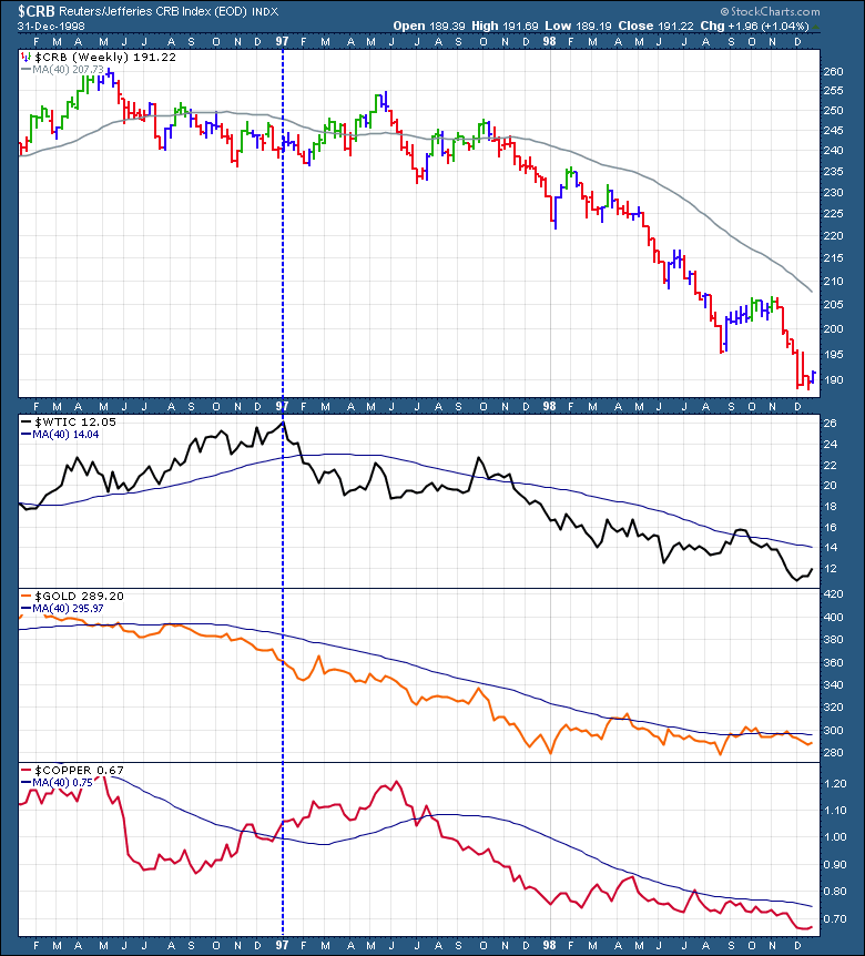
Here is a commodity view of the 1996 Period. I have chosen 3 years to show the impact of the rising $USD.
The $CRB lost 20%, Crude lost 50%, Gold lost 20% and Copper lost 30%.
With all the symptoms showing up on the top chart and Christine Lagarde discussing deflation and banging the drum to combat it, this could create some of the most important trades if the $USD breaks through that neckline. What could cause this? We might not know eactly until after the fact. That is why we use charts to denote the change. I can't believe how similar everything is on this chart. Interestingly enough, The $RTSI and $BVSP charts are below their 20 month moving averages and they are commodity countries. Brazil is just below the 200 DMA and Russia is above by 12 points. Australia's currency chart is similar to Canada and the stock chart is similar to the $TSX as well.
Whether the outcome is bullish or bearish will show up on the charts very soon. But probably the most important thing is to have a plan if the $USD breaks higher or lower from here.
One thing that leads me to believe there is something bigger going on is the rally in bond prices recently which would suggest investors are looking for safety.
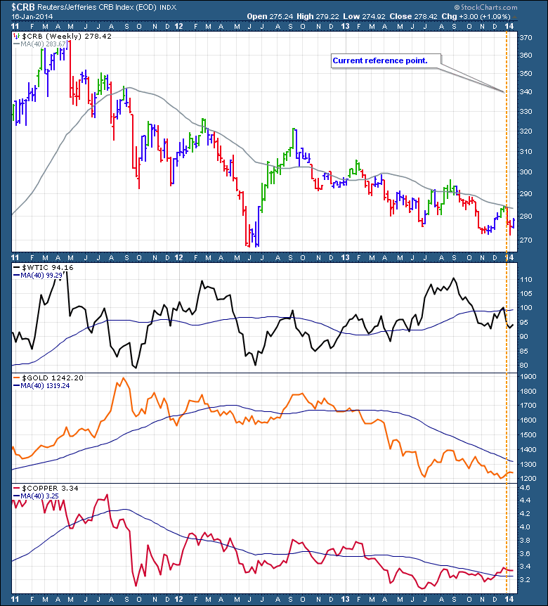
Here is the same commodity chart that I plotted for 1996 above. This is the 2014 version.
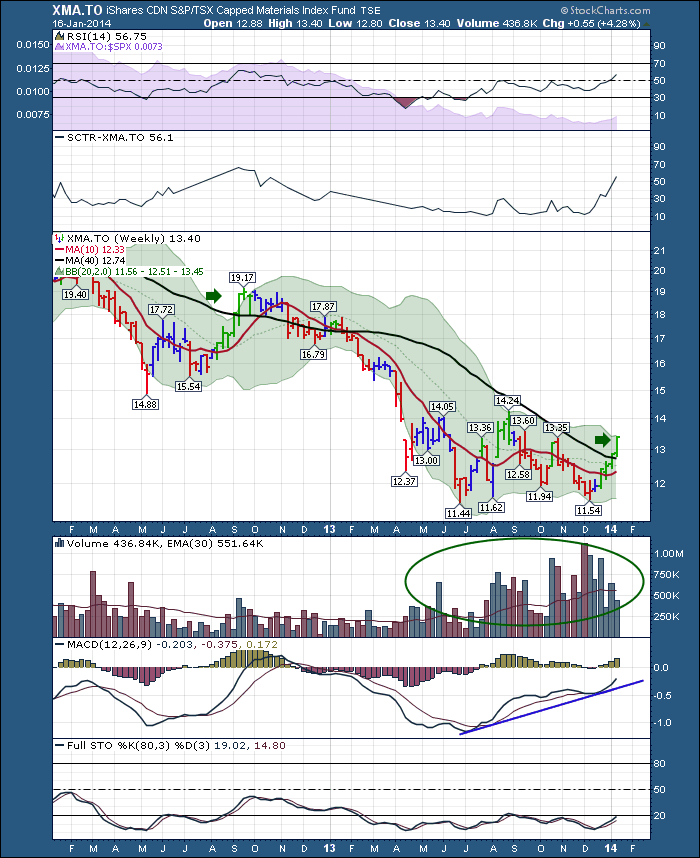
Maybe this all works out. The next sector that should accelerate is the Materials sector. It is currently rallying, just above 40 WMA. Is this just a bear market rally to convince everyone to get long? We won't know until later. The way the technicians manage this risk is to put the trade on as it breaks out of the base. With a trailing stop, the damage to the portfolio should be limited if the $USD does shoot up. If the sunny side of the outcome comes to pass, the technician got it early as it broke out of the base. A good example would be XMA.TO.
If the bear market in commodities continues, as it did in September 2012, the Technician is out with a minimal loss. See the green arrows on the chart above. An example for protection would be putting the stop just below the 40 WMA.
The charts for the 1996 - 1997 period are stunningly similar. The 10 year trend lines in both cases add to the allure. A breakout above should be respected. A breakout below should really give some lift to the oil and materials sectors. To summarize, the bonds are rallying, the $USD trying to move above a trendline on the daily currently, the $WTIC chart is stuck under the 40 WMA, $GOLD is getting no respect, and the $CRB seems to be weak.
Timing is everything.
Good trading,
Greg Schnell, CMT

