I recently presented this group of charts at the Atlanta SCU 101 and SCU 102 classes. After multiple requests to provide this as a PDF document, I thought I would post it as an article for you to read at your leisure.
First of all, the next two charts have some long term views. To help you match them up time wise, they are two long charts. I apologize in advance for making the flip flip flip on the iPad on. The rest of the charts are much better. Still some time matching (long charts) in a few other charts. The first two are monthly charts going back 15 years. The RSI shown is for the $SPX. You can see we have been overbought for almost a year. We had the same condition in 2007. It was not until we started to make lower highs on the RSI that the market was ready to roll over. Where the red arrow is, is an RSI Max reading in a bear market. You'll notice when the market rolled over at that level, the Fed added stimulus. As we reached the previous high in 2012, all four major central banks added stimulus while we were still at the highs. On each chart, you will notice the American markets are the highest. Other markets have accelerated. Notice how some markets are top right on the chart, others like Russia, not so much.
The Dow is up near its long term trendline. $TSX stuck at resistance. $NIKKEI stuck at resistance.
The Aussie market at resistance and has hovered for 6 months. The Shanghai looks like the $COPPER chart we will cover later. $SSEC has declining highs. $HSI stuck at resistance. Russia had a bearish ascending triangle and broke down.
On the chart below, I have duplicated the $SPX and the RSI. England is stuck at resistance. Germany is clustered near the highs for 5 months. France broke out and then went nowhere. It seems to have stalled at this level. France is also living in the lower right.
Spain is still making lower highs on the big picture and lives lower right. South Korea has been stuck in a range for 3 years since the 2011 break down. India has broken out, very bullish! Brazil has broken down. The Italian $MIB is living bottom right.
Let's zoom in on each market. I think you'll see a broad trend.
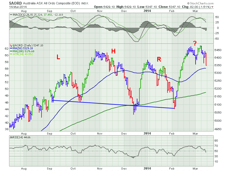
Australia built a Head/shoulders topping pattern. It then bounced significantly. The low was coincident with the US market low. It made new highs for 2 weeks and now seems to be rolling over. Really too early to call, but at this point it looks like a double top with the October high and the March 7 high. It is still making lower lows.
Below is Japan.
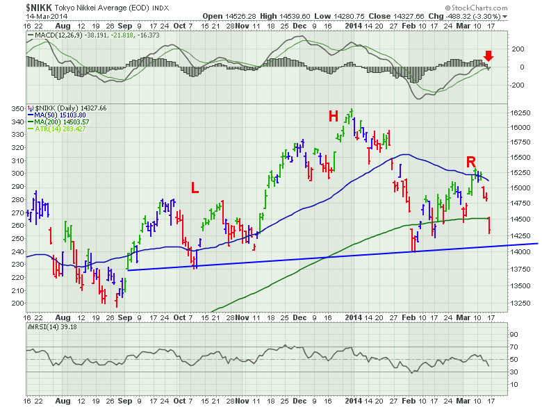
The $NIKK had a parabolic rise topping in May (not shown). After it quickly retraced, it worked higher. It made a new high for less tan a week and rolled over. It has definitely formed a Head/Shoulders topping pattern. The neckline may see a test next week. The MACD is rolling over at zero which is a very bearish signal on the right shoulder top.You can see the February low made the RSI dip to 30 for the first time. We would consider that to be a bearish signal as well. The fact that it did not make it back up to 65 which is also a bearish signal. There are many articles in my blog talking about the $NIKK for further reading. This is an important chart because it also reflects the Japanese Yen market which is instrumental as a carry trade currency. This means people borrow in Yen and invest elsewhere. If the $NIKK falls and the Yen rises, this puts pressure on the carry trade which in turn puts pressure on whatever those carry trades were invested in. (eg. US equities). The NIKKEI is failing at the 200 DMA.
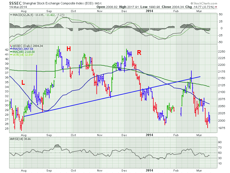
The chart above is the Shanghai. It is making a Head/shoulder topping pattern. After breaking down, it came back up and backtested the line from below which is a common trait in a head/shoulders pattern. Even if you disagree with the high sloping line on a Head/Shoulders topping pattern, you could use the bottom of the chart at 1975 to mark a head shoulders pattern. You may notice a double top at September and December with a 'Double Top' head pattern. Bottom line, they are all topping patterns. I am wondering what the next steps are. My believe is that it will probably break lower and follow copper down. I did notice a fail at the 200 DMA. A bearish signal. The market will tell us what's next soon.
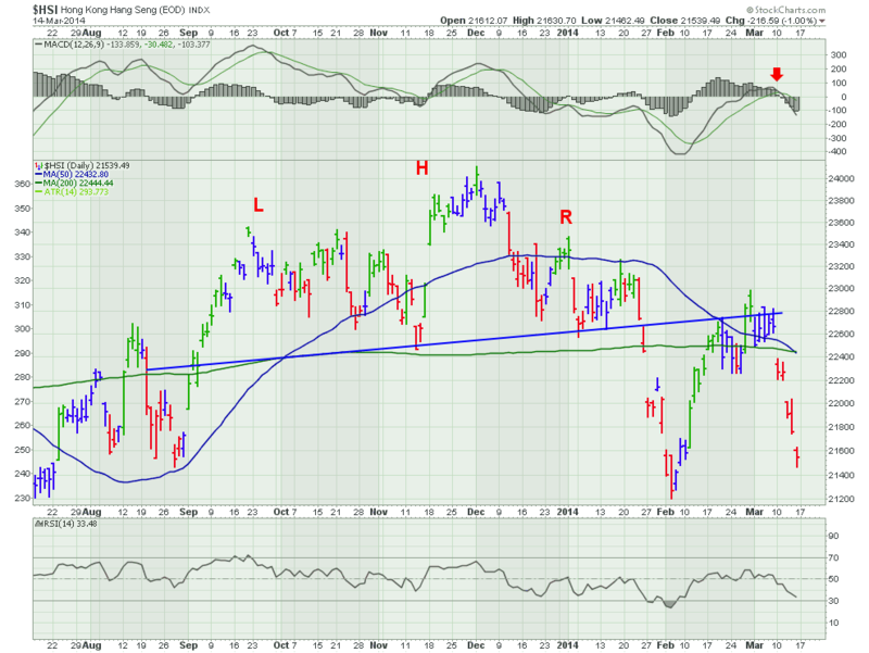
The MACD rolled over at zero on the $HSI (Hong Kong). Whether you use my blue trend line at 22500, or use the bottom level of 21200. You also notice the price failed on the right side at the 200 DMA. That is not good. Historically, when price is rejected at the 200 DMA, caution is advised.
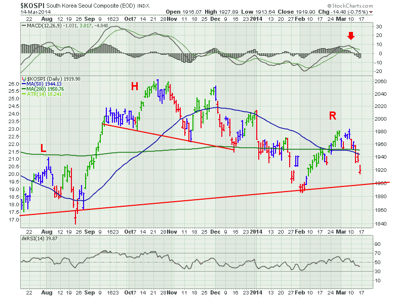
The South Korea market Has a 3 month Head/Shoulders top above the small red line. We also see the 8 month head/shoulders pattern with the lower line. The MACD is rolling over near zero. The RSI touched the low 30's and has been unable to make it back above 60 so far. A bearish trend. We also see it failed at its 200 DMA. $KOSPI 200 DMA rejected the price back in August 2013. It ended up being short lived. It is interesting that that bounce, marked the bottom left of the head/shoulders top.
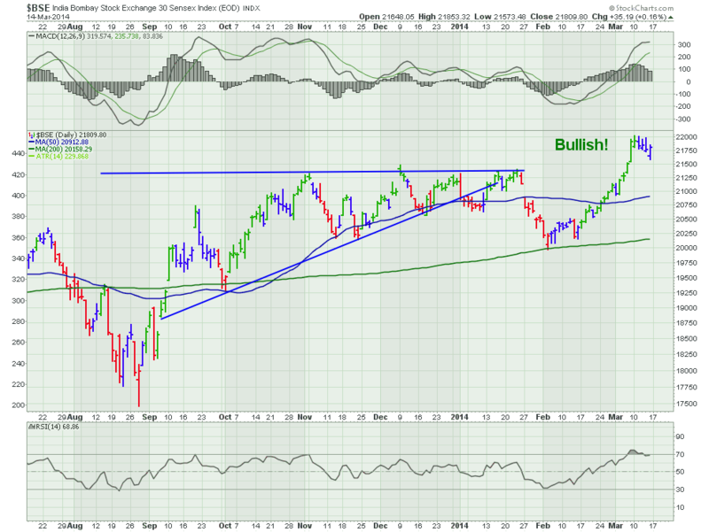
We can see the $BSE is breaking out. Bullish!!!!!! We will stay bullish if it can hold above the previous high. If it was to drop below, we would call it a failed breakout. But this is a bullish chart.MACD is high, the RSI is high, the bounce off the February low was bullish and shot up to new highs. Bullish!
The last Asian market I cover here is Russia.
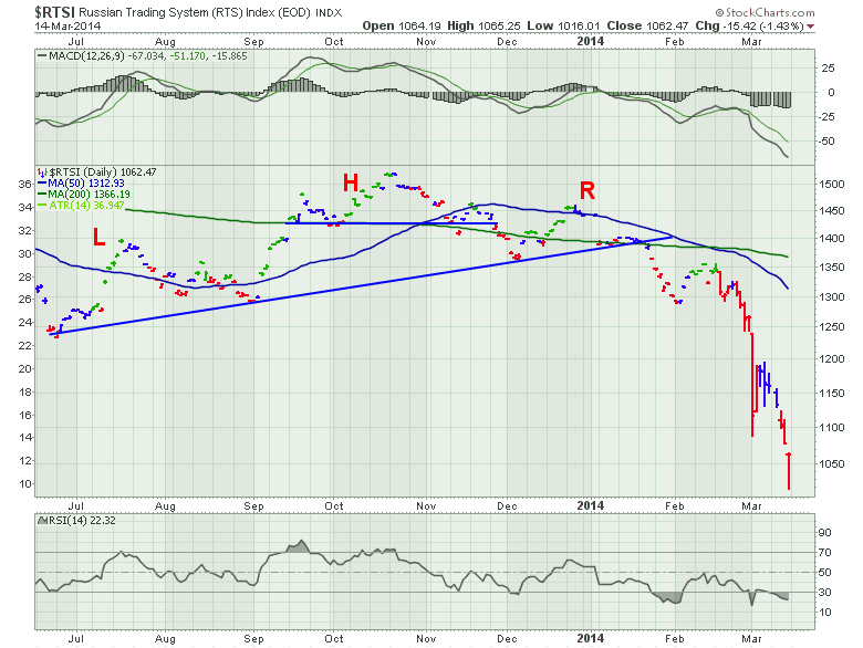
The Russian market made a head/shoulders topping pattern and broke the neckline in January. Long before the Crimean situation made headlines. Notice how it failed on the right shoulder at the 200 DMA. When it broke both the 200 DMA and the neckline, it made a major move down. On the Monthly chart above, Russia was making lower lows. Clearly, this market has broken down even without the Crimean situation.
Ok. The summary of Asia is head/shoulders topping patterns everywhere. This is important. Maybe everything gets healthy here right away, but even a disbeliever would have trouble disputing all of these charts appear to be topping if a head/shoulders pattern is considered a topping formation. The loss of momentum on the MACD is a strong confirming message.
I'll cover Europe in a separate document. It will be a collection of all the articles to put together the global picture.
Good trading,
Greg Schnell, CMT


