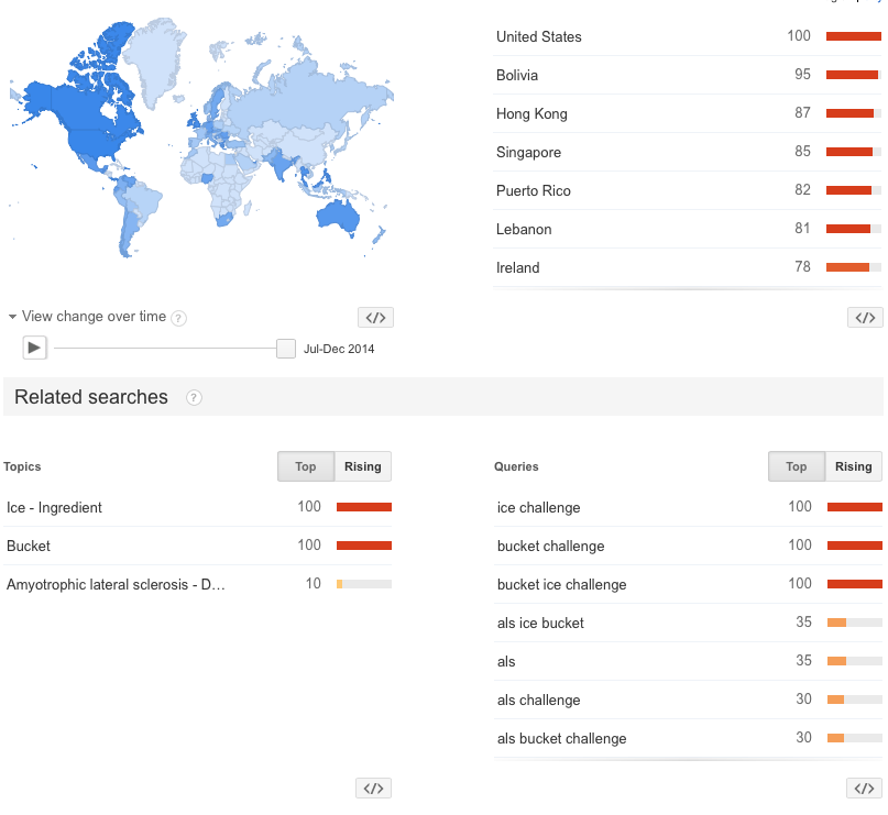
One of the best marketing campaigns in years has sprung from the ALS organization. We have all heard about the Ice Bucket Challenge. In July 2014 it was not a search term. By August 25, 2014 it seems the world knows about it. For seasoned through new investors, the chart from Google Trends is an excellent medium to help investors understand stock prices as well. While this looks pretty statistical, I will be brief on it. We can see the three trends in the bottom left. Ice and bucket were the most common search terms, whereas ALS had 1/10th the searches. The bottom right makes the story a little different, but the ALS is roughly a third of the searches for Ice Bucket Challenge. This is very powerful information. Obviously the number of people aware of the actual condition has gone up dramatically, but the majority of the searches were on the ice bucket challenge. Not so much on the facts, but on the hype. The same may be true of owning stocks. Lots of people may own them, but may not understand the underlying reasons. If we were investing in ALS as a stock...would you be adding to positions this morning? The graph below suggests the rest of the world is just becoming conscious about ALS and the Ice Bucket Challenge. If you had to guess at when the trend would be over, when would you sell?
Look at the rollout over a few days in the US. You can see the dates below each chart. The phrase started to show up on Google Trends on August 9, 2014. After noticing how bright each state gets ( meaning more activity), look what happened Saturday and Sunday.
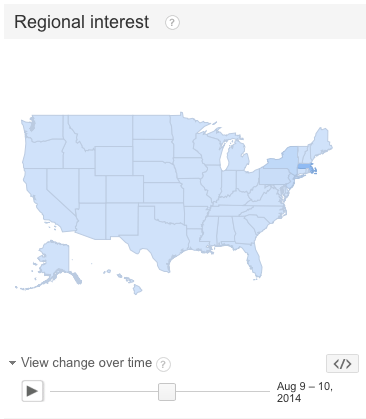
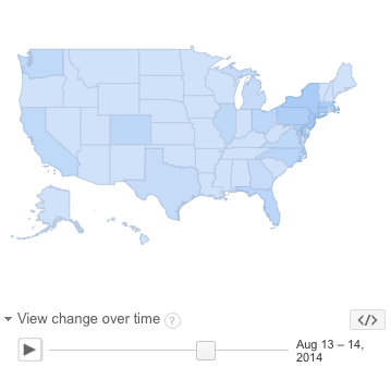
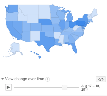
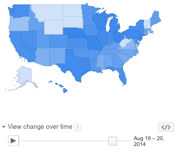
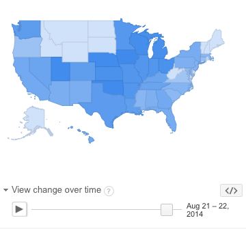
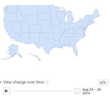
Nothing happened Saturday or Sunday. The interest that came, went quickly. We can see that the glow has already faded. The great news is ALS received a huge sum of money to continue research. What does this have to do with our portfolio? Well, lets graph the interest level over one month.
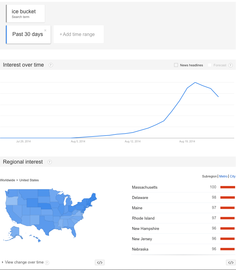
When you looked at the density of interest plots, did it feel like the interest peaked on August 19th? Could we have known when Nike had Tiger Woods and Rory McIlroy together on Jimmy Fallon on that day (August 19th) that the event would mark the top?
I would like to use this metaphor to demonstrate the life of a stock. Understanding the length of the trend you are in is very important. The hardest part is capturing the majority of the trend and not holding on too long. Trying to figure out the top of the trend in the hardest part. Selling big winners is never easy. Selling big losers is never easy. What can we do to help in our decision process?
Let's look at a few stock charts.
Sony (SNE) had a small portable music player called a walkman. It would play cassettes and cd's while you jogged. They also had a TV division that was a huge game changer. It wiped out RCA, Zenith and a host of other brands. When did Sony (SNE) peak?
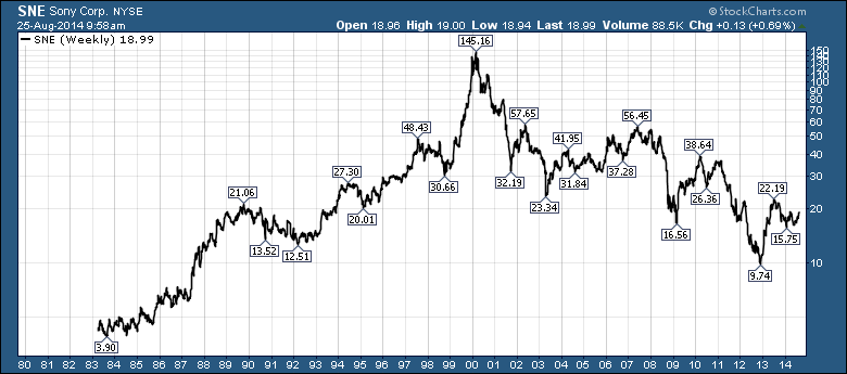
For great investors, it was the stock of your dreams. It was up 1000's of % if you bought on the IPO. Buying it any time between 1983 and 1998 was an outstanding bet on the future of Sony. But you could also have owned it so long, that you ended up with a double after passing on the opportunity to sell at 1000's of % gain. This is the Ice Bucket part of the challenge. When to leave the party?
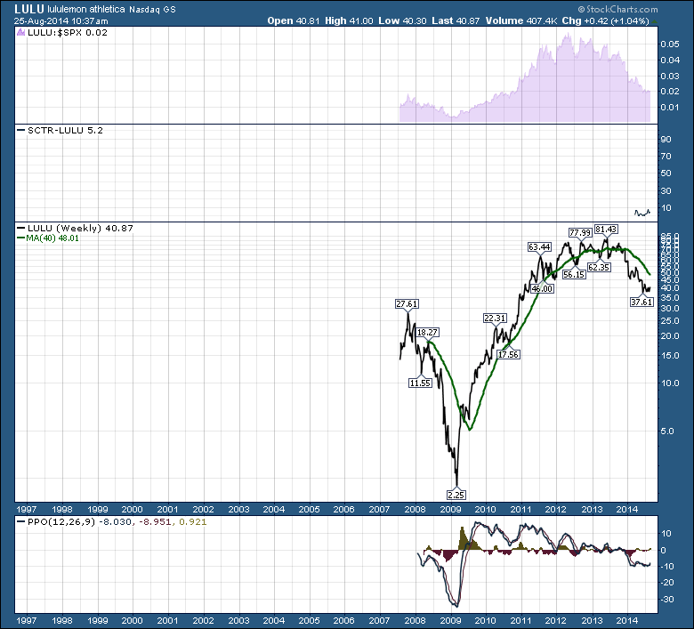
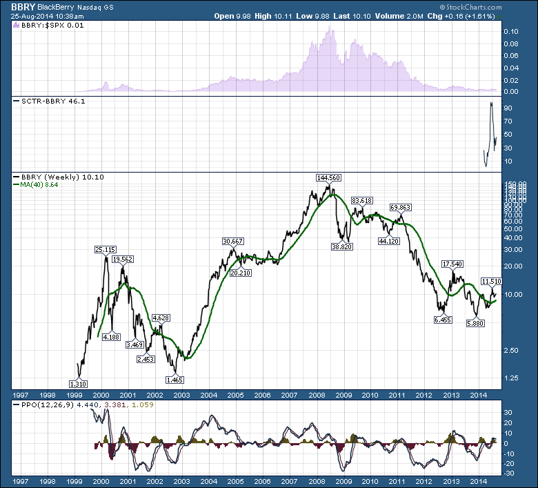
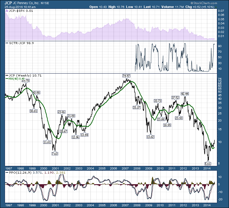
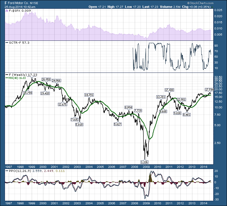
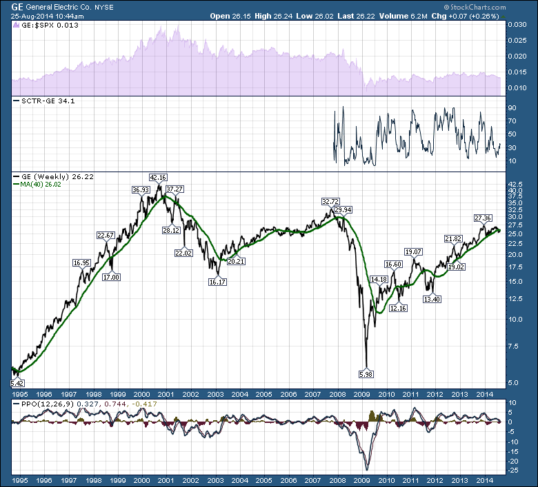
We can now look at LULU, DELL, BBRY, JCP, F, GE as great stocks that had best before dates expire. Some of those are rebounding, some may never. But holding a stock long after it expired is like an Ice Bucket Shower. You know it is not going to feel good, but you participate.
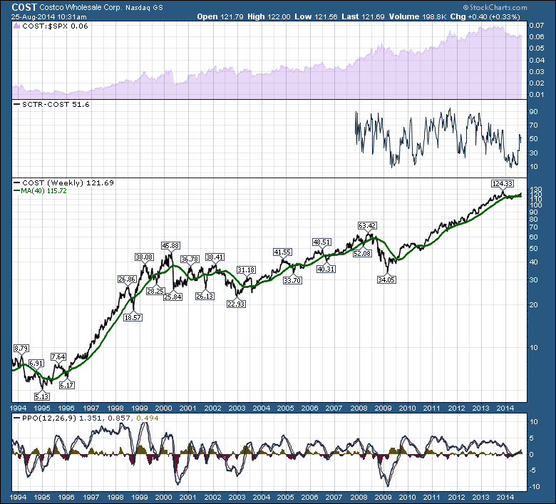
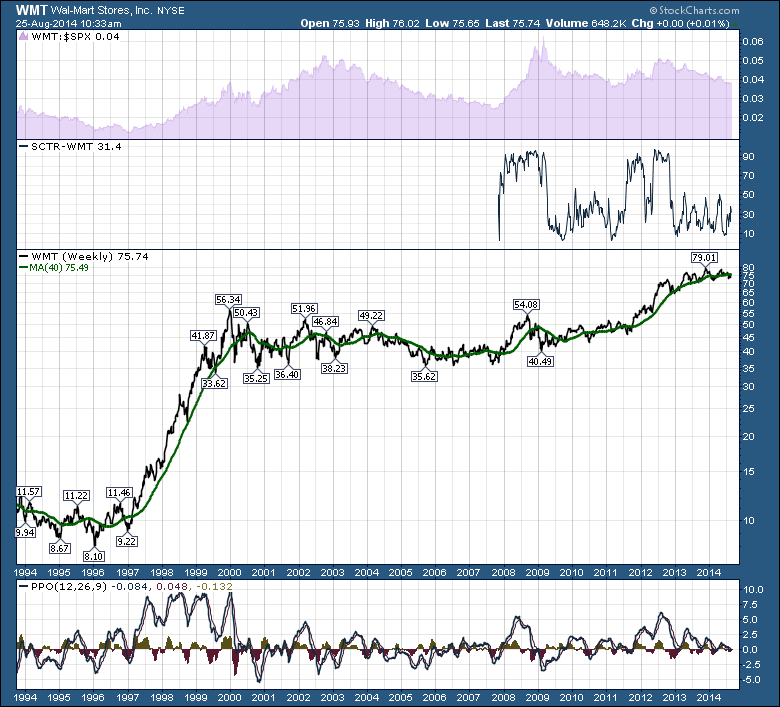
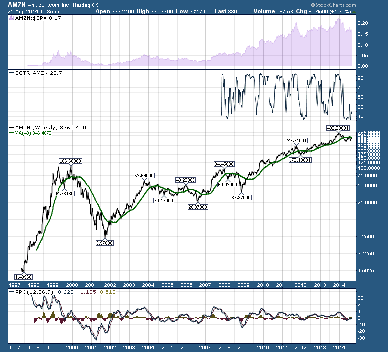
For current investors, it will be the momentum stocks like AAPL, COST, the long run WMT, AMZN, SBUX. When will they top? Are they anywhere near their final top?


We never know in advance if this will be the final top. MSFT made a new high this month, for the first time since 1999. I would prefer not to wait 15 years to get back to where I was. Talk about an endless loop!
Let's choose some indicators. The indicators I have chosen could be one of many. Pick a group you like. As Martin Pring likes to say, "the weight of the evidence." Some collection of indicators that makes us start, add, hold, reduce or eliminate our position. I have chosen 4 indicators. SPURS, SCTR, 40 WMA, PPO. Once a stock is in a negative cycle, owning it can be an ice bucket shower for your portfolio. If we can be more disciplined with our monitoring, we can prevent large losses. Let's use a simple +/- scale. For each indicator, +1,0, -1.
Big Picture Relative Strength (SPURS): Improving, flat or declining? +1.0,-1.
SCTR ranking, Above 75, +1, Above 50 = 0, Below 50 = -1.
40 WMA (green line) = Price is above and 40 WMA is sloping up = +1, Price is below an up sloping = 0. Price is below a flat or down sloping 40 WMA = -1.
PPO, Well above Zero based on history = +1, below signal line but above well above zero = 0. Rolling over just above or at zero, =-1. Below zero = -1.
PPO Bonus : Last PPO peak or current PPO line is higher than the previous peak, add another +1, If line is currently below zero, subtract another 1.
Let's look at AAPL again. Here is the AAPL chart.
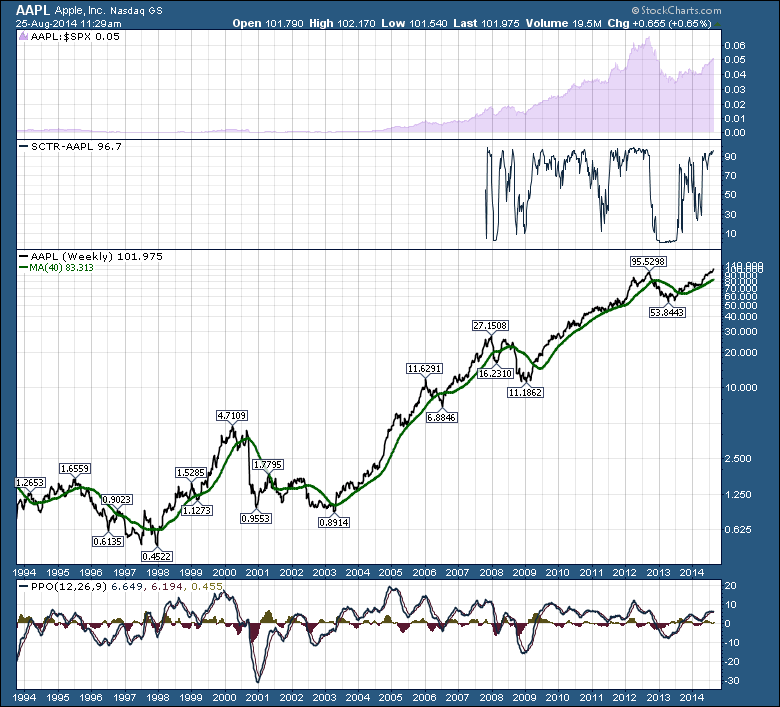
Big Picture Relative Strength: Improving, flat or declining? +1.0,-1.
SCTR ranking, Above 75, +1, Above 50 = 0, Below 50 = -1.
40 WMA = Price is above and 40 WMA is sloping up = +1, Price is below an up sloping = 0. Price is below a flat or down sloping 40 WMA = -1.
PPO, Well above Zero based on history = +1, below signal line but above well above zero = 0. Above zero, above signal line, but barely. = 0. Rolling over just above or at zero, =-1. Below zero = -1.
PPO Bonus : Last PPO peak or current PPO line is higher than the previous peak, add another +1, If PPO has a lower peak or is below zero pointing down, subtract another 1.
AAPL = Quick math = +1, +1, +1, +1. PPO bonus points +1 = 5.
Let's look at Starbucks.
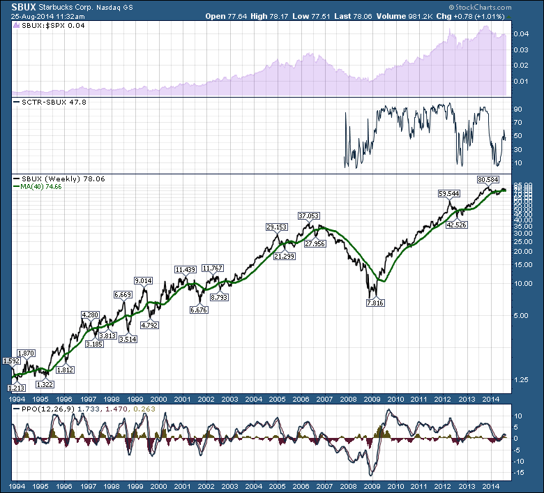
Here is the scale again.
Big Picture Relative Strength: Improving, flat or declining? +1.0,-1.
SCTR ranking, Above 75, +1, Above 50 = 0, Below 50 = -1.
40 WMA = Price is above and 40 WMA is sloping up = +1, Price is below an up sloping = 0. Price is below a flat or down sloping 40 WMA = -1.
PPO, well above zero based on history = +1, below signal line but above well above zero = 0. Above zero, above signal line, but barely. = 0. Rolling over and crossed below signal line just above or at zero, =-1.
PPO Bonus : Last PPO peak or current PPO line is higher than the previous peak, add another +1, If PPO has a lower peak or is below zero pointing down, subtract another 1.
Analyzing Starbucks:
Relative strength trend line broken Jan 1, 2014 = -1.
SCTR below 50 = -1
40 WMA = +1
PPO = +0,
PPO Bonus = -1 (lower peak)
SBUX = -2.
(If the PPO rolls below its signal line here, =-1).
At -3 or -4 I would be cautious. If it gets to -5, I can move along to find a rising stock instead.
The point of this exercise is not to duplicate the scale. Your time horizons are individual.The indicators you like are individual. You may find other indicators, use monthly charts and 60% drawdowns are ok. You may be a day trader, a swing trader or a long term investor. Day traders use tools to exit regularly. Whatever works. Some long term investors just ride. If you can pick your line in the sand for each indicator, you'll go a long way to better exits and entries. Be aware how each indicator looks when the stock starts to break down. When you get the Pring Thing - weight of the evidence - telling you that you are in a risky spot, you can make plans. COST recently turned up and measures positively. GE looks very borderline at this point. Will there be reversals the week after you sell? Technicians always suffer from whipsaws.
I did my Ice Bucket Challenge two days after the market top. My neighbour did it three days after the market top. It will probably look pretty silly if I do it in October. For technicians, timing your entries and exits is important. Don't pour cold water on your portfolio. Be very aware of how hard it is to recognize a market top in real time. These are very long term charts. The data on the far right is compressed and would be a lot easier to see on a shorter chart like 5 years. I challenge you to analyze your winners to make sure the comfort of former big gains does not obscure your vision. At least you won't be all wet!
Good trading,
Greg Schnell, CMT