No wonder miners gave up on using candles for illumination and went to battery powered helmets. The Canadian Mining Index Chart ($SPTMN) is riddled with technicians signals for illumination based on candles and almost every typical bullish candle pattern has been snuffed out. Looks like a few technicians have been beaten on this chart. It loves to give bullish signals and fail. I recently thought the breakout in July was good to go. Wrong so far.
Starting at the top of the chart. The RSI is still below the 60. It recently gave a new high (bullish) at the end of June only to fail. This continues to cap the RSI in the 3.5 year bear trend it has been in. The green uptrend on the RSI is intact, but the pullbacks are getting closer together... The relative strength of the miners to the $TSX is stuck (shown in red area). While the $TSX moves higher, this has been moving higher too. However, to get money to rotate into the sector, it needs to outperform.

Onto the price chart....This is a technicians nightmare. The only thing that could be worse would be using fundamentals. This chart just keeps getting cheaper and in fundamental terms (better value) all the time. Notice the blue horizontal lines. Breakouts that failed. Notice the big bullish green candles, labelled in red ( I through VIII). Big bullish moves only to stall...ouch. Focussing on the July 2012 - December 2012 period now. The Red downtrend line gets broken to the upside, the horizontal blue line gets broken to the upside, multiple long green candles in the base, oops, it rolls over. Starting January 2013 it produces 2 green candles in the next 10! Moving into 2013, it makes a head/shoulders base with April, July and November. Breaks the downtrend line with a huge candle on the highest volume in almost a year, and rolls over. Then it takes 6 full months to break the neck line of the Head shoulders pattern. We push through with another bullish green candle in late June 2014, only to print a shooting star on the next candle. The two subsequent weeks have now confirmed the shooting star. On the 2014 year, there has been declining volume while the price rises. Looking far left, you can see going into the 2011 top we had rising volume. This uptrend is questionable. I have drawn a dashed support line just below the neckline shown in solid blue. This is half way on the bullish breakout candle. This level must hold. I reproduced the same chart below here so iPad readers won't be flipping up and down so much.
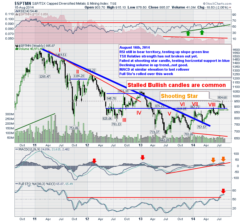
The MACD has limped higher. The two lines never get very far apart which means there is little very little acceleration in the trend. The slope of the MACD is getting shallower but it has not crossed below the signal line...yet. The Full sto's finally gave us a breakout signal in July. The Full sto's have already crossed below the signal line. Yecch!
I think stops need to be tight. This chart demonstrates the pitfalls of trying to be bullish in a primary bear trend on a 4 year chart. It might just be testing the conviction of the bulls on this breakout, but it has given the bears a lot more to be proud of than the bulls on every breakout attempt over the last 4 years. The low slope of the 2014 advance does not feel impulsive. The 2011 bear market rally (Moving up in a downtrend) has a very aggressive slope up, the 2012 is less aggressive, the 2013 move is short and failed to make a higher high and now we stare at the price action from November 2013 to the last candle. Each rally within the move is shorter and there is no real momentum building. Sometimes that is what makes a base work. Look at the $SPX from August 2011 to January 2012 as it rose out of the 2011 lows. A few failed breakouts but continued to make higher lows. When it finally got moving, the weekly candles were small and orderly. (this was also under Fed Stimulus so we (me) should be cautious on my comparison).
If this is a Wyckoff base, we should have a plummeting test of the 700-750 range to weed out the last of the weak hands before we mount our next major bull market. Conversely, if it rips lower and keeps going after taking out the 662 lows, we'll see some serious issues for the miners. Or the middle of the tall bullish candle holds and we start to walk higher and higher. This chart couldn't be at a more important inflection point than right here, right now.
Good trading,
Greg Schnell, CMT