I look at 6 of Goldman's Commodity Indexes. Let's take a quick look at the charts.
Here is the Precious Metals Index ($GPX). Starting at the RSI, we are still in a bear trend with the red line across the top. This is an interesting place as we try to double bounce off the 30 RSI level. In the background is the SP500 Relative Strength what I call SPURS. So the SPURS shows the $GPX or precious metals index continuing to under perform.
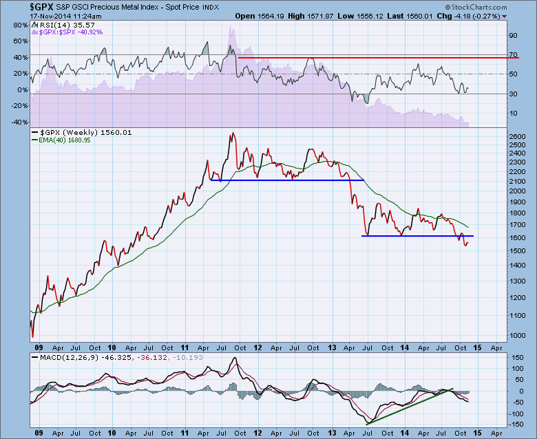
This price breakdown was capable of wiping out all the long positions. This is an important place to watch or invest with tight stops. If the Dollar surges this will probably continue to break down.
Here is the Energy Index ($GJX). While I have obviously front end loaded the worst charts to start your review, this is how weak charts look. The RSI is ghastly low at 15.84. The SPURS are plummeting.
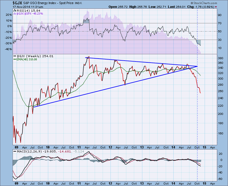
Since the price snapped the triangle, its been a one way trade. I have not seen any rallies that would get my interest in marking a low. The MACD is at the weakest level in 4.5 years. Yecch.
Next is the Industrial Metals Index ($GYX). Notice the change in behaviour of the RSI. It has pushed back up to almost 70. That could/should be a bull market signal. The RSI also continues to make higher lows. We find it today at 49.04. This is an important place on an RSI. After going up and then bouncing down near the 40 level, we would like to see this explode this to the upside if you are a commodities bull. I am not an economist but I can use an economist phrase. "But on the other hand" : ), this would be very difficult if this breaks down here. We would start to break trend lines and make lower lows which is not how bull markets start. :(
We can see the SPURS area chart is down sloping or flat at best.
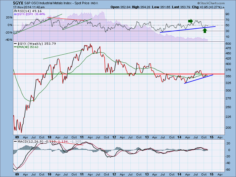
Price is at a firm support/resistance line. We would really like to see this break out to the upside for global growth. The MACD is at a cautionary area near zero. If it can bounce here, that is a beautiful confirming signal at an important place on the chart.
Here is the Agricultural Index ($GKX). This one is showing some signs of life. The RSI has made a strong double bottom and is heading up to the 50 level. This 50 level usually acts as some resistance, so we'll be watching for a more positive push through that level. We can see the SPURS is still in a big downtrend. A break above the purple line would be very bullish.
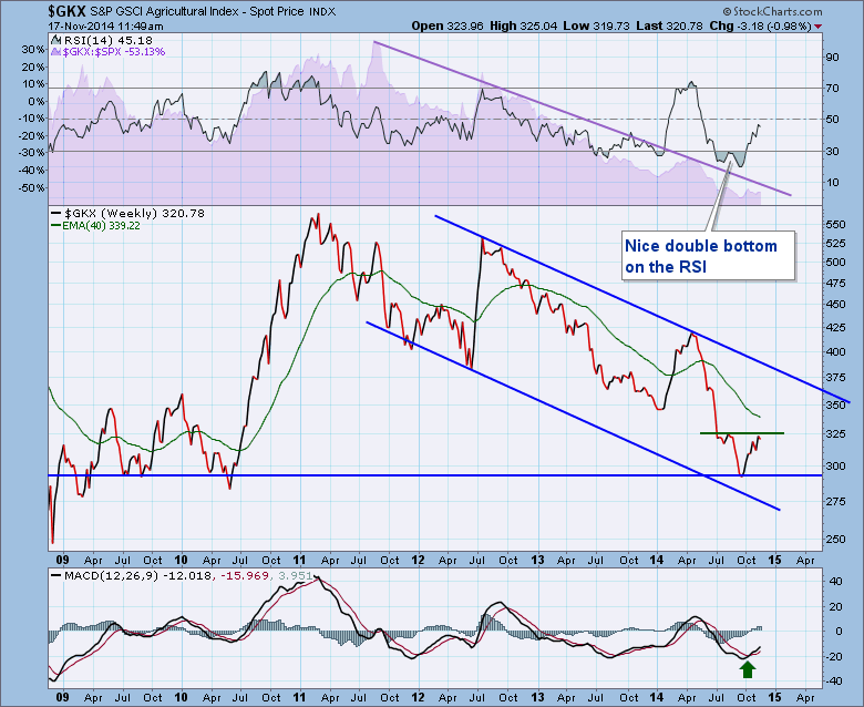
We can see the price is stalled at resistance with the short green line. Price bounced off a very important support/resistance level. . The MACD has turned up from an oversold level. This is a common level to look for reversals. The last bounce made it all the way up to above the zero line and failed again. If this can get a spurious rally going, the top trend line is 10% up and to the right. However, it is still in a major downtrend with a bearish pattern everywhere. Trading bounce only until proven differently.
The next chart is the livestock chart. See anything different here? Yeah, I thought I saw a bull trend. Notice how the RSI has been holding above 40. The RSI broke down, tested 40 and bounced. The SPURS continues to hold a pattern of higher lows which is bullish till broken.
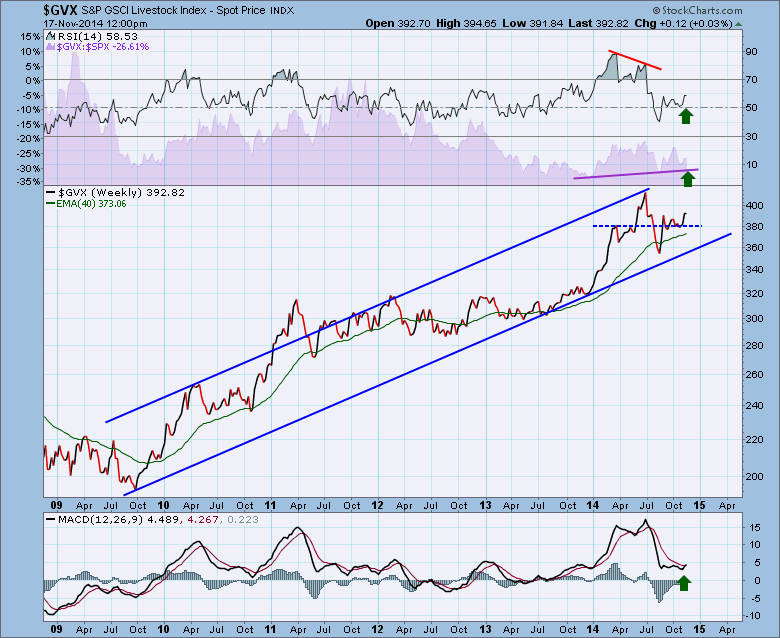
The price is in a nice ascending channel. This high volatility recently (Big up/down spike between September high/October low) adds caution to a big uptrend. Usually an increase in volatility make uncertainty in the trade. If this goes on to make new highs, stops should remain tight. I would be watching the MACD and if it makes a lower high over the next few months, that would generally be a problem.
Goldman also publishes a Total Commodity Index ($GTX). So that would be Chart 6. This chart looks so similar to the $GJX energy chart above, I can't help but think this is masking the inputs of the other commodities.
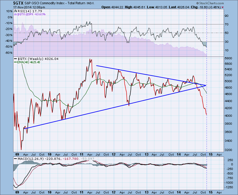
So, the general trend is down for 4 of 5 or 5 of 6 including the total index. The Livestock chart has some hope of pushing higher. However, any longs in 4 of the 5 charts at this point would be for countertrend bounces until proven otherwise.
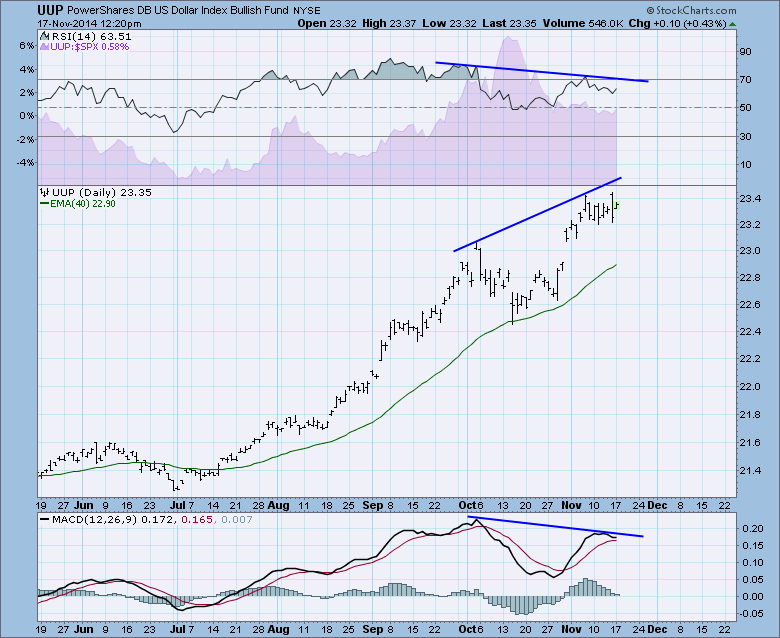
Investors long the commodities part of the market may wish to frame their investments as countertrend trades not holds. With that framing, there may be some bounces here that are worth participating in. I feel like the price action in Gold and Silver could be a potential play as illustrated on the Don't Ignore This Chart blog from Friday November 7. If the $USD stabilizes at this level, Gold may continue to bounce. If the $USD makes new highs, this could peel the $GOLD trade off the table. Here is the picture of the UUP which tracks the dollar index intraday. This is the main reason that a potential bounce in commodities could arrive. Should this divergence repair itself to the upside, the commodities will be under more pressure.
That is how I am viewing the commodities at this point. For all of the long term investors, the commodities are not in play yet unless the merger parade kicks into high gear.
Good trading,
Greg Schnell, CMT


