Since the announcement of European QE, things across the rest of the world have started to perk up. Even in a strong uptrend, the market pulls back. The caution flag that showed up on VEU last week is troublesome because of the timing and chart position. Recently we had all markets a-blazing and new highs were everywhere around the world. I was very optimistic with the large number of participating markets world wide. Then the new highs didn't hold and everything rolled back over. We also saw this same dynamic back in 2012 when we had the US administration and the Congress fighting over the fiscal cliff with a backdrop of worldwide stimulus. The US markets started to weaken as we headed to January 1, 2011 (not shown). Then, with the politicians generating maximum drama in front of the news media, they came to a last minute agreement. The rally continued! Here we sit with the timing very similar. The world breaks out to all time highs on the back of QE in Europe and then stalls. Not only does it stall, but it rolls over on charts like the $BSE and the $FTSE. Europe continued accelerating.
Let me walk through the chart. First of all, we'll start at the RSI, from Constance Brown's work. She built some excellent models on RSI analysis. The RSI establishes two major ranges. From 40-90 in a bull market and from 10 - 65 in a bear market. When we get bear market indicators or signals, we have to acknowledge them and see if the market does in fact crack enough to be very weak. In reality, during bull markets, the large institutional houses are adding to positions on pullbacks which holds the market up. When they stop supporting the markets on pullbacks, the market falls harder than usual and this shows up on the RSI. The September/October 2014 spike down was before the Japanese and European central banks started their stimulus programs.

Chart 1
I have duplicated the chart below to help tablet readers from having to scroll. Readers can refer to chart 1 or 2. The first dip below the 40 level on a weekly RSI is important as a potential sign of trouble ahead. I have identified the 3 locations on this chart where we had 'Bear Market Indicators'. Some may want to include the May 2010 (flash crash) RSI breach of 40. For chart cleanliness, I did not highlight it, but we can see the 2010 rally went straight to 70. This is a good example of a potential warning, but the market held up. In the three situations shown below, the break of the 40 level on the RSI came soon after the top of a major run up. In true market fashion, we usually get a retest of the highs. It does not have to reach up to the previous high and create a double top. It may only reach up to an area we call the left shoulder. All three of the areas above the black line show this trait. It is not always this clean. The second part of Connie's RSI strategy, is watching to see if it can breach 60 on the rebound after dipping below 40 and get back above 70. The problem with the current uptrend is it did not break above 60. However, every major bull market move has to go through this 60 level, so this might be a case of 'not yet'.
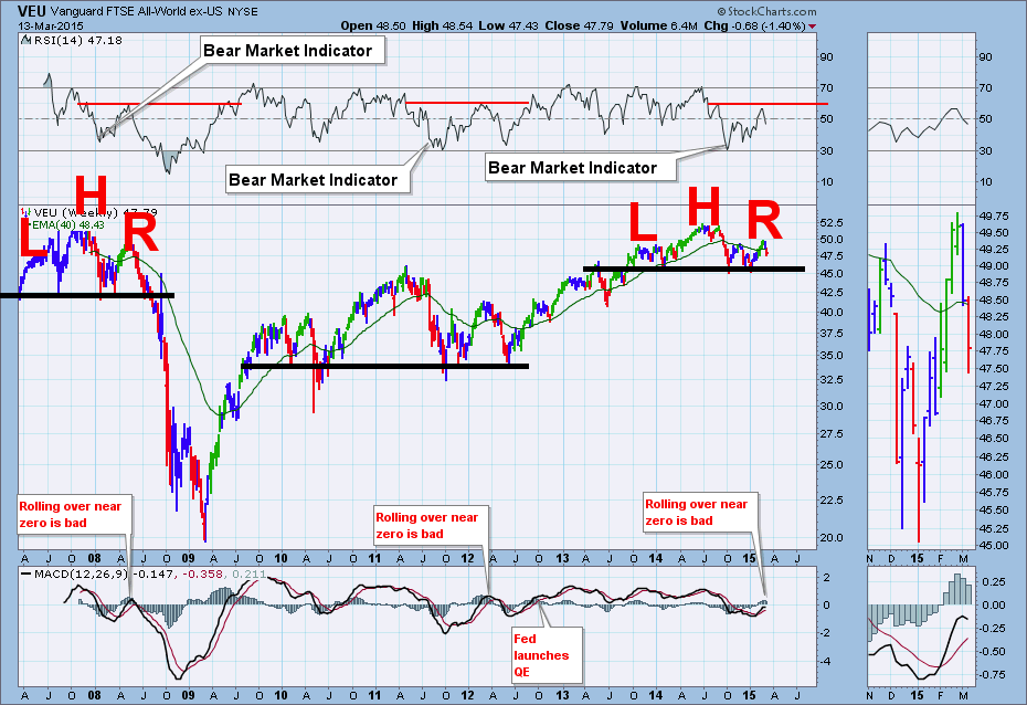
Chart 2
Moving on to the price on the chart, I have used the Alexander Elder colour candlesticks. Chart 2 and 3 are almost the same. Chart three has Monday morning data. Green means go, blue means caution and red means don't be long if you are swing trading. Two major points make this candle more difficult than the occasional red candle in an uptrend. If we compare it to the lonely red candle in the last quarter of 2010, we had broken to a new high, then pulled down creating the red candle and kept going the week after with a blue candle. Almost all of the red candle was above the previous highs and we were well above the 40 Week Moving Average (WMA). In today's case, we failed to hold above previous highs, and we are below the 40 WMA and we have also found resistance at the same elevation as the left shoulder. On the really big picture, we can see the VEU chart stopped at the previous levels of 2007/2008. The black line drawn under this current 'consolidation' from 2013-2015 is at the same levels as the breakout above the 2011 highs so it is a very important level on the chart.
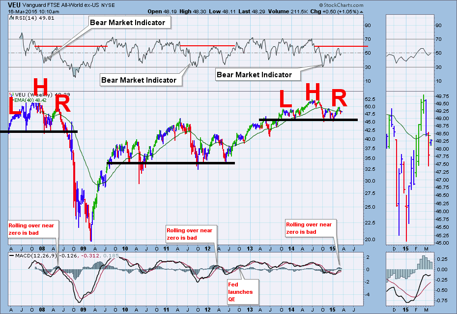
Chart 3
Finally, a look at the MACD with default settings. Whenever a weekly MACD is below zero, we have to be aware of the potential for increased downside risk. The MACD pushed below zero in October. It has been almost 6 months since the MACD was above zero so it would be time for the momentum to turn higher. Japan announced their stimulus in Mid October and the EU announced theirs in January 2015. After rallying since January, the MACD has started to roll over. So the rollover is bearish but is by no means complete. This could be a pause in the uptrend and ultimately resolves to the upside. You'll notice chart 3 has Monday morning data on it.
The main reason for publishing the chart this week is to demonstrate that the conditions are ripe for a major push down. However, we still have stimulus all over the world trying to push the markets higher. Apparently the Chinese Premier gave a 'Whatever It Takes' speech on the weekend. Japan is all in, Europe is trying, and we currently have 25 central banks that have softened interest rates in 2015 to improve economic conditions. That is a boat load of stimulus. We have to remain bullish as everything is trending up, but the red candle is very concerning. If all this stimulus fails to hold the rest of the world up, it will definitely show up on the charts and probably represents a deflationary cycle. While this could start anytime, I hope the chart has illustrated how important price action is through April. The stimulus and the current uptrend are still in place. The breadth of this chart (rest of world) holds vast information in the success of the efforts to stop deflationary forces and last week was an important signal. Perhaps it will just be a false signal like the fiscal cliff signal.
Good trading,
Greg Schnell, CMT


