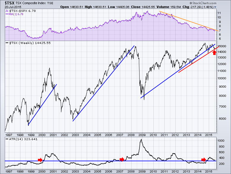
The Toronto Stock Exchange ($TSX) is struggling to hold above the long term trend lines. The chart below shows the last 19 years on the $TSX. After major uptrends, the market broke through the 3 blue lines and rolled over. In 2008 it went on an energy resurgence and popped to new highs before making a final turn down. In the current market, we can see that the blue trend line is well represented with lots of touches over the past 4 years. There is also a red trend line that shows the extreme market lows and investors may wish to wait for the breakdown on this line. That line is under pressure this week and it seems to be breaking down with the renewed selling in commodities. We can see the purple SPURS are breaking down and the $TSX continues to underperform the US market.
The one indicator shown in the bottom panel is one that I have been associating with a market top. What it shows is the increase in the weekly volatility. We can see the elevated levels on the Average True Range (ATR) are usually bearish. The recent spike up (OCT 2014) and pull back mean the weekly swings are above normal. Should this continue, I would be very cautious and I would suggest that the $TSX could accelerate to the downside if this trend line does not hold.
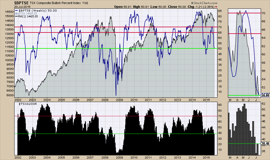
On the chart below, only 50% of the stocks are on a PNF buy signal and only 38% are above the 200 DMA. That is a very weak environment.
Investors should be extremely cautious if the trend lines shown in Chart 1 fail to hold up this week.
Good trading,
Greg Schnell, CMT


