The $TSX has not made a new high for three weeks and it looks suspiciously like this week is creating an important support level that needs to hold.
Below is a one hour chart, which I don't look at often. The RSI is stuck below 60 and the Relative Strength chart shown in purple illustrates the $TSX continuing to underperform the $SPX. The price rolled down significantly and has failed to get any higher than 15645. Monday March 1 was a big rally day in the USA with the Dow up over 300 on a push to new highs. The Canadian market has rallied back up to test the March 1 high, but continually rolls over. So far, the highs of March 10th and Monday, March 13 have stalled at lower levels. This chart looks weak. I have drawn a horizontal support line around 15425. The more this level gets tested, the more likely it is to fail.
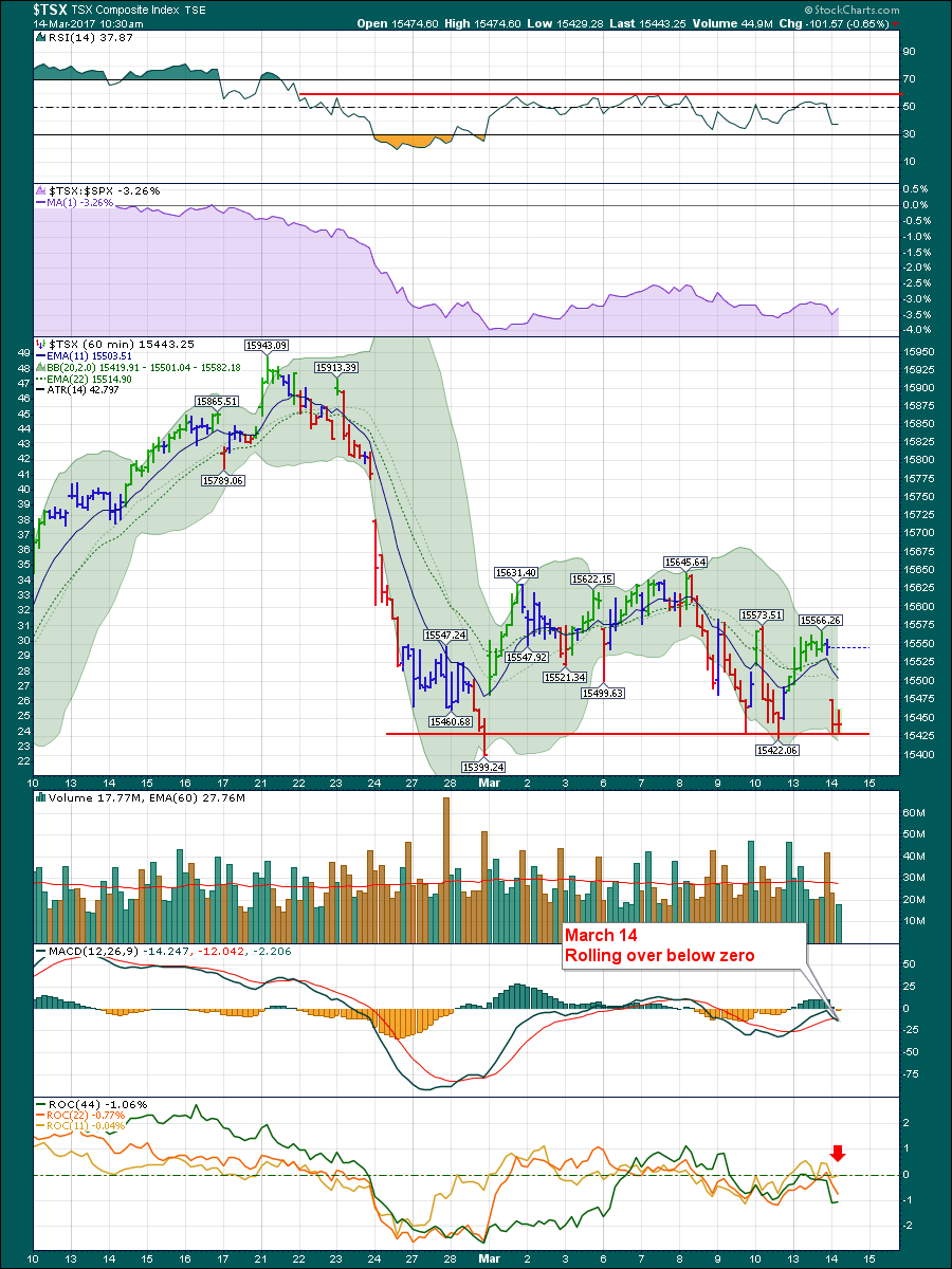
Continuing with the chart above, the volume looks stable with no clues there. The 60 period EMA is flat through the volume histograms. The MACD can't get back above zero so that is a very important clue that all is not well. Lastly, the rate of change continues to struggle and seems trapped below zero for the longer 22 and 44 period values. Overall, short-term bearish with not a lot of indicators pointing to a rally.
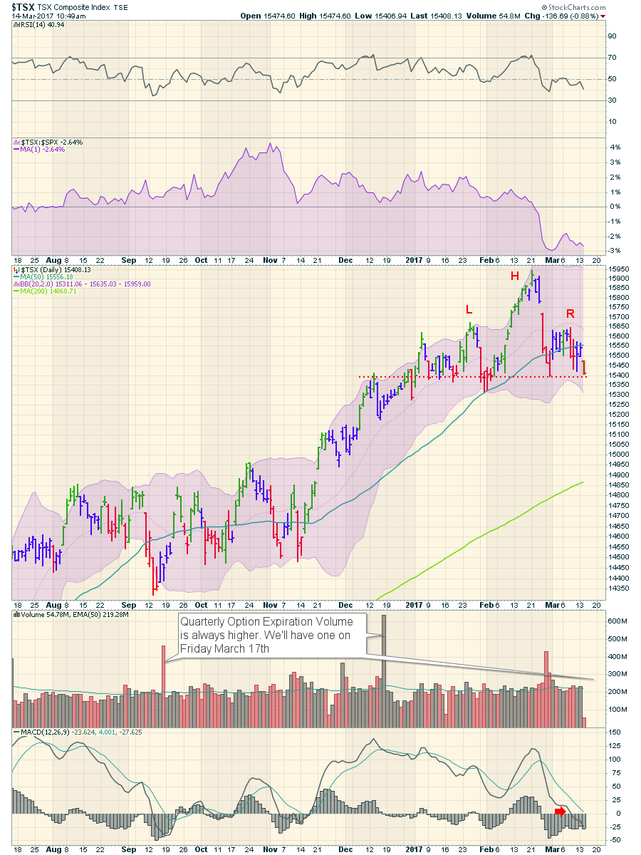
On the daily chart below, this is the time frame I look at the most.
The RSI has moved below 50 and is staying down there. So far, 40 is holding, which is a bull market level of support on the RSI for this time frame. However, the Relative Strength to the $SPX shows the $TSX underperforming the US market considerably and is at the lowest level in 8 months. Notice how the break in Relative Strength also shows the last time a new high was made. Relative Strength is a very important clue.
On the price panel, the Head and Shoulders top is being set up. What does that mean? The right hand side is making a lower high, so that warns us of a softening trend. Nothing more. The MACD is making lower highs and lows but the 15400 level looks more important on this chart. This is an important area for the chart to find support. If the chart breaks and closes below the February 28th low at 15399, we will have a series of lower highs and lower lows formed since the high on February 21st which is the definition of a downtrend. The potential Head/Shoulders topping pattern would be complete then. It is common that the left and right shoulder makes a high at a similar level. In this case that is at 15650 which is an important number to remember.
The daily volume shows a flat average volume. The MACD moving below zero is a definite point of concern. In the rally from the September lows, the MACD never got this low. So this is an important level to watch as new lows in momentum would be suggesting lower prices.
 The weekly chart is considerably different. Weekly charts hold many clues for the bigger trends. Firt of all, the RSI looks strong and healthy, well above 50. If we use 40 as a bull market support level for a weekly time frame, everything is still bullish. We can see looking left on the chart, that a move below 40 on the RSI was an important signal for further weakness. Also, if the RSI can't get back above 65, you are in a bear market.
Using those two data points (40,65) as guidelines, We have a signal above 65 in July suggesting a new bull market. However, that signal was well after the lows were made in January. From an RSI perspective, the chart is still bullish but sell signals are rarely timely using RSI.
Looking at the MACD, which I have moved above the price panel, we can see we have a crossover signal. The trendline in orange is at roughly the same slope as the two previous trend line breaks. Drawing trendlines on the MACD can be helpful but false signals that do not correspond with a break lower in price are the problem. An example is June 2014. September 2016 was similar, but the price at least stalled into a sideways range. Because of the signal (MACD crossing down through its signal line, and the orange slope lines are of similar slope), this could be an important topping signal.
 I have duplicated the weekly chart below, to eliminate the need for scrolling. For the Relative Strength indicator, this is an important big picture clue as to what is happening. Investors like to move towards things outperforming the $SPX and away from things underperforming the $SPX. When the $TSX is outperforming, or performing in line with the $SPX, that attracts money. When it starts underperforming, then investors migrate away. I have drawn some red uptrending lines, but you could also use lines that are horizontal. As an example, the last nine months have been sideways which tells us the Canadian market is keeping up with the $SPX.
Notice when these uptrends in Relative Strength broke, I marked this with a dashed orange vertical line. Then look at the price chart. It comes pretty close to marking the highs. You'll notice when Relative Strength trends break, along with momentum signals on the MACD, you have a pretty reliable signal over the last four years. It's all so easy in hindsight but hard in real time. This current break looks big enough to be a real signal to me. You can use the trend lines for both selling and buying. The importance of the big drop currently in the Relative Strength and a MACD sell signal is a big deal for me. That is a major caution and for me, pretty much a sell signal until proven wrong.
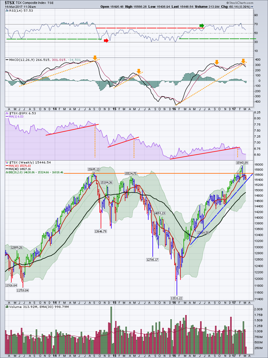 Looking at the price, I drew a line in at 15650 that I mentioned from the daily chart. Look where we are when we look left on the chart. The $TSX briefly broke out to new highs, then failed. Add the break in Relative Strength and I am really concerned about these highs. For those following my posts over the last couple of months, I mentioned that whenever you are testing previous highs, we need to watch for follow through. After the huge surge into February 21st, and then an immediate failure taking the price below long term resistance again, we had to be cautious.
If the uptrend line in blue and the horizontal line on the daily that we had placed at 15400 breaks, that would be a sell signal on the daily, the weekly, the RS and the MACD. At this point, protection plans should be in place.
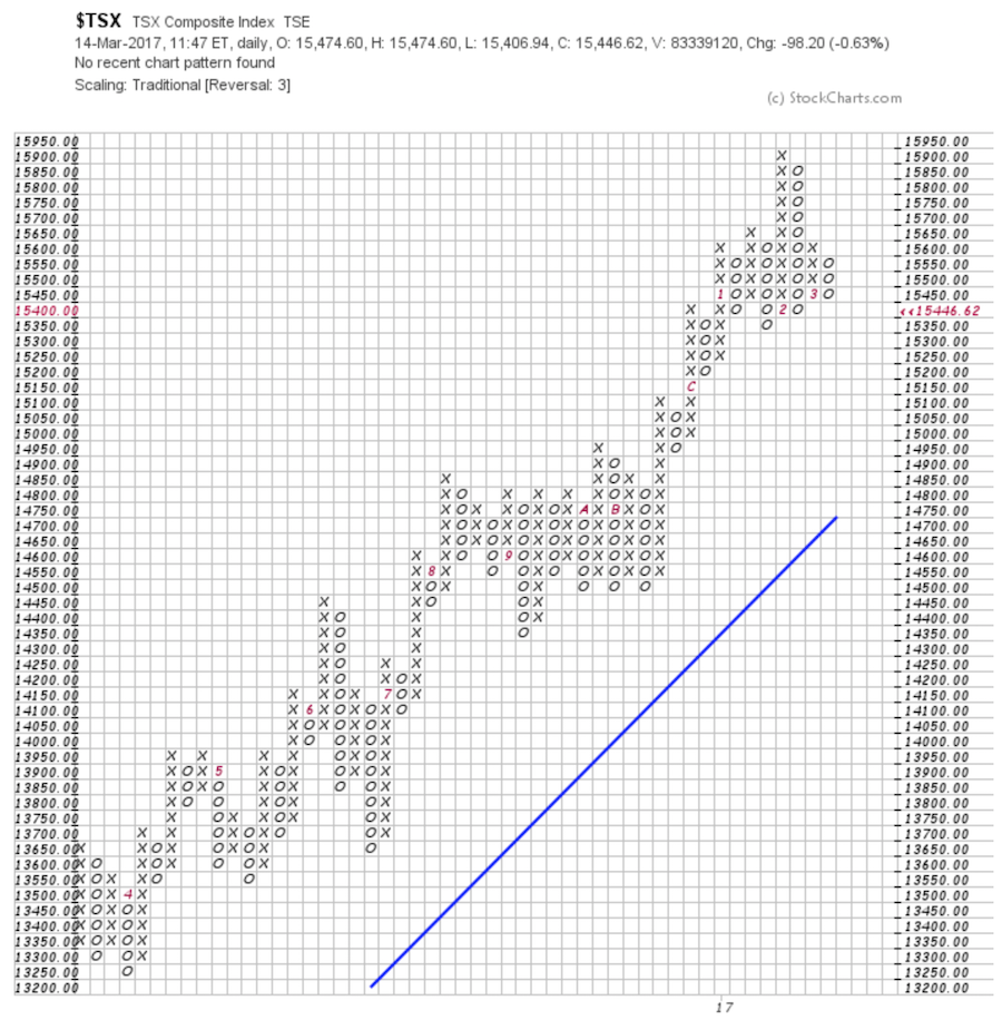
Lastly, the PnF chart. Link is here. A price below 15350 would create a lower column of O's. However, on the bigger picture, that would be in line with another low. I would rather use a sell signal at 15300 to confirm the trend break using a PnF chart. Any more O's below the current level would break the uptrend in rising lows.
 All that to say, a meaningful top could be in place. Watch closely.
Good trading,
Greg Schnell, CMT, MFTA.