- Bond prices look like they are are ready to go higher, not lower.
- Commodities continue to struggle
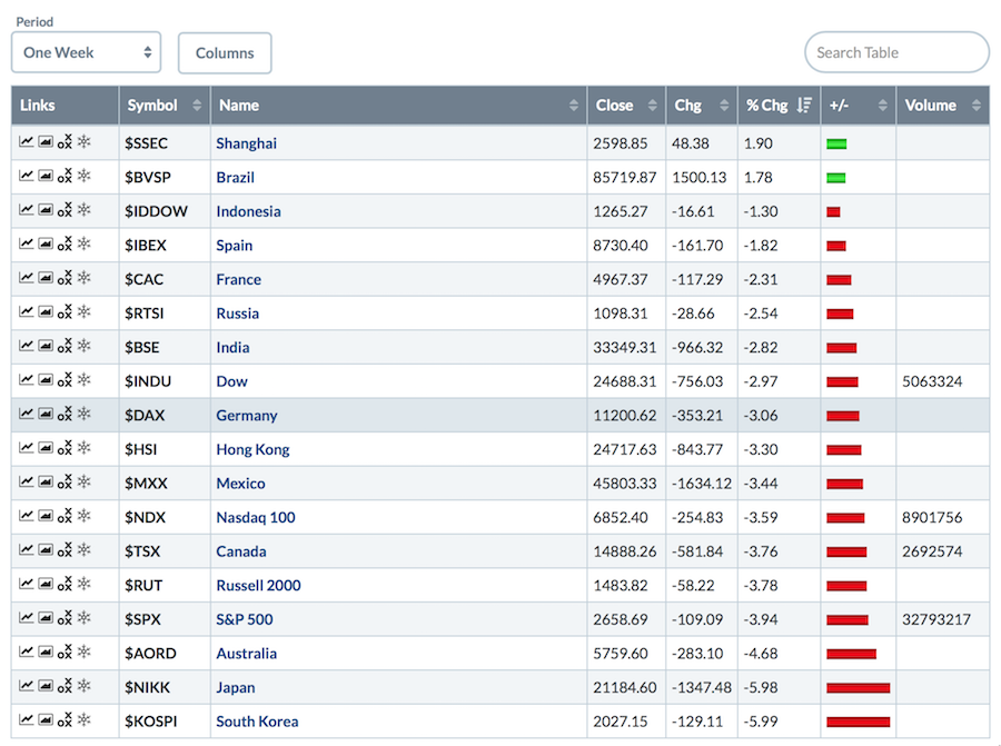
- It's a global meltdown
- Currencies are hard to figure out right here
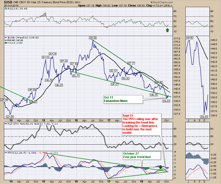
This is the 30-year bond price. After a move outside the wedge that looked like an exhaustion move, The PPO suggests a big turn to the upside. A break of this four year down trend line on the PPO near zero is a very bullish set up. Watch for any acceleration on the price here. This is a major turning point if it pans out like the setup suggests.
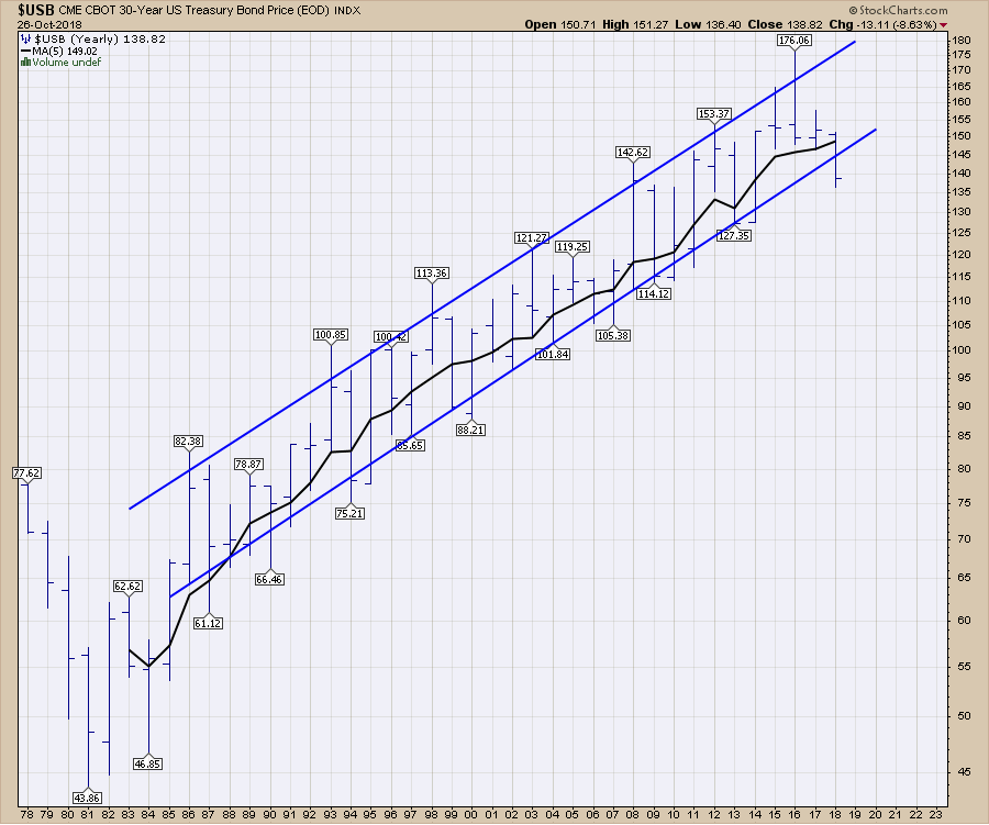
 If it does bounce from here, the chart below shows the annual price bars for the $USB. Lots of these bars have been outside the range during the year, but by the end of the year, the price has been contained between these blue lines. Notice the 5-year moving average is still pointed up.
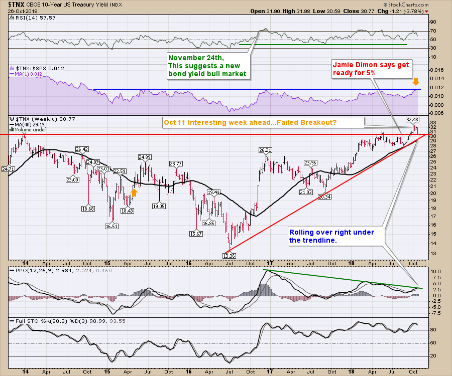
Looking at the ten-year yield, it looks like a failed breakout on the weekly chart. The PPO appears to be rolling over right at the top trend line. This PPO is near zero so it could definitely start to accelerate to the downside, which would mean bond prices are rising. Notice the RSI is dropping out of the 70 zone. Of interest only, is the shaded relative strength area. This seems to be the maximum relative strength performance over the last four years. You can find the same relative strength resistance line on the IWM chart back in June.
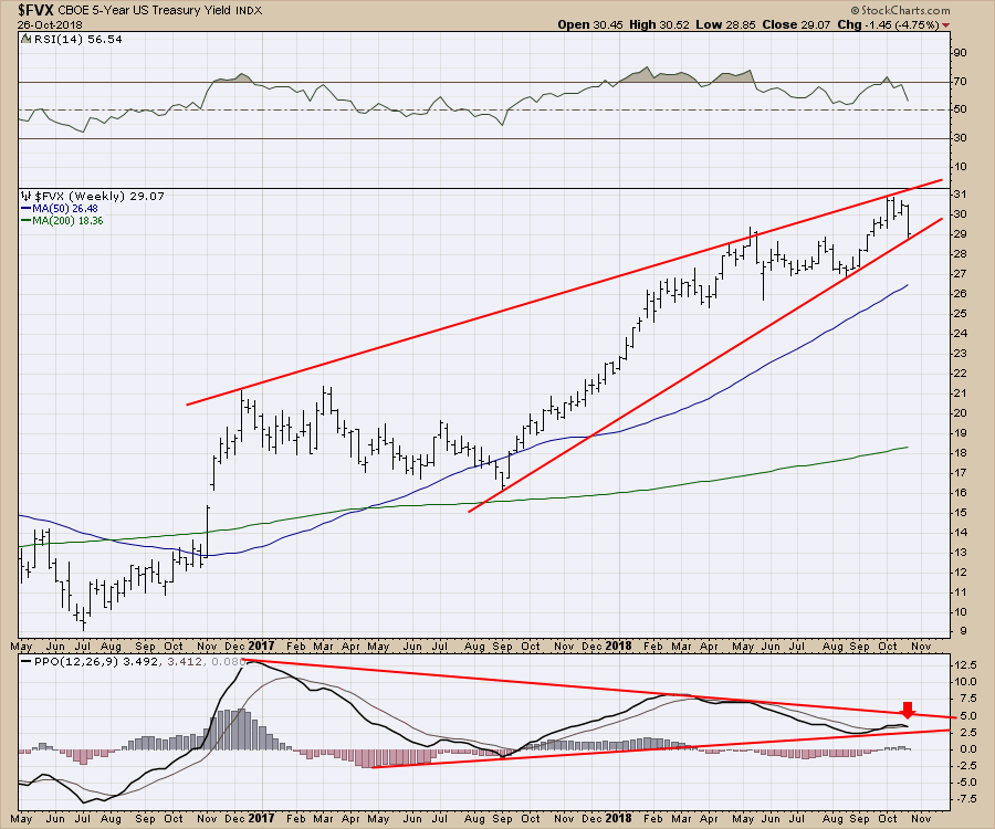
The five-year yield has been climbing rapidly over the last three years. Currently it is rolling over and looks like a break below support shown in dotted red. That doesn't look too bad. 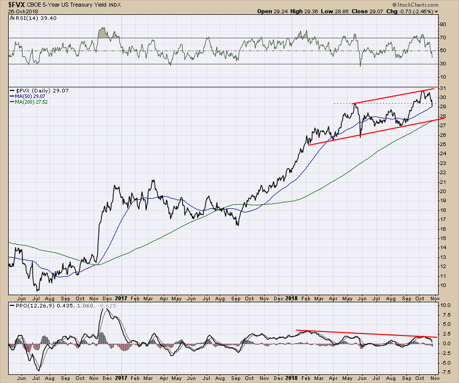
Now check out the weekly. The weekly shows a different view. The weak momentum on the PPO on this last thrust is an important clue that this move in yield could be done. Note that this is the second (May & October) lower high this year on momentum. That suggests to me that this is going to move lower.
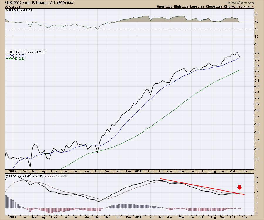
Lastly, on the two-year, the PPO has rolled over again. It is still at a very high level - 5% -. With the rest of the yield curve rolling over, it would not be a surprise to see this drop as well.
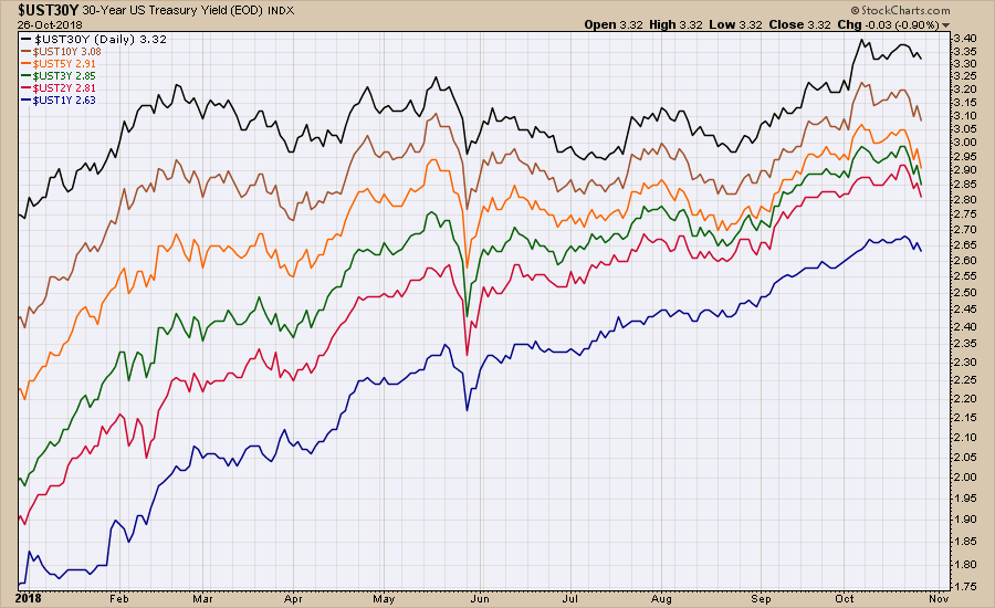
 Notice the compression on the Two-Five-Ten year yields since the beginning of the year.
Moving onto commodities, it was a very rough week. On the video below, I walked through all the commodities but not a lot of upside just yet. There is an important discussion on the gold miners.
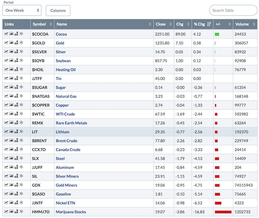 Every sector of the market lost ground this week. When you hear that there is always a bull market somewhere, it becomes a small, narrow, tiny 'bull market' on a week like this.
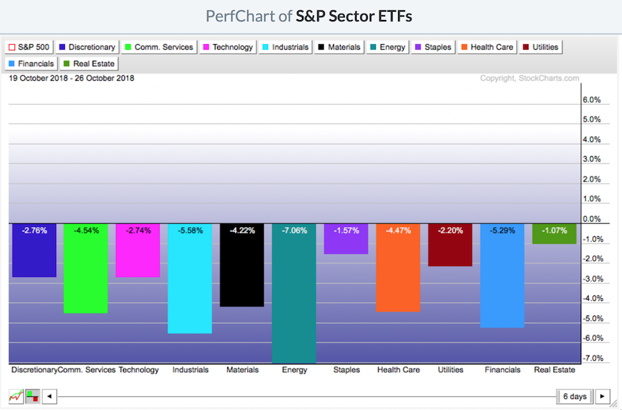 I covered off the breadth in depth on the video, so I would encourage you to check that out. Currently, most of the indexes have less than 35% of the components above the 200 Day Moving Average.
On the table below, the Shanghai made a higher low and higher high on the week. This might be a time to start looking at some of those high flying China based stocks that have been crushed.
 I could post a lot of currency charts here, but on the video I mentioned how difficult the currency direction is hard to pick right now. You'll need to watch the video.
Here is this week's video.
I have included some scans to help you find some nice setups near these lows.
The Canadian Technician video shows the massive breakdown on almost every sector chart in Canada. Canada is back below the 2008 highs. Tough ten years for investors.
If you are looking for a small gift, you might have family or friends that would like to learn more about the basics of charting. The first section of the book walks through all the chart settings to get the charts you want. The second section is why you might use charts for investing and the third section is putting it all together.
Click here to buy your copy today! Stock Charts For Dummies.
If you are missing intermarket signals in the market, follow me on Twitter and check out my Vimeo Channel often. Bookmark it for easy access!
Good trading,
Greg Schnell, CMT, MFTA
Senior Technical Analyst, StockCharts.com
Author, Stock Charts for Dummies
Hey, have you followed me on Twitter? Click the bird in the box below!
Want to read more from Greg? Be sure to follow his StockCharts blog:
The Canadian Technician

