Gold finally had a day in the sun. It feels almost remarkable. Much like when rainy days envelope a city for weeks, and then, the first day of sunshine feels so much better. I love to trade around gold on the long side, which has been infrequent lately! But the charts say to wake up and smell the golden coffee, as it could be time to wake up in your portfolio. Yeah, really, I know, that does sound unbelievable. Come for a chart tour and see if you agree.
First of all, let's build a road map. When do you want to own gold stocks? Clearly, not all the time! Let's look at some indicators and try to find a strong setup.
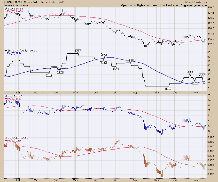
For commodities markets in general, when commodities are above the 50 day moving average that's a good place to start. On the charts below let's use that as a simple test.
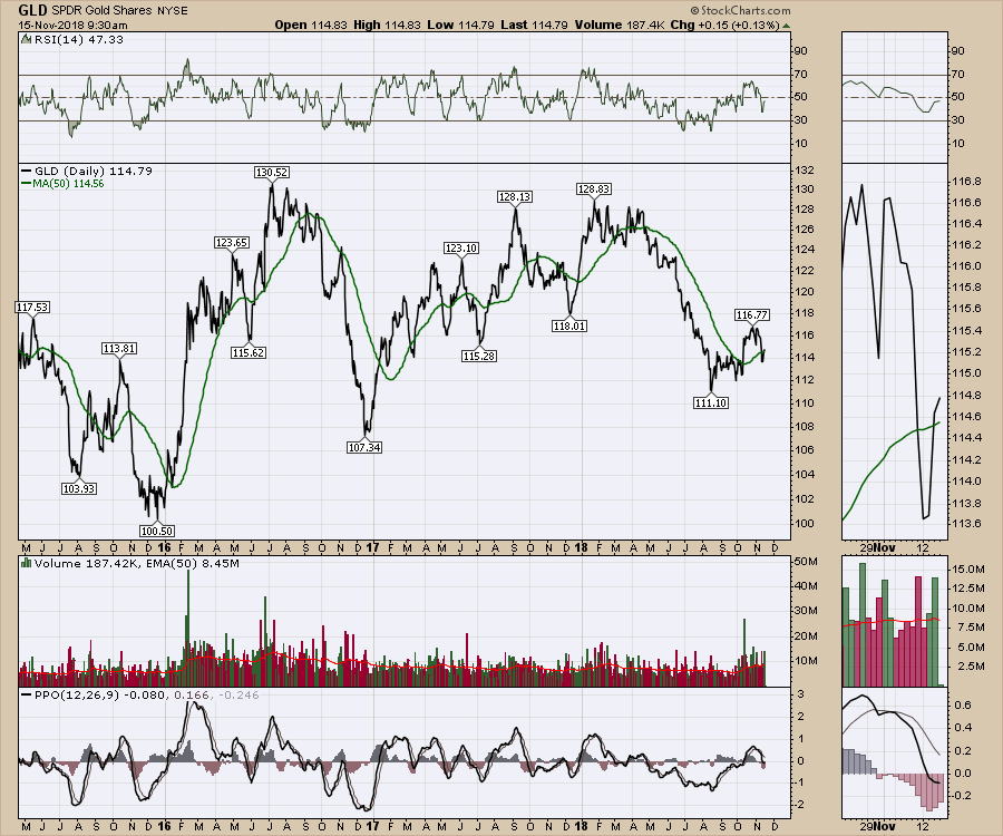
GLD is back above the 50 day moving average and the slope on the 50 DMA is positive. That is a nice setup. A series of rising lows on the daily is also positive.
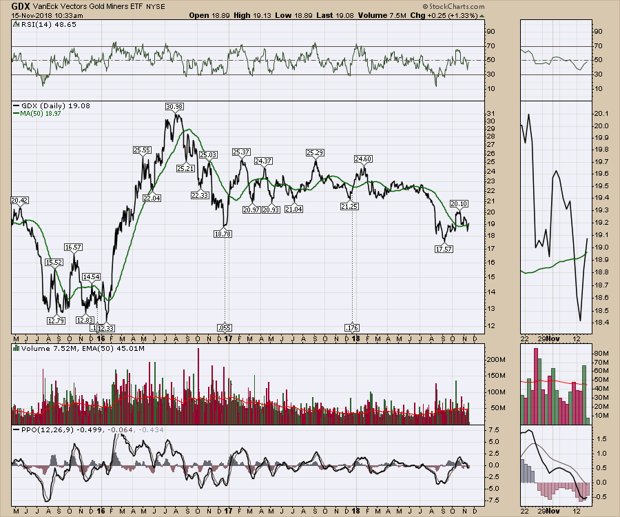
 Looking at the miners ETF, the GDX chart, we can see the same chart settings. In this case, as of early Thursday morning November 15th, the chart has just made it above the 50 DMA but it is very close.
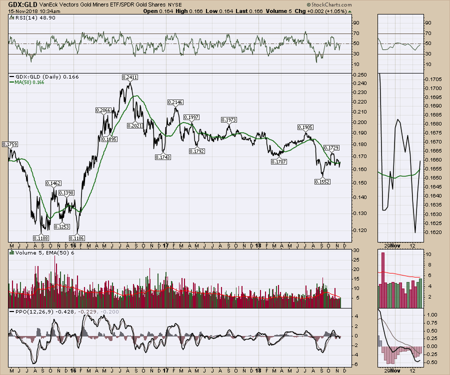
 Next, look at the ratio of gold miners to Gold. I'll use the ETF's GDX and GLD to demonstrate that. We want to see if it is above the 50 DMA. The answer is it just pushed above this morning.
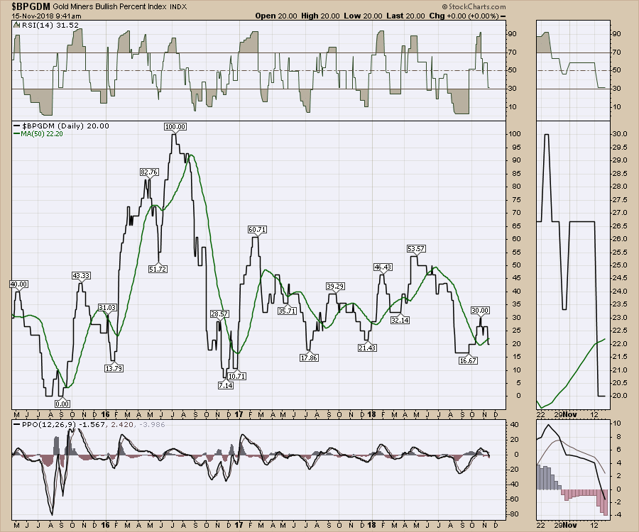
 Lastly, look at the Bullish Percent Index for the gold miners. Notice the chart was above the 50 DMA and just recently dropped below. Again, the 50 DMA is sloped up so that is a positive as well. Look specifically at the major lows. Some had a double bottom, some paused at the 50 DMA. The problem is the best one, 2016, continued straight up. I see a few things to like on the chart. The actual level is really low. The positive slope on the MA is encouraging, and when the market turned with a really low moving average around 20, these were great rallies to own.
 Let's put it all together into one chart. Three of the four charts are moving above the 50 day moving average early on Thursday morning. That's pretty bullish. The $BPGDM is still below, but it is important to understand how bullish percent charts go positive. They don't just have to cross a moving average. Each chart in the BP index has to make a higher high on a point-and-figure chart which can take time to reverse.
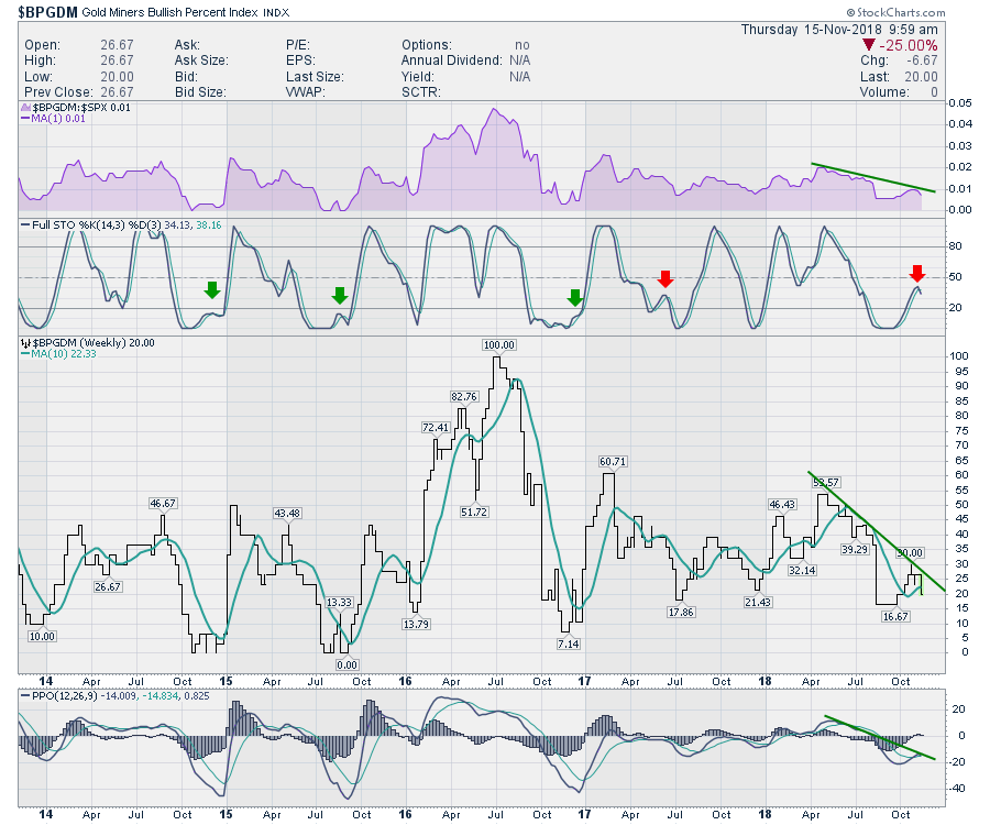
 Lastly, let's look at a few weekly charts for momentum indicators like the PPO.
The BPGDM is not compelling. The full stochastic has rolled over below 50 which is bearish. It is only Thursday morning, so perhaps there is a big push that could turn it up, but the other rallies that started with a brief whipsaw are shown with the arrows. None occurred in this zone between 20 and 50% on the full stochastic. I really like the slope on the PPO. If this was to turn up now it would be an excellent momentum signal.
 The chart of GLD is informative. The relative strength in the purple shaded area is not breaking out yet. That would be a preferable signal. If GLD can outperform the $SPX, that will attract fund flows. Moving down one panel, the full stochastic suggests watch out below, so that is a very negative signal. There is important support at 112.50 on the price panel so we have a level to shoot against. Lastly on the PPO, these low readings below -2% generated big rallies, even if it was only for a month or two.
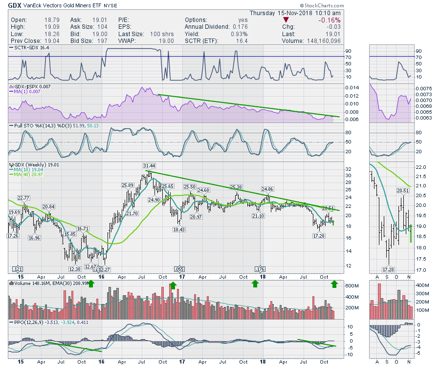
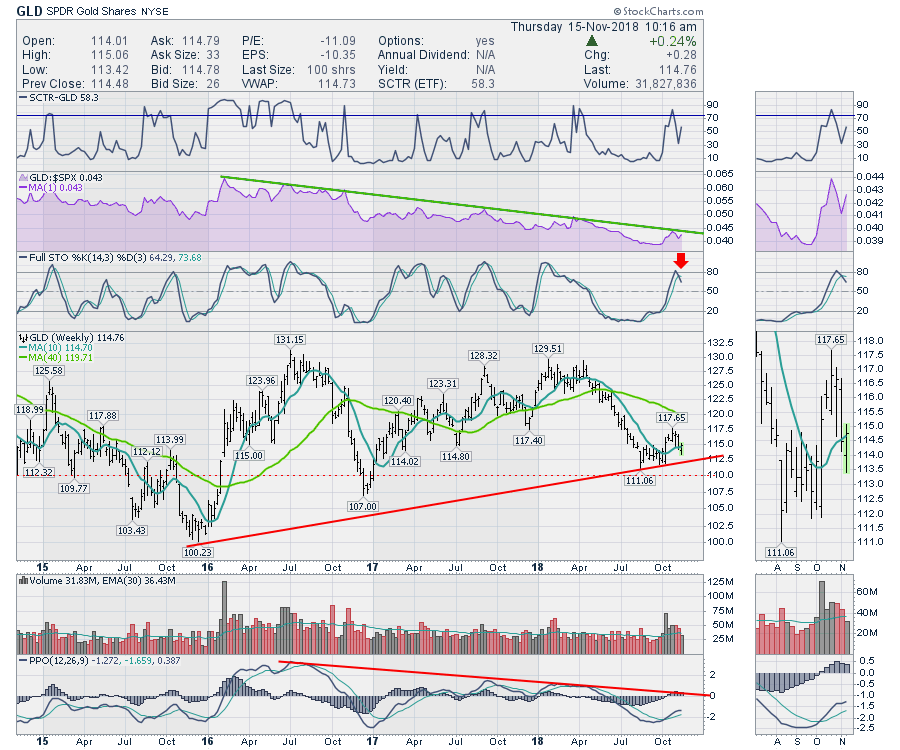 The chart of GDX looks a lot better! I like this chart a lot. Look at the seasonality of the gold miners turning up shown by the green arrows on mid November. The purple area chart showing relative strength is right on the long trend line. Any breakout would be very bullish! When the full stochastic on a weekly chart moves above 50% that is a great place to be bullish. However, I have to add, in this continuous cycle of lower lows for gold, there are a lot of failed moves above the 50% level on the full stochastic. Most of the big rallies in gold occurred after the full stochastic stayed below 20% for two or three months so this metric of being really held down and then surging looks good.
Focusing on the price panel, the move below support suggests any bulls that were weak, have left. A higher low about now on the chart would look like an optimal time to buy not sell. If a new low was made, that would change the chart dramatically.
The slope of the PPO line looks similar to the position back in 2015. In the zoom panel you can see the PPO line is above the signal line. Also, very low PPO levels led to very big rallies. Clearly, none of them were easy to hold through.
 I would say the picture is tilting bullish with 3 of 4 daily charts moving above the 50 DMA. A close there would suggest getting involved. I'll talk more about that on The Final Bar broadcast at 5 PM ET on StockCharts TV and on the weekend market review. You can find both of those on my Vimeo channel or on the StockCharts Youtube channel.
Lastly if you are going to trade commodity related investments, use stops!
Here is this week's broad market review video.
The Canadian Technician video shows the bounce off the late October lows in Canada. Canada is back below the 2008 highs. Tough ten years for investors.
This video covers off some of the recent price action since the late October lows. It also covers the areas where we may expect resistance through the upcoming week. The drop in oil has been huge and this is discussed on the video.
If you are looking for a small gift, you might have family or friends that would like to learn more about the basics of charting. The first section of the book walks through all the chart settings to get the charts you want. The second section is why you might use charts for investing and the third section is putting it all together.
Click here to buy your copy today! Stock Charts For Dummies.
If you are missing intermarket signals in the market, follow me on Twitter and check out my Vimeo Channel often. Bookmark it for easy access!
Good trading,
Greg Schnell, CMT, MFTA
Senior Technical Analyst, StockCharts.com
Author, Stock Charts for Dummies
Hey, have you followed me on Twitter? Click the bird in the box below!
Want to read more from Greg? Be sure to follow his StockCharts blog:
The Canadian Technician


