- World Charts Look Risky
- Outside Bars Suggest Reversal
- Commodities Under Fire
- Timing on the Copper and Steel charts is Unnerving
- Energy-related ETFs and Stocks have Huge Caution Signs
- Watching to see if Gold is the Next Bullish Move (expecting a huge move)
Continuing with my theme of trouble out there, banks, industrials, brokers and energy all had another tough week. The video this week shows 50 or 60 charts corroborating an all-asset testing of risk right here. Bond prices soared, yields plummeted. While the world clings to hope that the recession is still a year away, my charts say otherwise.
Outside weekly bars occurred on a significant number of indexes around the world. An outside bar is when the market makes a higher high and a lower low in comparison to the prior week. The thinking is that the market tested higher prices and got rejected. Then, as the price goes down and tests the prior week low, we want to see new buyers stepping in before it makes lower lows. This week, the lows of the prior week did not hold.
In addition, we have lots of monthly charts that are extremely concerning. While we have another week to go, it is important to keep watching, as some charts are back below the February highs and the close of February. To stall after a strong February means that the buying pressure has weakened. How weak is it? We are going to find out as we close out the month.
Many of the global charts are testing the 20-month moving average from below. Typical bear market price action would have the price stalling around the 20-month moving average, which is important to keep that in mind as we lookl around the world. The first part of the video focuses on the world indexes.
While two countries are not the only charts that matter, these two are closely correlated with the USA.
Japan is testing the underside of the 20-month moving average. The Yen surged to new 5-week highs, putting downward pressure on the $NIKK. I expect the price action of Friday in the USA to show up on the $NIKK next week. A close above 22000 would mean I made the wrong call. That level is roughly 2% higher from here. Likewise, a break below this month's low at 21000 would suggest we're headed a lot lower, as it would be breaking through horizontal support.
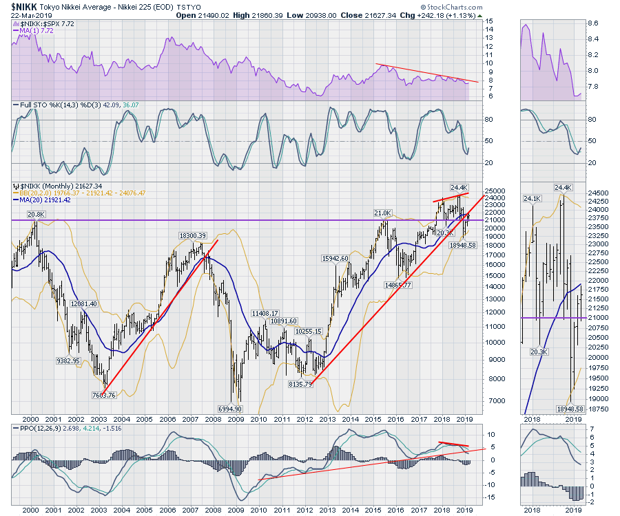 I could write an entire story about the situation in Japan from the charts, but I'll just say that for the purpose of this article, this should be a big one to watch over the next two weeks. I expect the $NIKK to move down.
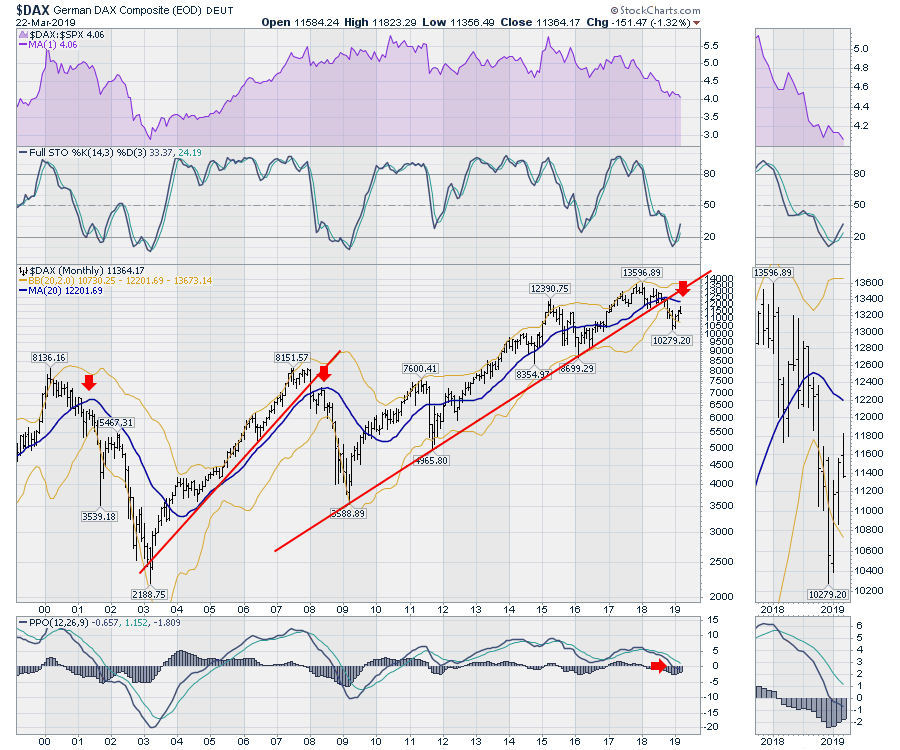
Germany is another chart that is worrisome. On Friday, correlating with the weak US market, the $DAX moved down hard. The monthly candle looks to be rejecting higher prices and is sitting at the lows for the month. The down-sloping 20-month moving average is a big concern, as is the negative momentum indicator (PPO). Notice that the trend line connected the exhaustion lows of 2009, 2011 and 2016, which were significant lows for the market. That support line has clearly been broken, and that broken 10-year trend line is significant for me.
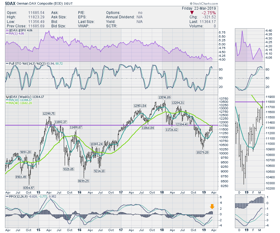
 Looking at Germany on the weekly chart, I feel very uncomfortable. Sometimes a chart behaves perfectly, as seen here. There is a head-and-shoulders top in place above the purple line. Technical analysis convention suggests the price should break below the neckline and bounce back up to retest the neckline. If it cannot make meaningful progress through the neckline, price will break much lower. See this ChartSchool article.
The huge outside reversal bar in the zoom box retraces 4 weeks of work, failing at the neckline. It also failed at the 40-week moving average, which is typical in a bear market. Notice the initial failure at this level was the first week of October. Remember what happened after that in the US markets?
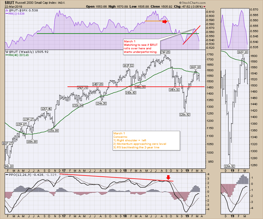
 A quick look at the US markets suggests the Russell is continuing to tell us what is really going on.
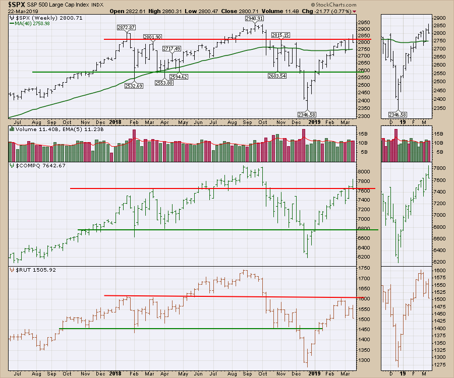 I describe a lot more information on the videos, so hopefully you have been following along. Below is a chart I posted on March 1 from the video. Notice the down-sloping 40-week moving average. My comfort level drops with each of these bearish chart formations.
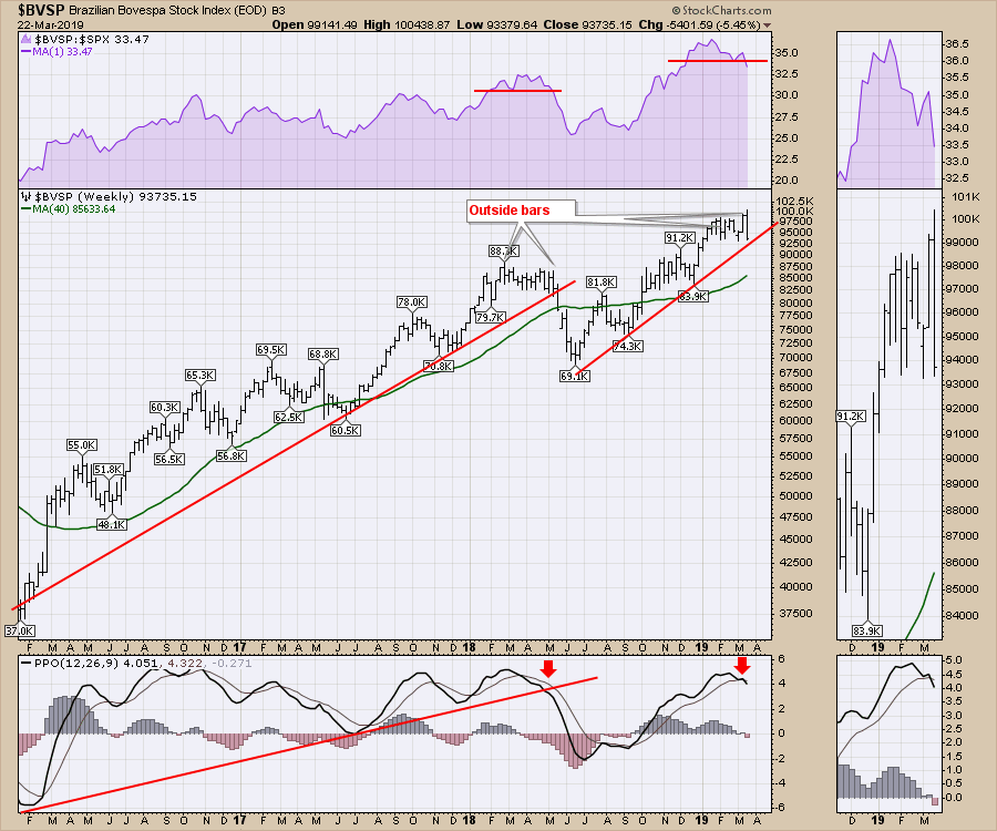
Commodities also look troubled. Brazil is a big commodities market, and its chart looks like it wants to go lower. I should also mention round number resistance at 100,000. It broke through briefly this week before then plummeting. The chart was strong through the 4th quarter of 2018. The outside bar this week, along with the relative strength breakdown in purple, suggests it might be syncing up with global growth fears.
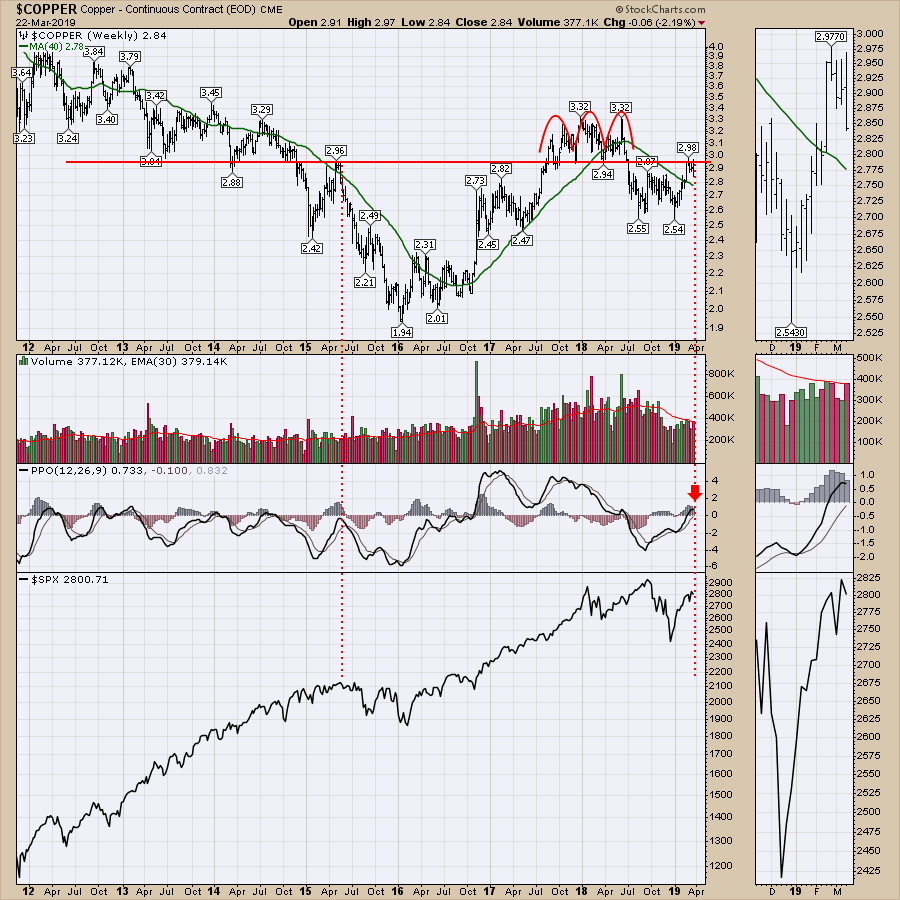
 The Copper chart this week was another chart pattern from the technical analysis textbook on head-and-shoulders topping patterns. After bouncing sideways for months, Copper finally tried to surge back through the neckline, only to fail with an outside bar.
Taking a longer view of Copper, there is more symmetry with the $SPX. Copper's breakdown from the $2.96 level coincided with the top in 2015 following a bounce up from below. Having the momentum shown by the PPO roll over close to zero adds to the symmetry. If Copper starts another repetitive sequence of PPO rolling over near zero, that would make this the start!
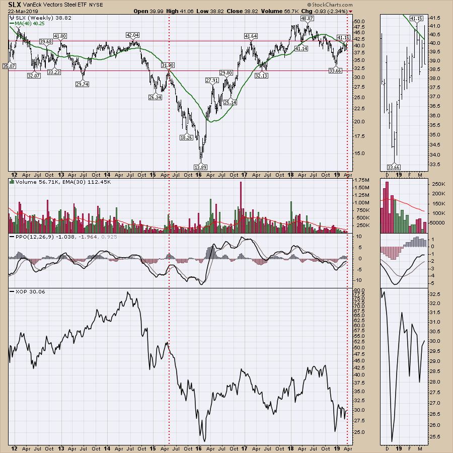
 My thoughts on Steel are the same as Copper, which does not bode well for the industrial stocks I covered last week. It's not good for energy, either. Steel rolled over at a major horizontal support/resistance line in 2015 as the $SPX topped out in May 2015. The PPO was below zero then as well. The exploration and production ETF (XOP) is shown in the lower panel. Does that give you any comfort in owning energy stocks here?
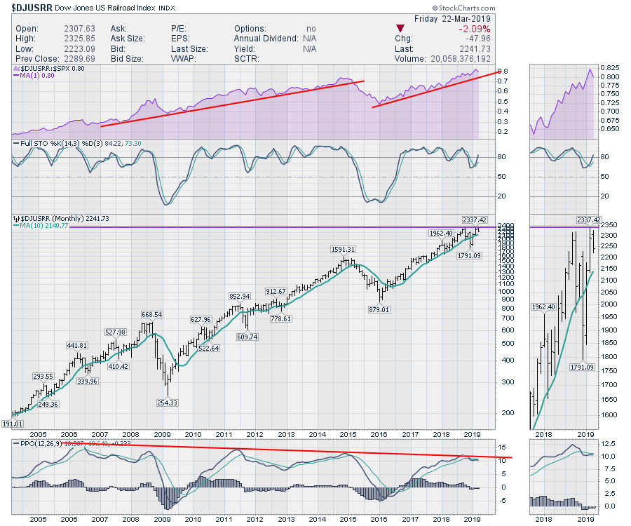
Before I go off the cliff, there is one chart I continue to look to for confirmation of all of this. That one chart is the railway chart, which is a few paragraphs down.
When a market makes a pullback, the price has to test or break through the prior high at some point. The railway chart has been trying to push through 2300, as seen in the zoom box. The price bar for this month is a weak inside bar, which is the opposite of an outside bar. An inside bar makes a lower high and a higher low than the previous month. I associate an inside bar with indecision or consolidation. The railways trend up and down nicely (they're very trendy!). All of the major breaks below the 10-month moving average never got back above before continuing lower (2008, 2015). Conversely, the recent pullback below the moving average and the resumption back above looks a lot more like the 2006 and 2011 moves.
The PPO suggests the index has reached the trend line in momentum, so it is more likely to drift lower in momentum than surprise us with renewed strength. Although, in both 2007 and 2012, the PPO drifted lower while the index moved higher.
All of what I just described suggests a move higher for the rails. The problem is this month's bar being near the lows and below last month's close. We can see in October 2018 (on the zoom panel) that the same price formation showed up and that the previous close was above the current price. Needless to say, it'll be a battle to see how this resolves itself. My perspective based on the global charts is lower down.
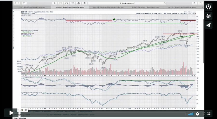
There is less movement of autos as the $DJUSAU chart looks terrible, steel looks weak as discussed, copper looks weak as discussed, canola (China stopped buying Canadian Canola in a battle over the Hauwei executive), and oil shipments in Canada all suggest more trouble for this North American index. If the relative strength trend on the purple area chart breaks, that would confirm the whole breakdown. So far, it is solidly bullish.
 Let's wrap up on a positive note.
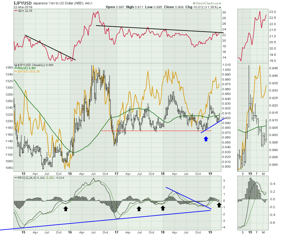
Gold and Silver.
Using the black arrows on the PPO, notice the subtle little histograms with the PPO are in roughly the same place as it is now on this chart of the Japanese Yen. The PPO turning up while above zero is very bullish and mark the first such event in four years for the Yen. That leads me to believe that Gold could light it up here, which is shown as a gold line on the chart! I would prefer to own the miners as they move faster than the metals. The best moves happened when the Yen moved above the 65-week moving average, which happened on Friday's close.
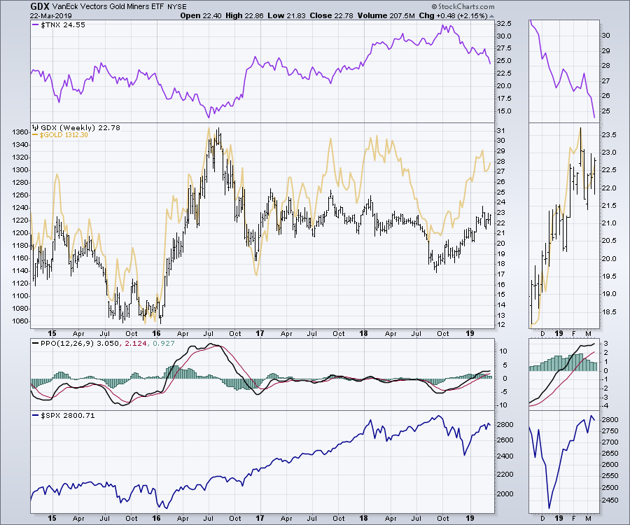
 I have one other chart (I know, you're surprised) that leads me to believe this might be a bigger than normal pop! This is the inflation protected bonds ETF (TIP). Notice the sudden surge in 2016 coincided with a pop in Gold and the Yen. The Gold Miners ETF surged 150% in six months (see the second chart)!
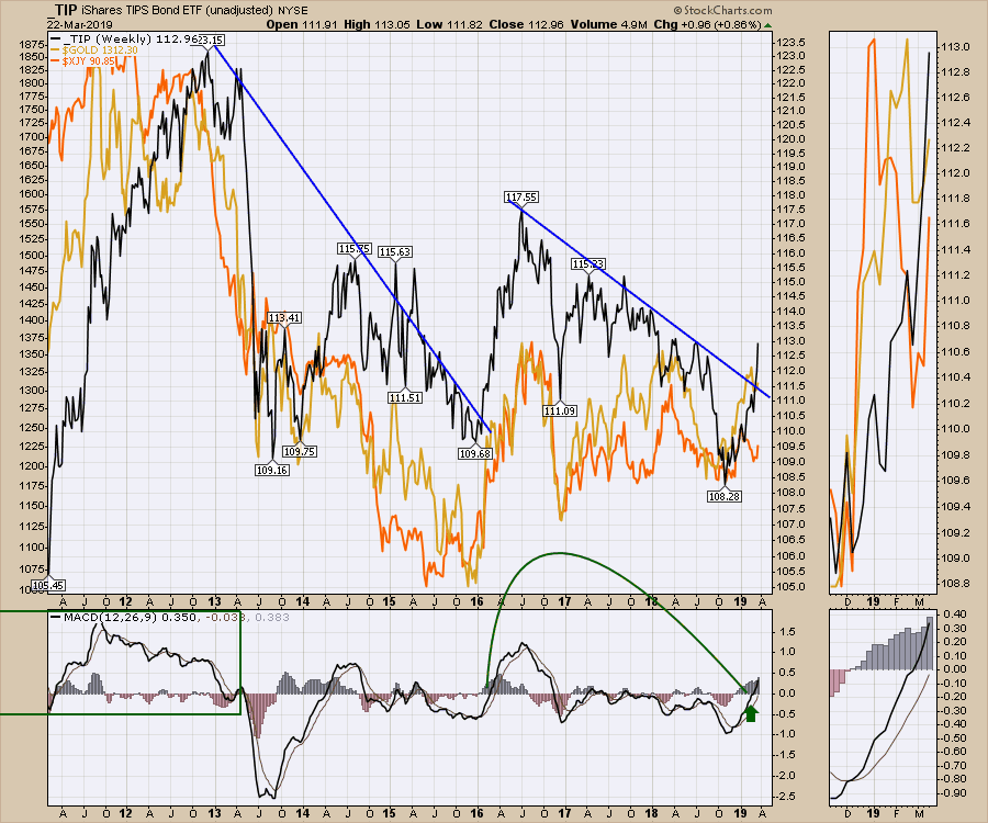 That also coincided with a big drop globally in the stock market, which bottomed in February 2016 and stayed down until April 2016. Up in the top panel is the Ten-Year Bond Yield, which also dropped in 2016 as Gold soared.
 There is more in the video about Gold and Silver. Pull out those precious metals chartlists!
Here is a link to this week's Weekly Market Roundup video, with a lot more information on the global mess the charts are in.

Here is the the Canadian Market Roundup for mid-March.
If you would like to learn more about the basics of charting, check out Stock Charts for Dummies. The first section of the book walks through all the chart settings you need to help you get the charts you want, the second section explores why you might use charts for investing and the third section is about putting it all together.
Click here to buy your copy of Stock Charts For Dummies today!
If you are missing intermarket signals in the market, follow me on Twitter and check out my Vimeo Channel. Bookmark it for easy access!
Good trading,
Greg Schnell, CMT, MFTA
Senior Technical Analyst, StockCharts.com
Author, Stock Charts for Dummies
Hey, have you followed Greg on Twitter? Click the bird in the box below!
Want to read more from Greg? Be sure to follow his StockCharts blog:
The Canadian Technician


