What an important week for technicians. I have some great friends that are also great technicians, and many of them are extremely bullish, what with all the breadth indicators having such a big initial market thrust. However, I personally am a lot more concerned after doing my intermarket review for the week.
The moves in the bond market over this past week were really concerning to me. Chart after chart had meaningful moves towards safety, despite the fact that the market pullback was only a few percent. The currency markets experienced a significant breakout and close on the US Dollar. The Euro, the Canadian Dollar and Aussie Dollar all had tough weeks. The British Pound looks ready to fall here. The Yen has been weak; tried to rally on Friday, but concluded with an extremely weak candle after starting with a big gap up. Bonds, currencies, equities and commodities all struggled. Agriculture, with the exception of livestock, was particularly ugly in the commodity section. Let's get into the charts.
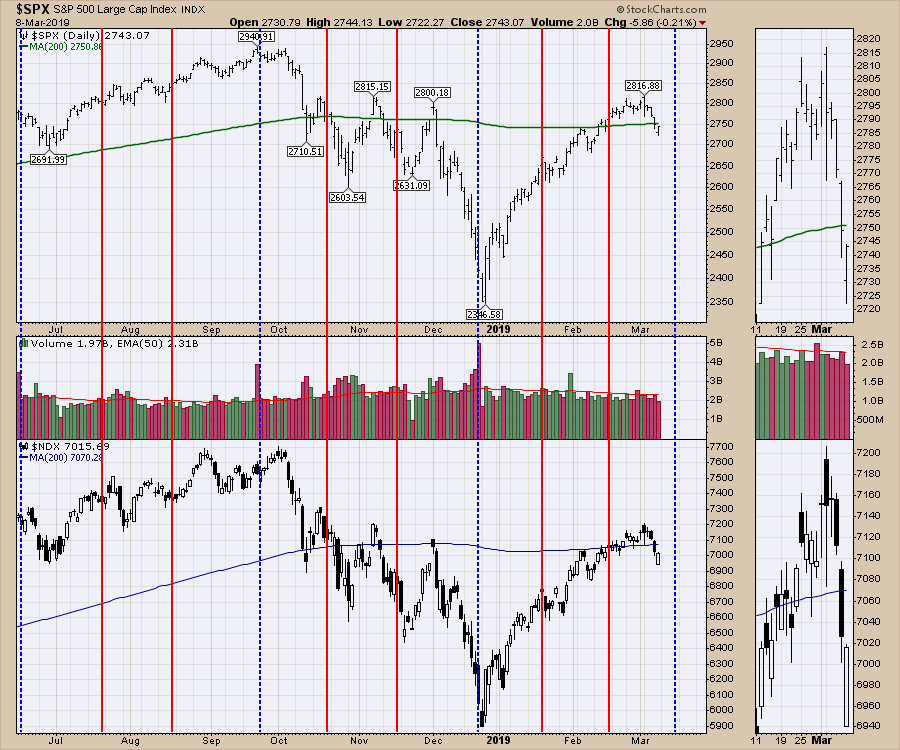
The market hit resistance at one of the three places we might expect. The first was the dotted green line, the second was the 200-day moving average (in green) and the third was at the prior resistance marked by the blue line. I would add that one should always expect resistance at a test of the highs. Now, the debate rages as to whether the market can restart the rally.
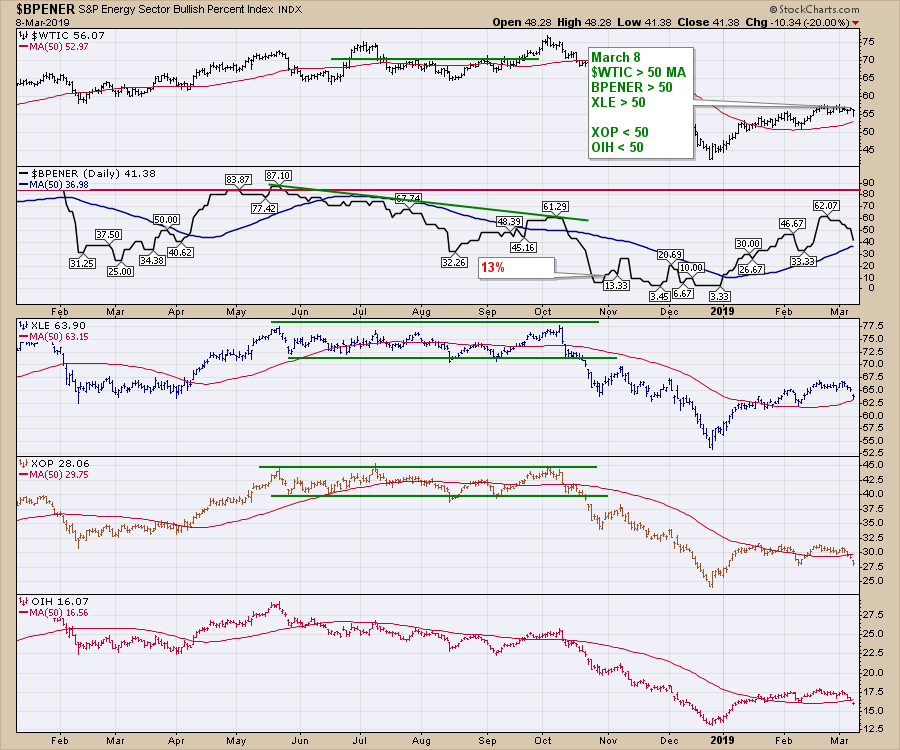
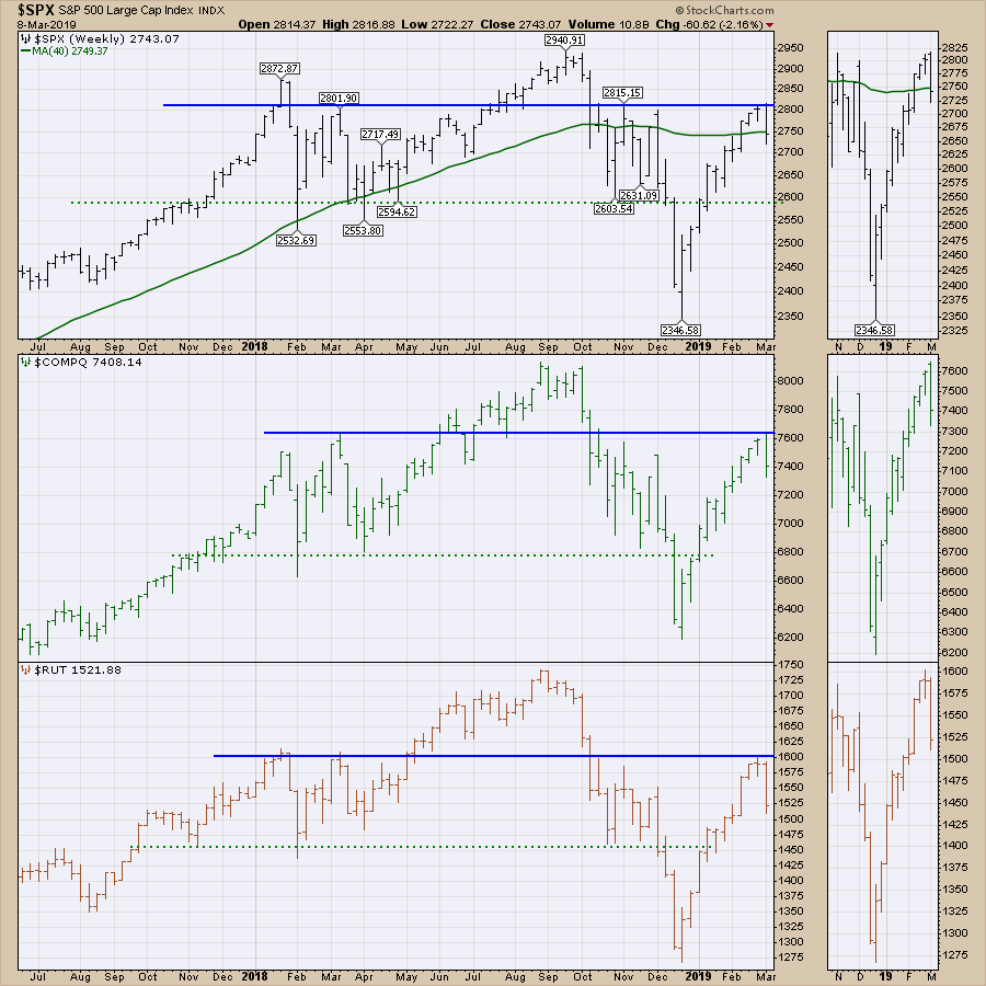 On this week's video, I spent the majority of time working through currencies, equity market indexes and bonds. Almost all of the commodity charts were ugly. Crude oil, gasoline and heating oil looked okay, but the related ETFs like XOP, OIH, XLE, CRAK and FRAK seem to be breaking down. To me, Energy is on a sell signal until the ETFs improve.
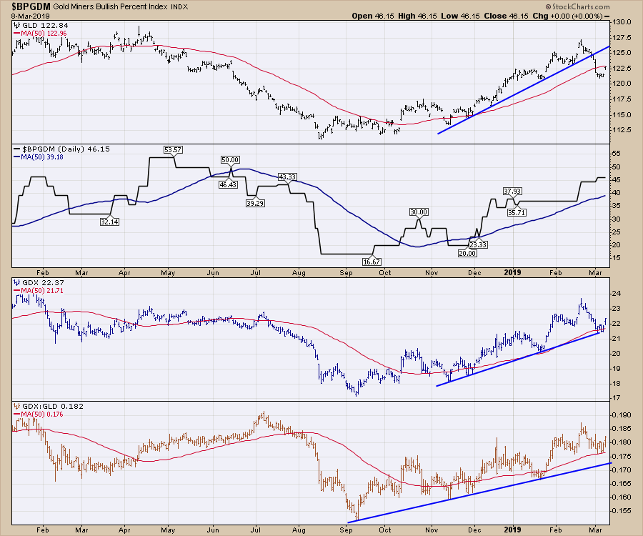
Gold is almost the opposite. The miners are above and the metal is just below the 50-day moving average. Will the move in the US Dollar crush gold, or will Friday's pop in gold prove to be a clue of a failed breakout in the Dollar? I am leaning toward the Dollar breakout being real and gold being hurt. Next week, we'll find out whether or not I am wrong!
 Big events are in store for the next 10 trading sessions. These are amplified in importance by what has happened over the last 5 months. We have quad witching on Friday, where there will be four different contract expirations: stock index futures, stock index options, single stock futures and stock options. Quad witching marked the top in September and the bottom in December. Quadruple witching, as indicated by the name, happens 4 times per year: March, June, September and December, which are all marked with blue lines on my chart.
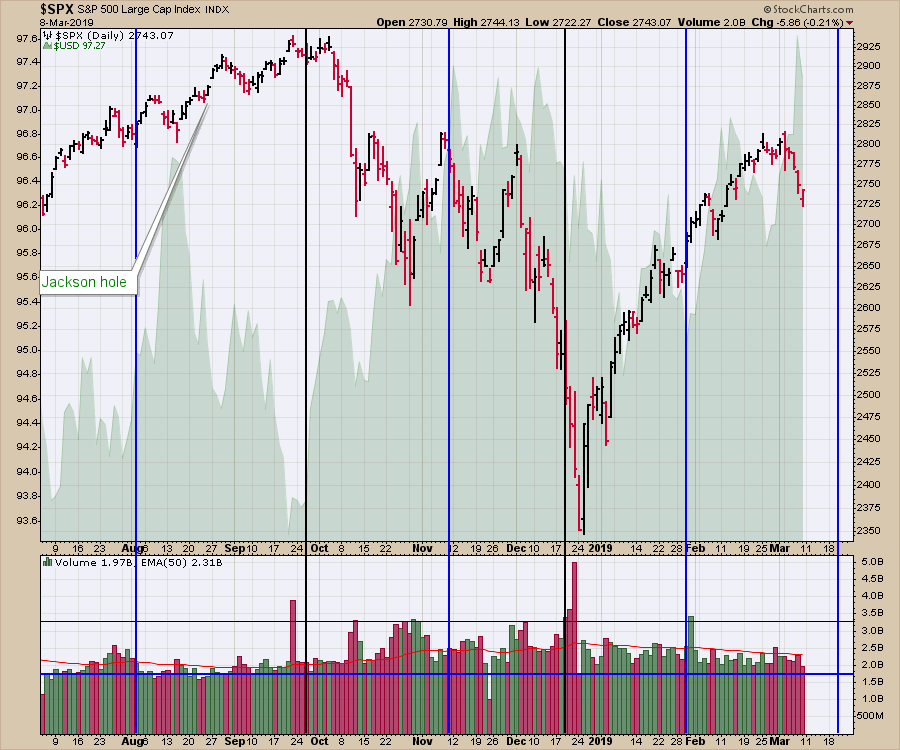
 The following week, we will have a Fed meeting. These also closely align with the quad witching dates; the four quad witching months usually have a Fed meeting within days of either side of the quad witching. The September, November and December Fed meetings didn't help the market much. By the end of January, the Fed was "extremely accommodative" towards the market's opinion. In the background of the chart is the $USD (in green) as an area chart. Some of the dollar moves are initiated on the Fed meeting outcomes. The US Dollar ($USD) put in the highest weekly close going back 20 months. This isn't the time to go get a hot dog at the game! There is a lot going on.
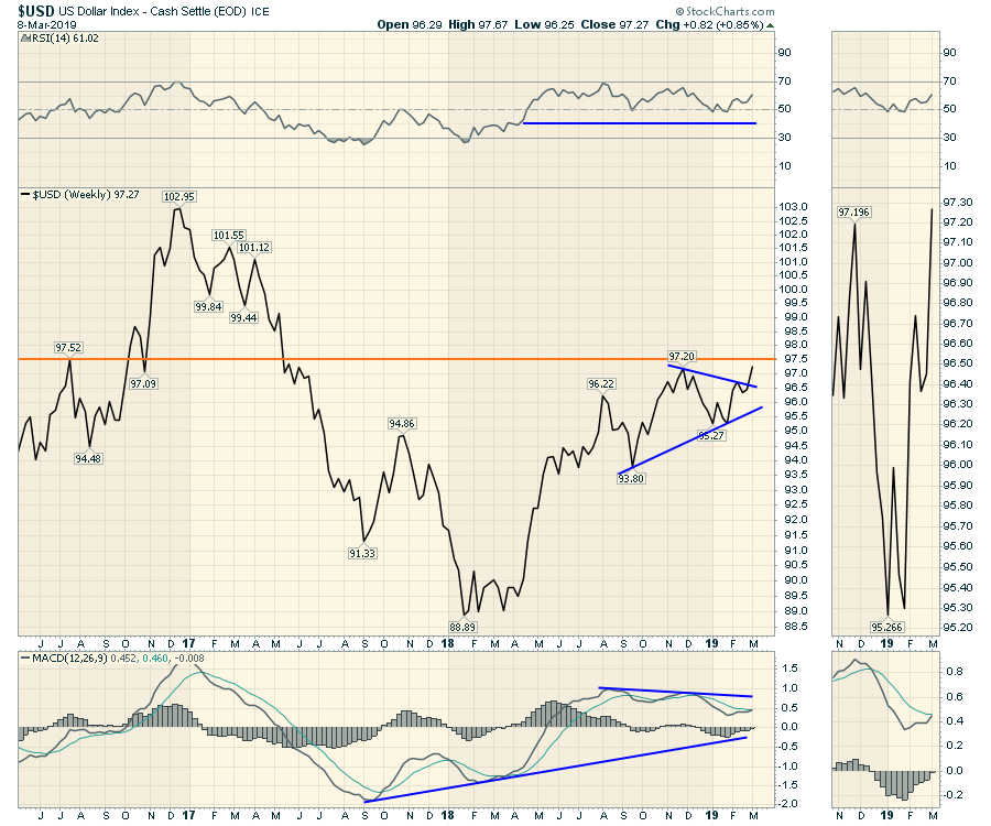
 The $USD made its highest weekly close in 20 months. That is a very important signal following 5 months of consolidation between 95.5 and 97.5. I would say this is a lever of huge importance.
 The daily looks a little trickier to interpret. Is this a failed breakout or just the Dollar catching its breath? With a week to go before the Fed meeting, I'll be focusing closely on this. The daily PPO indicator on the lower panel suggests new momentum hitting the $USD. A soaring Dollar from late September saw the market drop. Is this breakout causing the same effect on the equity markets? Or is this three drives to a final high before it rolls over in an exhaustion move? With the Fed involved, the next two weeks should provide some very important information.
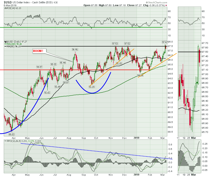 Intermarket analysis (correlating the moves in assets between equities, bonds, currencies and commodities) can be extremely valuable. It is also very difficult to get all the pieces to synchronize nicely. With the $USD trying to break out, there are a lot more moves in other currencies, including the Euro losing support, the Canadian and Australian dollar breaking down and the British Pound at an inflection point. The video has a lot more currency information, as does Friday's Don't Ignore This Chart Article.
The 2 Year Yield
The Relative Strength Index (RSI) is a type of momentum indicator commonly used as an overbought (70) and oversold (30) indicator. On a monthly chart, these readings can persist for a period of time. I am more interested when the decline starts on the RSI after being in an overbought condition or rising after being in an oversold condition. The chart below has vertical lines when the $USD starts surging upward, while the yield is rolling over after breaking down from an overbought RSI 70. It is this last condition - the slowing momentum after an overbought signal - that I want to use as an anchor for the analysis below.
In the frothy tech stock top, the RSI signaled a top for the 2-year yield. The RSI breakdown and the PPO sell signal both occurred near the September top in 2000. This tight timing was a strong signal.
In 2006, the yield topped in the frothy housing market. The PPO (momentum) level was really high at that time, as the yield double topped and fell below the green 10-month moving average. The US Dollar didn't start surging until the bank failures started. The 2007 $SPX had a similar wave action, topping structure setup just as we have today. The high PPO (momentum) fell a long way before the $SPX topped. This wide spread in time suggests that, as a timing tool, this may not be tight, but it should at least add caution when the yield has been dropping, the stock market has been dropping and the $USD has started to surge. Notice the similar level of yield compared to today.
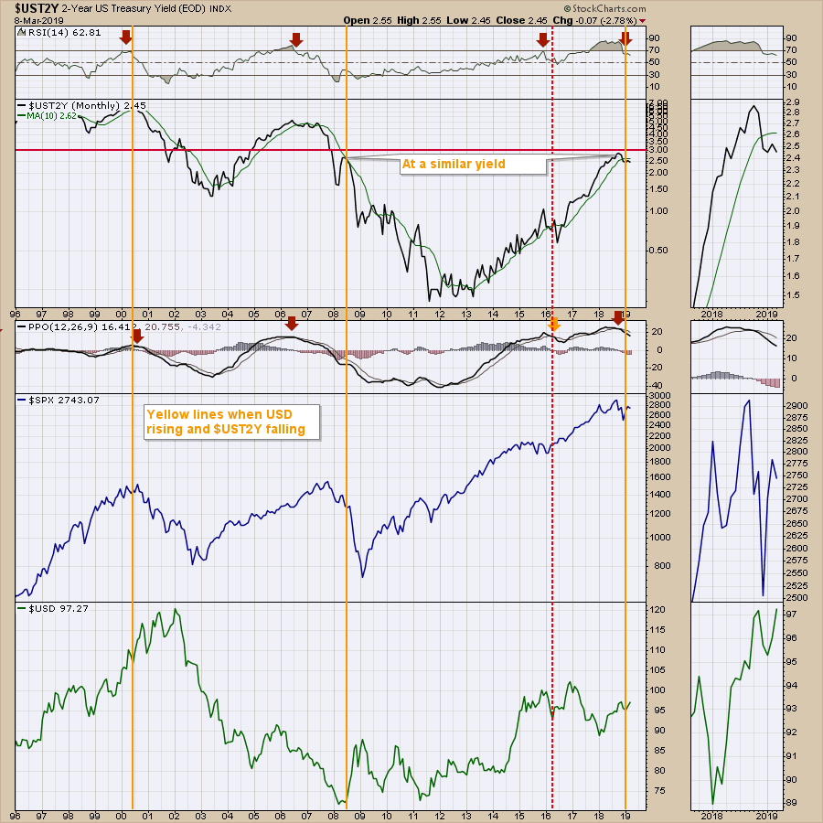 Staying with the chart above, the 2015 signal ended up being a false dawn. As everything quickly returned to bull market conditions with the $SPX at new highs, the signal failed.
Comparing the past to today, the setup persists with lots of similarities. The yield's inability to rally above the 10-month moving average doesn't give me any comfort. Two other things add to that unsettling condition. The first is that momentum rolling over after only two years of the PPO uptrend is relatively soon on big cycle work. The other is that the global weakness that is occurring could exacerbate this situation and make the negative outcome more plausible.
When I combine the $USD chart breaking out with the yield chart breaking down, it might be time to order a double at the scotch bar - just to calm the nerves a little bit. Let's add this to our list of things that make you go "hmmmm" and continue watching for directional clues.
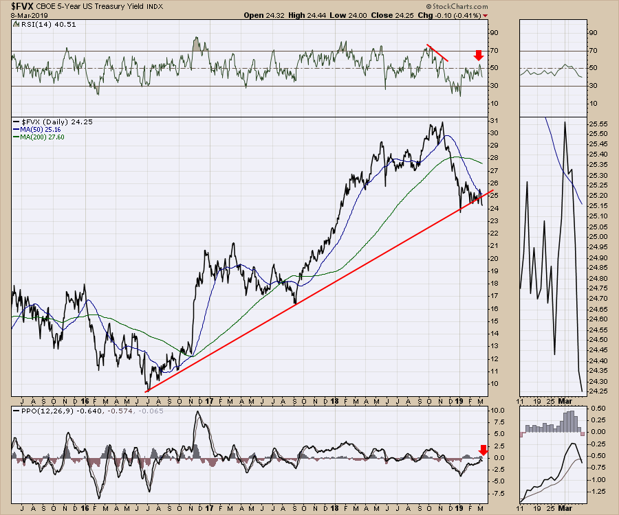
The Five Year Yield doesn't improve the outlook.
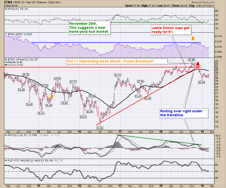
The 10-Year Yield is also a problem. We made a lower high and a lower low this week, with a new 56-week low weekly close. That statement excludes the intra-week (not the weekly close) lows of December 2018. Weekly closes are deemed more important in technical analysis, as investors have to be satisfied with the position over the weekend.
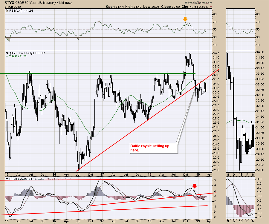
 The 30-Year Yield is still engaged in the battle royale denoted on the chart. This week's big black candle looks terrible, having stalled at the 200-day moving average.
 Here is a link to this week's Weekly Market Roundup video, with a lot more information on the asset classes. The video is action-packed with many important charts to consider.
Friday's Market Buzz was all about the $USD. Click the image below to watch.
 Wednesday's Market Buzz talked about the Railway stocks and the fragility of their momentum rolling into March. Click on the Market Buzz below to watch.
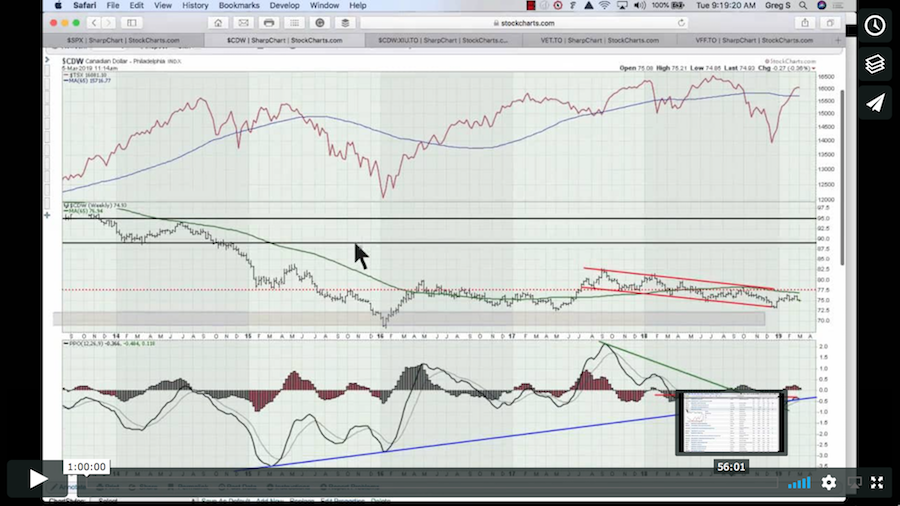
 Here is the Canadian Market Roundup for the start of March. In this video, I also set up a scan to find all the stocks that made a new 1-year high. There are some great charts out there!
If you would like to learn more about the basics of charting, check out Stock Charts for Dummies. The first section of the book walks through all the chart settings you need to help you get the charts you want, the second section explores why you might use charts for investing and the third section is about putting it all together.
Click here to buy your copy of Stock Charts For Dummies today!
If you are missing intermarket signals in the market, follow me on Twitter and check out my Vimeo Channel. Bookmark it for easy access!
Good trading,
Greg Schnell, CMT, MFTA
Senior Technical Analyst, StockCharts.com
Author, Stock Charts for Dummies
Hey, have you followed Greg on Twitter? Click the bird in the box below!
Want to read more from Greg? Be sure to follow his StockCharts blog:
The Canadian Technician

