US bond yields dropped sharply this week.
Below is the 2-year yield. One of the important technical characteristics of the chart is a double top. When a chart tests a prior high, we want to see if it succeeds or fails at the prior level that was resistance once before. Clearly the 2-year stopped and did a hard reversal. This pattern suggests the recent top could be a more intermediate top for the bond market, rather than just a short-term stall in price action.
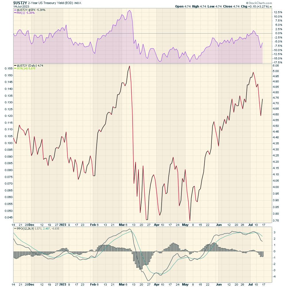
With such a big focus on equity market gains recently, perhaps the bond market is waking up. The short-term notes have higher yields than longer-term bonds, which means the yield is inverted. You would expect a lender to get a higher rate of interest for loaning further out into the future. When they don't get that premium, it is called an inverted yield curve.
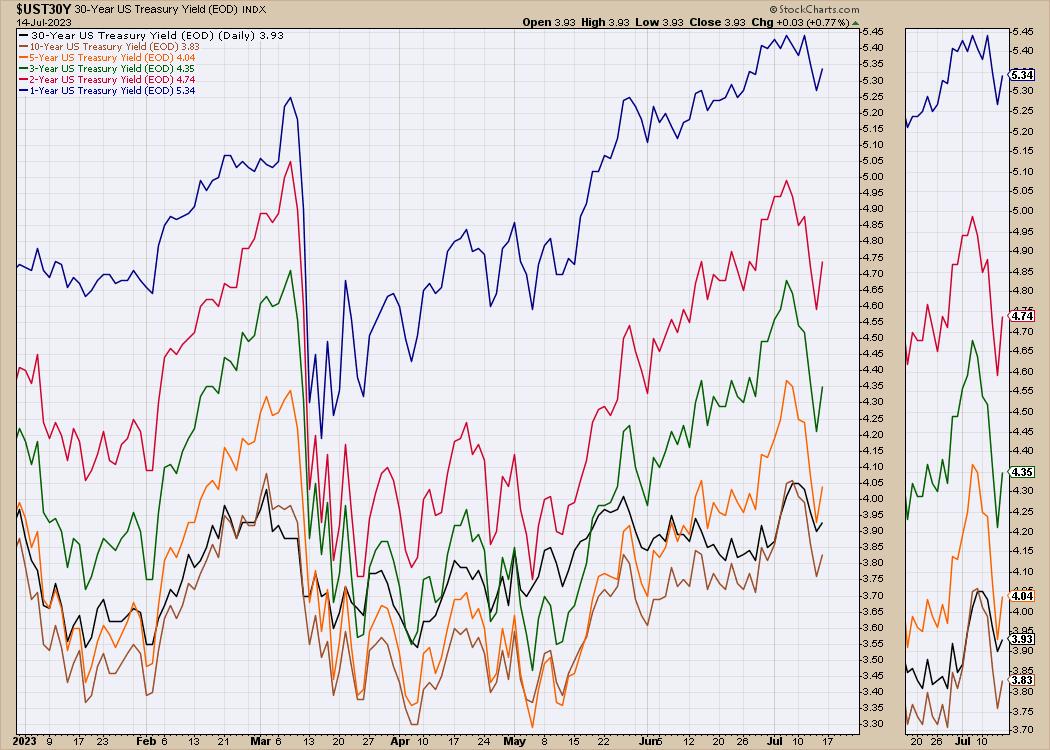
What I noticed about the yield chart for the USA was the speed of the decline this week. The 2-year yield is down 40 basis points, or almost 10% from last week's high. The 3- and 5-year yields were down even more on a percentage basis!
The spread between the 5-year yield and the 30-year yield last week was more than 30 basis points. On Thursday, the difference was just 3 points, so the spread dropped 90%. If we have put in the highs for the bond yields, that means we have put in the lows for the bond prices. Even if the bond market continues to drift sideways, the investor is still collecting a significant yield. But if we do have a recession next year, and typically the bond prices will rise as the Fed lowers rates, paying us yield and capital gain.
On the Market Buzz episode this week, I showed how the rest of the world equity charts were starting to slip. Will this perhaps start a rotation into bonds in foreign markets?
I started to hunt down some foreign government bond ETFs perking up. There were some bond charts that showed up as more interesting than in recent weeks. As an example, emerging market bond fund ETFs look good based on the charts. One of the things to watch for: if bond prices start to rally, will we have equity market weakness?
This leads to two scenarios:
- If the rest of world is entering the recession before America, perhaps their government bonds are starting to move higher, which could provide a regular dividend payment and capital gains.
- On the other hand, if the recession fears are overblown, then some of the other high yield or corporate bond charts might improve more as the central banks pause or start lowering rates.
Let's look at both ideas below.
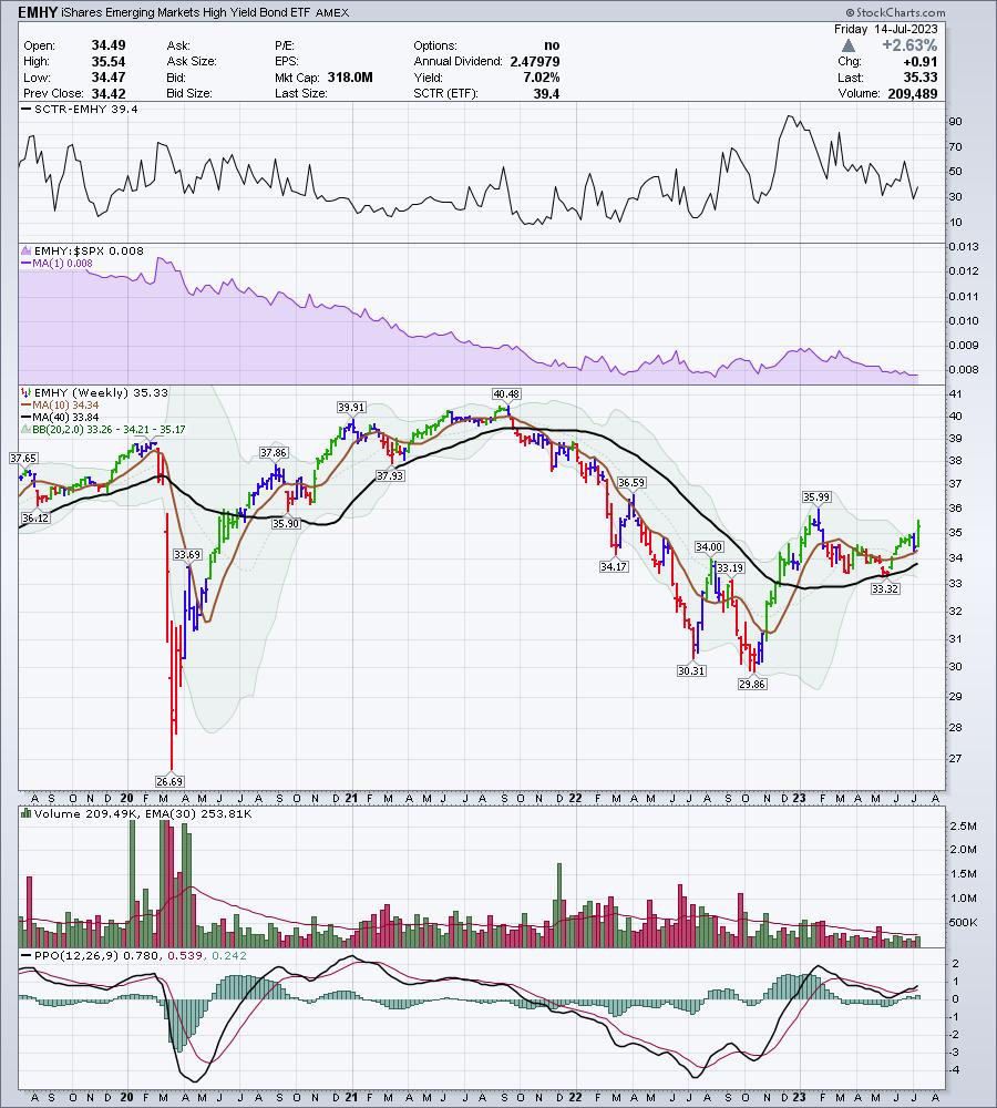
Emerging Market High Yield Bonds
The case for emerging market high yield bonds getting better is shown below.
The chart ticker is EMHY. The chart is high yield emerging markets. This chart pays a 7% dividend and is starting to break out to the upside; that suggests an improving outlook.
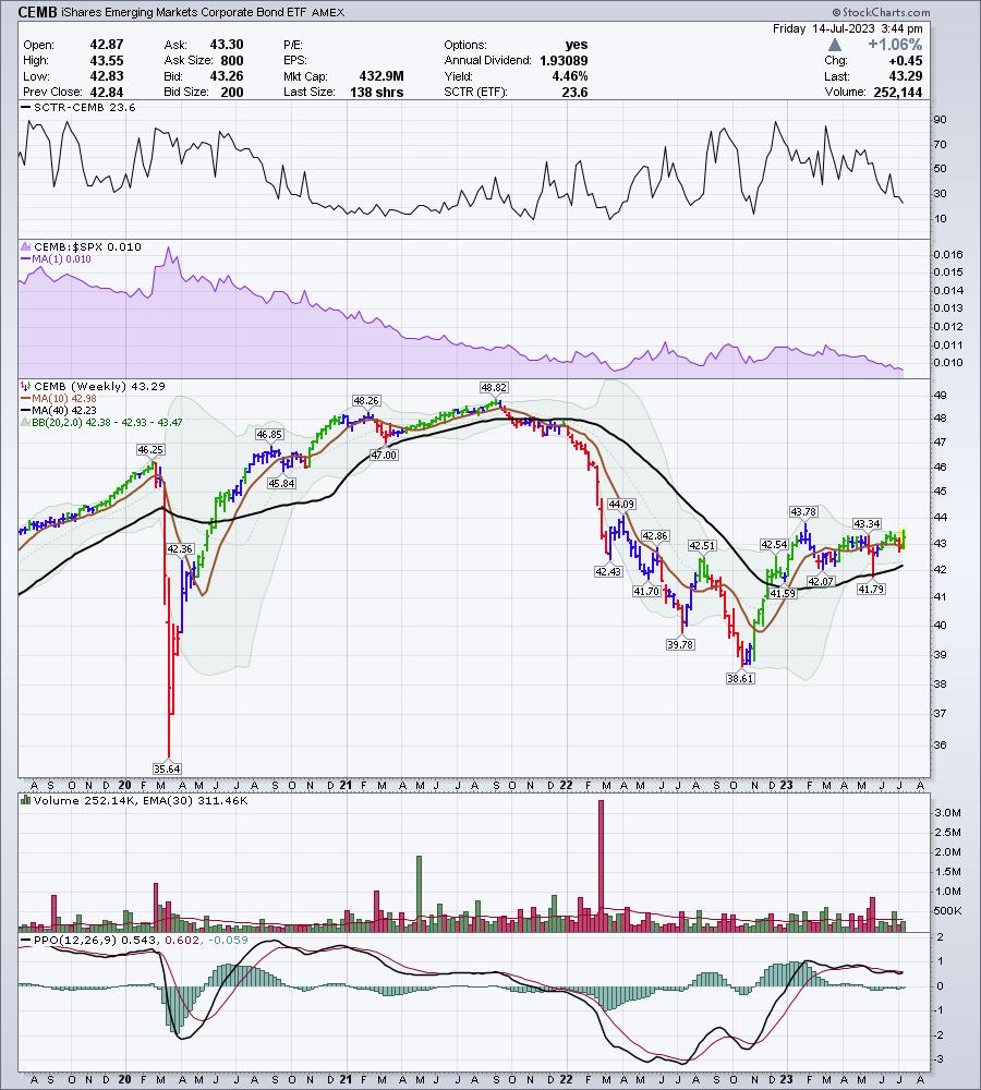
Corporate Bonds
The next chart is for emerging market corporate bonds, but not high yield (higher risk). This chart is also turning up, and made the highest high since February. It pays a 4.4% dividend. Are the emerging market economies starting to improve as both of these charts are looking good?
Government Bonds
Now, if the emerging market world struggles, as their equity charts appear to be saying, it might be better to buy emerging market government bonds in an economic downturn. In 2022, we had an interesting year, as both bonds and equities fell together. Usually, we tend to see bonds do well when stocks are weakening. If we are going back to a normal rotation, perhaps we'll see the interest in government bond markets perk up. As yields fall, bond prices rise. Capturing a yield, as well as capital appreciation, makes the trade work out nicely. The yield is 5.4% on this government bond ETF!
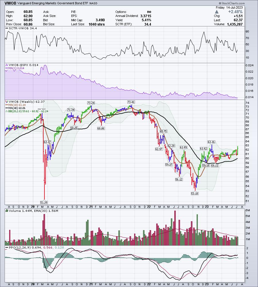
What these charts suggest to me is that the highs for the emerging market bond yields are in, and we are starting to see bond prices rise. Will high yields continue to go higher with government bonds?
Every week, the stock market continues to surprise on the upside. We have been talking about the big moves up in commodities over the last few weeks. I'll have a lot more ideas after rolling through the charts this weekend. If you would like to sample our work, there is a $7 one-month trial subscription offer that you can try at OspreyStrategic.org. This will also allow you to read up on our past newsletters and watch our previous videos.
One of the things our members have found helpful is the Osprey Opportunities page, with good looking charts provided based on themes or industries.
I think you'll find using the Osprey Opportunities pages to be helpful. Feel free to try it at OspreyStrategic.org for just $7!
Good trading,
Greg Schnell, CMT, MFTA
Senior Technical Analyst, StockCharts.com
Author, Stock Charts For Dummies
Want to stay on top of the market's latest intermarket signals?
– Follow @SchnellInvestor on Twitter
– Connect with Greg on LinkedIn
– Subscribe to The Canadian Technician
– Email at info@gregschnell.com


