An indicator that has recently become quite popular is the SPX/VIX Ratio. I have tried to convince two of its proponents that it is a calculation that makes no sense, but to no avail. Nevertheless, I will present my argument here for your assessment.
Ratio calculations are most commonly used to demonstrate relative strength between two price indexes, or to determine the price acceleration/deceleration of a single index. For the relative strength calculation you divide one price index by another. For example the chart tools on both DecisionPoint.com and StockCharts.com web sites have an indicator named "Price Relative", which on the default setting will divide the selected stock price by the SPX. The resulting indicator is an index that rises and falls based upon the relative strength of the stock versus the SPX.
For the Rate of Change (ROC) calculation for a single price index we simply divide today's price by the price from a previous date. This results in an indicator that expresses speed and direction of the price index.
The SPX/VIX Ratio (which divides the S&P 500 by the CBOE Volatility Index) makes no sense because it divides a price index, with a theoretically infinite range, by a range-bound indicator index . The result of this calculation is an indicator that behaves quite differently when the S&P 500 is below 400, as it was in 1990, compared to when the S&P 500 was over 1500 points, as it was in 2000. You can see what I mean on the chart below.
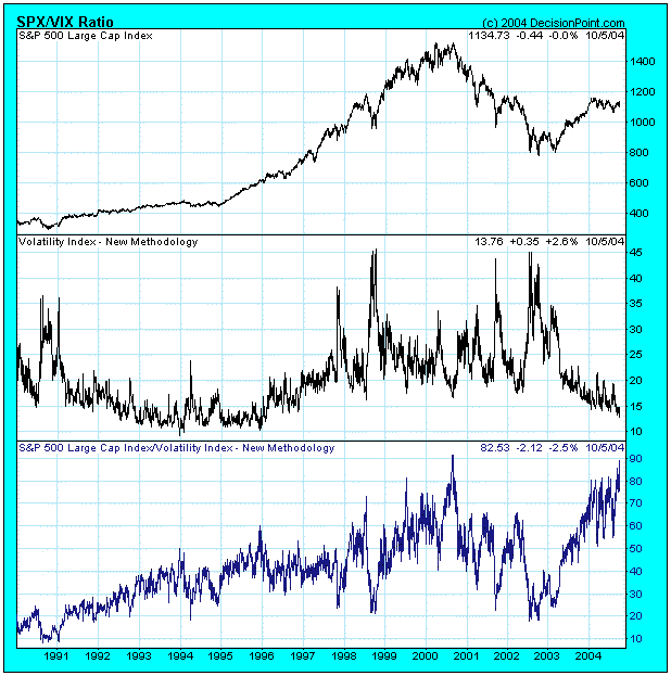
It is hard for me to construct a rationale for this indicator, but I think the current assertions are that the recent ratio spike near 90 is warning that we are near another important top like the 2000 top, which also had a ratio spike near 90. I will not argue about whether or not we are near a major top -- it's possible -- but a single previous data point in a 15-year period doesn't prove the hypothesis.
I think the VIX chart taken by itself is more constructive and informative. Note how the upward spikes mark periods of extreme fear brought on by severe market declines. Currently the VIX is near the lower end of its range, indicating that investors are very complacent; however, this behavior is much like it was in the 1990s, a time when the market was advancing. We can see by the historical range of the VIX that, while people are indeed complacent, they are not as complacent as they can get.
As for the SPX/VIX Ratio, with all due respect to its proponents, it expresses a relationship that has no meaning. I think this is evident when we view the longer-term chart.


