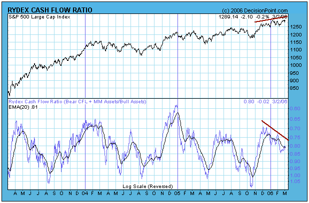
The Rydex Cash Flow Ratio*, which is shown on the first chart below, reflected a fair amount of bullish sentiment and peaked around the end of November. Since then it has been sliding down toward the bearish side of the range in spite of the fact that prices have been moving higher. This is not normal -- prices normally drive the Ratio as money flow adjusts to price movement.
My first conclusion was that over-anxious bears were placing their bets too early and driving prices higher with their short covering; however, a closer examination of the Ratio's components reveals that something quite different, and dangerous, is taking place.

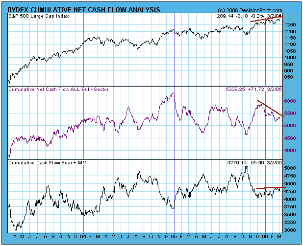
The chart below shows the components of the Cash Flow Ratio. Note that, since November, bear plus money market funds cash flow has been flat to slightly rising, demonstrating clearly that the bears have been relatively patient.
On the other hand, cash flow for bull plus sector funds has decreased dramatically. This means that money has been moving out of bullish funds even though prices have moved higher. This is almost always a bad sign.

To summarize, the Rydex Cash Flow Ratio divergence does not reflect premature bearishness, rather it shows that many people (smart money?) are quietly moving toward the exits. This is just one of a long list of divergences that can be observed on our indicator charts, and, even though the trend of the market is still up, increased caution is appropriate.
RYDEX CASH FLOW RATIO: The Rydex Cash Flow Ratio gives an improved view of sentiment extremes by using cumulative cash flow (CCFL) into Rydex mutual funds rather than using the totals of assets in those funds (which we use for the Rydex Asset Ratio). It is calculated by dividing Money Market plus Bear Funds CCFL by Bull Funds plus Sector Funds CCFL. To read more click here.


