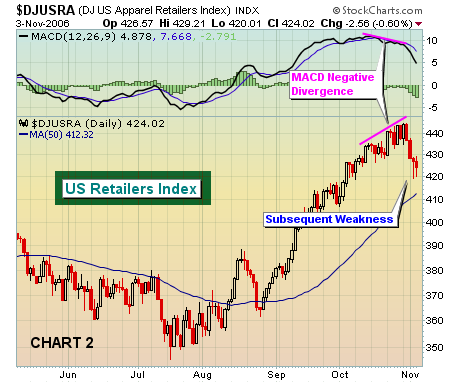
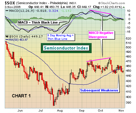
On the technical side, we believe the combination of price and volume is paramount to successfully trading the stock market. A strong second place finish goes to the Moving Average Convergence Divergence, or the "MACD". The standard settings on the MACD are 12, 26, 9. On daily charts, the MACD is the difference between the 12 day exponential moving average (12 day EMA) and the 26 day exponential moving average (26 day EMA) and this difference is plotted on StockCharts as the "thick black line". The 9 refers to the 9 day moving average of the MACD and is the "thin blue line". So what does the MACD do? Well, it is a momentum indicator. When a stock or index is rising, the 12 day EMA will be higher than the 26 day EMA and the MACD will be positive and above the zero line, or centerline. When a stock or index is falling, the 12 day EMA will be lower than the 26 day EMA and the MACD will be negative and below the zero line, or centerline. The beauty of the MACD is that as prices put in higher highs, the MACD will sometimes put in a lower reading. The significance here is that on the surface momentum appears to be strong if looking only at price action. Underneath the surface, however, the MACD begins to signal a very different message. The difference between the 12 day and 26 day EMA's is actually beginning to shrink, suggesting slowing momentum. These "negative divergences" can be a precursor to lower prices, and in some instances even predict a long-term top. Let's take a look at two examples. First in Chart 1, you'll see the Semiconductor Index which in mid-October experienced a rally that carried it beyond September highs. But take a look at the MACD reading on that higher October high. The MACD reading was actually lower, indicating that the momentum was waning. Astute technicians would have taken notice and lightened up on the sector or simply looked for opportunities elsewhere. We have seen a similar pattern unfold with retailers over the past week or two. Notice in Chart 2 below that the Dow Jones US Apparel Retailers Index continued to trade higher throughout October, but the MACD mysteriously lost its momentum. We're just beginning to feel the effects of that negative divergence now.


