Mary W. writes "I'd like to see how much above or below the 200-day moving average a stock currently is. Does your charting system show that?"
While we don't have a specific indicator for "Percentage above/below the Moving Average", clever chartists that understand how the "Price Oscillator (PPO)" works can create such an indicator easily. The PPO is very similar to the well-known MACD Indicator. Both are based on the difference between two exponential moving averages. The PPO differs from the MACD in that it's values are converted into a "percentage difference" rather than the "absolute difference" used by the MACD.
Essentially, PPO(#1, #2) = Percentage Difference of EMA #1 from EMA #2.
Remember, what Mary asked to chart is "Percentage Difference of the Closing value from the 200-day Moving Average."
See the similarity in those two statements? If Mary is willing to use the difference between the close and a 200-day Exponential Moving Average, then we can accommodate her. The final piece of the puzzle is to recognize that "Closing value" is equal to "EMA(1)." Given that, then
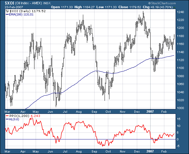
PPO(1, 200) = Percentage Difference of EMA(1) (i.e., Close) to EMA(200).
Thus all we need to do is plot PPO(1, 200) to see the line that Mary is asking for.
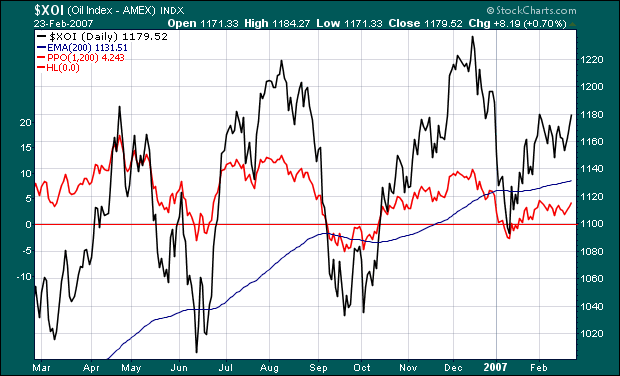
Viola! With a couple of setting changes, we can overlay that indicator on our price plot:
Click either chart to see how they were constructed. Last we heard, Mary was happily charting percentage differences left and right. Hopefully, this trick can help your chart analysis also!


