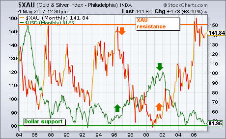
One of the most consistent of all intermarket relationship is the inverse relationship between gold assets and the U.S. Dollar. Nowhere is that more evident than in the chart below. The green line plots the U.S. Dollar Index (which measures the dollar against six foreign currencies. The Euro has the biggest impact in the USD). The orange line is the Gold & Silver (XAU) Index of precious metal stocks. It's clear that they trend in opposite directions. For example, the 1996-2000 dollar rally coincided with a major downturn in the XAU (see arrows). The fall in the dollar at the start of 2001 helped launch a major upturn in gold shares. The most important feature of the chart is that both markets are at key junctures. The green line shows the Dollar Index testing its all-time low along the 80 level. The orange line shows the XAU testing its all-time highs around 150 reached in 1987 and 1996. The fact that the XAU is stalled at long-term resistance may also explain why precious metal stocks have lagged behind the commodity over the last year. That may also explain why the bull market in bullion has been stalled since last spring.

