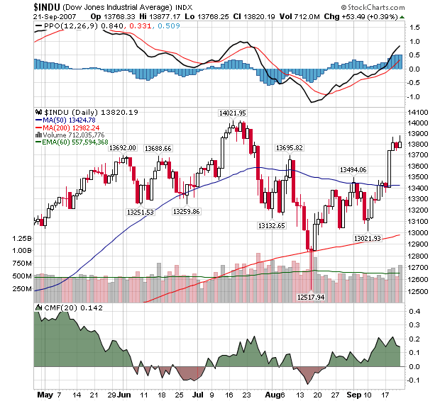
The Fed's surprising move last Tuesday did wonders for the major averages and "wrecked" many technical forecasts in the process (oh well). As you can see below, Tuesday's rally moved the Dow well above the 50-day Moving Average (blue) which had been providing some resistance prior to that time.

The CMF and MACD lines also strengthened significantly as a result. So everything must be looking up right? Well... Check out this chart:
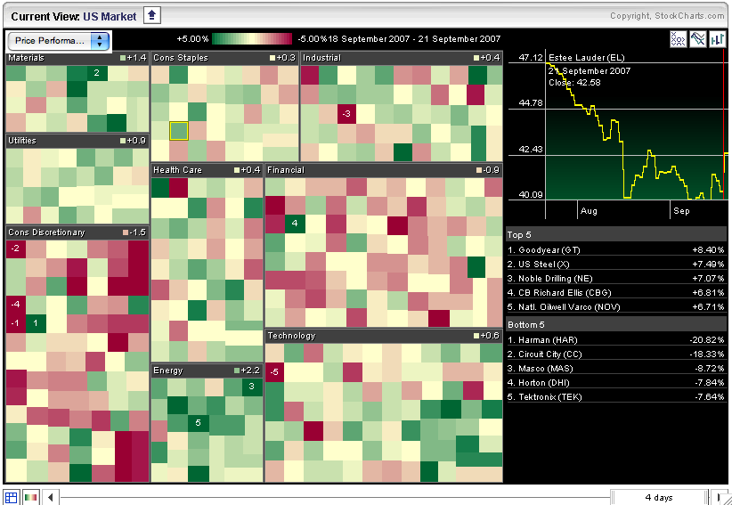
This is a MarketCarpet chart (Java required) for all of the stocks that make up the S&P Sector ETFs. Each square represents a different stock. They are grouped into the 9 major S&P sector categories. The color of each square is determined by the percentage increase (green) or decrease (red) that each stock has had since the Fed made its move on Tuesday. To read this chart, look to see if the overall color of a given sector tends towards green (bullish) or red (bearish).
As you can see, many of the stocks on this charts are tending towards the red - especially in the Consumer Discretionary and Financial sectors. Only the Energy sector is showing lots of green. This indicates that there hasn't been much follow thru since the Fed's move on Tuesday and that the downward pressure that was in place prior to Tuesday may still be having an impact.

