The panic selloff and subsequent recovery in August was nearly a mirror image of what we've seen in October. First, let's start with August. If you recall, we discussed how long-term market bottoms are marked by extreme bearish sentiment. The sentiment we saw in August doesn't get any more bearish. We had put call ratios routinely printing 1.30 to 1.40 and higher. The "equity only" put call ratio printed over 1.0 on 3 consecutive days, the first time that had happened since CBOE has been providing data to the public. For those of you unfamiliar with the put call ratio, it represents the number of put contracts divided by the number of call contracts. A number above 1.0 indicates that more puts are being bought than calls. Since 1995, the average or norm has been .75. The put call ratio serves as a contrarian indicator. The more bearish the put call ratio becomes (ie, the higher the number), the more bullish the implic ations for the stock market. It made perfect sense to us that a significant market bottom was put in place on August 16th after watching the put call ratio soar. The timing of the late afternoon reversal on August 16th and the ensuing gap up on August 17th couldn't have been better for market makers as options expired on August 17th. The reversal saved marker makers a bundle.
Now let's fast forward to October. As we approached options expiration Friday, the market had been straight up for weeks with tons of in-the-money calls. A further look at sentiment early last week revealed a 5 day moving average of the put call ratio that equaled its lowest level since April 2006. The pessimism from August had faded and sentiment was suggesting that the market was ripe for a selloff. Solid earnings reports came in from the likes of INTC, YHOO and GOOG, yet the market couldn't sustain attempted rallies. That was a big red flag and with so much money on the line for market makers due to options expiration, it should not have shocked anyone to see the indices sell off the way they did on Friday. This time a fortune was saved by market makers benefitting by a move in the opposite direction.
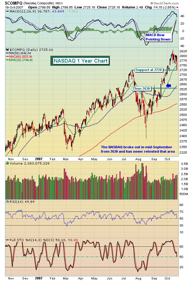
Where does this leave us now? Well, for starters, you must realize that next week is historically the worst performing week of the year, bar none. We are believers of historical tendencies and since 1950, the S&P 500 struggles more during the next 7 calendar days than it does during any other period throughout the year. In addition, the market had become way too complacent as we rose week after week after week. Below is a chart of the NASDAQ and key support levels to watch.

While we remain very bullish on the long-term prospects of the market, it could be financial suicide to ignore the short-term signals here. Take it easy, play it safe and look at any upcoming weakness as yet another opportunity to make money on the long side if panic selling kicks in.


