This is the sixth part of a series of articles about Technical Analysis from a new course we're developing. If you are new to charting, these articles will give you the "big picture" behind the charts on our site. if you are an "old hand", these articles will help ensure you haven't "strayed too far" from the basics. Enjoy!
(Click here to see the beginning of this series.)
Chart Scaling
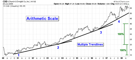
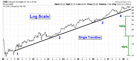
Charts are created with one of two different kinds of vertical price scales. An arithmetic scale evenly spaces price along the right side of the chart. Arithmetic chart spacing between $10 and $20 is half as tall as the spacing between $20 and $40. A log scale evenly spaces price in percentage terms. Chart spacing between $10 and $20 has the exact same chart spacing as between $20 and $40 since they represent the same percentage increase.
The SharpCharts above illustrate the differences between the two scaling methods. On the arithmetic scale, three different trend lines were required to keep pace with the price advance. On the log scale, the trend line fits the price trend during the entire rally. Log scaling should be the first scaling choice when using trend lines, especially over long time frames.
Volume
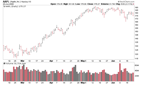
StockCharts.com provides several ways to plot volume data on a chart. The following price and volume SharpChart of AAPL illustrates how volume is typically plotted.
Volume can be plotted in an ‘indicator panel' above or below the ‘price plot area' or in the price plot area as an ‘overlay'.
When the ‘Color Volume' option is used, the volume bars are shown as black for up days and red for down days. Color volume bars allow the chartist to quickly see where heavy or weak buying and selling activity is happening.
CandleVolume Charts
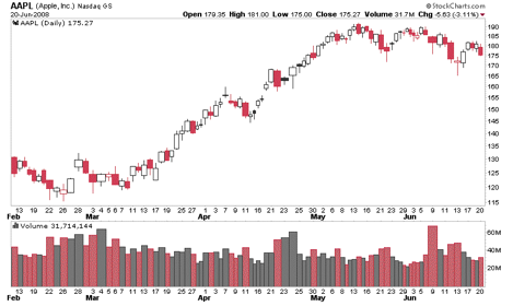
CandleVolume charts are similar to candlestick charts except that each candle's width is proportional to its corresponding volume value. This charting style allows one to visualize the volume activity ‘in' rather than ‘below' price moves. Depending on the style of analysis, volume bars could be omitted to simplify the chart.
The time axis for these charts is not uniformly spaced since the candlestick bar widths vary with volume values. As a result, trendline analysis using CandleVolume charts should always be confirmed with a standard candlestick or OHLC chart. The SharpChart above of AAPL shows how volume bars correlate to the candlestick widths.
That wraps up our look at how charts are constructed. Next time, we're going to start to talk about how charts are analyzed - starting with Support and Resistance analysis.


