Hello Fellow ChartWatchers!
Here at StockCharts we are fanatical about accuracy. Without accuracy, there would be no reason to use our website. We work hard at it every day. There are two key factors in creating the "cult of accuracy" we have here - first, you need accurate data; then you need accurate calculations. If we get either of those things wrong, our charts suffer and your trust in us diminishes.
Data accuracy is a huge can of worms that I'm not going to address today. I want to spend some time however on Calculation Accuracy because I can show you some specific cases where our Calculation Accuracy exceeds other websites out there. Here is an article I wrote back in 2001. Amazingly, it is still as valid today - 8 years later - as it was back then:
Recently, someone named "e91978" (really!) wrote us to inquire about our chart for QLGC. QLGC was closing in on its 200-day Exponential Moving Average and e91978 was trying to find out if it had closed above or below that indicator last Monday evening. The charts on their broker's website showed that QLGC was below its 200-day EMA while our charts showed it was above. Which was correct?
At first glance, a question like this may seem unimportant. But the question goes to the heart of an extremely critical aspect of Technical Analysis for, you see, many other indicators and overlays used by technical analysts are based on calculating one or more Exponential Moving Averages. If someone's EMA's are wrong, then you really should not trust any of their other indicators. With that in mind, e91978 had every right to be concerned.
The answer to the question lies in the way that Exponential Moving Averages are calculated. While calculating a 200-day Simple Moving Average is easy (add up 200 data points and divide by 200), calculating a 200-day Exponential Moving Average is much trickier. What most people don't know is that, in theory, every closing price a stock has ever had should be used to calculate any EMA for that stock no matter what the EMA's period is! See our ChartSchool article on Moving Averages for the gory details.
Bottom Line: The less data you use in your calculation, the less accurate your results.
Because some stocks have data going back to the 1920's or earlier, and because the effect of data from many years ago diminishes over time, most high-performance charting programs - including ours - actually estimate the true EMA by performing the calculation on a subset of the stock's data. If you go back far enough, the estimated EMA will be accurate to within a fraction of a penny. The trick is knowing how far back is "good enough" - StockCharts is very conservative here, using more data than our competitors to make sure that our calculations are correct. Thanks to e91978, here's the proof:
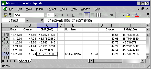
First off, I created an Excel spreadsheet that contains all of the data for QLGC going back to when the stock IPO'ed in 1998. I then had Excel calculate a running 200-day EMA for the stock all the way up until Nov. 26th, 2001 (column C above). The value Excel came up with was 45.72894008. I'm going to consider that to be the "true" EMA value.
Data errors can often throw off sensitive EMA calculations, so next I collected QLGC data from an independent source (Yahoo.com) and had Excel perform the same calculations (column I above). Excel's Yahoo-based 200-day EMA value was 45.72987435 - a difference of 0.000934269 - which is very close to the first value.
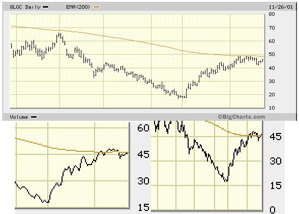
On Nov. 26th, 2001, QLGC closed at 46.24 - fortunately all of the charting sites did agree on that! Now, 46.24 is clearly higher than then values that Excel calculated for the "true" 200-day EMA. Let's see what some of the common charting sites displayed on that date:
Look familiar? Look closely at the top chart. That is the chart that you get when you use the default settings and add a 200-day EMA. First off, we can't be sure what the 200-day EMA value is since it isn't displayed. However, in the top chart, QLGC closed clearly below the line. Now look at the chart on the lower left. That is a blow-up of a 2-year chart. Notice that now QLGC closes right on top of the EMA - the EMA must have moved! Finally look at the chart on the lower right. This is a blow-up of a 5-year chart. Wow! Now the EMA is (correctly) below the closing price! Obviously, the longer the chart, the more accurate the result - but that's not the way things should work!
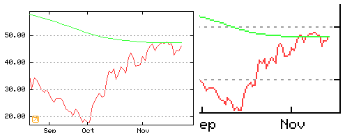
The chart above is what e91978 was looking at. It's even harder to tell what the value of the EMA is since the axis values are on the left side of the chart, but this chart's EMA is also clearly above the closing price (wrong!). A blow-up of a 2-year chart is in the upper right corner - again, the EMA appears to have moved!
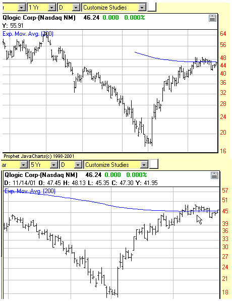
One last example, this is from an "interactive" Java charting tool. The problem is that both the code for the tool and the data for the chart has to be downloaded into your computer before the chart can appear. To minimize delays, they minimized the amount of data that they initially download, thus maximizing the potential for EMA errors. The top chart shows the default view of things. Note that the 200-day EMA line doesn't start until mid-September and the close is once again in the wrong position. It was a struggle, but I was finally able to get the tool to load lots of data but only display the last couple of months. Once that was done, a fairly accurate 200-day EMA line appeared (bottom).
2010 UPDATE
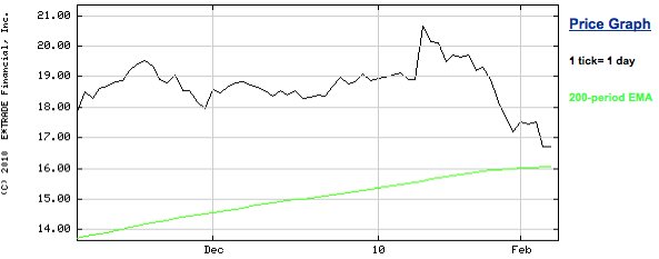
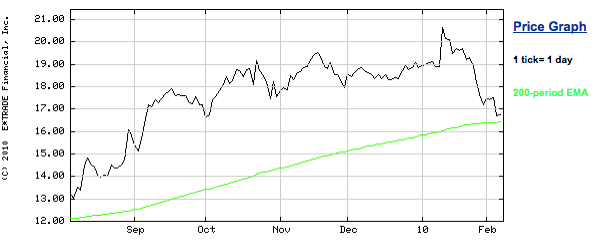
The charting site that e91978 was using back in 2001 still doesn't get it. Here's their 3-month chart of QLGC from this Friday followed by their 6-month version of that same chart:
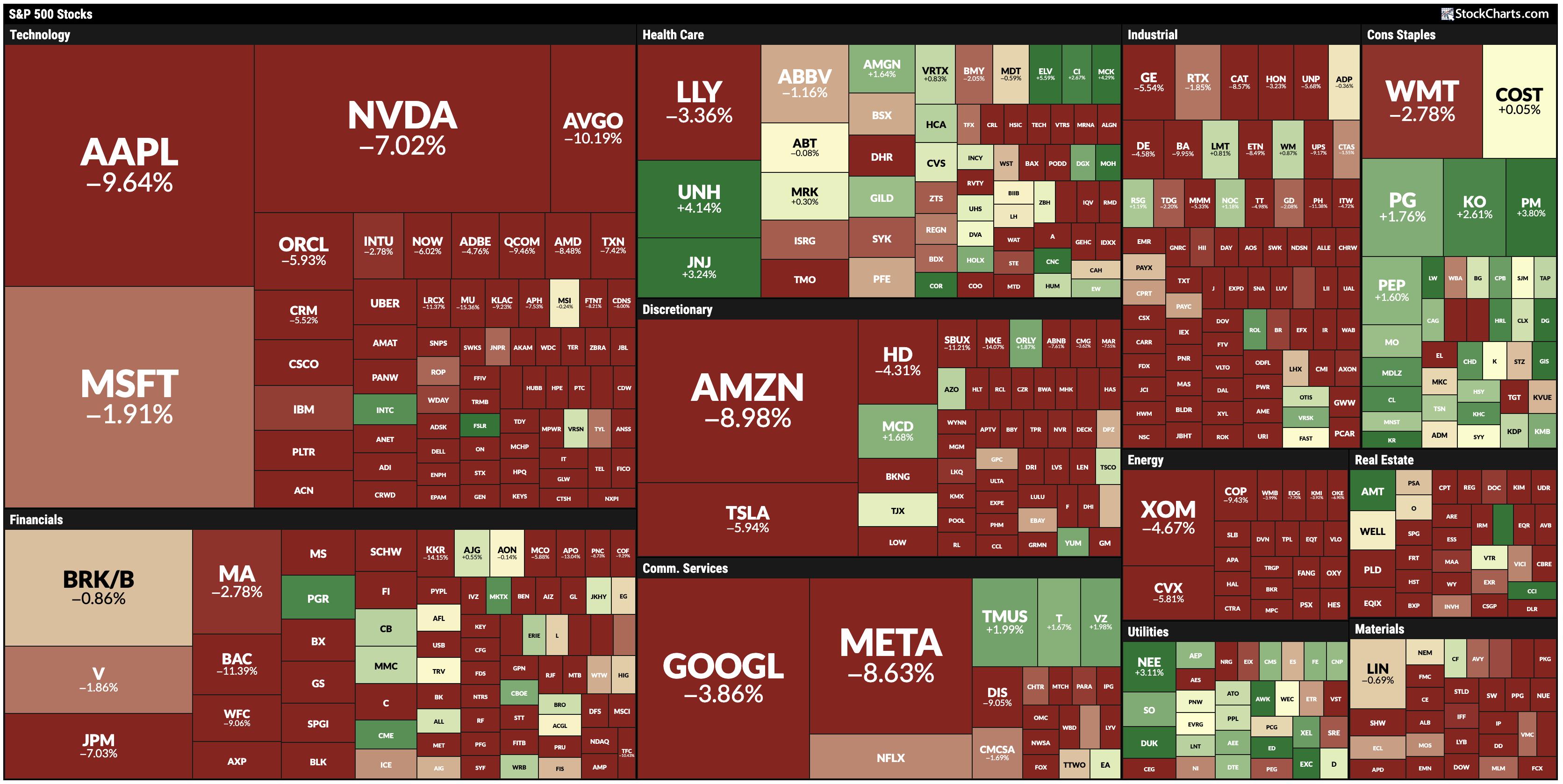
All I did was change the chart's setting from 3-months to 6-months. Notice that the green 200-day EMA was very close to 16.00 on the top chart but then has moved up to near 16.50 on the bottom chart? That's a huge difference! So where should the 200-day EMA be? Here's a hint.
Remember folks, many other important technical indicators are derived from EMAs including the MACD, the PPO, the Percentage Volume Oscillator, the Chaikin Oscillator and the McClellan Oscillator. I'll say it one last time - Incorrect EMAs mean incorrect charts.
- Chip Anderson

