Let's face it. Two weeks ago, the market looked cooked. There didn't appear to be a single drop of gas left in the bulls' tank. We saw impulsive selling. The volume surged on the selling. Daily charts had already printed long-term negative divergences across our major indices, indicative of slowing bullish momentum. Then came the dreaded "death cross", with our shorter-term 20 day EMA crossing below the longer-term 50 day SMA. There was little hope of a recovery....or was there? Shortly after the last article, I hosted one of our Online Traders Series events, "Distinguishing Between Pullbacks and Bear Markets". It turned out to be very timely. I discussed, in part, how you MUST keep one eye on the long-term charts when evaluating the nature of short-term selling. When you break down in the short-term and begin what MAY become a transitional period into a flat or bear market, the key is to adapt your trading strategies until the market becomes clearer in the long-term. For me, that means fewer trades and fewer shares. It's a simple case of managing your risk. You need to pause and allow the market to send you a message as to its intent before becoming more aggressive.
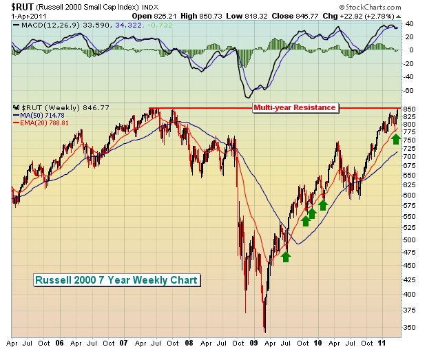
The Russell 2000 is the strongest of our major indices and it comes at a very interesting time of the year as April and May are two of the three best calendar months historically for small cap stocks. Check out how the Russell 2000 handled the recent selloff on its long-term weekly chart:

The above shows clearly that we had a short-term pullback to test a key uptrending 20 week EMA. The test was successful and now we see the rally picking up steam once again. The lesson to learn here was that the long-term bull market run was tired, needed a break, and received one by pulling back in acceptable technical fashion and bouncing EXACTLY where it needed to. The daily charts, if you recall, were much more bearish looking, but it's important to keep one eye on those longer-term charts as well. The green arrows on the chart above highlight the successful 20 week EMA tests during this long-term uptrend.
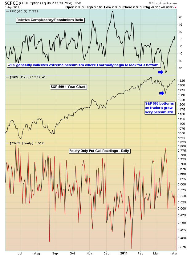
As for market sentiment, I've written plenty at StockCharts about the equity only put call ratio (EOPCR). I use a short-term moving average of this ratio and compare it to a longer-term ratio. The purpose? To identify the "pendulum" swings of traders' emotions in terms of relative complacency and relative pessimism. This ratio has an uncanny ability to sense key turning points in the market and it did it once again at the recent bottom as relative pessimism soared. Take a look:

As the EOPCR approached panicked levels (which I consider -20%), the S&P 500 made a sudden rush back to the upside, confusing most technicians and traders. While nothing in the market provides us guarantees, the EOPCR is one self-developed tool that needs to be watched very carefully for tops and bottoms. It's so important that I provide it to our members every day in our morning Market Chatter.
The market is very complicated. But I try to take as simplistic a view as possible to keep my sanity. Listening to all the talking heads on a regular basis can leave you completely exhausted and confused. We must follow the technicals and "clues" that the market provides us in order to better gauge the highest probability of the market's next move.
I discuss many of the subtle secrets of the market in my FREE Traders Boot Camp series. CLICK HERE to register.
During the very first week of the Boot Camp series, I was asked by participants to have a live webinar to discuss all of the topics of the boot camp in more detail and I'll be doing just that next Saturday, April 9, 2011 from 9am to 12pm EST. If you'd like more information, CLICK HERE.
Happy trading!


