Hello Fellow ChartWatchers!
Recently we introduced a new cycle analysis tool in our ChartNotes annotation tool - the Cycle "Sine Wave" tool. This tool helps you look at various period cycles on your charts. It can be used on any chart in a wide variety of ways but many people people will probably use it to look for cycles on long term charts.
To use the tool, create a SharpChart and then start our ChartNotes annotation tool by clicking on either of the "Annotate" links below the chart. Once ChartNotes is running, you can click once on the old "Cycle Lines" button in the top toolbar. After you click, a second button will appear below your mouse with a Sine Wave icon on it. Click that button to select our new "Sine Wave" tool.
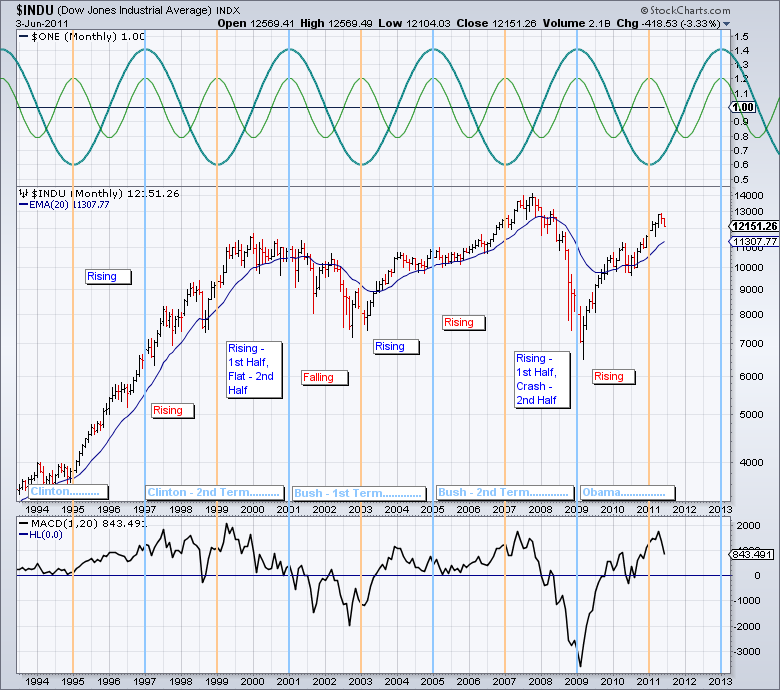
Once the tool is selected, simply click and drag to create great looking cycle charts. Here's an example:

(Click to see a live version of this chart.)
This example is designed to explore the fabled 4-year Presidential stock market cycle. The theory behind this cycle is that presidents implement difficult economic measures soon after taking office and implement economy stimulating measures before the next election to make voters happy.
The chart above is a very quick look at whether or not that phenomenon has played out over the course of the last 15 years. Again, this quick analysis shows that the start of the 2nd term for both Clinton and Bush played out counter to cycle expectations with the markets rising instead of falling.
I encourage everyone to play with these tools and explore other cycle phenomena. If you find something great, think about sharing it via your Public ChartList. I can't wait to see what you come up with.
- Chip


