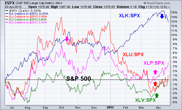
One of the ways to measure the mood of the stock market is to see what sector rotations are taking place beneath the surface. Chart 1 shows that sector rotations over the past month reflect a market mood that is turning more defensive. The four sector lines are plotted "relative" to the S&P 500 which is the flat black line. In other words, the four sector lines are relative strength ratios that measure their performance "relative" to the S&P 500. The blue line shows the Technology SPDR (XLK) leading the market higher since the beginning of the year. Technology leadership is a good thing for the market. The XLK:SPX ratio has started to drop during April, however, which shows short-term loss of that leadership. In fact, technology was this week's weakest sector. The other three lines show the relative performance of the three defensive sectors which are consumer staples (pink line), healthcare (green line), and utilities (red line). Those three sectors underperformed the S&P 500 since December as the market rallied. Notice, however, that those three relative strength ratios have turned up over the last month. In fact, utilities, healthcare, and staples were this week's three strongest sectors. That's normally a sign that investors are turning more defensive and are protecting themselves from a possible market correction.


