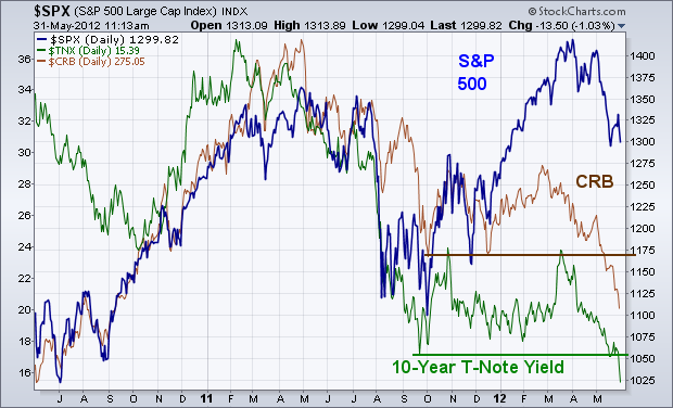
BOND YIELDS AND COMMODITIES HIT NEW LOWS... Everywhere I look I see more serious warning flags for the U.S. stock market. Two of them are coming from recent breakdowns in bond yields and commodity prices. The chart below shows the 10-Year T-Note Yield (green line) and CRB Index (brown line) falling to new lows. Bond yields are now at the lowest levels in sixty years. Over the past few years, a positive correlation has existed between commodity prices, bond yields, and stock prices. That relationship weakened during the first quarter, but now appears to be re-asserting itself. Falling commodity prices imply global economic weakness. Falling bond yields imply the same. A collapsing Euro (along with foreign stocks) is pushing money into the relative safety of Treasuries and the U.S. Dollar. Rising bond prices equate to lower yields. A rising dollar equates to falling commodity prices. Falling bond yields and commodities are now leading to falling stock prices. The rising dollar is also taking a more serious toll on foreign stocks. Their technical condition looks a lot weaker than the U.S. Problem is weakness there causes weakness here as well.
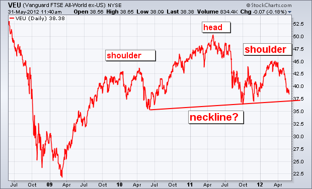
FOREIGN HEAD AND SHOULDER TOP... I wrote about the possibility that foreign stocks were forming a "head and shoulder" top a couple of weeks ago. But I believe it bears repeating. That possibility really worries me. Judge for yourself. The next chart shows the Vanguard All-World ex-US ETF (VEU) from its 2009 bottom. In my view, the price pattern since the start of 2010 has the look of a potential H&S top. [A H&S top is defined by three peaks, with the middle peak (the head) surrounded by two lower peaks (the shoulders)]. Unless I'm seeing things, the chart below appears to be tracing out a textbook H&S top. The trendline drawn undere the 2010/2011 lows represents the "neckline". A decisive drop below that support line would complete the top and signal lower prices. [An alternate bearish view requires a close below the fourth quarter low]. Either way, the pattern scares me. If foreign stocks are in fact tracing out a major top, there's no way U.S. stocks will escape more serious damage. They may not fall as far, but they will fall some more.
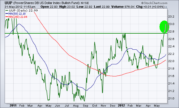
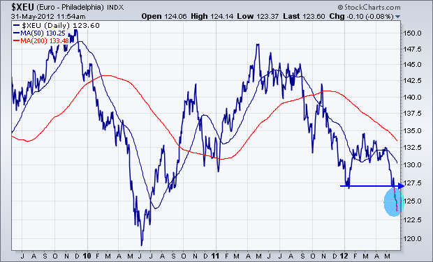
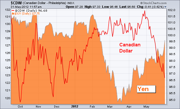
DOLLAR INDEX BREAKS OUT TO THE UPSIDE... Money continues to flow into the safe haven of the U.S. Dollar. The first chart below shows the PowerShares Dollar Bullish Fund (UUP) exceeding its January high to reach the highest level in eighteen months. Most of that gain is coming form a tumbling Euro. [The Euro accounts for 57% of the trend in the UUP]. The next chart shows the Euro tumbling to the lowest level since the summer of 2010. The last chart shows the Canadian Dollar tumblng as well (along with falling commodity prices). Some forex money is flowing into the safety of the Japanese yen (orange matter). At the moment, the four markets attracting safe haven money are the dollar, the yen, U.S Treasuries, and the German Bund.

